Blog
How To Add Search, Filters, And Sorting To Any Divi 5 Loop

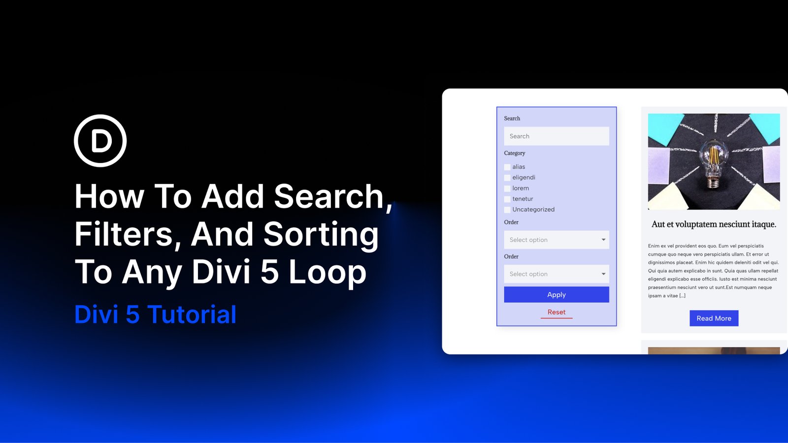
Search, filters, and sorting help visitors find specific content in a blog, product catalog, or directory. With Divi 5, you can add these controls to a custom post loop using the Post Filter Module.
In this tutorial, we’ll connect a filter form to a blog post loop, configure its search and category fields, add sorting controls, and style the form for desktop and mobile. The filtering tools are built into Divi 5, so this blog example needs no additional filtering plugin or custom code.
What Do Search, Filters, And Sorting Do?
Each control helps visitors browse a loop in a different way:
- Search finds content using a typed keyword.
- Filters narrow the results by criteria such as a category, tag, or custom field value.
- Sorting changes the order of the matching results, such as newest first or title A to Z.
Baymard Institute’s research on product lists and filtering highlights how these tools help shoppers find relevant products. A blog or directory can use the same browsing pattern to make a large collection easier to explore.
For example, a visitor could search for a recipe, select a category, and then sort the matching posts by date. Each control has a separate role in refining the results.
Native Search, Filtering, And Sorting In Divi 5
The Post Filter Module contains the form controls and connects them to a target loop. This tutorial uses a custom post loop built with Divi 5’s Loop Builder. For WooCommerce products, build a custom product loop rather than trying to attach the form to WooCommerce’s standard shop loop.
The module offers seven item types. Text provides a search input. Select displays choices in a dropdown, while Radio displays a list of single-choice options. You configure which post data, taxonomy, or custom field each relevant control uses.
Checkbox allows multiple selections. Order By sets the sorting criterion, and Order sets its direction. Button items provide the form’s submit and reset actions.
Build and style the form in the Visual Builder, then check its behavior on the front end after saving.
Adding Search, Filters, And Sorting To Your Loops In Divi 5
Start with a working loop, place the filter form beside it, and connect the two. We’ll use blog posts for the example below.
Build Your Loop
Choose the content the loop should display, such as blog posts, WooCommerce products, or another custom post type. Then create the card that Divi will repeat for each result.
With Divi 5’s Loop Builder, you can enable Loop Element on an element or container. For a card with several modules, use a container such as a Group or Column. Add the image, title, excerpt, and link using the corresponding loop Dynamic Content values.
Our custom blog post loop guide covers designing the cards, enabling the loop, and configuring its query.
Arrange The Filters And Results
Add a two-column row with a narrow left column for the filters and a wider right column for the results. An approximately 30/70 split gives the posts most of the available width.
Place the blog loop in the wider column. Keep the narrow column available for the Post Filter Module.
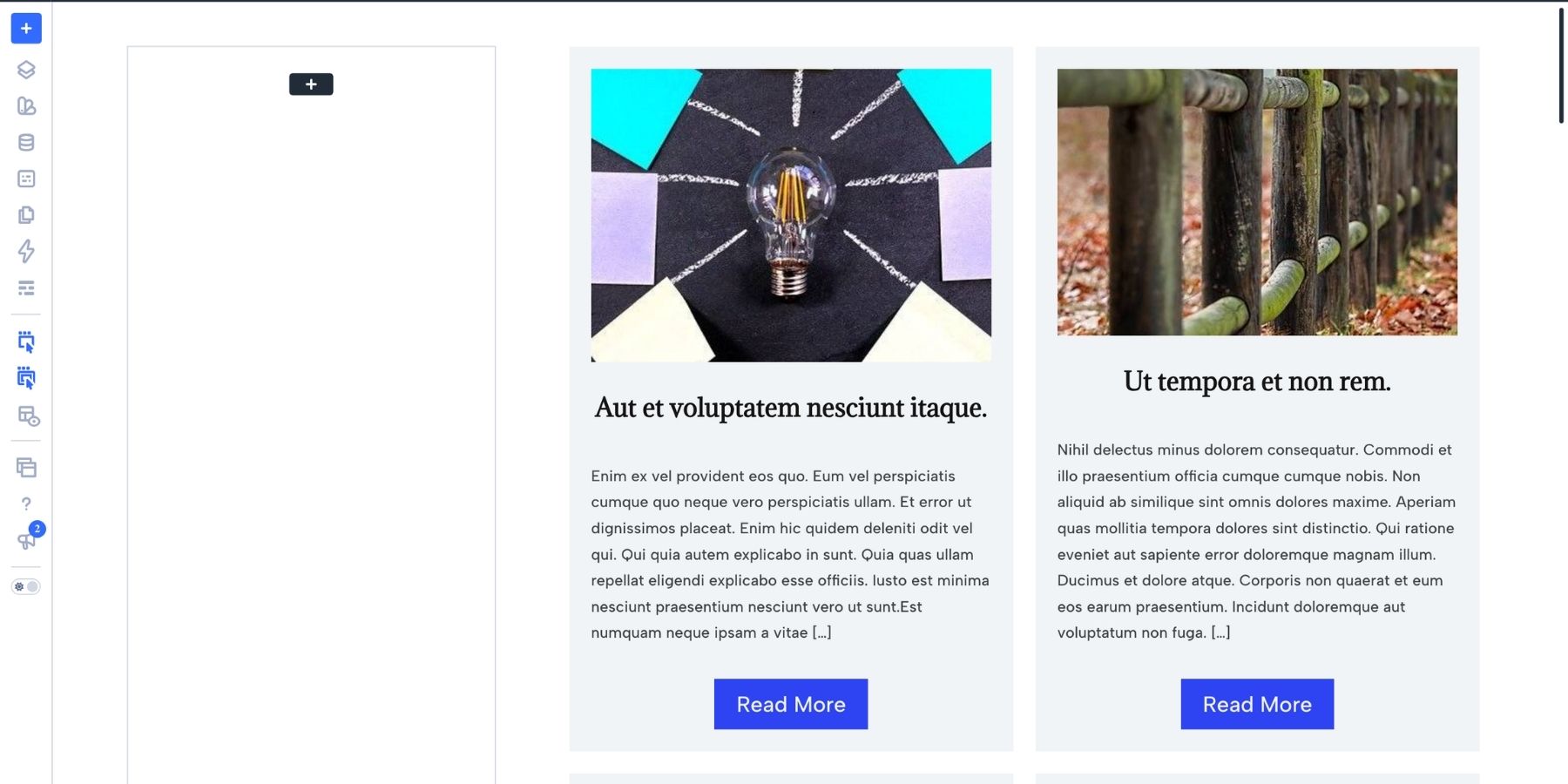
Divi 5’s Flexbox layout system lets you adjust this split. In a Flex row, the row is the flex container and its columns are flex items.
Use each column’s Design > Sizing > Column Class setting to adjust its share of the row. You can start with a row template and refine the column sizes to suit the form and cards.
With Nested Rows, you can also place a row inside the results column to organize the cards. At smaller breakpoints, adjust the parent row’s Layout Direction and column sizing to stack the filters above the results.
This sidebar layout is a starting point. The same filter form can also sit above the loop if that better suits your page.
Add And Connect The Post Filter Module
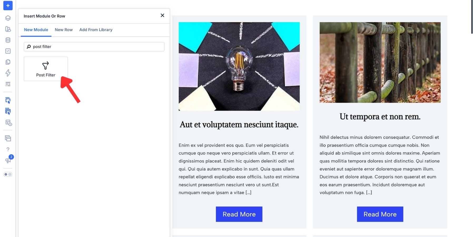
Insert the Post Filter Module in the narrow column.
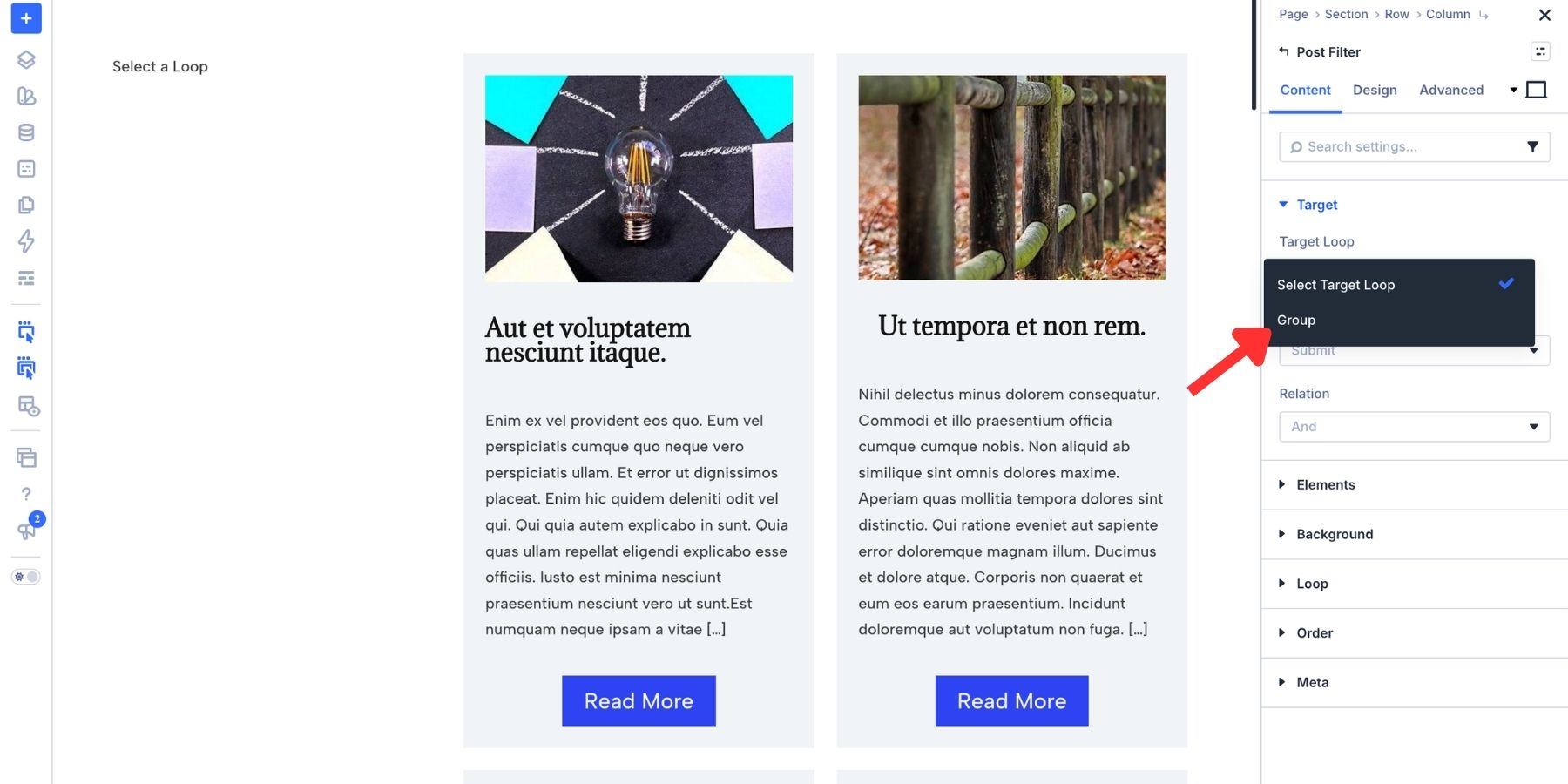
Open Content > Target and choose your loop under Target Loop. Select the element with looping enabled, which is the Group in this example.
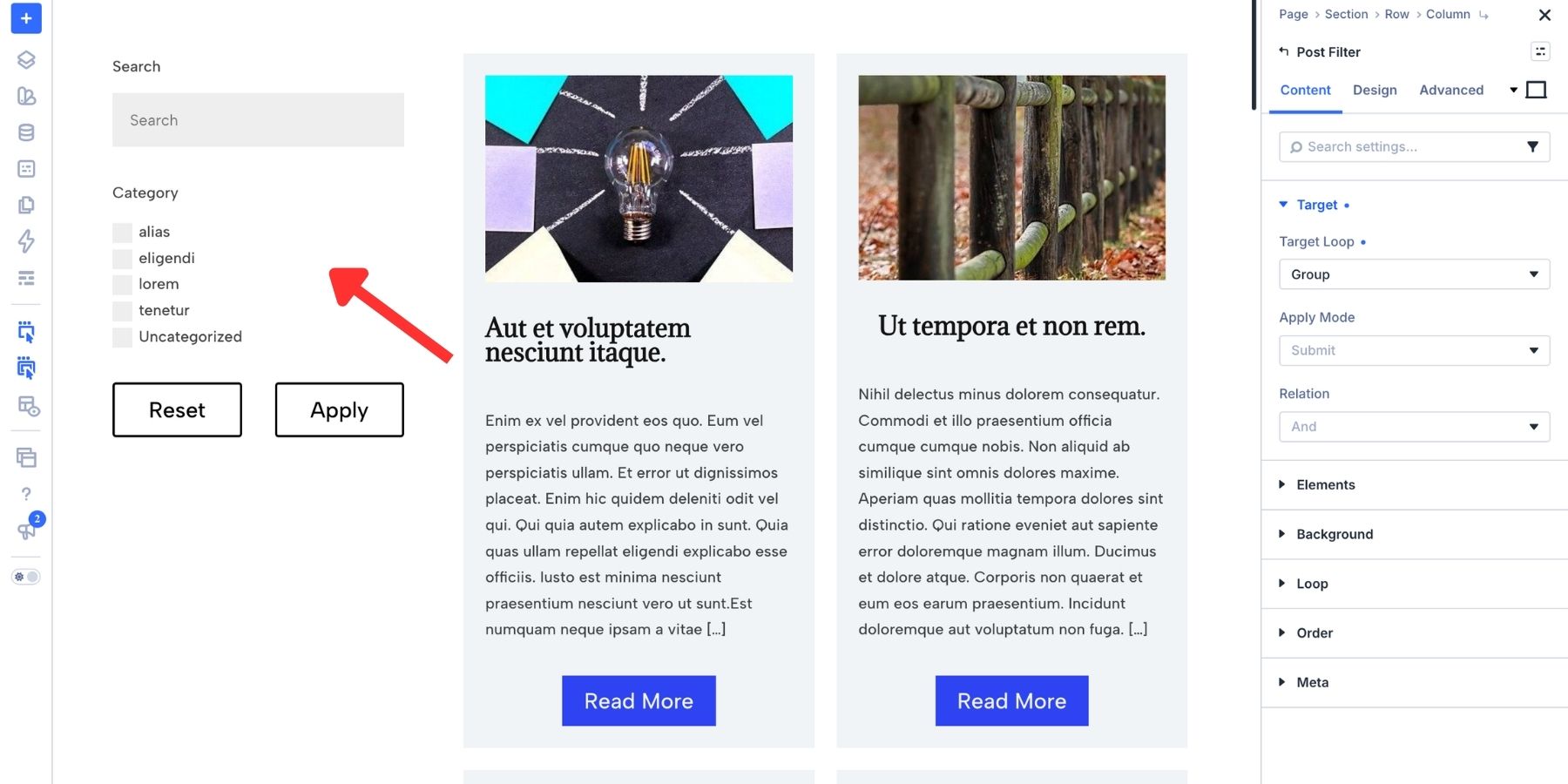
The default form in this example contains Search, Category, Reset, and Apply items.
In the same Target group, review Apply Mode and Relation.
Apply Mode determines when the form updates the results. Submit applies the criteria when visitors click the submit button. Automatic updates results as visitors change the controls. Use Submit here so visitors can choose several criteria before applying them.
Relation determines how the filter conditions are combined. And requires matching conditions together, while Or allows alternatives. Keep And for this example. This form-level setting is separate from the choices made within an individual field.
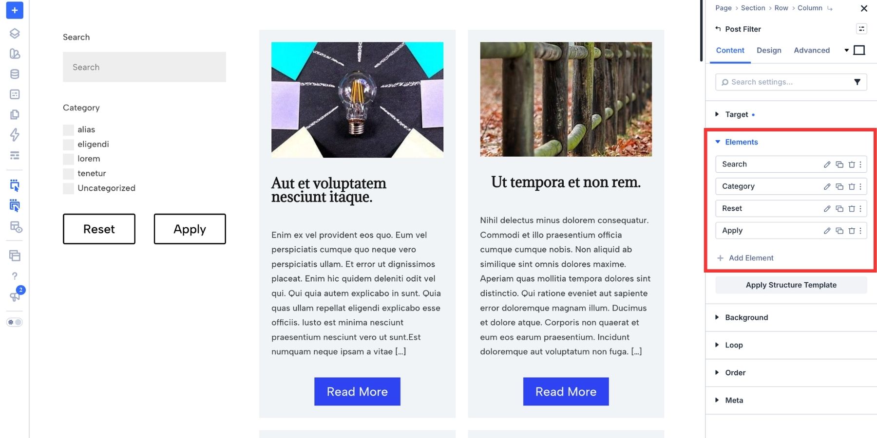
Expand Content > Elements to add, remove, edit, or drag the filter items into a different order.
Configure The Search Field
Click the edit icon beside the existing Search item. Keep it as a Text field using the post search option for this blog example.
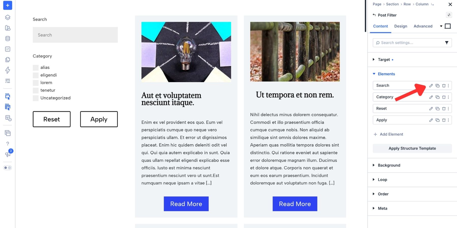
Set a helpful Field Placeholder, such as “Search Posts.” For a recipe blog, “Search Recipes” would be more specific. Changing the placeholder changes the prompt visitors see, not which content the field searches.
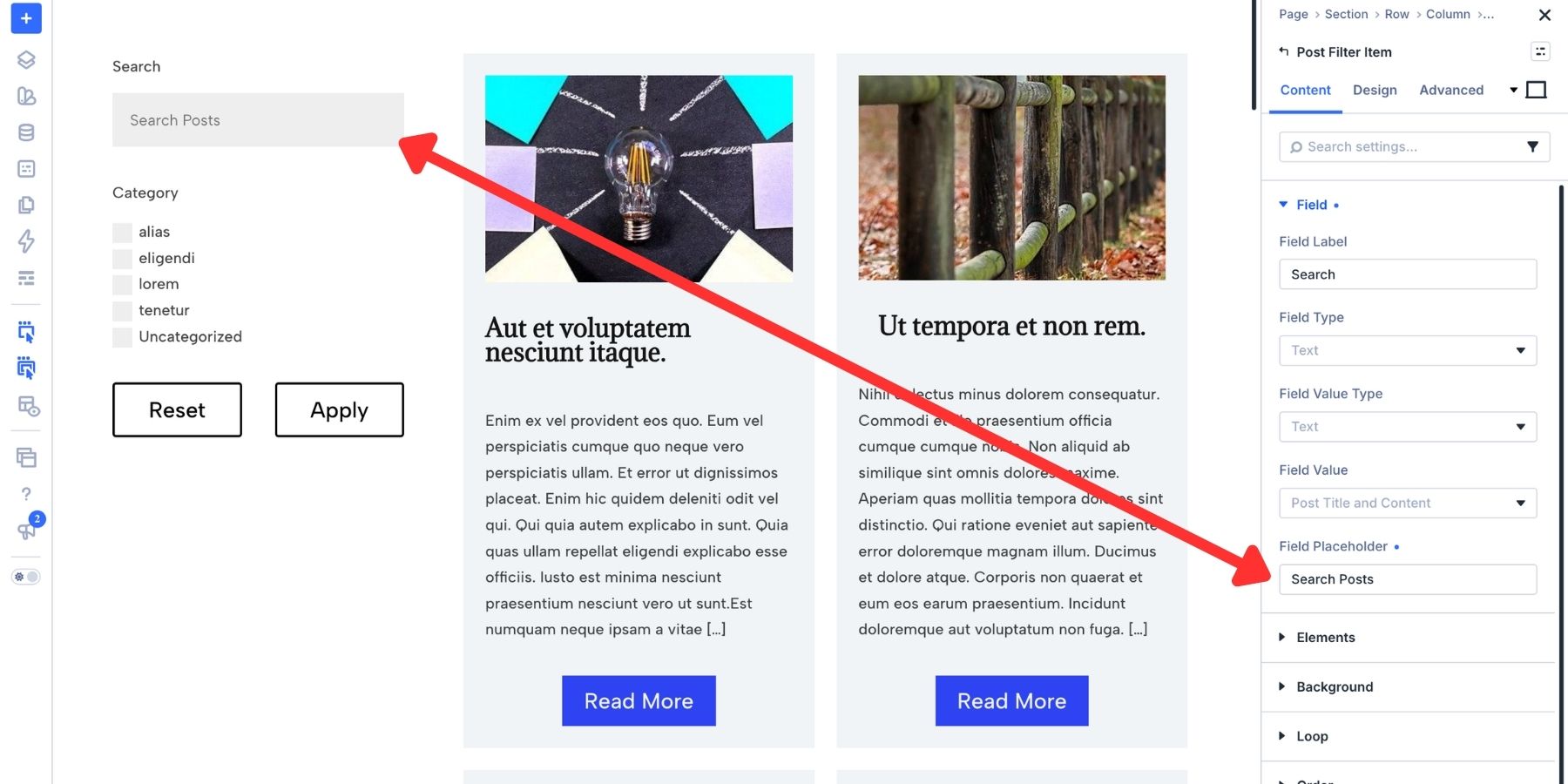
Set the Field Label to Search. Divi provides separate controls for the label’s text and visibility. Keep a clear label so the field remains identifiable after a visitor starts typing.
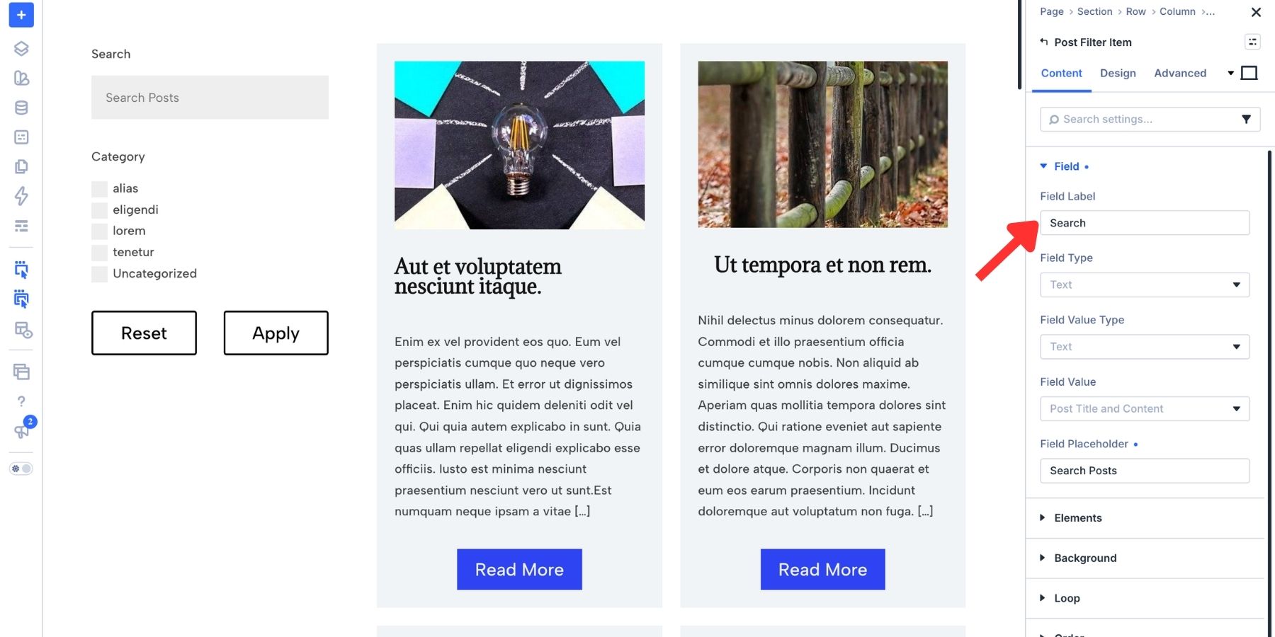
Configure The Category Filter
Return to the parent module’s Elements group and edit the existing Category item. For the checkbox list shown in this example:
- Keep the Field Label as Category.
- Use Checkbox as the Field Type.
- Under Field Option, select the category taxonomy for the posts in your target loop.
- Use Automatic options to populate the choices from the taxonomy.
The category names will reflect your site’s content, so they will differ from the sample terms in the screenshots. For a single-choice filter, use Select or Radio instead. Choose the taxonomy belonging to the target post type; product categories and blog categories are different taxonomies.
Add Sorting Controls
To let visitors choose both the sorting criterion and direction, add Order By and Order fields. Order By determines what to sort on, and Order determines whether the results run in ascending or descending order.
Use Add Element to add two Post Filter Items.
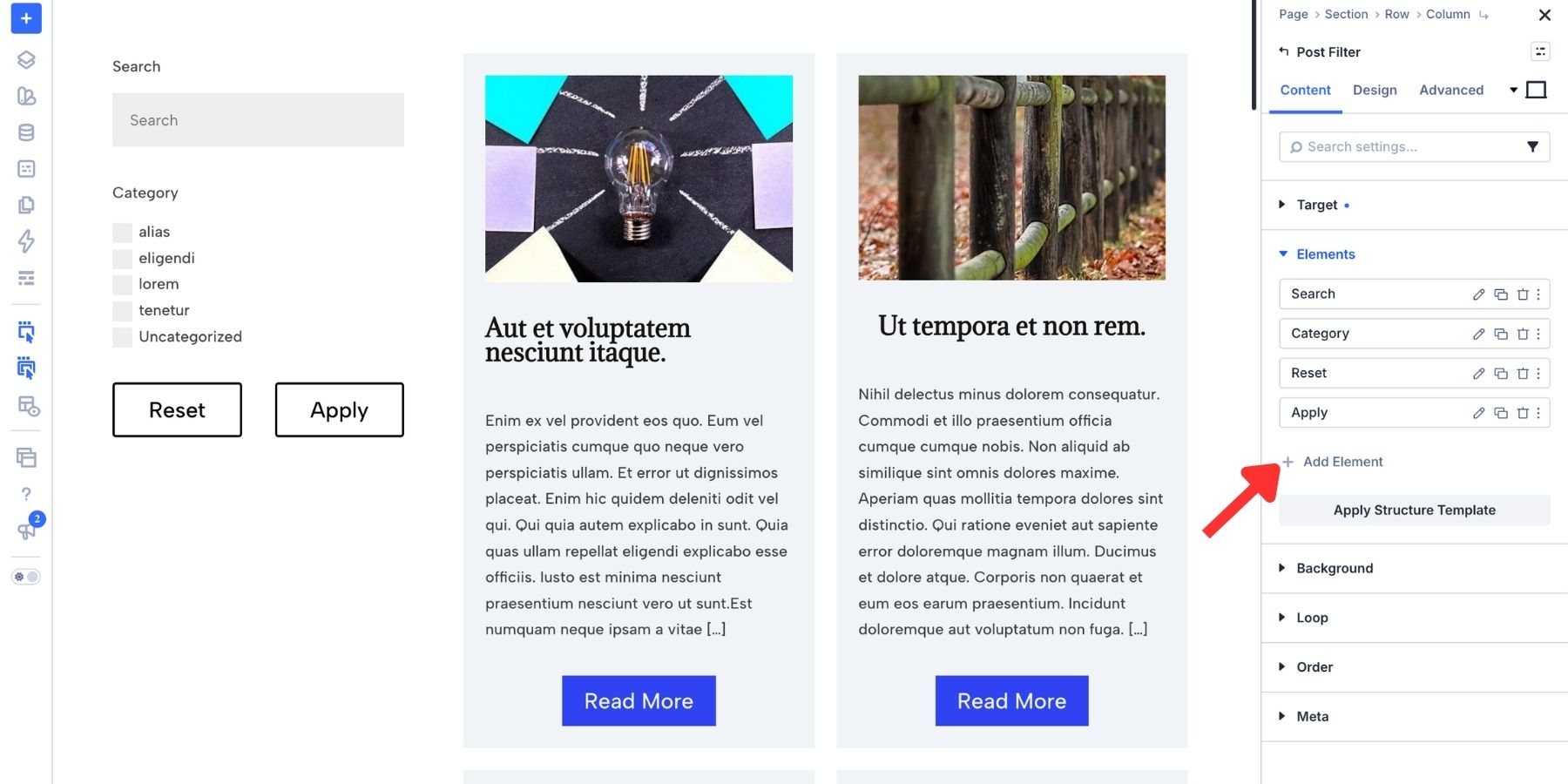
Drag the new items above the Reset and Apply buttons, then open each item’s settings.
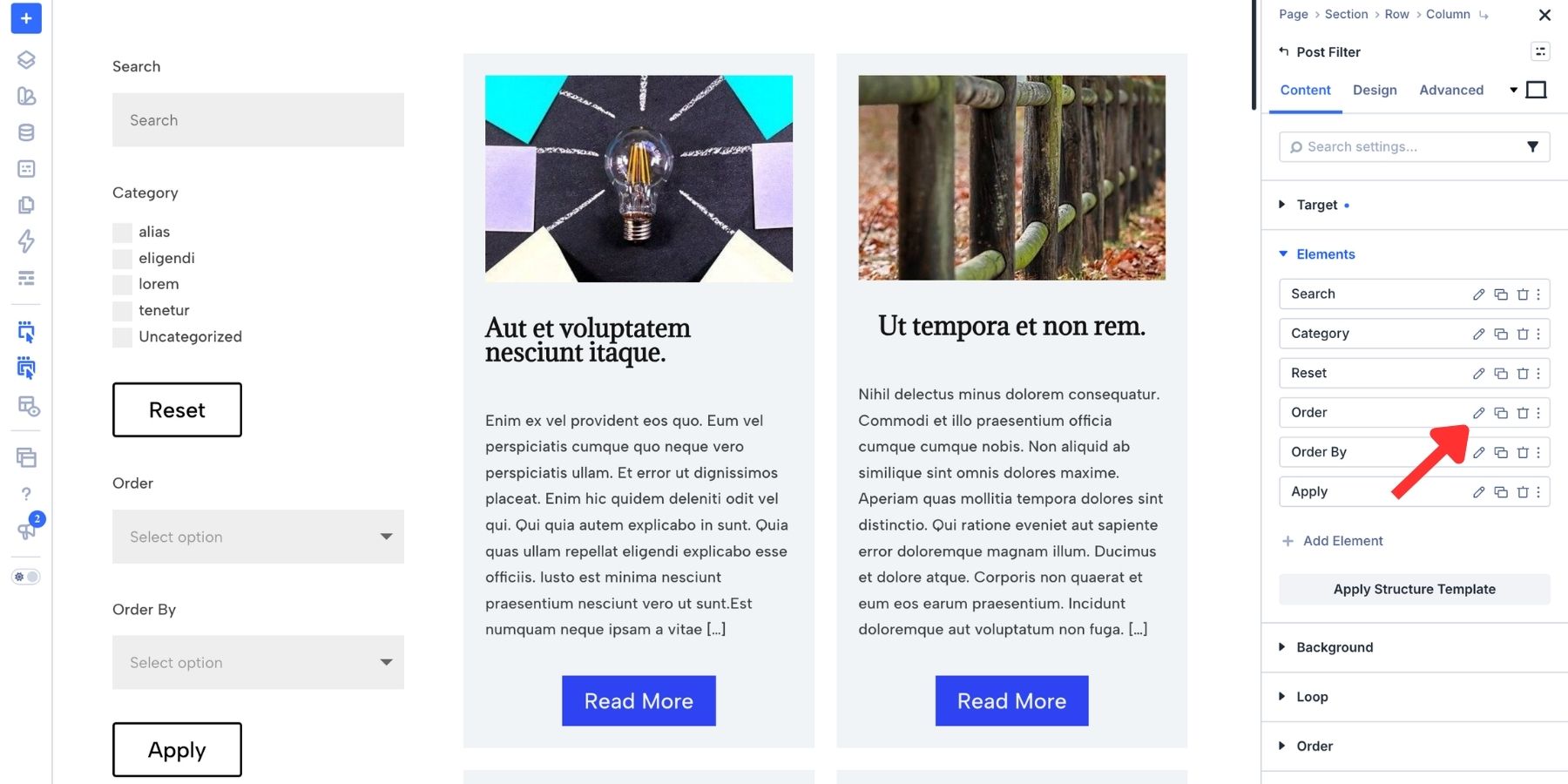
Set one item’s Field Type to Order By and its Field Label to Order By. Set the other item’s type and label to Order. Use distinct labels so visitors can tell the two controls apart.
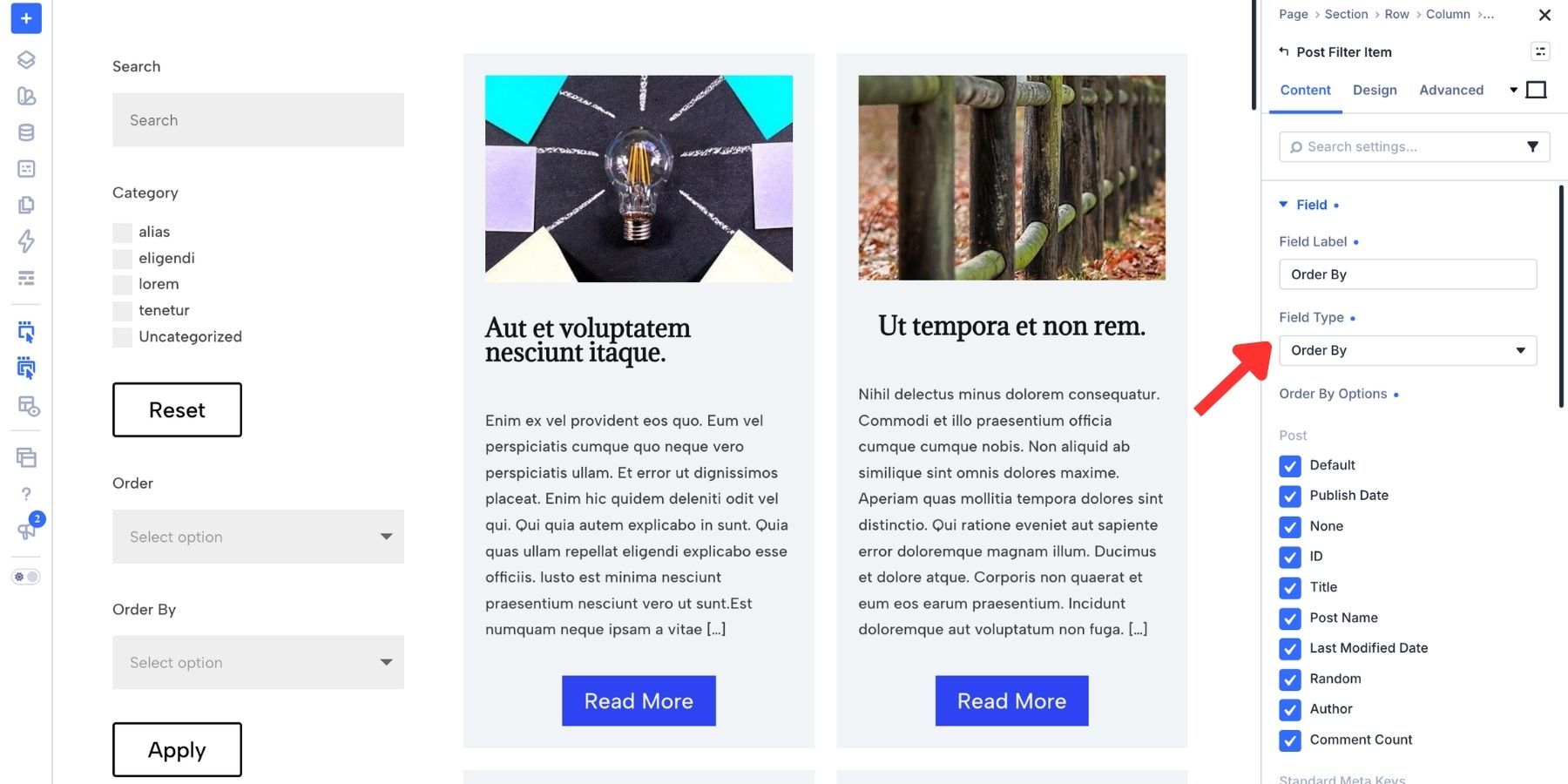
Under Order By Options, choose the criteria visitors can use. For this blog loop, keep Publish Date and Title. You can also retain Default to let visitors use the loop’s configured order, and deselect options that are not useful for this page.
Available choices depend on the target loop and its data. A custom product loop can use a price-related sorting option where available; this blog example uses publish date and title.
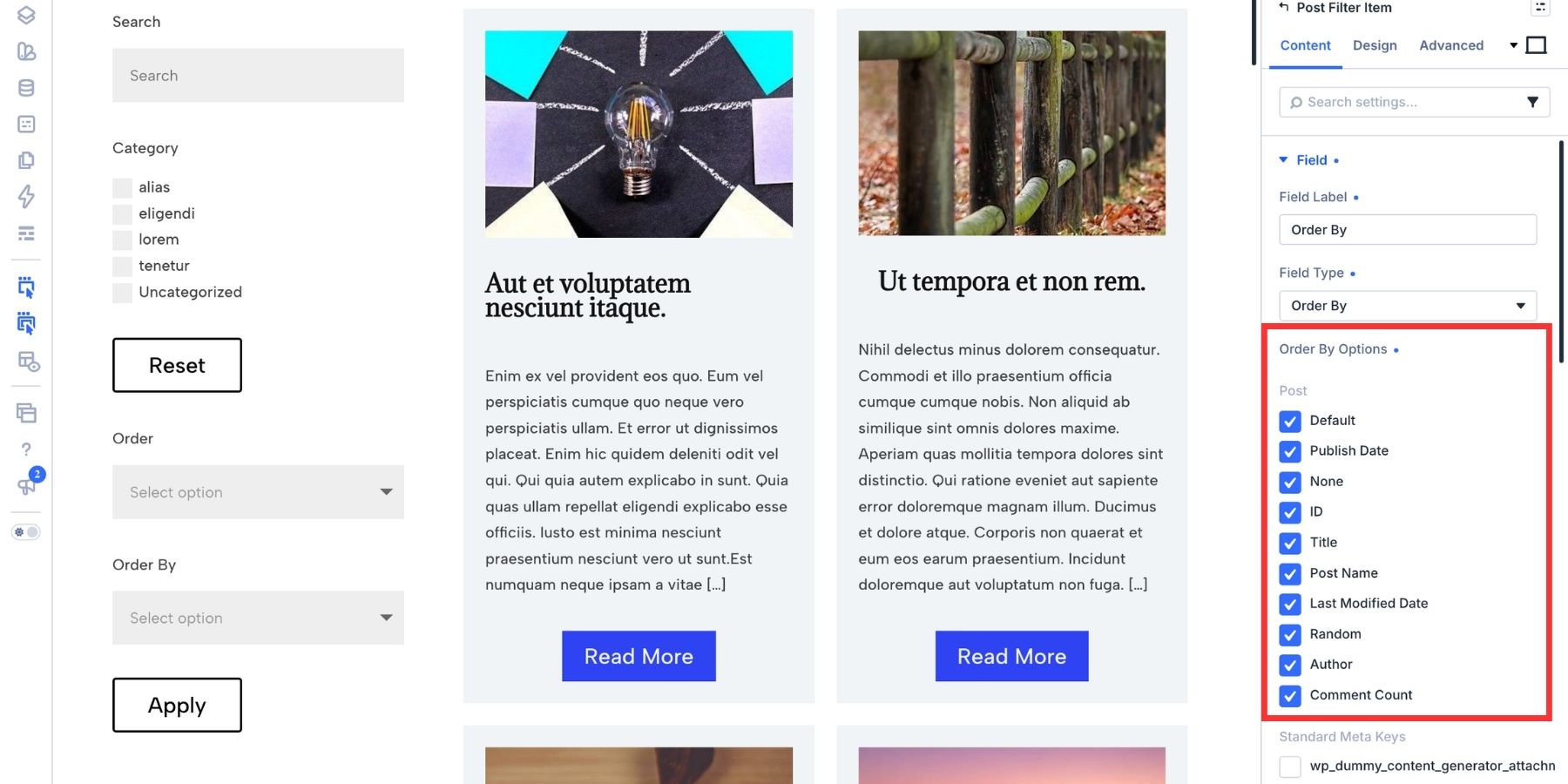
The controls work together: Publish Date with Descending puts newer posts first, while Title with Ascending sorts titles from A to Z.
Configure The Submit And Reset Buttons
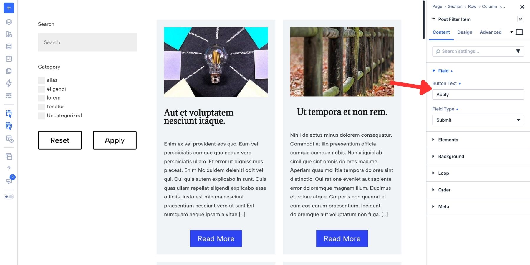
The default form includes Apply and Reset items. Open each item’s settings to review its button action and text.
Keep Apply as the submit button. With Apply Mode set to Submit, it applies the current search, filter, and sorting choices together.
Keep Reset as the reset button. It returns the form to its starting state. Resetting visitor filters does not remove restrictions already configured in the loop’s base query, such as its post type or category limits.
Use Button Text to change the visible labels if needed. “Apply Filters” and “Reset” are clear choices.
Style Your Search And Filters
Style the search input, category options, sorting controls, and buttons to match the rest of the page. You can make shared changes at the parent module level and refine individual items where needed.
Use the parent Post Filter Module’s Design tab for shared field styling, including text, colors, borders, and shadows. These settings provide a consistent starting point for the form’s items.
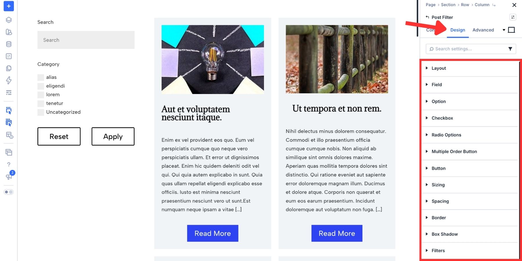
Open an individual Post Filter Item’s Design tab to style that item separately. This is useful when the submit button needs a stronger treatment than the reset button.
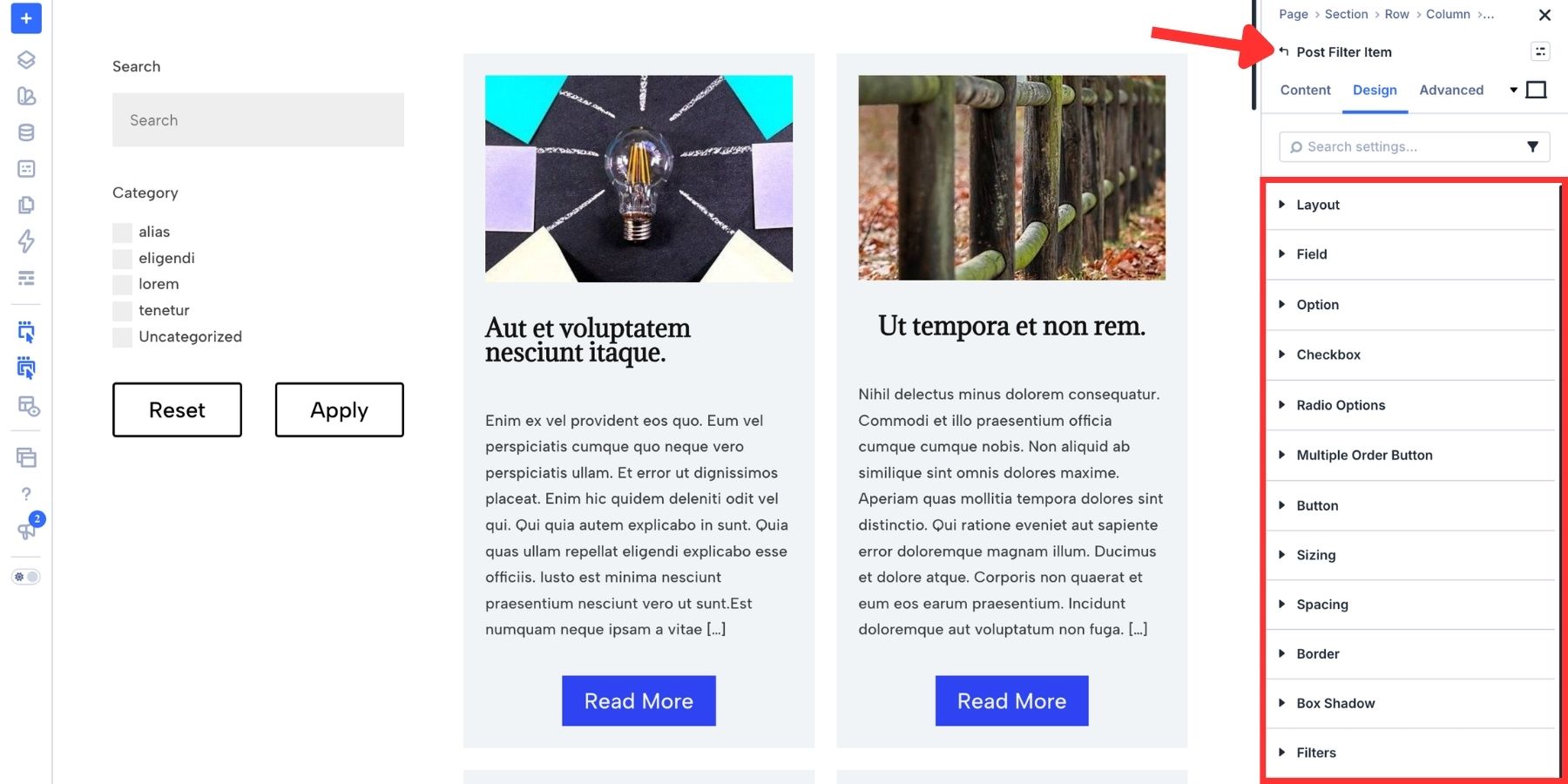
You can also connect the form to the rest of your site’s design system using variables and presets.
Use Design Variables For Consistent Styling
Design Variables let you reuse named values instead of entering the same color, size, or font repeatedly.
Open the Variable Manager and create color, number, and font variables for your form. Use number variables for values such as spacing, border width, and corner radius. In supported settings, use Insert Dynamic Content to select the appropriate variable.
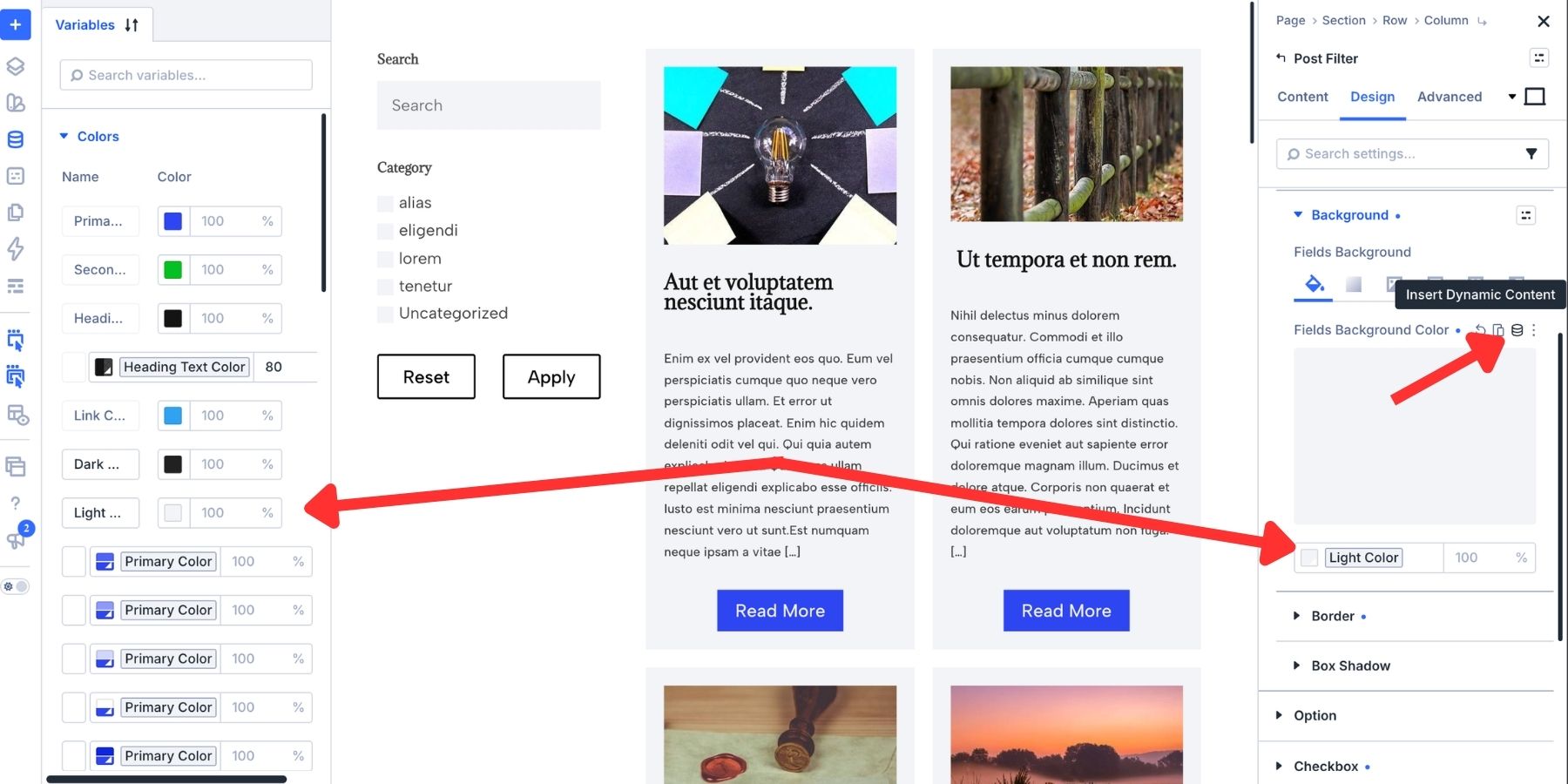
Variables are reusable across the site, but they affect only settings that reference them. For example, the same color variable can be used on this filter form, a contact form, and a pricing table. Updating that variable changes each linked setting.
A value entered directly in a field remains independent; a variable keeps that value connected to your shared design system.
Style Focus, Checked, And Hover States
Use state styling to make it clear which field has focus and which options are selected. Relevant controls support Focus, Checked, and Hover styling.
The Variable Generator can create tints and shades from your primary color. Use a light tint for a field background and a stronger shade for a visible border or selected state.
Open the responsive/state menu at the top right of the settings panel and select Focus.
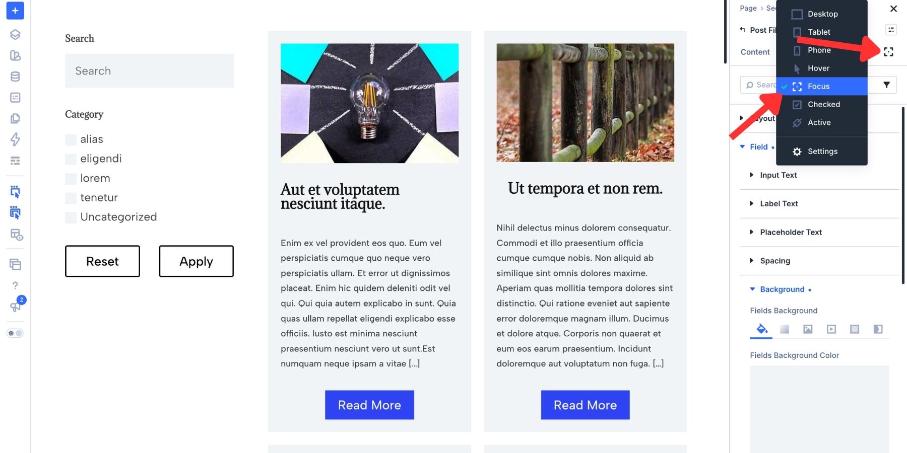
In the relevant field’s Design settings, assign a tint variable to its background. Use a contrasting border color to make focus easy to see. Keep the text readable in both the default and focused states.
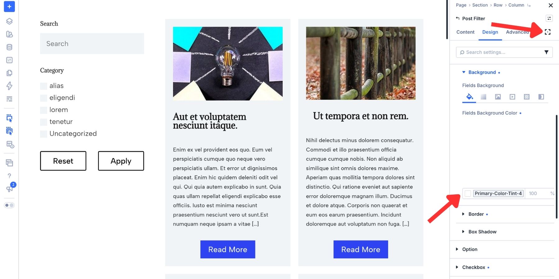
For Checkbox and Radio controls, switch to Checked and style the selected state. Choose a fill that keeps the checkmark or selection indicator visible.
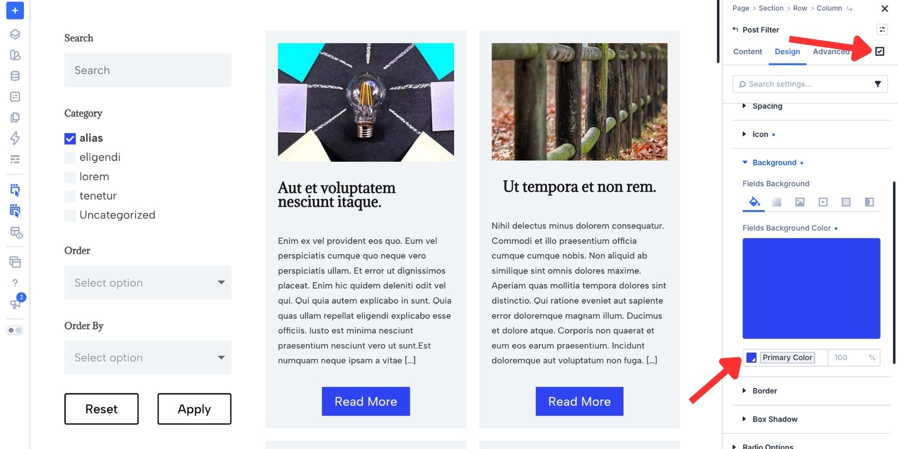
Use Hover to style the buttons when a pointer moves over them. Keep a visible focus treatment for keyboard users as well. Our guide to accessible form focus states explains the same principles using a contact form.
Save The Styling As Reusable Presets
Option Group Presets save settings from a particular option group, such as text, spacing, or borders. Reuse them on elements that support the same group.
In this example, a button in the loop already has the style we want. Hover over its relevant option group and click the presets icon to save those settings as an Option Group Preset.
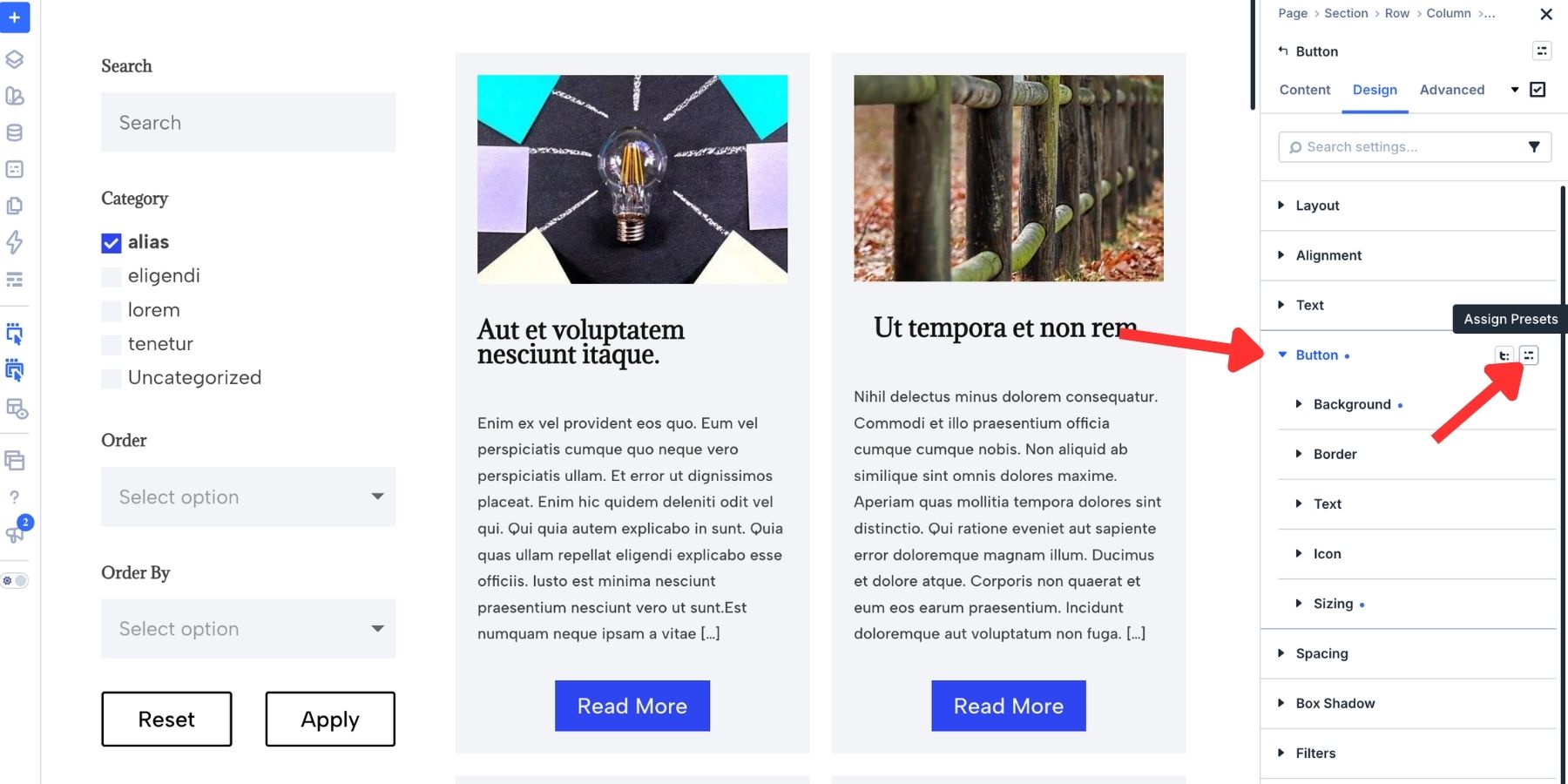
Apply that compatible preset to the filter’s Apply button. Style Reset separately with a more understated treatment so the primary action stands out.
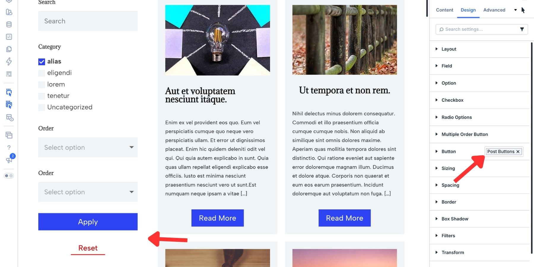
Use an Element Preset to save a broader collection of settings for the same element type. It can include variable references and assigned Option Group Presets.
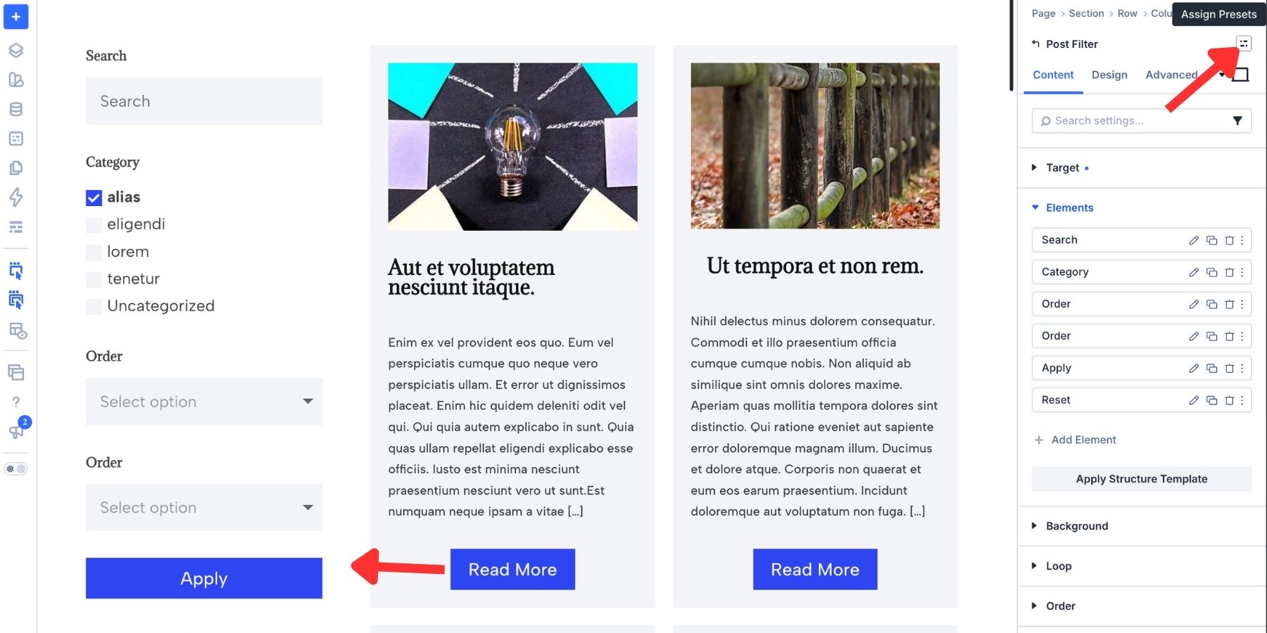
Apply the Element Preset when you create another filter element of the same type. Review its content and target settings for the new loop.
Editing a shared preset updates the elements using it, subject to any local overrides. Option Group Presets can be shared across compatible groups; Element Presets are tied to their element type.
Style The Filter Container
Style the parent Post Filter Module to give the whole form a background, padding, and border.
Set the panel color under Content > Background. Select a color variable to keep it connected to your palette. Then use Design > Spacing to add padding around the fields.
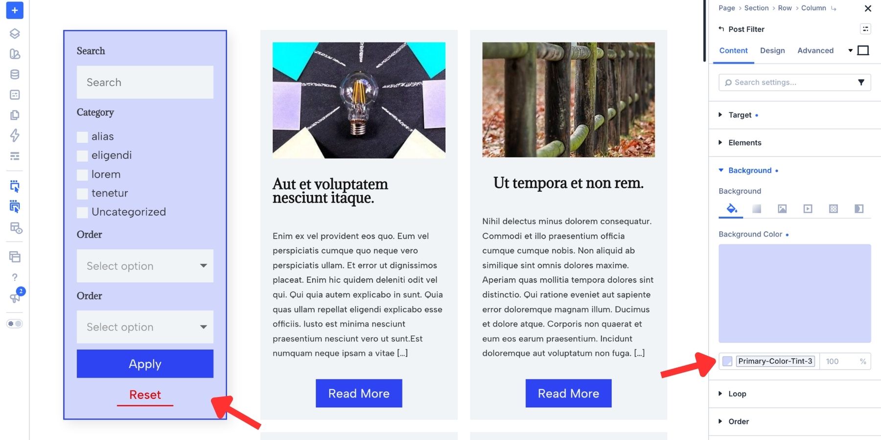
Use the Border settings to add a border color and rounded corners. Add a subtle Box Shadow if you want to separate the form from the page background.
The module also provides Flexbox layout controls. Use Layout Direction to arrange the fields vertically or horizontally, depending on the space available.
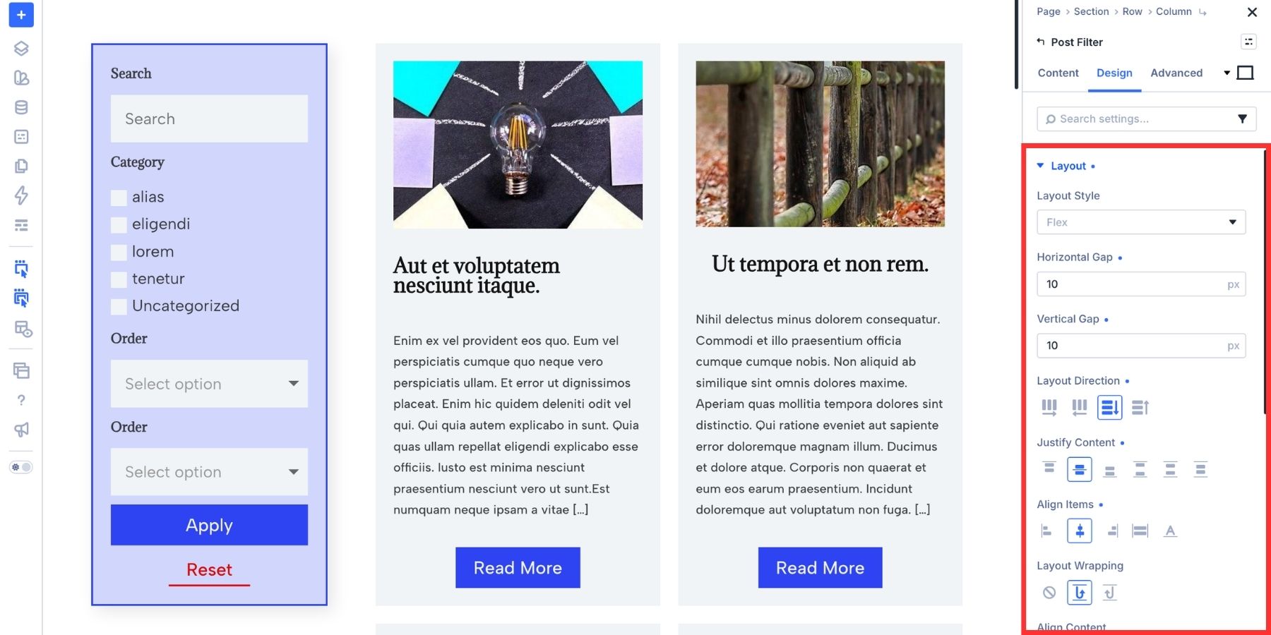
Use the gap settings to control spacing between items. Justify Content distributes items along the main axis; Space Between spreads available space between all items, rather than moving only the buttons to the bottom. It needs spare space in the container to have that effect. Align Items controls the cross-axis alignment. Our guide to Divi 5’s Flexbox settings explains each control.
Make The Filters Easier To Use On Mobile
A tall filter sidebar can push the results far down the page on a phone. Put the mobile form inside a collapsible Toggle so visitors can open the filters when needed.
Divi 5’s Toggle Module supports nested elements, including the Post Filter Module. Give it a clear title such as “Filter Your Posts” and set its initial State to closed.
Keep the existing sidebar filter for desktop. Add a Toggle for phones and tablets, then duplicate the Post Filter Module into the Toggle’s content area. Keep the duplicate connected to the same Target Loop.
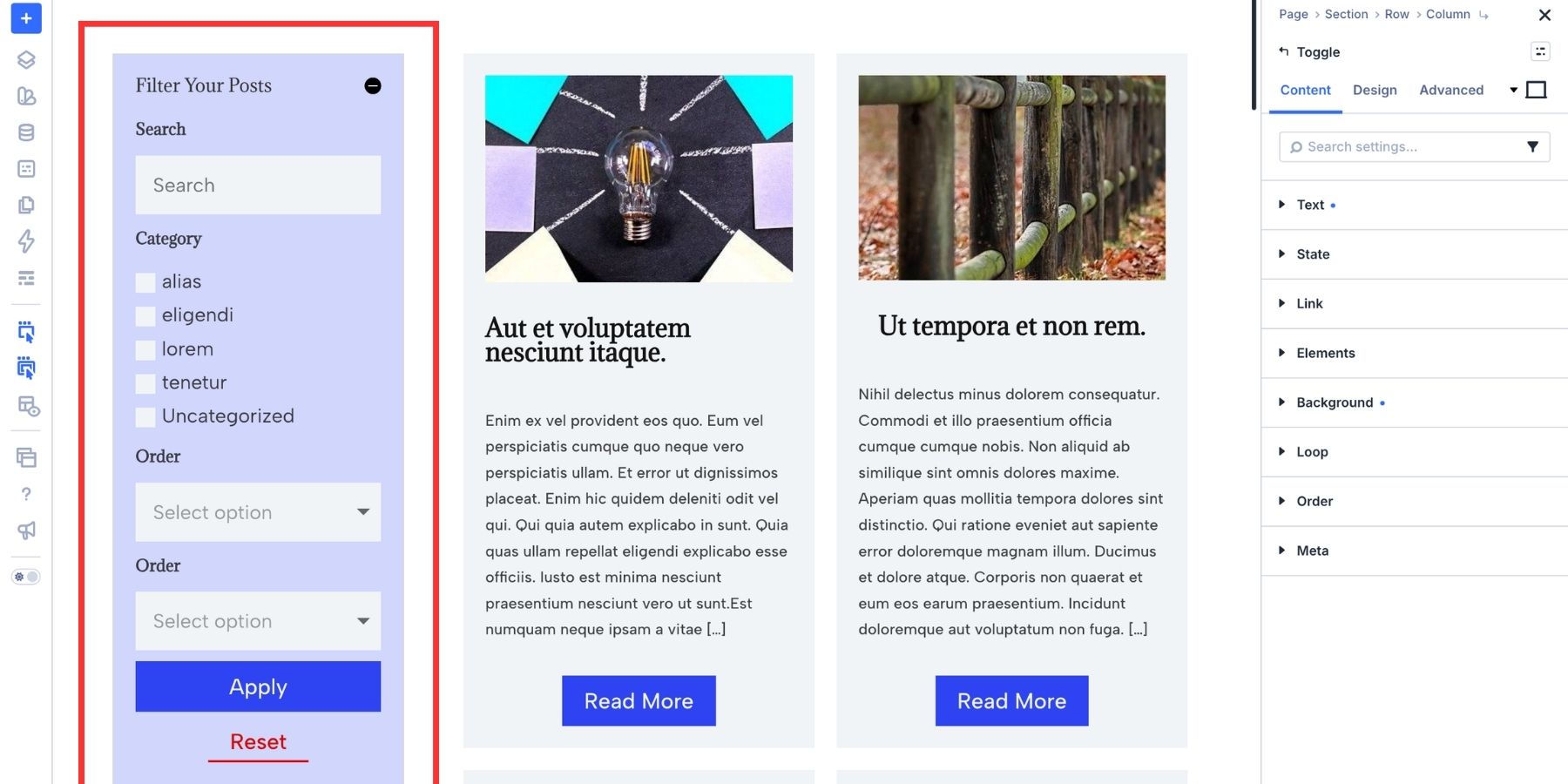
In the Toggle’s Advanced > Visibility settings, disable it on Desktop.
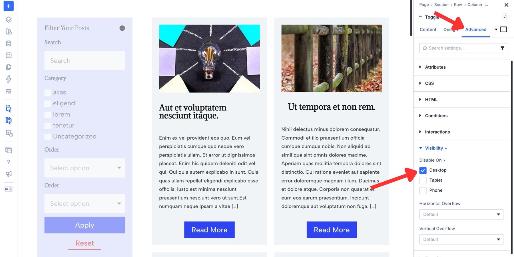
On the original sidebar Post Filter Module, open Advanced > Visibility and disable it on Phone and Tablet.
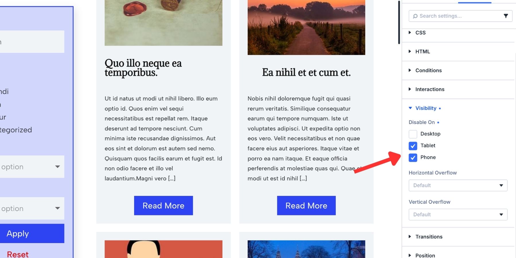
At phone and tablet breakpoints, check the parent row’s layout and column widths so the Toggle and results use the available width. Hide an otherwise empty desktop-only sidebar column if it still occupies space.
Save the page and check the form on the front end. Try a search term and category, apply a date or title sort, and use Reset to return to the starting view. On a phone or tablet, open the Toggle and repeat those actions to confirm that the visible form controls the intended loop.
Give Visitors More Ways To Browse Your Loop
Use search for keywords, category filters to narrow the results, and sorting to change their order. With the form connected to your custom loop, you can reuse the approach for other post types and adapt the controls to the content visitors need to find.
Download Divi 5 to build your own searchable, filterable loop.