Blog
Exploring Divi 5’s New Charts Module

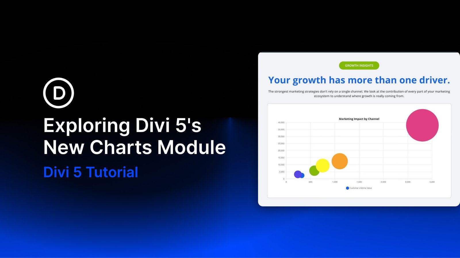
Divi 5 continues to expand its native module library. One of its newest additions is the Charts Module, released alongside the Gravity Forms, Imagely, and Payment Button modules. It turns raw data into interactive charts without relying on a third-party chart plugin, shortcode, or static screenshot.
You can choose from nine chart types and manage their data through a new tabular editor inside the Visual Builder. You can enter values directly or populate the chart by uploading a CSV file, then style the result with Divi 5’s design controls.
In this post, we’ll explore the available chart types, data tools, and design options before walking through how to create and customize a chart in Divi 5.
Let’s dive in.
What Is The Charts Module In Divi 5?
The Charts Module lets you display data as interactive, customizable charts directly inside the Visual Builder. Instead of embedding scripts or preparing static graphics elsewhere, you can build and refine a chart in the same environment as the rest of your page.
A clear chart can make trends, proportions, comparisons, and relationships easier to understand at a glance. Because the module uses Divi’s design system, its typography, colors, Spacing, and responsive behavior can remain consistent with the rest of your site.
Key Advantages Include:
- Native Visual Builder integration with a live preview.
- Nine interactive chart types with tooltip support.
- Flexible data entry through the tabular editor or CSV import.
- Design controls for chart text, legends, tooltips, and the module container.
- Useful applications for reports, statistics, comparisons, dashboards, and product analytics.
The Nine Chart Types
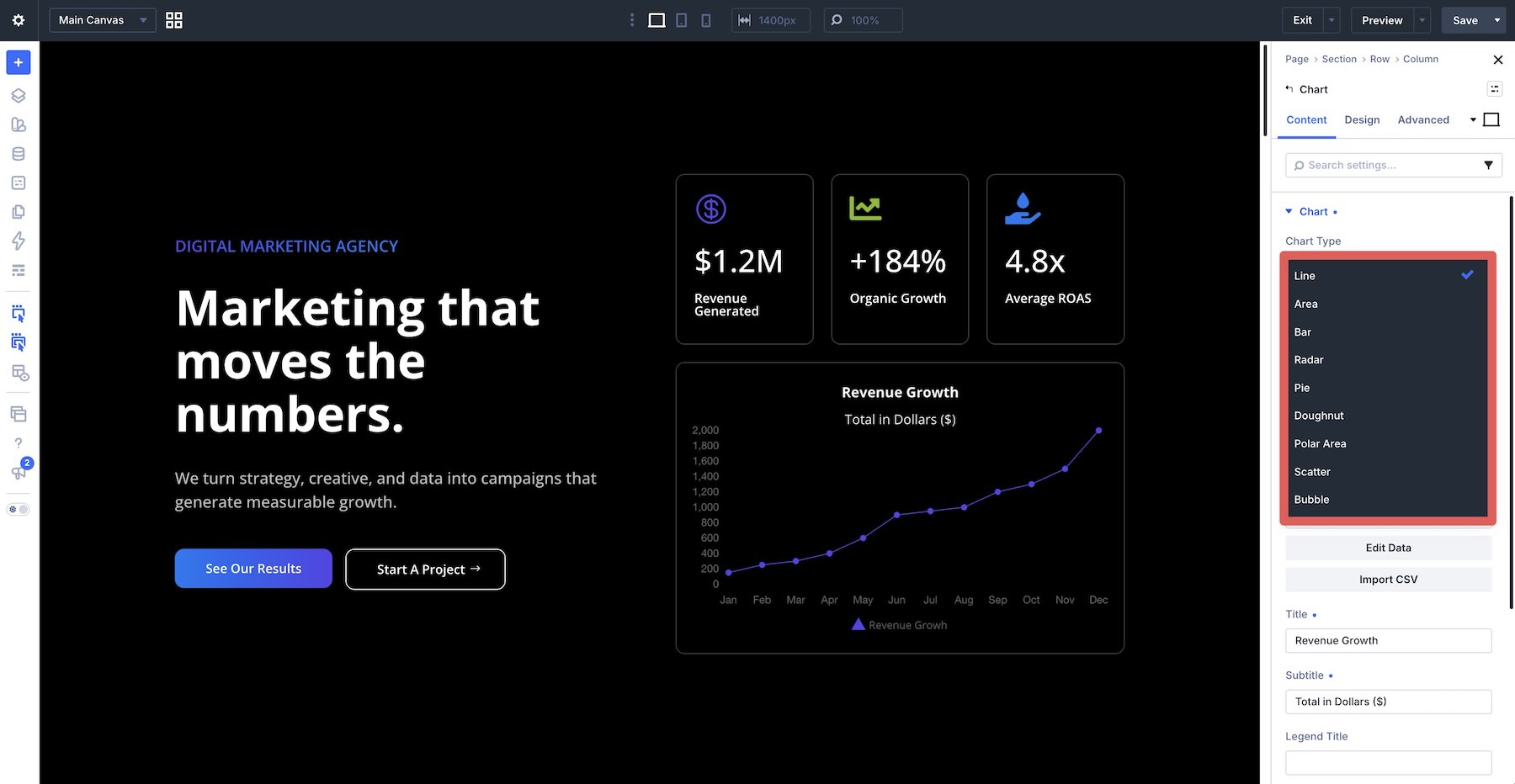
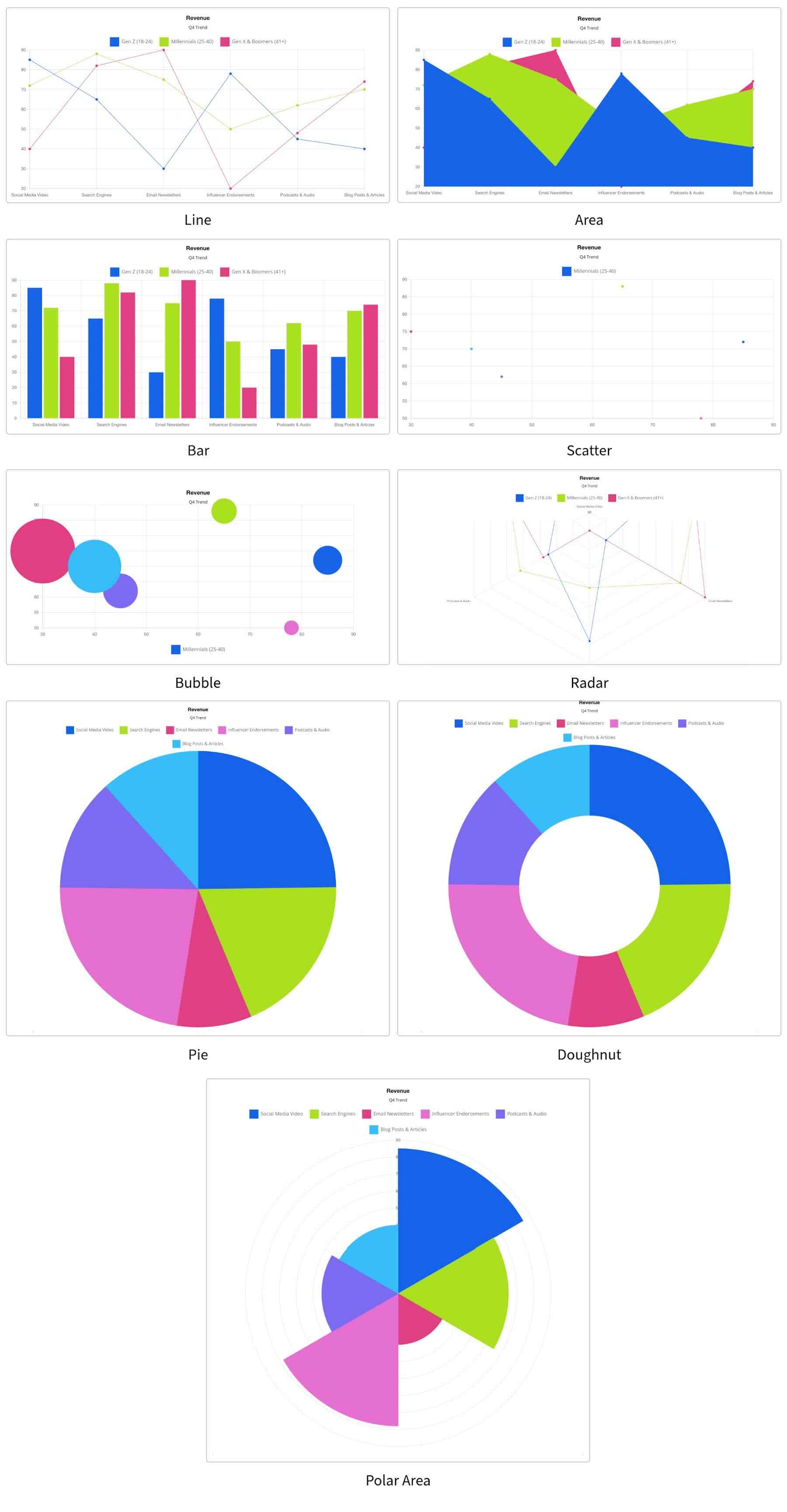
The module supports line, area, bar, radar, pie, doughnut, polar area, scatter, and bubble charts. Each format presents data differently, so the right choice depends on the relationship you want visitors to understand.
Line
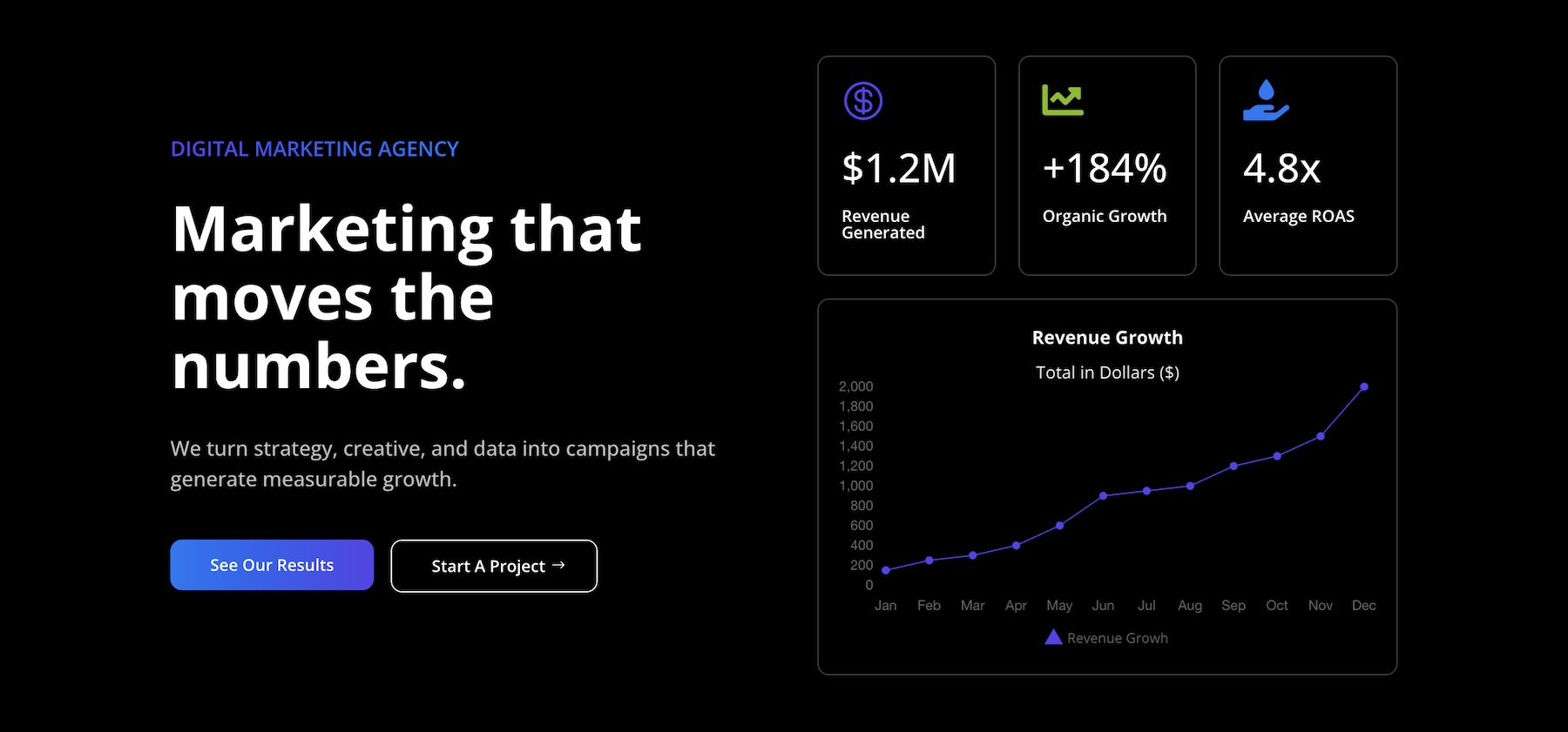
Line charts connect data points to show changes across a sequence. They work well for sales growth, temperature readings, and other time-based data where direction and rate of change matter.
Area
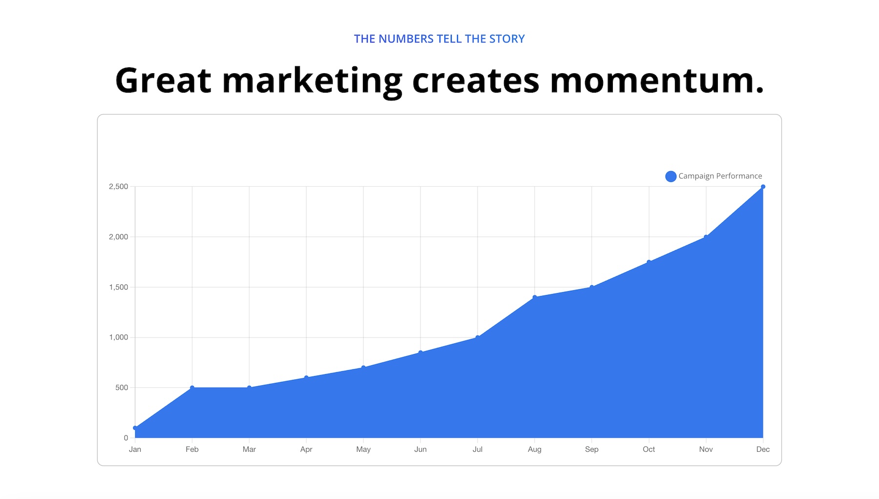
Area charts fill the space beneath a line, giving the magnitude of change more visual weight. Use them when both the trend and the volume represented by the values are important.
Bar
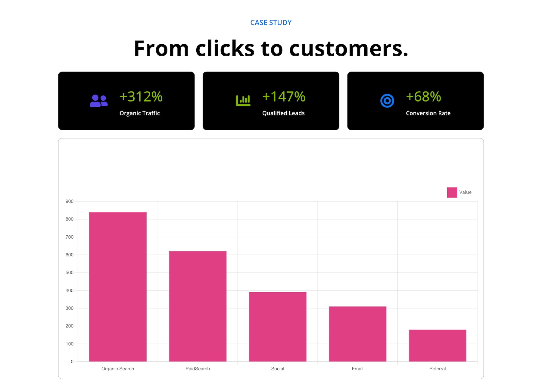
Bar charts compare values across categories. Their side-by-side structure suits data such as revenue by product, survey responses, or performance metrics.
Radar
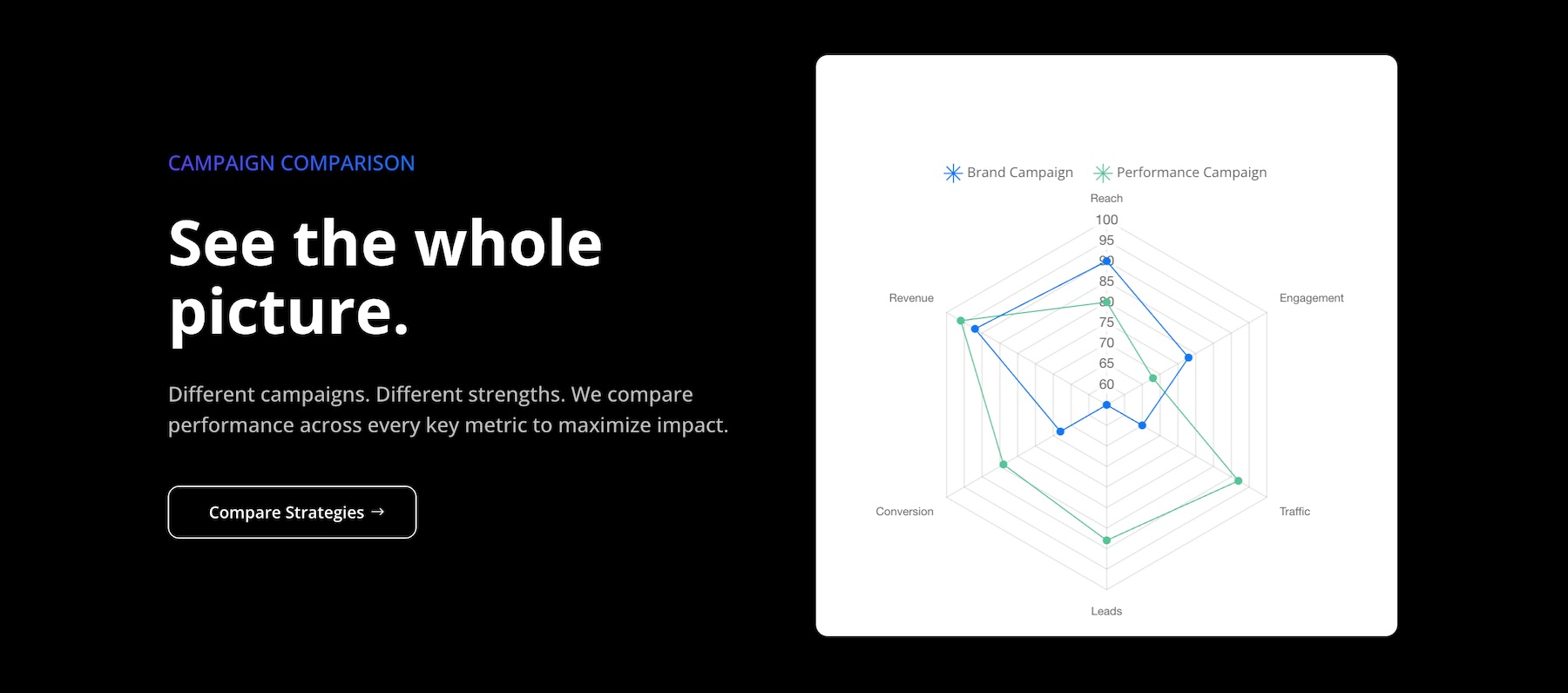
Radar charts plot several variables on axes that radiate from a central point. They are useful for comparing skills, product features, or performance across multiple criteria.
Pie
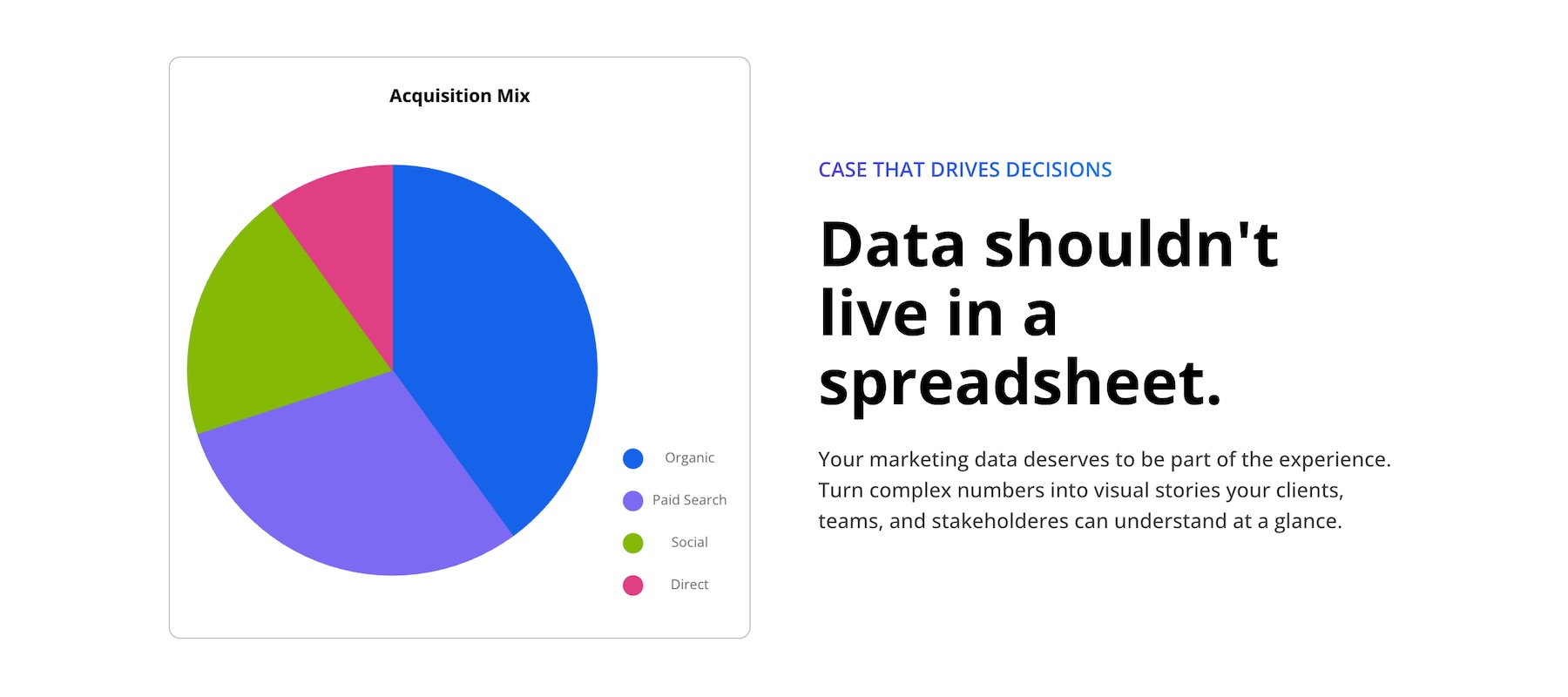
Pie charts divide a whole into proportional slices. They work best with a limited number of categories whose relative shares need to be understood quickly.
Doughnut
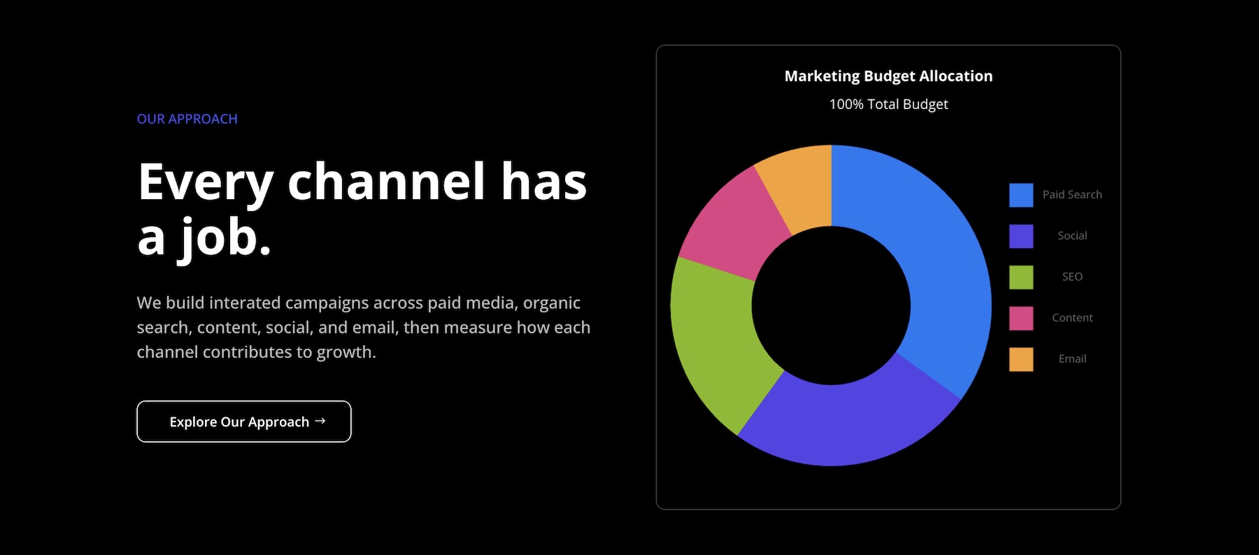
Doughnut charts present proportions in a ring. They communicate the same type of part-to-whole relationship as pie charts while providing a lighter visual treatment.
Polar Area
Polar area charts arrange categories around a circle, with each segment’s radius representing its value. They combine a radial layout with a clearer emphasis on differences in magnitude.

Scatter
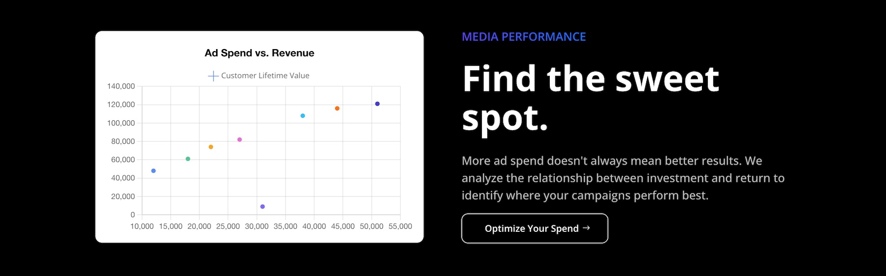
Scatter charts plot points across two axes to reveal relationships, clusters, correlations, and outliers. They suit datasets such as price versus popularity or height versus weight.
Bubble
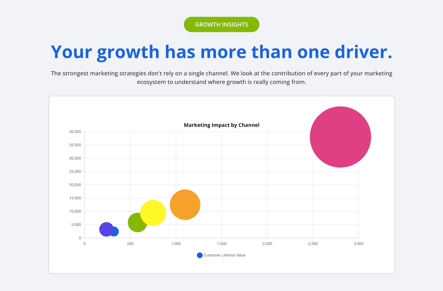
Bubble charts extend scatter plots with a third value represented by bubble size. For example, one chart could compare sales volume and profit margin while using bubble size to show market share.
You can change the chart type in the module settings and compare different presentations of your data in the live preview. Some formats require different data structures, so review the result and its labels whenever you switch types.
Managing Chart Data With The New Tabular Data Editor
One of the most useful parts of the Charts Module is its tabular data editor. Instead of spreading values across separate settings or leaving the builder to prepare every update, you can view and edit the chart’s data in a table inside the Visual Builder.
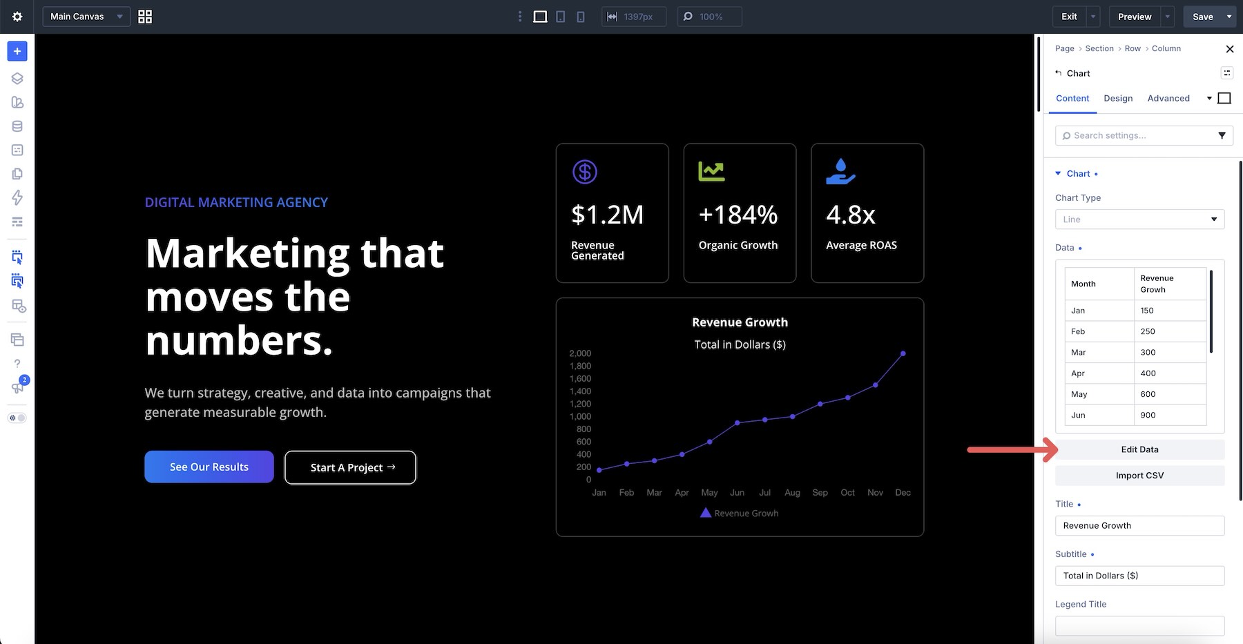
The editor shows labels and values in a structured format, making it easier to see how the data maps to the selected chart. This is especially useful for charts with multiple series because related values remain visible side by side.
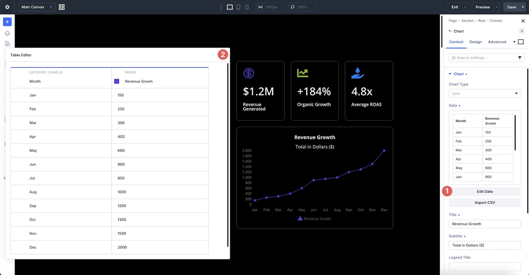
There are two ways to populate the Charts Module. The first is to enter and edit data directly in the table. Add rows, adjust labels and values, and watch the chart update in the Builder.
The other option is to upload a CSV file. This is the faster route when the data already exists in a spreadsheet or export.
You can reopen the table whenever the data changes, update cells, add or remove entries, or import a revised dataset. The chart updates from the data stored in the module, so routine edits do not require rebuilding the design.
This approach keeps the workflow self-contained: prepare the values, preview the visual, and refine both without leaving the Visual Builder.
Design Settings And Customization Options
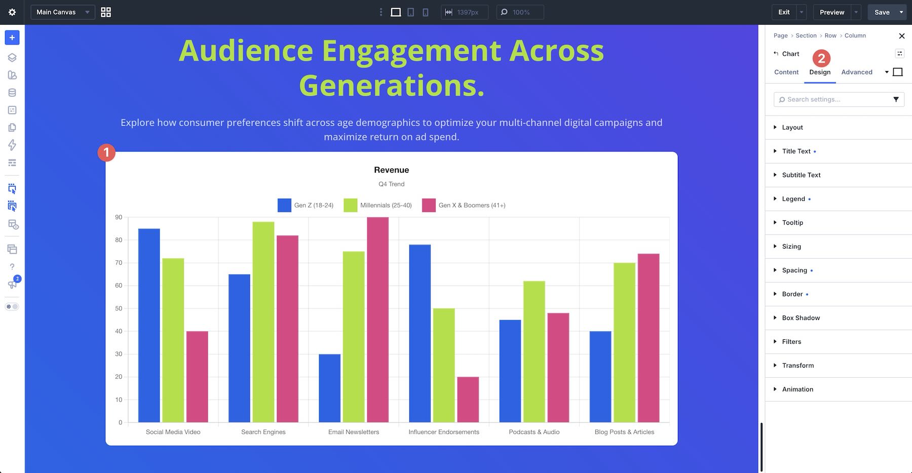
The Charts Module includes familiar Divi option groups for styling its content and container. Common groups include Layout, Title Text, Subtitle Text, Legend, Tooltip, Sizing, Spacing, Border, Box Shadow, Filters, Transform, and Animation.
Title And Subtitle Text
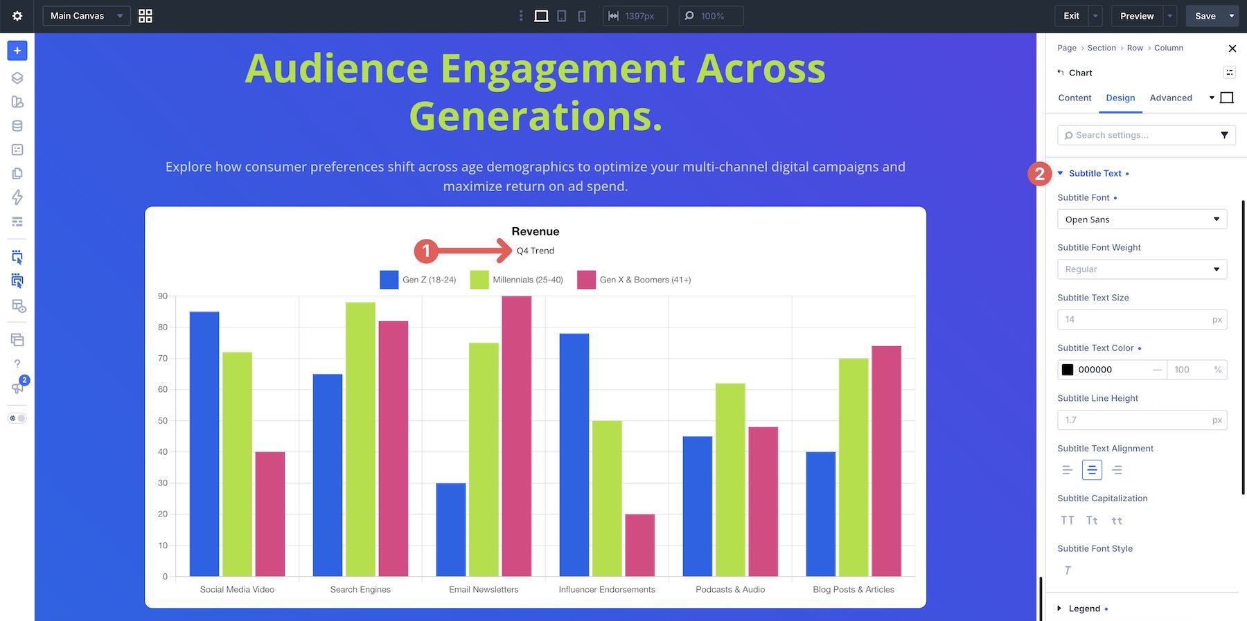
Use the Title Text and Subtitle Text option groups to style the labels that provide context for the chart.
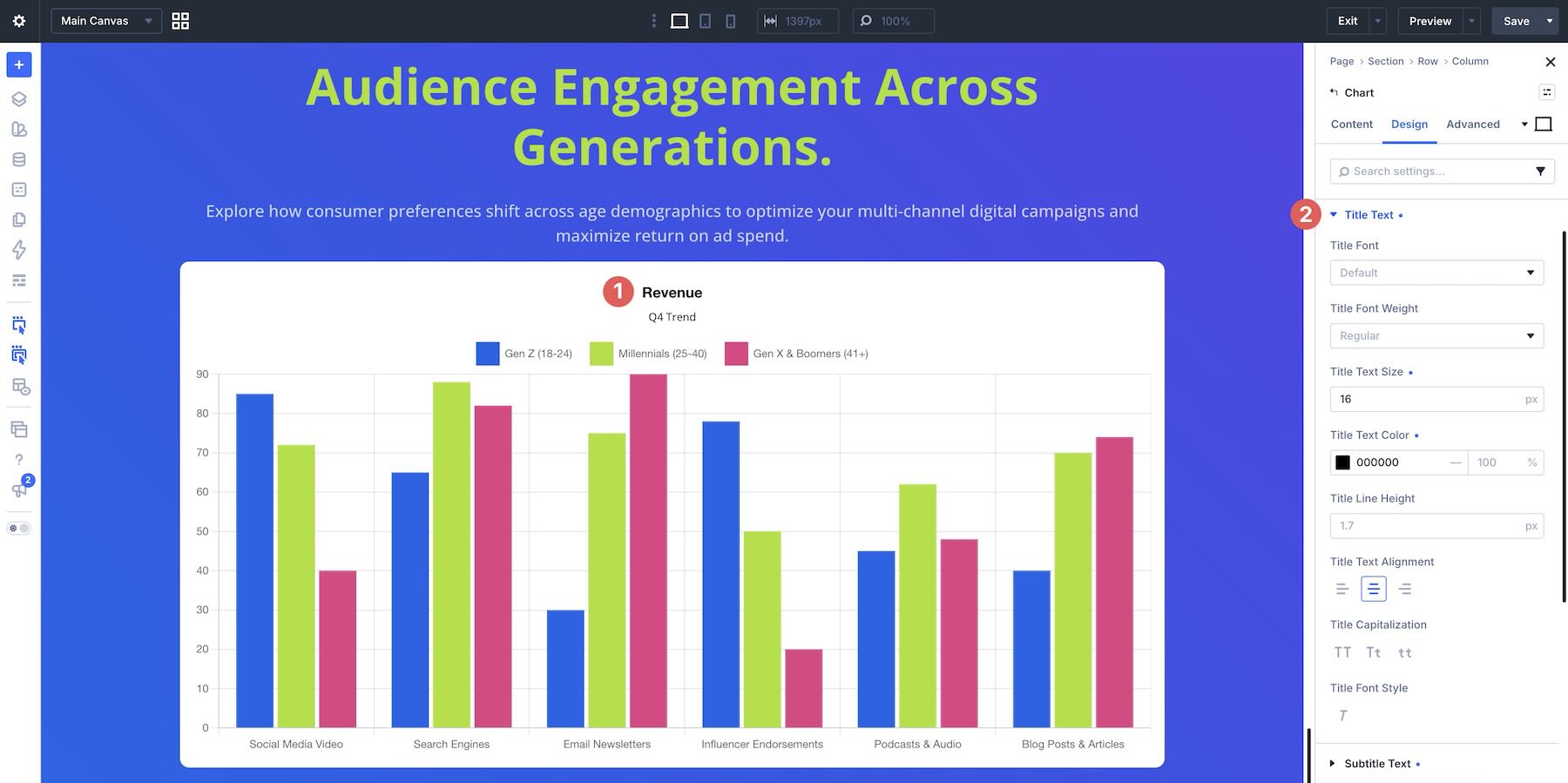
Both groups include controls for font, font weight, text size, color, line height, alignment, and more. They also support Variable Fonts, giving you additional control over the chart’s typography.
Legend
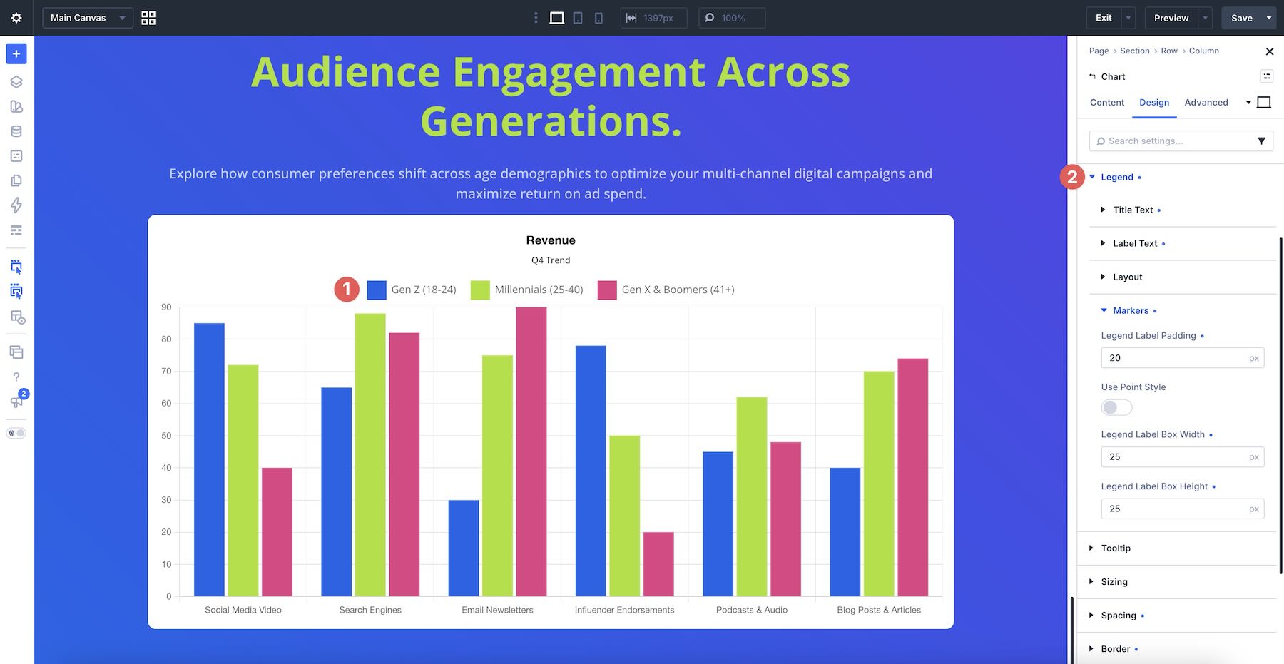
The Legend option group controls the key used to identify each data series. You can style its title and labels, adjust its position and alignment, and customize marker properties such as point style, padding, width, and height.
Tooltip
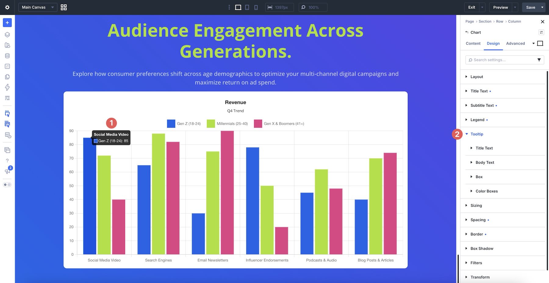
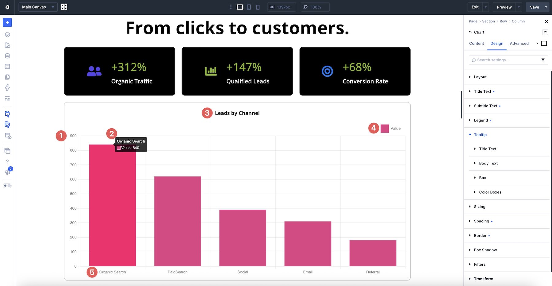
When a visitor hovers over a data point, a tooltip displays additional details. The Tooltip group includes controls for its title and body text, container, and color boxes, allowing the popup to match the rest of the chart.
Module-Level Design
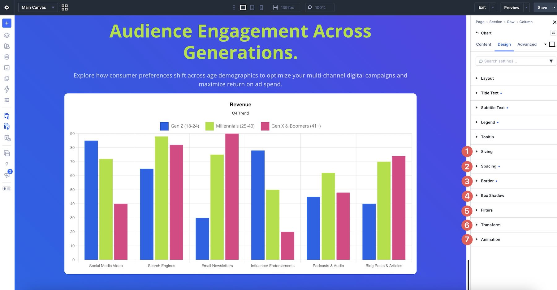
The remaining groups work like those in other Divi 5 modules. Sizing and Spacing control the module’s footprint, while Border and Box Shadow frame its container. Filters, Transform, and Animation can add further visual polish.
Because these are standard Divi option groups, you can use Design Variables and Presets to keep multiple charts consistent with the rest of the site.
How To Use The Charts Module
To create a chart, add a Charts Module to a Section in the Visual Builder. Its settings open with the familiar Content, Design, and Advanced tabs.
In the Content tab, choose one of the nine chart types. You can return to this setting later to compare other formats.
Next, click Import CSV if you already have a dataset, or click Edit Data to enter values directly. You can return to the table at any time to edit cells, add entries, or import updated data.
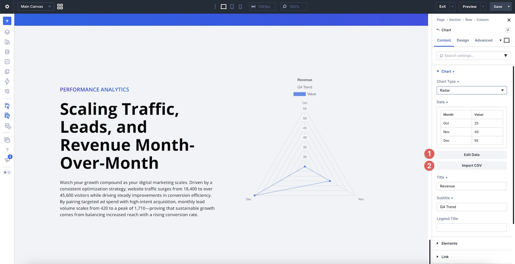
Once the data is in place, compare compatible chart types and choose the format that communicates it most clearly.
Add a Title and Subtitle when the chart needs more context. These fields appear with the chart and can be styled in the Design tab.
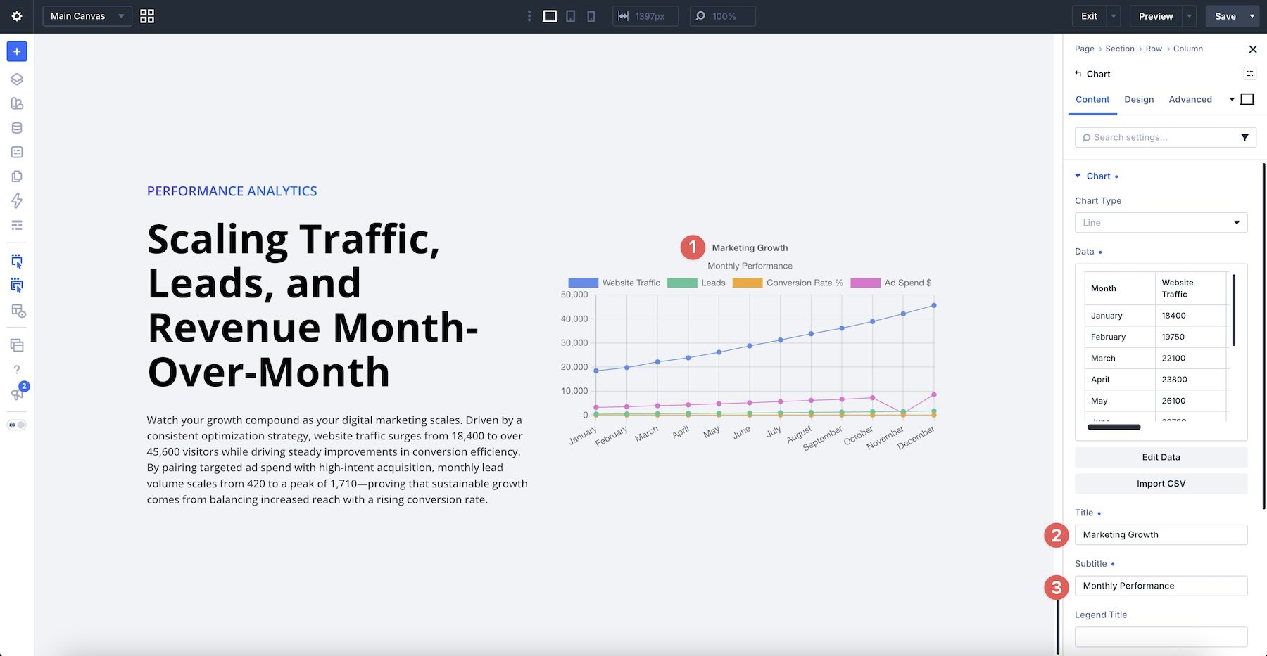
Open Edit Data again to verify the imported values, check the legend labels, and assign colors to the data series.
Switch to the Design tab to refine the title, subtitle, legend, and tooltip. Then use Sizing, Spacing, Border, and Box Shadow to fit the module into the surrounding layout. Add Animation only when it supports the presentation.
Use Divi’s Live Preview to test the chart’s interactivity and confirm that its labels and data remain legible.
Finally, review the chart at each of Divi’s Customizable Responsive Breakpoints to make sure it works at every screen size.
Tips And Best Practices
A useful chart depends on both the data and its presentation. The following practices will help keep each visual clear and consistent.
Start With Clean, Well-Structured Data
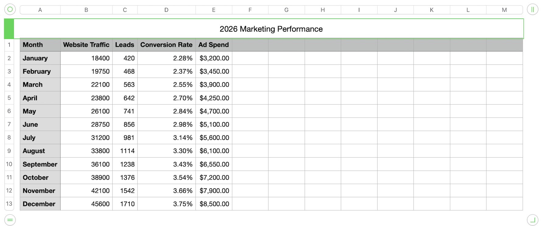
Before uploading a CSV or using the table editor, keep column names consistent and remove empty cells or unnecessary formatting. Clean source data helps labels map correctly and makes the chart easier to update.
Note: Keep value cells numeric. Remove currency symbols, percentage signs, and thousands separators before importing, while retaining decimal points where needed.
Choose The Right Chart Type
Match the format to the point you want visitors to understand. Use line or area charts for changes over time, bar charts for category comparisons, pie or doughnut charts for simple proportions, and scatter or bubble charts for relationships between values. If the story is unclear, compare another compatible format before committing to the design.
Keep Designs Consistent With Variables And Presets
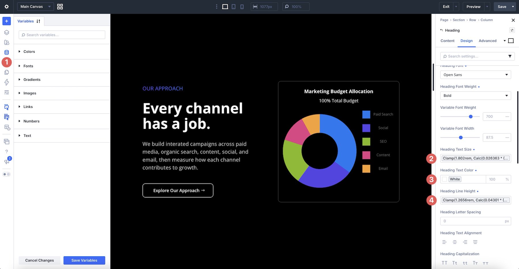
Style titles, subtitles, legends, and tooltips with the same Design Variables used elsewhere on the site. Then save Option Group or Element Presets so future charts can reuse the same typography, colors, and Spacing.
Use Clear Labels, Legends, And Tooltips
Give the chart a title and subtitle that explain its subject in plain language. Keep legend labels short and specific, and make the tooltip easy to read on hover. Visitors should be able to understand the chart without a paragraph of supporting copy.
Avoid Overcrowding The Visual
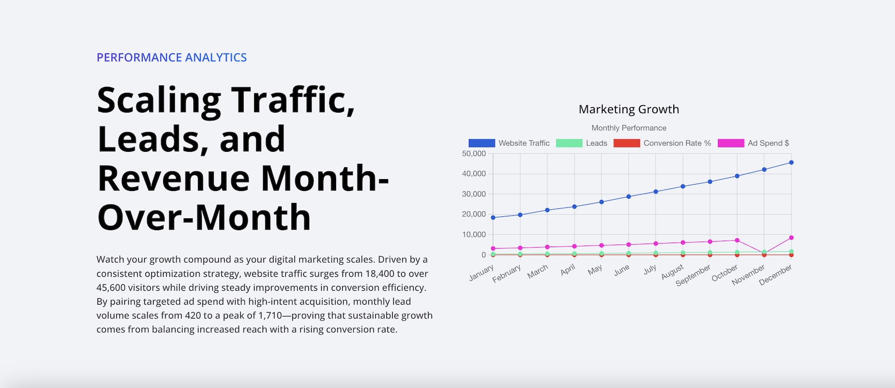
Too many series, categories, or labels can make a dataset difficult to scan. If a chart becomes crowded, split the information into two focused visuals instead of forcing everything into one.
Use The Table Editor For Fast Updates
When values change, reopen the tabular editor and update them in place. You do not need to rebuild or restyle the module for routine edits, making the Charts Module practical for reports, quarterly statistics, and other frequently updated pages.
Download The Files
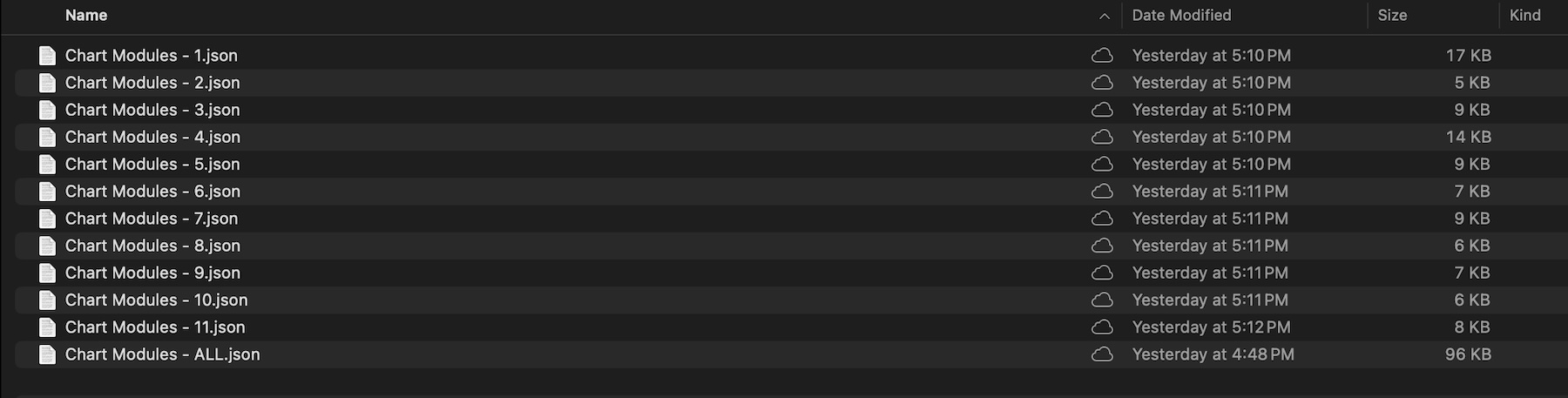
We’ve created a zip file containing every example used in this post. It includes 12 JSON files: one Chart module – All.JSON file containing all 11 examples and 11 individual JSON files.
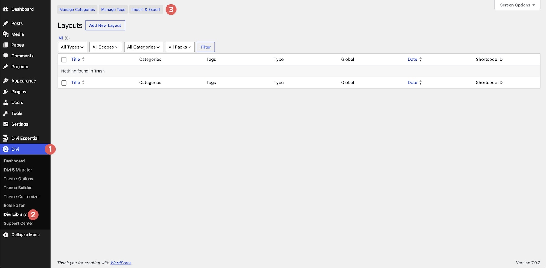
To use them, go to Divi > Divi Library and click Import & Export.
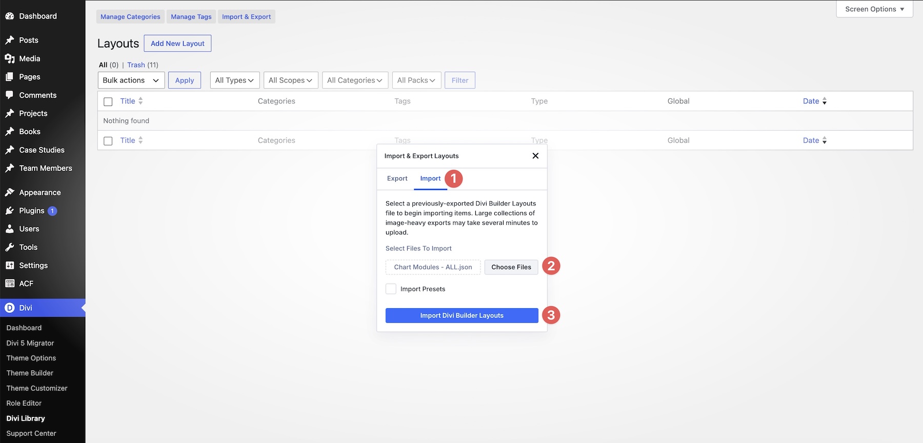
Select the Import tab, choose a JSON file from your computer, and click Import Divi Builder Layouts.
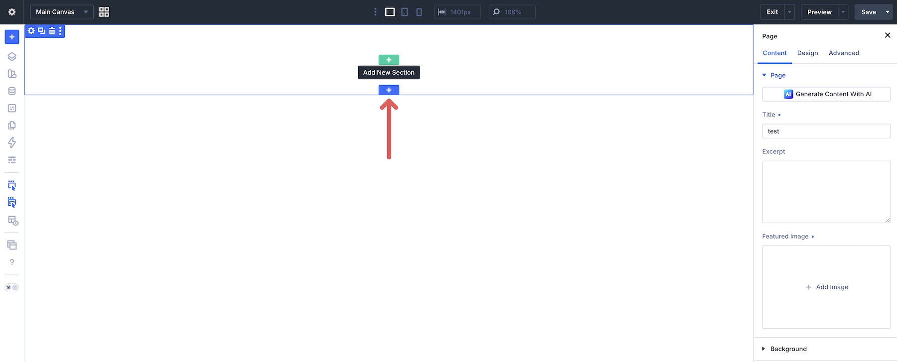
Create a page or open an existing one in the Visual Builder, then click the blue + icon to add a Section.
Open the Add From Library tab, choose a layout, and click Use This Section.
After adding the Section, replace its chart data by importing a CSV file or editing the table directly.
Try The Charts Module In Divi 5 Today
The Charts Module makes data visualization a native part of Divi 5. You can choose from nine chart types, enter values in the tabular editor or import them from a CSV file, and style the result using the same design system as the rest of your site.
If you are already using Divi 5, update to the latest version and add a Charts Module to a page. Compare chart types, refine the data, and adjust the design until the information is easy to understand.
Let us know what you think in the comments below or on our social media channels. We look forward to hearing your feedback!