Blog
16 Gallery Grid Layouts For Divi 5 (Free Download!)


Divi 5 gives you flexible layout tools for arranging imagery into structured, visually engaging compositions. Its CSS Grid Editor also makes it easier to visualize and adjust grid structures directly inside the Visual Builder. In this free pack, you’ll get 16 Gallery Grid Layouts for Divi 5 that are perfect for photography websites, portfolios, creative agencies, product showcases, travel pages, lookbooks, editorial layouts, project galleries, and more.
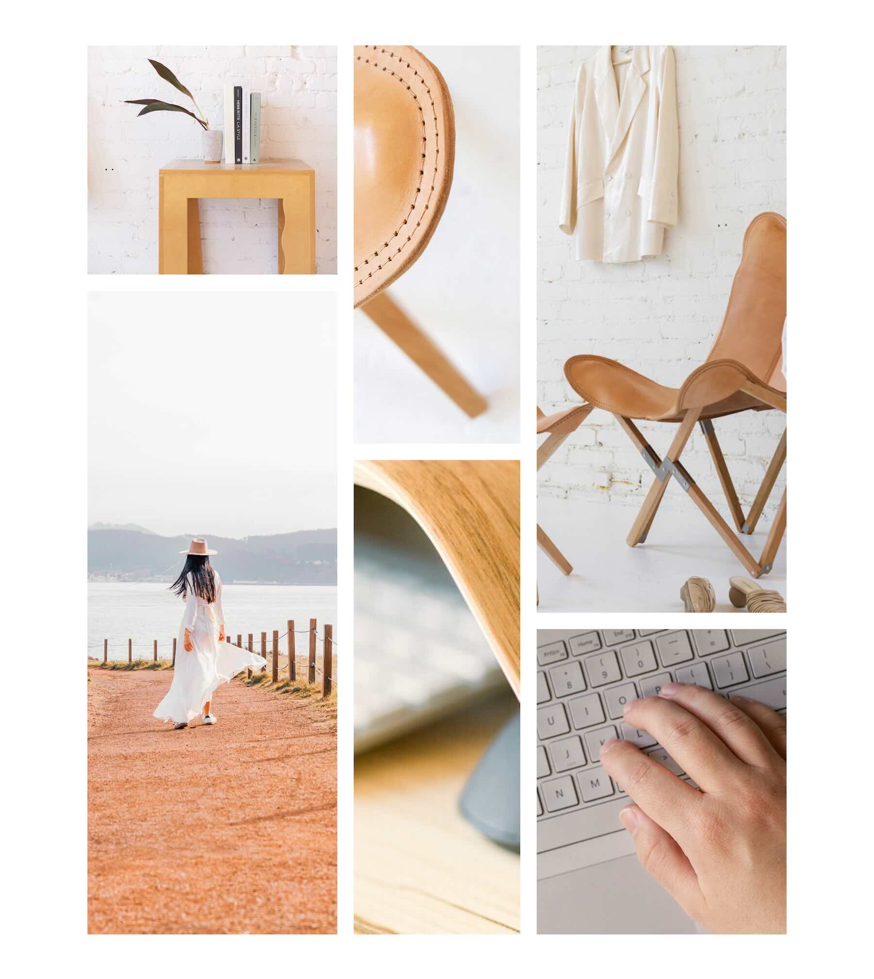
Each design combines images of different sizes and proportions to create a distinct visual rhythm. Import a section, replace the example images with your own, adjust the grid or styling when needed, and add a polished gallery-style composition to your page.
Preview
Here’s a quick look at the 16 Gallery Grid Layouts included in the pack. The download is further down the post.
Download 16 Gallery Grid Layouts For Divi 5
Get all 16 sections for free. Import them into your Divi Library and add them to any page in the Visual Builder.
What’s Included (17 Exports)
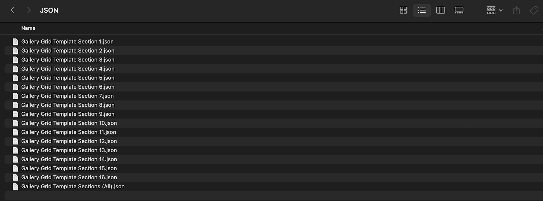
After you download and unzip the file, you’ll find 16 individual Gallery Grid section exports, plus 1 file containing all layouts.
Gallery Grid Template Section 1 to 16 (16) → Sixteen gallery layouts featuring different image arrangements, proportions, spacing patterns, and grid compositions that you can use as-is or customize.
Gallery Grid Template Sections (All) → Imports all 16 designs into your Divi Library at once.
How To Use The Gallery Grid Layouts
Keep your download folder handy. We’ll import the files, add a Gallery Grid section to a page, replace the example images, and customize the composition for your content.
1. Import Sections Into The Divi Library
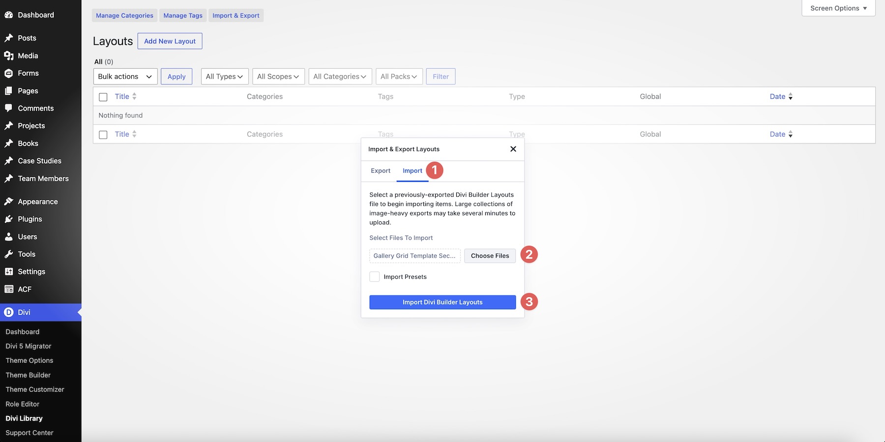
Go to Divi → Divi Library. Click Import & Export at the top of the screen.
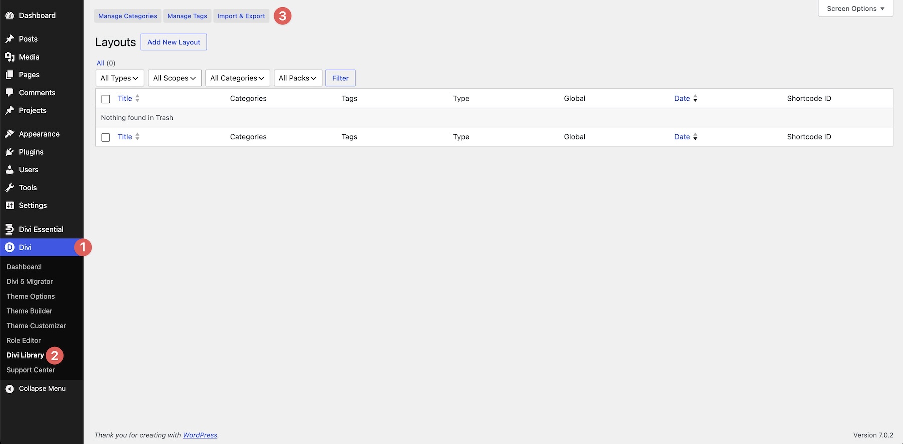
In the Import & Export Layouts modal, switch to the Import tab, then click Choose File. Select any individual Gallery Grid Template Section JSON file if you only want one design. To import every layout at once, choose Gallery Grid Template Sections (All).json instead.
Click Import Divi Builder Layouts and wait for the import to complete.
2. Add A Gallery Grid Section To Any Page
Open a page in the Visual Builder and add a new Section where you want the gallery to appear.
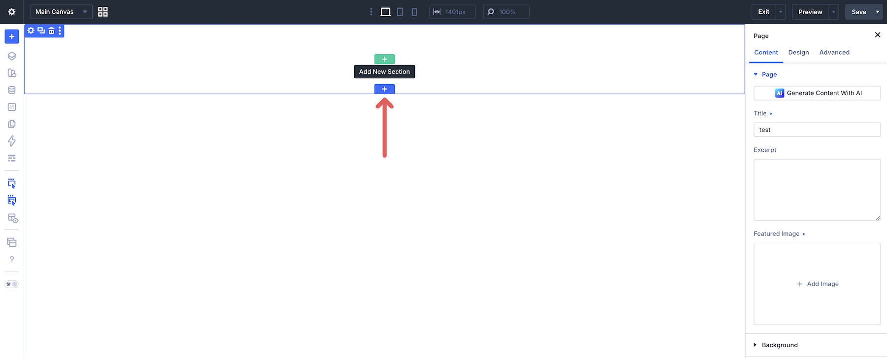
Click Add From Library and select one of the Gallery Grid sections you imported.
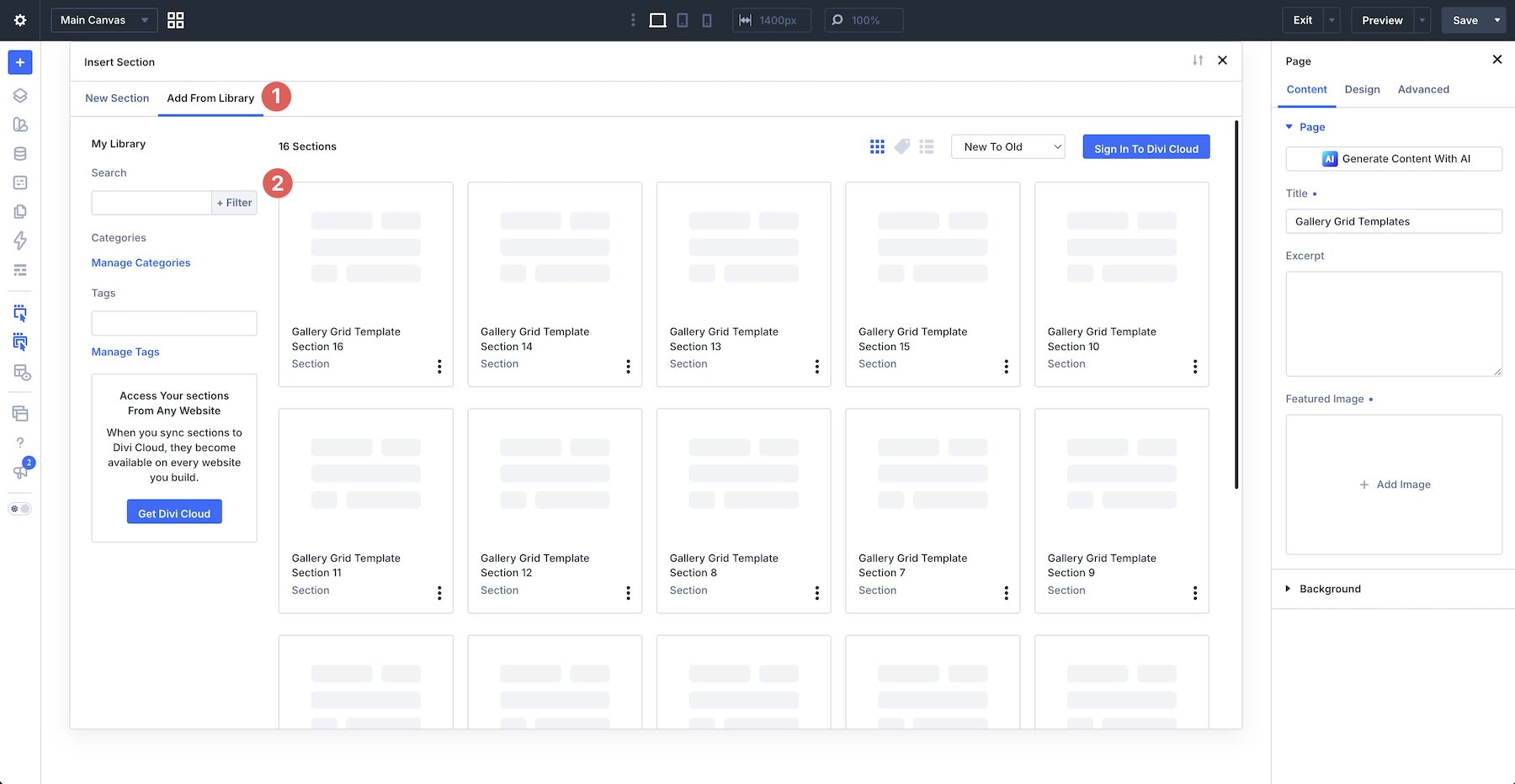
The complete design will be added to the page with its original images, proportions, spacing, and grid composition intact.
3. Replace The Gallery Images
Start by replacing the example imagery with your own photos, product shots, artwork, project visuals, team photography, or other media that suits the page.
Work through the layout one image at a time. Depending on how an image is added to a particular block, open the relevant image or background settings and select your replacement from the Media Library.
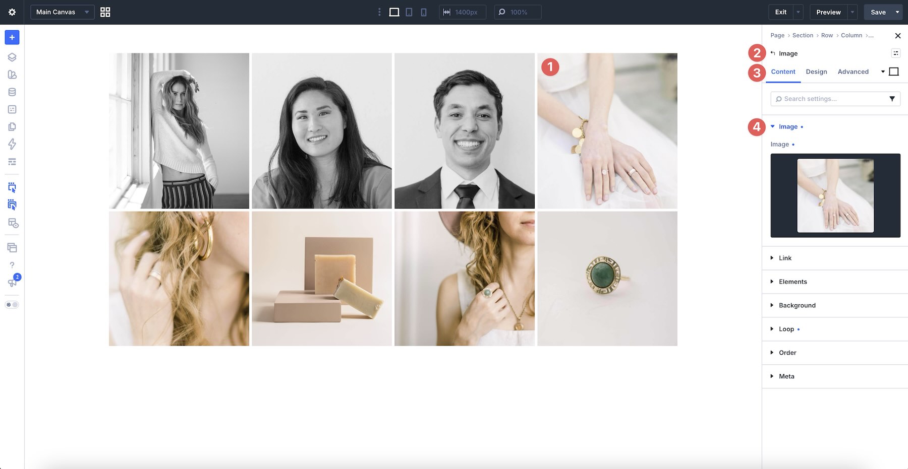
Choose images with enough resolution for the space they occupy. Larger focal areas need stronger source images than compact supporting tiles, especially on wide desktop screens.
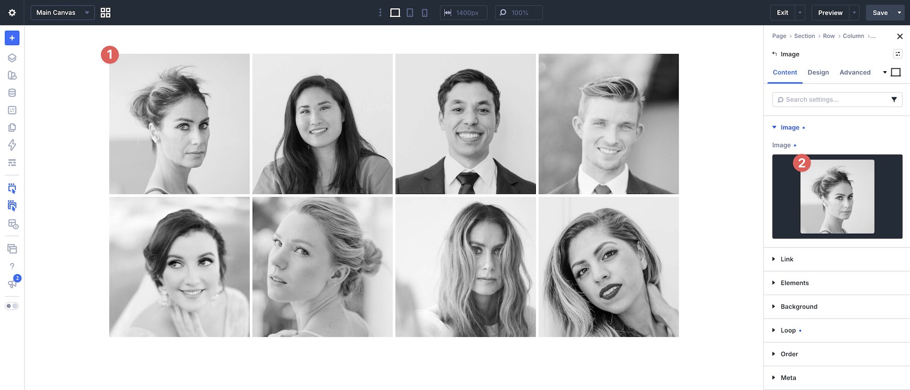
As you replace each image, review how its subject sits within the available frame. A photo that works well in a wide area may not translate to a narrow or square tile without adjusting its crop or focal position.
4. Adjust The Grid Structure
You can keep each layout exactly as provided or adapt its structure to your image collection. Select the container that holds the gallery items and open the Grid Editor to visualize the current composition.
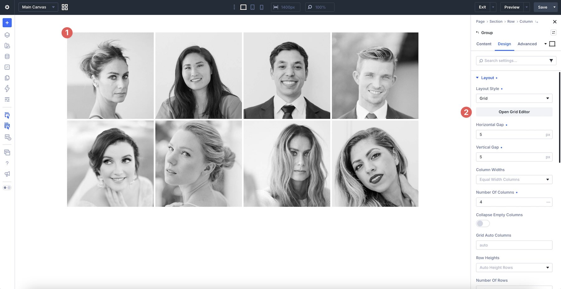
From the Grid Editor, you can resize and reposition items, adjust row and column sizes, and refine horizontal or vertical gaps. Use these controls when you want to give one image more emphasis, change the balance between tiles, or make the layout better suit the proportions of your photography.
If you need another image, duplicate an existing gallery item and replace its content. If you want a simpler composition, remove an unnecessary item and review the remaining layout to make sure it still feels balanced.
Make structural changes gradually. Resizing one item can affect the visual weight of its neighbors, so review the full gallery after each adjustment instead of judging individual tiles in isolation.
5. Refine Image Cropping And Styling
The Gallery Grid Layouts are already styled, but you can customize their image presentation, spacing, backgrounds, borders, and other design settings to match your website.
When an image needs a different proportion, use Divi 5’s Aspect Ratio and Image Framing settings where applicable. Aspect Ratio defines the shape of the rendered image area, while Image Framing helps control how the image fills and is positioned inside that space.
Use consistent border radii, borders, or image treatments when the gallery needs a more unified appearance. For a more editorial composition, you can preserve differences in scale and proportion while repeating a smaller set of styling choices throughout the layout.
If you change the gaps or outer spacing, use values that create a deliberate relationship between the images. Tight spacing creates a denser collage, while larger gaps allow each photo to read more independently.
6. Check The Gallery On Smaller Screens
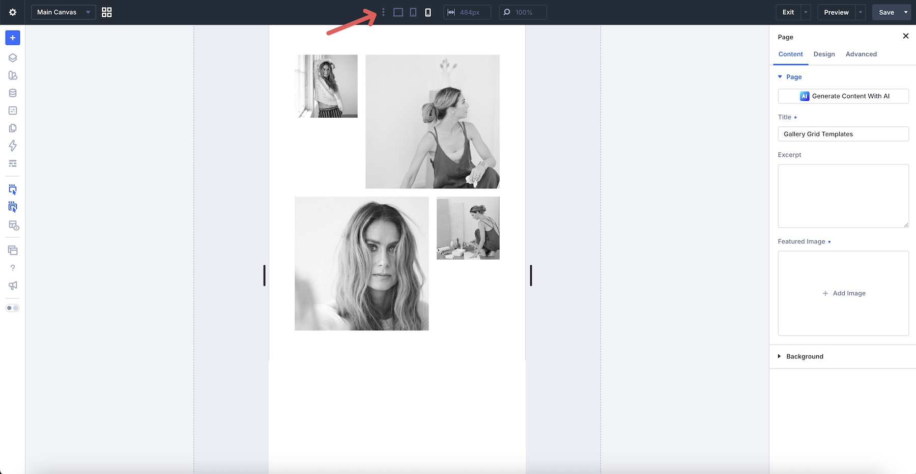
Multi-column image grids can change considerably when they adapt to narrower screens. Use Divi’s responsive editing tools to review the layout on desktop, tablet, and phone before publishing.
Pay particular attention to stacking order, image crops, item heights, gaps, and any intentional empty areas. The desktop composition may rely on images appearing beside one another, so confirm that the mobile order still presents the gallery logically.
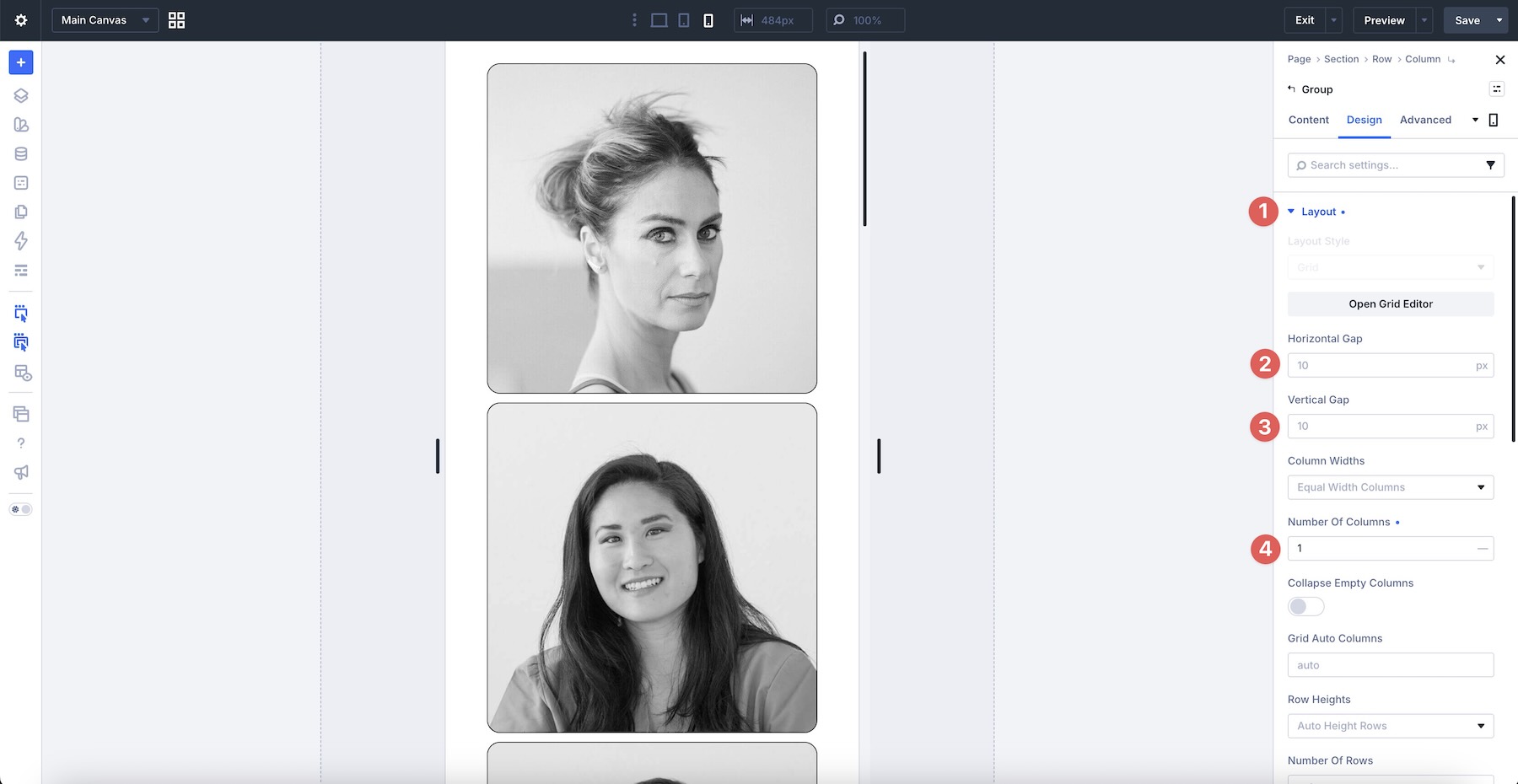
If necessary, adjust grid settings, spacing, sizing, or image framing at smaller breakpoints. Check the live page as well as the builder previews to confirm that the final gallery is balanced and easy to browse on different screen sizes.
Tips For Effective Gallery Grid Layouts
An effective gallery does more than place images next to one another. Use these tips to create a cohesive composition that supports the imagery and guides visitors through it.
Choose A Clear Focal Image
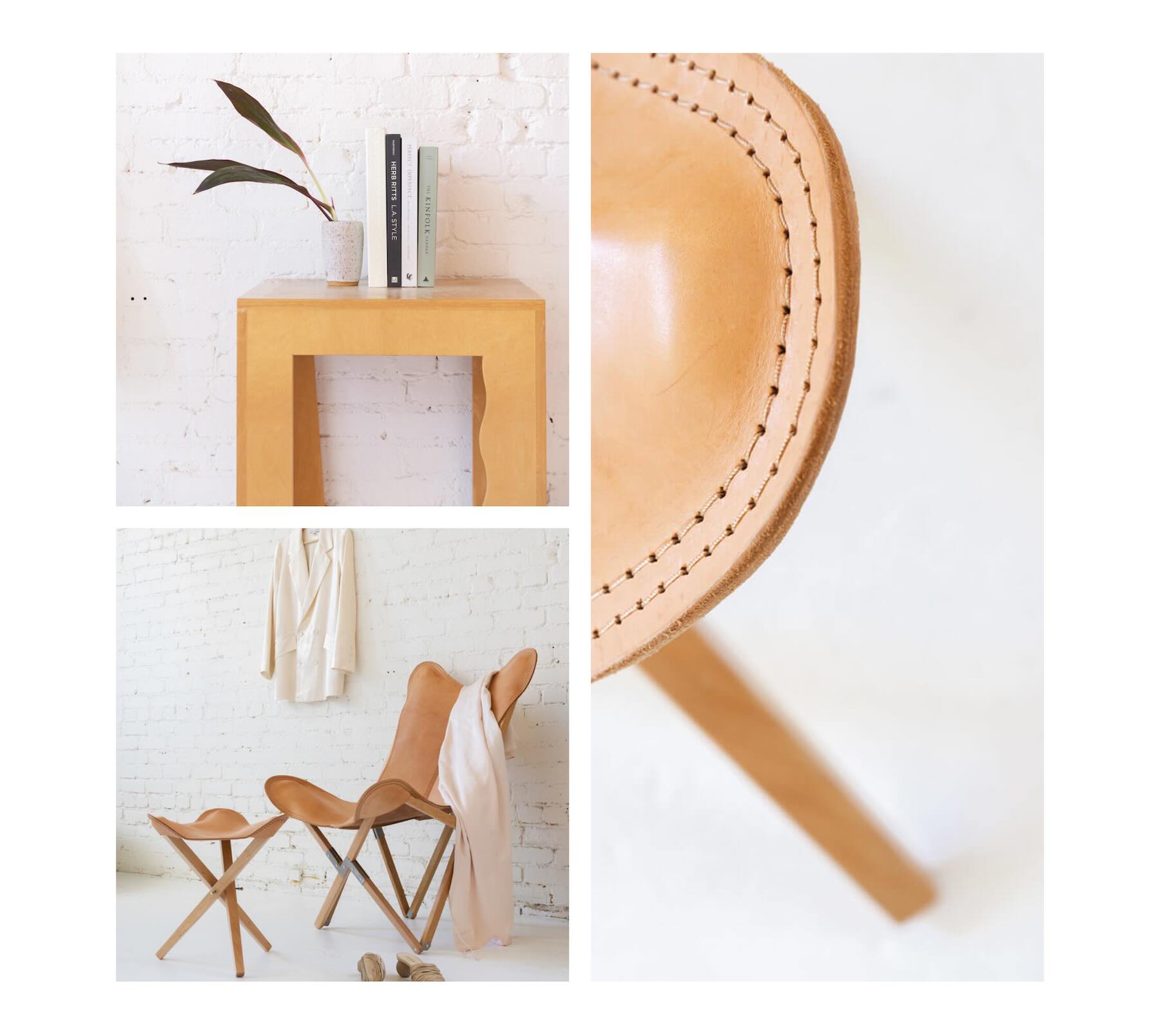
Give one or two images more visual weight through size, placement, contrast, or subject matter. Smaller supporting images can then add context and variety without competing for equal attention.
Build A Cohesive Image Set
Choose images that feel connected through subject, lighting, color, editing style, or narrative. They do not need to look identical, but they should make sense when viewed as one collection.

Mix Image Proportions Intentionally
Combining portrait, landscape, and square areas can create movement across the gallery. Match each photo to a frame that complements its subject instead of forcing every image into the same shape.

Keep Gaps Consistent
Consistent gaps help separate individual images while holding the complete composition together. If you adjust the spacing, repeat the same horizontal and vertical values unless a deliberate variation supports the design.
Protect Important Focal Points
Faces, products, typography, and other important details should remain visible after cropping. Review every image at each breakpoint and reposition it when the frame cuts off essential content.

Use Whitespace Purposefully
Not every area needs to be filled. Intentional whitespace can break up a dense image collection, create pauses between visual groups, and direct more attention toward key photographs.

Optimize Images Before Publishing
Large galleries can add significant page weight. Resize and compress images appropriately before uploading them, use modern image formats when suitable, and add concise alternative text that describes meaningful images for visitors who cannot see them.

Check The Visual Order On Mobile
When a gallery stacks or changes structure on smaller screens, its visual sequence becomes more noticeable. Make sure related images remain grouped and that the strongest photographs still appear in positions that support the intended story.
Start Building In Divi 5 Today!
These 16 Gallery Grid Layouts give you a flexible starting point for photography websites, portfolios, creative agencies, product showcases, travel pages, lookbooks, project galleries, and more. Import your favorite design, replace the images, refine the crops and spacing, and create a polished gallery composition with Divi 5’s Visual Builder.