Blog
6 Expressive Google Variable Fonts For Bold Divi 5 Headlines

Open the font dropdown while editing text in almost any project, and you will probably scroll past many of the same reliable choices. That makes sense for body text, where readability across longer passages matters. Hero headings have a different job. With only a few words to communicate, they can afford to be more expressive.
Google Fonts includes several variable fonts that look too unusual for body copy but can work well as display type. The six designs below use expressive Google variable fonts in Divi 5, with each font assigned a specific role.
Why These Fonts Get Skipped
At first glance, it is easy to see why these fonts are often overlooked.
- Bitcount constructs its glyphs from repeated, pixel-like elements.
- Sixtyfour Convergence layers color and scanline-based elements to create CRT-inspired glyphs.
- Handjet builds glyphs from modular elements that can resemble an LED display.
- Shantell Sans uses its Bounce and Informality axes to create an irregular, hand-drawn feel.
- Kablammo combines a Morph axis with contextual alternates, allowing repeated characters to take different forms.
- Honk is a color font with built-in palettes and shadows.
At 16px, the more decorative fonts quickly lose clarity, while even the more readable options can feel too active across a long paragraph. That makes them easy to dismiss as novelty fonts. However, paragraph size is the wrong test for a hero heading. Body text has to stay readable across hundreds of words. A hero heading may only need to hold a few.
Nabla, another expressive variable font, shows this contrast clearly. Its layered structure works well at a large heading size but becomes difficult to read as the text gets smaller.
Used in the right place, these fonts can give a page a distinct look without carrying the entire design.
Where Divi 5 Fits In
Each variable font has its own axes. Kablammo has one, Handjet has three, and Honk has two in addition to its built-in color palettes. Axis names such as MORF, ELGR, and XELA are not always immediately descriptive, and values that look good in a font specimen do not always work in a real layout.
When you choose a supported Google variable font in a Divi 5 text option group, Divi reads the axes included in the font and displays the relevant controls alongside the standard text settings.
You still need to know which fonts support variable settings before selecting one. Google Fonts makes this easier with its variable font filter. We also covered seven more examples in our post on variable font combinations in Divi 5.
6 Expressive Variable Font Designs To Build In Divi 5
Each design uses a different variable font. You can copy the settings directly or adjust the axes once you understand what they control.
1. A 404 Page With Sixtyfour Convergence
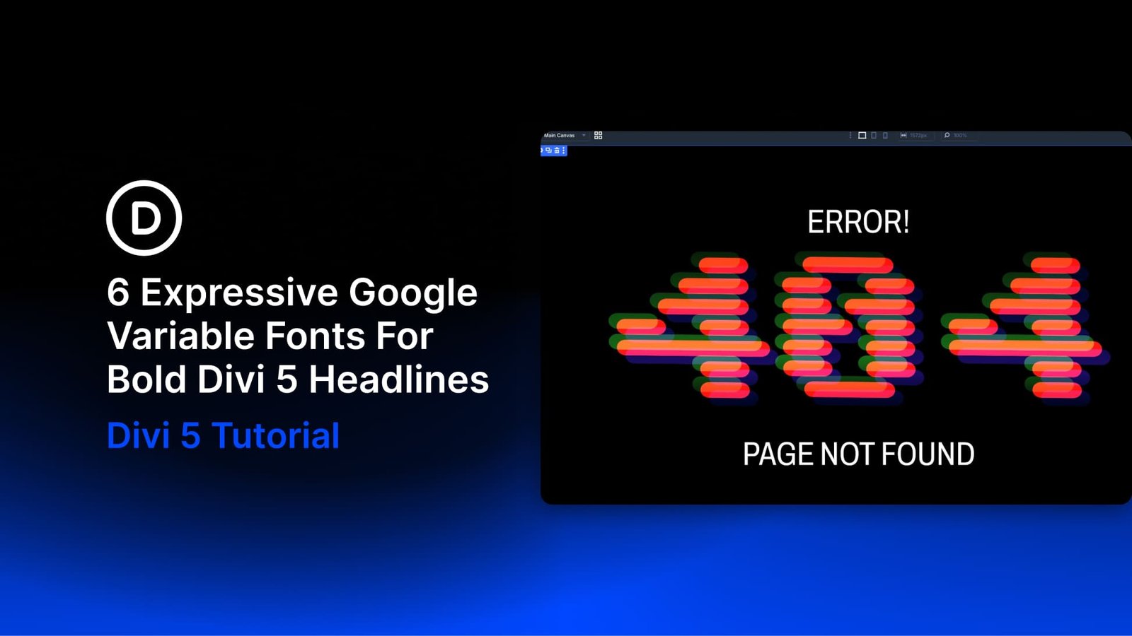
A 404 page does not need much copy. The visitor already knows something went wrong, so the design can do more of the work. Here, a 400px number built from layered, colored elements becomes the main visual.
Add a Heading Module and set the content to 404. Open the Design tab, expand Heading Text, set the Heading Level to H1, and choose Sixtyfour Convergence from the Heading Font dropdown. Four variable font controls appear. Use these values:
- Variable Font Bled: 0
- Variable Font Scan: -2
- Variable Font Xela: -33
- Variable Font Yela: 39
- Heading Text Size: 400px
- Heading Line Height: 1em
Bled controls the horizontal bleed of the pixel elements. At 0, the forms stay crisp. Scan changes the scanline treatment. Setting it to -2 keeps the internal lines relatively restrained.
Xela and Yela control the horizontal and vertical alignment of the font’s elements. At -33 and 39, the color layers separate enough to show the convergence effect while the number remains recognizable.
Leave Heading Text Color at #000000. In browsers that support the font’s color format, the numerals still appear in orange, pink, and green because Sixtyfour Convergence stores its colors inside the font file. Divi’s text color setting does not override them.
Add two lines of plain white sans-serif text to finish the page. Place ERROR! above the number and PAGE NOT FOUND below it.
Next, switch the Variable Font Xela and Variable Font Yela controls to the Hover state. Set both values to 100 and leave the other settings unchanged. Divi transitions between the default and hover values, making the colored elements move apart when the cursor reaches the heading.
At 100 on both axes, the number becomes difficult to read during the hover effect. That works here because 404 is clear before the animation starts. If the text needs to stay readable throughout the interaction, keep the hover values closer to the default settings.
2. A Hero Section With Bitcount
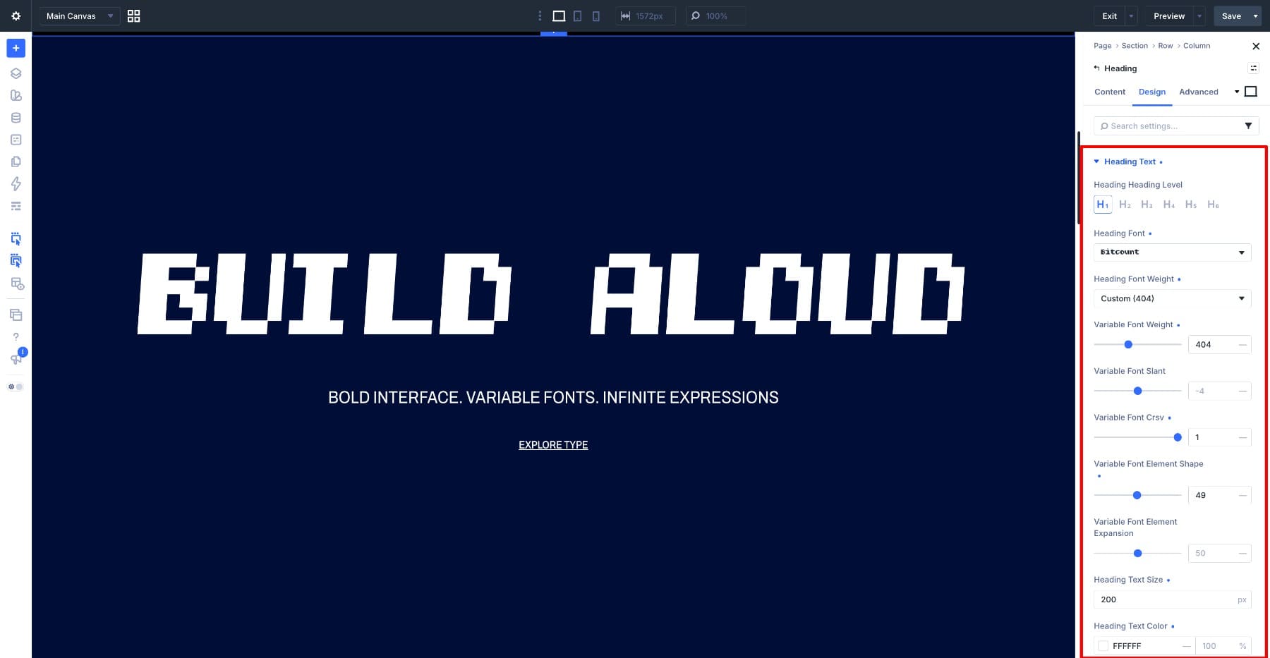
Bitcount works well for large headings because of its pixel structure. In this hero section, the white heading sits on a deep navy background with a hot pink text shadow. The rest of the section uses simple sans-serif text so the heading stays the focus.
Add a Heading Module, set the content to Build Aloud, and choose Bitcount from the Heading Font dropdown. Five variable font controls appear. Use these values:
- Variable Font Weight: 404
- Variable Font Slant: -4
- Variable Font Crsv: 1
- Variable Font Element Shape: 49
- Variable Font Element Expansion: 50
- Heading Text Size: 200px
- Heading Text Color: #FFFFFF
- Heading Letter Spacing: -7px
- Heading Line Height: 0.9em
Element Shape changes the form of the repeated elements, while Element Expansion changes how those elements fill out the glyph. At 49 and 50, the elements form stronger strokes while keeping the stepped edges visible.
Slant ranges from -8 to 0. Setting it to -4 gives the heading a slight forward lean. Crsv at 1 enables the cursive letterforms.
The pink layer comes from Divi’s text shadow, not Bitcount itself. Scroll down to Heading Text Shadow, choose the fifth preset, and use these values:
- Horizontal Length: 0.04em
- Vertical Length: 0.07em
- Blur Strength: 0em
- Shadow Color: #FF00D1 at 100%
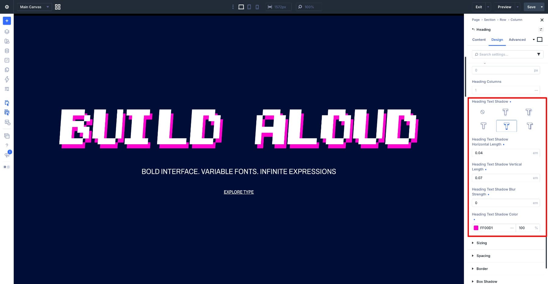
Keep the blur at 0em to create a sharp second layer behind the text. Using em values for the offsets also keeps the shadow proportional as the heading size changes across breakpoints.
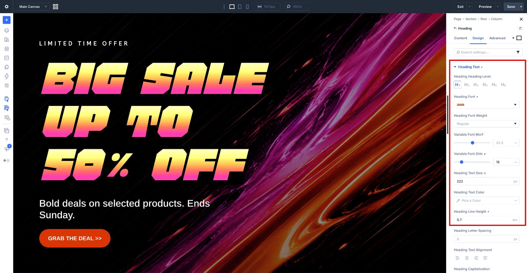
Honk combines irregular letterforms, built-in colors, and an internal shadow, making it a natural fit for a short promotional heading.
Add a Heading Module, set the content to Big Sale Up To 50% Off, and choose Honk from the Heading Font dropdown.
Leave Heading Text Color unchanged. Honk includes its own color palettes, so the letters appear yellow and pink without using Divi’s color setting. Two variable font controls appear. Use these values:
- Variable Font Morf: 22.5
- Variable Font Shln: 18
- Heading Text Size: 222px
- Heading Line Height: 0.7em
Morf changes the shape, size, and position of the parts that form each letter. The axis ranges from 0 to 45. Setting it to 22.5 places it at the midpoint and gives the letters a more angular form.
Shln controls the length of the shadow built into Honk. It ranges from 0 to 100. At 18, the shadow stays short and adds depth without looking like a second copy of the text.
Set the line height to 0.7em to keep the three lines close together.
Honk already adds a shadow to the letters. You can add another Divi text shadow to separate the full heading from the photograph behind it.
Choose the second preset under Heading Text Shadow and use these values:
- Horizontal Length: 0em
- Vertical Length: 0.06em
- Blur Strength: 0.07em
- Shadow Color: #FFC2E9 at 100%
The two shadows have different jobs. Honk’s built-in shadow changes with the letterforms. Divi’s 0.07em blur spreads pale pink around the full heading and helps separate it from the background.
This design also uses a busier background than the other examples. The heading remains visible because the supporting text and button are small, while the main subject in the photograph sits mostly on the right side of the section.
4. A Coming Soon Page With Handjet
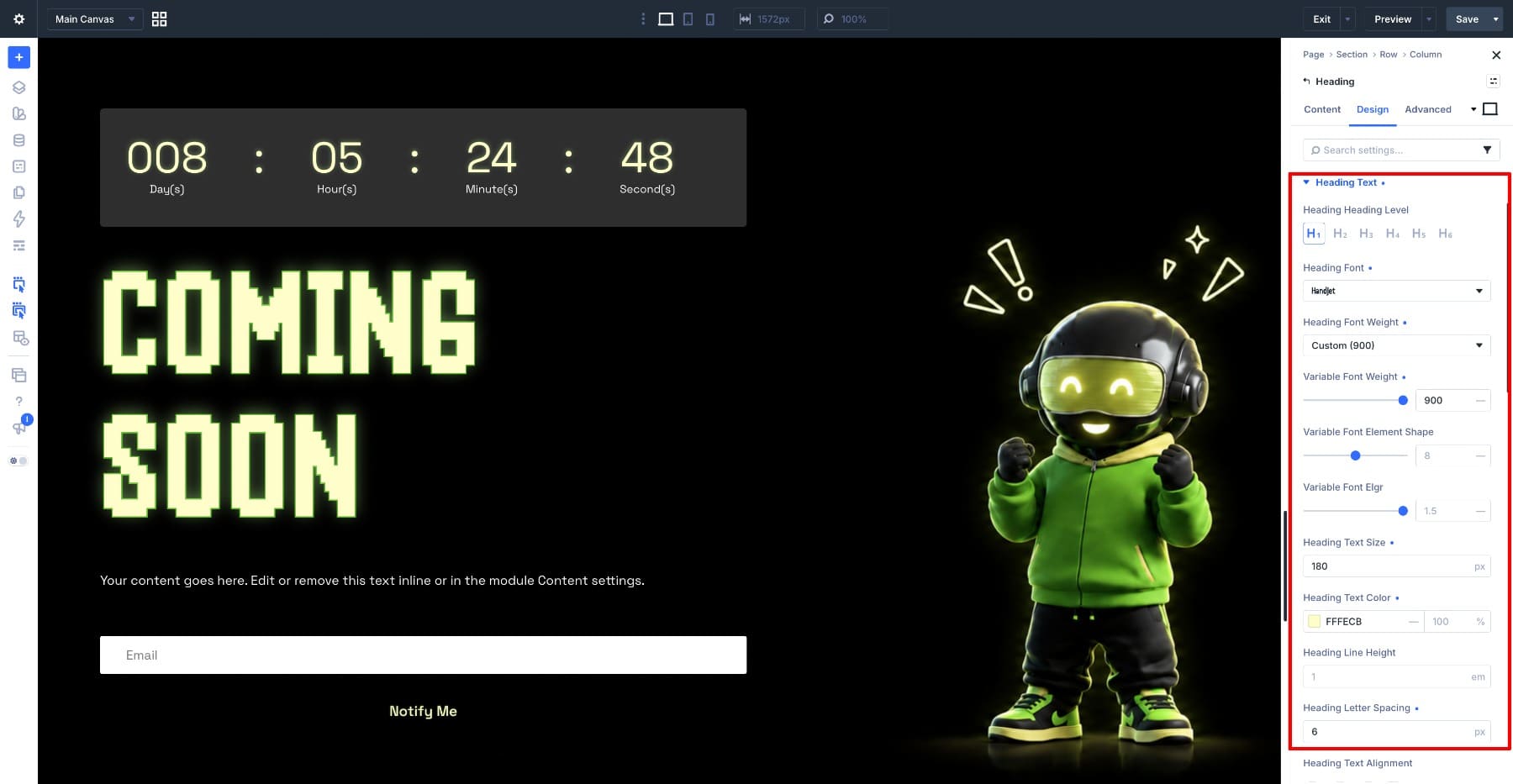
This page uses four main elements: a Countdown Timer Module, a Heading Module, a line of body text, and an Email Optin Module. Handjet is used for the heading, countdown numbers, and button label. The paragraph stays in a simple sans-serif font.
Start with the heading. Add a Heading Module, set the content to Coming Soon, and choose Handjet from the Heading Font dropdown. Three variable font controls appear. Use these values:
- Variable Font Weight: 900
- Variable Font Element Shape: 8
- Variable Font Elgr: 1.5
- Heading Text Size: 180px
- Heading Text Color: #FFFECB
- Heading Line Height: 1em
- Heading Letter Spacing: 6px
- Heading Capitalization: Uppercase
Handjet builds each glyph from smaller elements, and its variable axes control those elements. Weight controls their size. At 900, the elements become large enough to form strong strokes. Element Shape ranges from 0 to 16, with different values producing different modular forms. Setting it to 8 selects the Circle instance and creates a dot-matrix structure.
Elgr controls how many elements fit inside one grid unit. It ranges from 1 to 2, moving from a single element to a group of four smaller elements. Setting it to 1.5 places the design between those two extremes and adds more detail to the letterforms.
Handjet creates the modular structure, but the glow comes from Divi’s stroke and text shadow settings. Set Heading Stroke Width to 3px and use #48AA01 for the stroke color.
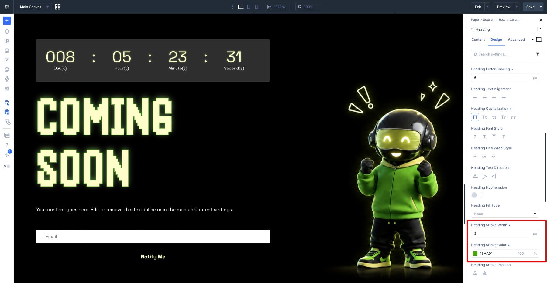
Then add a text shadow with these values:
- Horizontal Length: 0em
- Vertical Length: -0.02em
- Blur Strength: 0.11em
- Shadow Color: #B4F68D at 50%
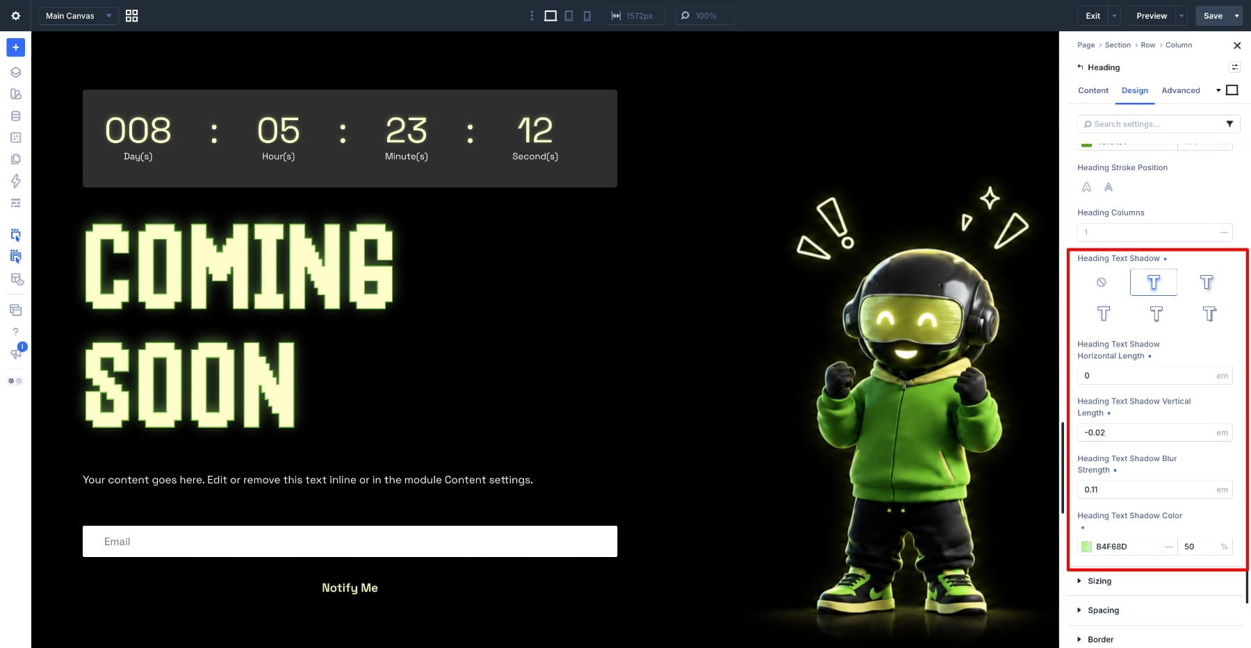
The negative vertical value moves the glow slightly upward. Keep the shadow opacity at 50% or lower so the blur does not hide the modular structure.
Apply the same font, color, stroke, and shadow treatment to the countdown numbers, separators, and Notify Me button. Keep the paragraph small, white, and set in a simple sans-serif font.
5. A Thank You Page With Shantell Sans
A thank you page only needs a simple message. Shantell Sans works here because its irregular letterforms make the heading feel more personal and hand-drawn.
Add a Heading Module, set the content to Visiting Our Store, and choose Shantell Sans from the Heading Font dropdown. Four variable font controls appear. Use these values:
- Variable Font Weight: 754
- Variable Font Bnce: 100
- Variable Font Infm: 100
- Variable Font Spac: 0
- Heading Text Size: 108px
- Heading Line Height: 1em
- Heading Text Color: #FFFFFF
Bnce moves glyphs above and below the baseline to recreate the bounce of handwriting. Infm changes their shapes and proportions. Setting both to 100 makes the line look less uniform and more hand-drawn. Weight ranges from 300 to 800. At 754, the strokes stay thick enough to support the irregular letterforms at 108px.
Leave Spac at 0 because the letters already have enough room between them.
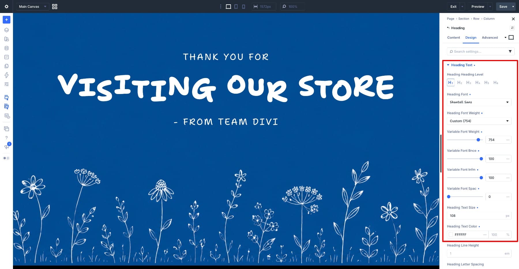
Keep the two supporting lines small and white so they remain secondary to the heading. The illustration sits along the bottom in a lighter blue and adds detail without competing with the text.
6. A Landing Page With Kablammo
Kablammo’s decorative letterforms suit short headings on simple backgrounds. This example pairs a dark green heading with an illustrated forest scene.
Add a Heading Module and enter your heading. Open the Heading Text option group, select H1, and use these values:
- Heading Text H1 Font: Kablammo
- Heading Text H1 Font Weight: Bold
- Variable Font Morf: 0
- Heading Text H1 Text Size: 139px
- Heading Text H1 Text Color: #1D3210
- Heading Text H1 Line Height: 1.2em
These settings style the H1 inside this Heading Module. To reuse the same treatment elsewhere, save the Heading Text settings as an Option Group Preset and apply it to the other headings.
Kablammo has one variable axis called Morf. Increasing it moves the decorative elements around the letters while shifting their weight and contrast. At 0, you get the least distorted version. Higher values make the letters more decorative, so they work better for short headings on simple backgrounds.
The dark green heading also matches the trees in the illustration.
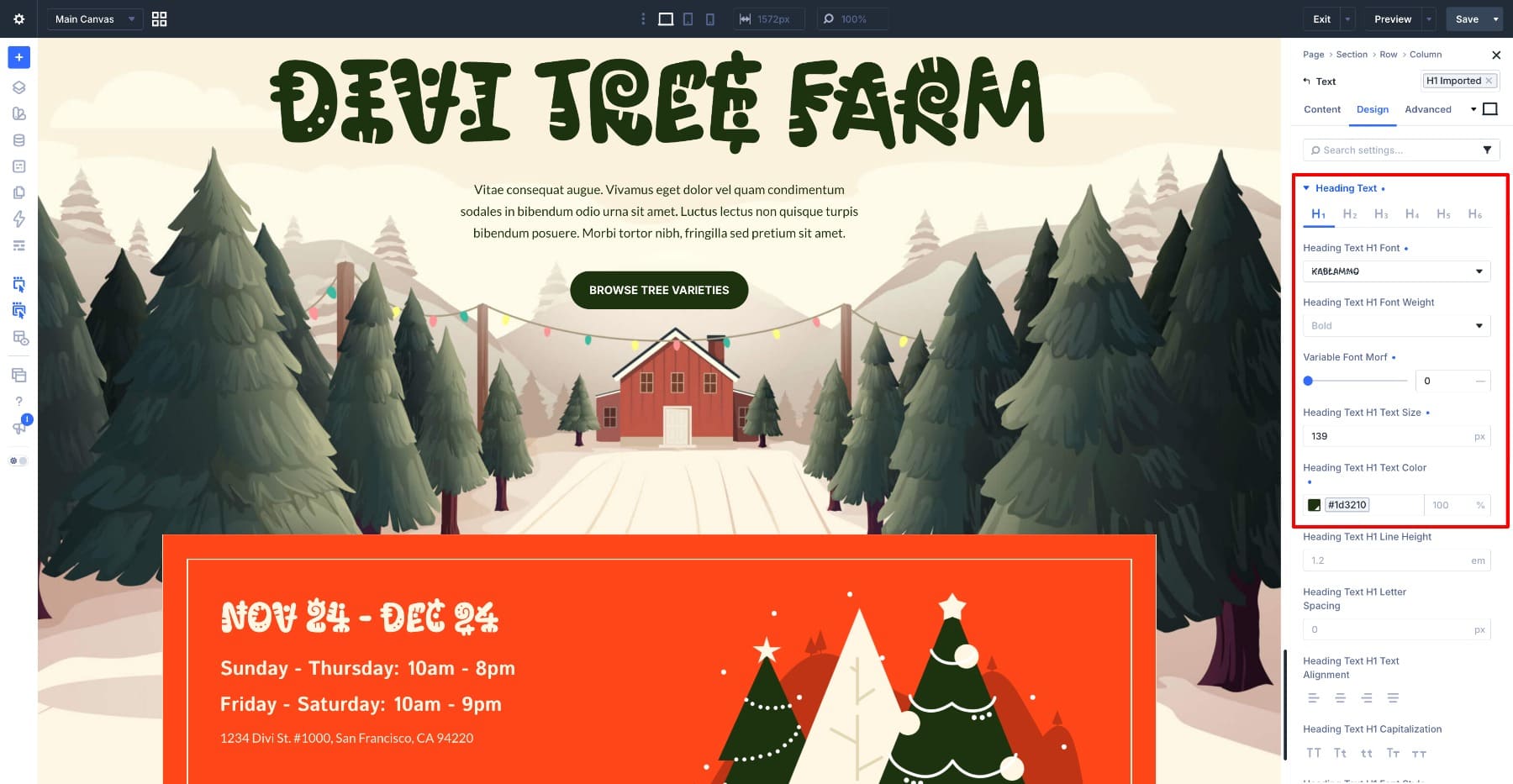
Kablammo also includes contextual alternates for repeated characters. The two Es in TREE are different, and so are the 4s in the date block below. With contextual alternates enabled, the font automatically swaps forms when the same character appears within a span of ten glyphs.
Test your actual heading before committing to the font. Decorative letterforms can become difficult to recognize at some sizes, especially characters such as a capital I. Use your real copy in the builder so you can see how every letter behaves.
What To Check Before Publishing
These fonts can work well, but there are a few things worth checking before you build a page around them.
- Test Color Fonts In Safari: As of this writing, COLRv1 renders in Chrome, Edge, and Firefox but is not supported in Safari on macOS or iOS. Test Honk and Sixtyfour Convergence in Safari and choose an acceptable fallback before publishing.
- Divi’s Text Color Does Not Override The Palette: Color fonts control their own palettes, so Divi’s standard text color setting cannot replace their built-in colors. Make sure the font remains legible against your chosen background.
- Add Responsive Text Sizes: The large text sizes in these examples are desktop values. Use Divi’s responsive controls to set appropriate tablet and phone sizes, then check the line breaks at each breakpoint.
- Retest The Axes After Editing The Copy: Variable font settings that work for one heading may not work as well after the words change. Add a note to the Module’s Admin Label so the next person knows to recheck the font settings.
Try One Before You Rule It Out
It is easy to dismiss these fonts from a specimen page. Try them in the builder at the size you would actually use. Add your own words, adjust the available axes, and judge the result within the full layout. Divi 5 displays the available variable font controls as soon as you select a supported font. If it does not suit the page, switch back. If it does, you have another option for creating a heading that looks different from the usual display fonts.