Blog
Dieter Rams avoids computers. His ten rules still fit designing for AI.

His principles were never about technology for its own sake. They were about restraint, honesty and most importantly clarity — exactly what the rush to ship AI keeps leaving out.
Dieter Rams, one of the greatest designers no one other than designers has ever heard of, spent four decades at Braun making mundane things people used without thinking about them — yet the radios, calculators, shavers, the shelving Vitsœ still sell.
Elegant in their simplicity and clarity.
For Rams, beauty wasn’t applied to function — it emerged from it. The work was understanding people deeply enough that the right form became obvious.
In the 1970s he boiled his approach down to ten principles for good design. Much of the design field, including myself, has run on them quietly ever since; most people don’t understand how much Rams has influenced the devices they use. His minimalist-functionalist canon is a winning strategy, not the winning strategy.
His won still. A lot.
The point: He didn’t invent functionalism; he framed it through the restraint of ten principles so it was clear and easy to understand.

That framing is massive, with Apple’s product line and $4.5 trillion market cap as an obvious example.
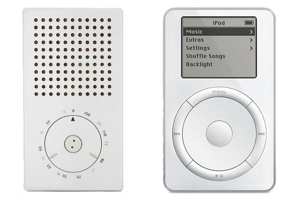
One of his biggest disciples, Jony Ive, built much of Apple’s design language on top of them, stealing without apology with Steve Jobs as an advocate. You’ve probably recited a couple in a critique without knowing whose they were.
I’ve held them up repeatedly, and they’ve always been where I go to for designing software and quite frankly, living my life.
Then there’s the economic impact.
If you assigned even 5–10% of Apple’s brand premium to design-language inheritance, you’d be at a few hundred billion dollars. From one company.
Then it fans out.
- Muji is basically Rams in retail form.
- Vitsoe is his actual furniture, still selling shelving 60 years later.
- Design Within Reach, one of my favorite stores.
- Braun itself. At a premium.
Then every minimalist consumer hardware brand of the last 20 years — Nest, Sonos, Dyson (different in form but same functionalist DNA), every smart home device that’s a white rounded rectangle.
On the software side, the entire flat-design turn in the 2010s — iOS 7 onward, Material Design’s more restrained moments, the whole “less but better” tic in SaaS UI — pulls from the same well.
Decades of influence. One man.
Here’s the part that should give us pause: Rams, in his nineties, doesn’t own a computer and probably never has many of the devices he influenced.
My guess he didn’t care.
That’s because he understood it wasn’t about the technology, was about the human outcome. The user doesn’t care whether a feature runs on a specific model or not; they care whether it works, whether it helps, whether they can trust it to accomplish the task they need done.
Because of this, I believe good AI design is just good design — which is why a 1970s list still works because it is long-lasting. That’s principle 7.

Good Design Is Innovative
Rams tied innovation to new technology, but he never treated novelty as the for the lede of the story. A new capability was a reason to rethink the product that made it easier to use, not a license to decorate it.
Real innovation asks what the technology lets you remove, collapse, or rethink about the underlying job. The honest version of that is uncomfortable, because it often means the visible feature gets smaller, not larger, or disppears altogether like an ambient agent. A genuinely new use of a model might collapse a five-step form into one sentence a user types, or delete screens entirely — outcomes that don’t photograph well in a launch deck.
And this alone is why many designers are struggling in this new age — it’s about reducing complexity, not adding it. That’s hard.
Novelty is loud. Innovation should be quiet, and yet most organizations reward loud. Don’t be them.
Often the best use is taking a mundane task the user quietly dreads — reconciling records, cleaning a messy list, reformatting a document — and making it disappear or making it simple.
Rams’ radios weren’t innovative because they used the newest transistor; they were innovative because the new component let him simplify the object around it. The same discipline applies now. Ask what the model makes newly possible to take away, not only what it makes possible to add.
Solving the boring well is innovation, and usually a more useful one than the demo that gets the applause.
Designing for AI
- Map the workflow first. The model’s value is in changing the shape of the work, not sitting beside it — and you can’t see that opportunity without understanding the job first.
- Ruthlessly cut. Keep reducing the steps, and ask if AI can help do that, like the five whys.
- Test the baseline. A model that can’t beat a plain rule or default is just cost and unpredictability with nothing to show for it.

Good Design Makes A Product Useful
Rams said design exists to make a product useful, and to throw out anything that gets in the way of that.
The AI-era reflex runs backward: you add a capability because it kills in the demo, then go looking for someone who needs it. Usefulness is narrower and harder than that. It means the feature shortens the gap between what a person wants and getting it, measured in their work.
Usefulness is unforgiving in a way that raw capability isn’t. A demo only has to work once, on the happy path you chose. A useful feature has to work on the inputs people actually bring, on the days they’re rushed and imprecise.
Most AI features clear the first bar and quietly fail the second, and the gap between “it worked in the demo” and “it works in the job” is where adoption dies.
A demo has an audience and a date. Usefulness shows up weeks later, in someone else’s workflow, with no one in the room to defend it — which is how it loses, quietly, to the thing that looked good in the review.
There’s a subtler failure underneath that one: features useful to the company but not the user. Engagement climbs, the model gets more sessions, and none of it shortens anyone’s actual task. Rams’ test was simpler and harder — does this help the person do the thing they came to do? Hold AI to that, and a lot of shiny features don’t make the cut.
Designing for AI
- Define the task. A feature with no named job it shortens is a capability hunting for a use, and engagement numbers will flatter it long after it has stopped helping anyone.
- Test on the mess. The demo runs on the inputs you chose; the product runs on the ones people actually bring, rushed and imprecise, and that gap is where usefulness is won or lost.
- Build the escape hatch. A probabilistic system will be wrong sometimes; if fixing its mistakes costs more than doing the task, the feature is a net loss however good it looks.
Good Design Is Aesthetic
Rams treated aesthetics and function as the same conversation; a well-made thing is pleasant to live with, and that pleasantness is part of how it works.
In AI products, the aesthetic question has moved the answer itself.
Most generative interfaces converge on the same blank chat box — the ChatGPT text field that nearly every product now clones — which is the aesthetic equivalent of shipping everything in gray.
When every product answers with the same field and the same streaming cursor, the interface stops telling you anything about what it’s good at or how to use it well. A calculator that looks like a chat thread teaches you nothing about calculation; a coding tool that shows its edits as a diff you can accept or reject teaches you everything you need to know about how it works.
It’s more about the interaction — how fast a response comes back, the tone of the copy, what your screen does to build trust while the model is thinking.
Pacing and content restraint now matters as much as layout. A model that dumps a wall of text the instant you stop typing feels different from one that pauses, structures its answer, and shows you where it’s going — even when the underlying output is identical. Words matter more than icons.
Rams understood that how a thing behaves is part of how it looks. In AI, behavior is almost all of the aesthetic.
Designing for AI
- Meet the user where they are at. The output surface tells users what the tool is for and the intent of the interaction. Slack needs a much different approach than the web, so design with that intent.
- Design the stream. How an answer arrives — its pace, the way it takes shape — shapes how much it’s understood and trusted, not just the words that land.
- Fill the empty state. A blank field hands the user the job of guessing what the tool can even do, which is exactly the moment most of them give up. Set expectations with intent.
Good Design Makes A Product Understandable
Good design, Rams wrote, explains itself. AI fights that instinct at every turn. The outputs are probabilistic, the reasoning is a black box, and your users are left staring at an answer wondering where it came from. Understandable now means making the system explainable: what it can do, where it stops, and why this particular answer showed up.
A large part of that is setting expectations before the user ever sees an answer. An understandable system signals what it’s good at and what it isn’t, so people arrive with calibrated expectations instead of discovering the limits the hard way.
It’s scaffolding with purpose.
Many AI products do the reverse — an open prompt and a confident tone imply the model can handle anything, and the disappointment shows up later, quietly, at the boundary. Scope stated up front sets an expectation the rest of the experience can actually meet.
The hard part is that the system itself often can’t explain why it produced an answer, so understandability has to be designed around the model rather than extracted from it.
That means surfacing what it drew on, what it’s confident about, and what it’s guessing — scaffolding the model won’t volunteer on its own.
The interface has to do the explaining the model can’t.
Perplexity does a version of this: it anchors each answer to numbered sources you can open, so the basis for a claim is one click away rather than something you take on faith. The provenance is part of the surface, not bolted on afterward.
Most products skip this because the fluent answer feels self-evident. It isn’t.
A user who can’t tell where an answer came from also can’t tell when to trust it, and that uncertainty erodes the whole product slowly. A confident paragraph with no visible basis is the least understandable interface we’ve shipped in years, and legibility is what lets people use the system at all.
Designing for AI
- Set expectations up front. Expectations form whether you manage them or not; an open prompt and a confident tone quietly promise everything, so the limits, met later, land as a betrayal.
- Expose the steps. An agent that acts invisibly is asking for trust it hasn’t earned — people can only rely on what they’re able to check.
- Explain the answer. With no visible basis, a user can’t tell a sound answer from a confident guess, so they either over-trust the system or abandon it — and both are failures.

Good Design Is Unobtrusive
Rams compared good products to tools: neutral, restrained, leaving room for the person using them. AI pulls hard the other way. It wants to suggest, autocomplete, summarize, and act, usually before anyone asked. Unobtrusive AI waits. It sits lambently in the background until the moment it’s actually useful, and it doesn’t hijack the intent the person walked in with.
The pressure runs the other way, though. Every team wants to show that its AI is “doing something,” so the assistant pops up, pre-fills, and narrates — proving its presence at the cost of the user’s attention.
Activity gets mistaken for value.
A tool that constantly reminds you it’s there is, by Rams’ standard, poorly designed.
Restraint is hard to ship because it’s invisible on a roadmap. “We made the assistant interrupt less” is not a headline feature, even when it’s the right call. But the products people keep using tend to be the ones that stay quiet until needed.
GitHub Copilot is a decent model of this: it offers code as dimmed ghost text right at the cursor, which you take with a keystroke or erase simply by continuing to type — there when wanted, gone when not. The difference between an assistant and a nuisance is mostly a question of when it speaks.
Designing for AI
- Surface where it matters. Help the user didn’t ask for competes with the work they’re trying to do; attention is the scarce budget every interruption spends.
- Keep suggestions light. Anything the model writes into a user’s work uninvited turns them into an editor of your output instead of the author of their own.
- Offer an off switch. A proactive feature you can’t turn off isn’t a tool, it’s an imposition — and the freedom to refuse it is what keeps the user in charge.
Good Design Is Honest
This is the one AI tests hardest. Rams meant design shouldn’t make a product look more capable or valuable than it actually is. Chat interfaces do exactly that — a fluent, confident tone reads as competence even when the answer is flat wrong.
When Columbia’s Tow Center tested eight AI search tools on naming real news sources, they were wrong more than 60% of the time, and the tell is that they rarely just declined — they guessed, confidently. That’s not honest.
We can put the signal back and explainability is the main instrument for doing it. Showing the basis for an answer — the sources, the steps, the data it leaned on — lets a user weigh the reasoning instead of the tone.
A system that can’t explain how it reached a conclusion is asking to be trusted on confidence alone, which is the opposite of honest.
Honesty also means resisting the product incentives that push the other way. A hedge reads as weakness in a demo; “I’m not sure” feels like a worse experience than a confident guess, right up until the guess is wrong and costs someone.
Honest design closes the gap between how sure a system sounds and how sure it actually is — and usually it’s the move that tests slightly worse and serves the user better.
Designing for AI
- Cut the persona. Copy that implies the system thinks or believes overstates what it can actually do — capability inflated and dressed up as friendliness.
- Build an abstain path. A system that never says “I don’t know” is guessing some of the time and hiding it — and the guess that sounds certain is the one that does the damage.
- Flag uncertainty inline. A blanket “AI can make mistakes” footer protects the company, not the user; uncertainty only helps where it sits next to the claim it qualifies.

Good Design Is Long-Lasting
Rams designed against fashion so his products wouldn’t look dated a few years on. Designers under the opposite pressure: models, providers, and best practices turn over every few months, and anything wired tightly to this quarter’s capability ages in a hurry.
Long-lasting design separates the durable part from the volatile part — and the volatile part is whatever model you’re calling under the hood.
A workflow tuned to one model’s quirks — its prompt format, its strengths, the way it phrases things — can break when the provider ships an update you didn’t ask for, which seems to happen every other week. That is the AI equivalent of designing for fashion.
The durable layer is almost always the human one. The user’s goal, their data, and their trust outlast any model generation, and a design anchored there can absorb the turnover underneath.
Build the experience so the engine is replaceable, and the churn becomes maintenance instead of a redesign.
Guardrails are part of that durable layer, and they age badly when they’re scoped only to today’s fast fashion. Build them so they can tighten without a rebuild: a kill switch you can actually reach, audit trails you already keep, human checkpoints you can move as the stakes change. Guardrails designed for this quarter’s model are usually the first thing in the system to expire.
Designing for AI
- Abstract the model. Bind your product to one model and you inherit its every change — and the model is the single part of the stack most certain to be replaced.
- Version the prompts. The model can shift under you without warning, and with no way to notice, your users find the regression before you do.
- Layer the guardrails. Models keep gaining capability and the rules keep tightening, so guardrails scoped to today’s system are the first thing to expire — they have to be able to move on their own.

Good Design Is Thorough Down To The Last Detail
Nothing should be arbitrary, Rams insisted; the care in the details is how you show respect for the person using the thing. AI makes that harder precisely because it’s probabilistic. The demo path looks clean while the edges quietly fall apart — the odd input, the wrong format, the small slice of answers that are confidently, the hallucinations, completely off.
It also means the quality of the answer is now a design concern, not someone else’s. In a traditional product, design stops at the interface and the content behind it belongs to another team.
In AI, the answer is the product — its accuracy, its completeness, its tone — so caring about whether the output is actually good is part of the design work, not a handoff after it.
A polished frame around a mediocre answer is still a mediocre product. Probability changes what “finished” even means. With a deterministic interface, if the button works, it works. With a model, the same input can succeed and then fail, and the failures cluster in the inputs you didn’t think to test.
The polish you see in a demo says almost nothing about the experience at the tenth percentile. The tail is the product.
This is unglamorous work, and it’s where respect for the user actually shows up. Designing the empty result, the malformed output, the confidently-wrong answer, the path back from each — none of it demos well, all of it decides whether people trust the thing.
Rams’ insistence that nothing be arbitrary lands hardest exactly where the model is least predictable.
Designing for AI
- Keep an eval set. The happy path will always look fine, so the only honest measure of quality is what the system does on its worst inputs, release after release. Generate them synthetically so at least you have a starting point.
- Design the failures. With a probabilistic system the failure paths aren’t rare edge cases, they’re a routine part of the experience — and that’s where trust is decided.
- Set the quality bar. A good average hides the tenth-percentile experience, and it’s the tail, not the mean, that decides whether people keep trusting the product.

Good Design Is Environmentally Friendly
Back in the 1970s Rams argued that thoughtless consumption was over and design should conserve resources. The principle has teeth again. Running these models has a real and growing footprint: the IEA projects data-centre electricity use will roughly double by 2030, to around 945 terawatt-hours — close to 3% of world demand — growing about four times faster than electricity use overall.
Designers sit closer to this than it seems.
Defaulting every interaction to the largest available model, re-running a generation because it’s easier than caching, calling a model on every keystroke — these are design decisions, and at scale they’re energy decisions too.
Right now the AI Assistants work like flying a 747 down to the corner store for milk. That’s not responsible.
Remember that the cheapest model that does the job well is often the responsible choice and the faster one at the same time. We should design that into the system.
This isn’t a call to sacrifice the experience for a marginal saving; it’s a call to stop treating compute as free. The same restraint that makes a product feel considered — using the minimum that solves the problem — happens to shrink the footprint.
Rams’ point from the 1970s holds: thoughtless consumption is a design failure, not just an external cost.
Designing for AI
- Route by difficulty. Most requests don’t need the largest model, and reaching for it by default spends energy and money on capability the task never uses. Suggest routing by default.
- Cache and reuse. Re-running the same inference because it’s easier treats compute as free, which it is neither for the user’s wait nor for the grid behind it.
- Batch the calls. Firing the model on every keystroke is developer convenience paid for in cost and latency the user never asked to carry.

Good Design Is As Little Design As Possible
“Less, but better.”
Rams’ last and most-quoted principle is the hardest one to honor when capability is this cheap.
AI invites more of everything — more features, more autonomy, more surface to maintain — because adding is easy and taking away takes judgment. The discipline is finding the smallest move that actually solves the problem.
Subtraction is harder than addition, and AI tilts the field toward addition. Products accrete AI surfaces — a generate button here, an autosuggest there — each defensible on its own, collectively a mess no one chose on purpose.
“Less, but better” advocates for restraint, and it’s where the thread running through the other principles surfaces as the spine of a well crafted message.
The restraint behind being innovative (use the new part to remove, not pile on), unobtrusive (stay quiet until wanted), and environmentally friendly (use the smallest model that works) was never separate disciplines — it was this one all along.
Sometimes that’s a single well-placed model call. Sometimes the best version of an AI feature is a sharper default and no model at all. The hardest design decision in this era is often what to leave out.
Designing for AI
- Design the non-AI version first. If a plain default or rule already does the job, the model is just complexity and cost with nothing to justify it.
- Consolidate the entry points. Scattered AI surfaces each look defensible on their own, but together they become a product no one chose to design.
- Keep the user in command. Background autonomy is useful right up to the moment it commits to something the user would have stopped — checkpoints are what keep quiet help from becoming quiet risk.
Conclusion
Read together, the ten share a common theme, and it isn’t aesthetic. It’s restraint — the willingness to subordinate what you can build to what people actually need. That’s the part this moment makes hardest.
When capability is cheap and shipping is fast, every incentive is more: more features, more autonomy, more confident output. Rams’ list is the counterweight — questions to hold up against that pressure before it it’s part of the roadmap.
Steve Jobs, whose company absorbed Rams most directly, put it more bluntly.
Say no. A lot.
He’d just come back to a flailing Apple, was about to cut its sprawling product line down to a handful, and told a room of developers that “innovation is saying no to 1,000 things.”
Restraint wasn’t a limit on the work. It was the work.
The AI era hands you a thousand new things you could say yes to — which is the whole reason the discipline of no matters now.
It’s also worth remembering where these came from — A designer who keeps no screens in his house, who judges the work by whether it serves a human need and not by what the technology can suddenly pull off, who probably doesn’t use AI. At all.
That distance is the thing most AI work is missing.
![]()
Dieter Rams avoids computers. His ten rules still fit designing for AI. was originally published in UX Collective on Medium, where people are continuing the conversation by highlighting and responding to this story.