Blog
The Iconic Swatch SKIN Line Takes on Tropical Tones
Swiss brand Swatch first emerged in the early 1980s as a fresh, sportier alternative to the more staid luxury producers making up the country’s timepiece industry. It was the quartz crisis—a period marked by decline in the market due to shifts in mechanical systems and international competition—and the emergent company seized the moment by fully embracing the new technologies. And while its established counterparts eventually bounced back, Swatch remained a rebellious favorite, an accessible go-to for BMX-ers, skateboarders, surfers, and young gen-x looking to define their era: the 1990s.
One innovation the brand introduced during this period was the ultra-think SKIN line. The near-weightless design—available in a variety of materials—has been refined and re-styled over the past four decades; reflecting changes in taste. The minimalist, no-nonsense contour of this slim chronometer serves well as a canvas of these stylistic shifts, an agile quality that has largely ensured its longevity and enduring popularity.

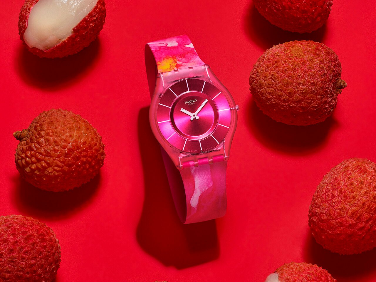
The just released Painted Paradise Collection represents an exuberant, naturalistic take; a breath of fresh tropical air for this particularly dark timeline. These four deftly imagined compositions are transportative; wrist-bound portals to soft white-sand island beaches paired with the turquoise waters of the Caribbean; the dense greenery of a Brazilian rainforest with bright sunlight flickering through these verdant canopies; vibrant blooms from Central Africa captured in the half-light of dust; and a cornucopia-arrangement of lush South Asian fruits.

There’s little need for immediate, intrusive connectivity—hundreds of emails, text messages, or news alerts popping up at any moment. Checking the classic dial head—rendered in captivating yet pattern-molifying metallic purples, baby blues, fuchsias, and silvers—is a far less stressful experience.

In expressing this feeling on an implicit rather than explicitly representational level, Swatch’s design team chose to adorn the bands in viscerally expressive motifs: marble, watercolor puddling, cloud, and sfumato effect effects that incorporate different tones. These silhouettes become freeze framed landscape paintings: abstracted representations and distilled depictions of these somewhat universal settings culled without the need of AI Slop generative image-making tools. The visual quality is engaging yet not overpowering, playful but elegant, serious but not so serious.


To shop the collection or see more from the brand, visit swatch.com.
Photography courtesy of Swatch.