Blog
studio vapore Turns Up the Color in its Music Classrooms
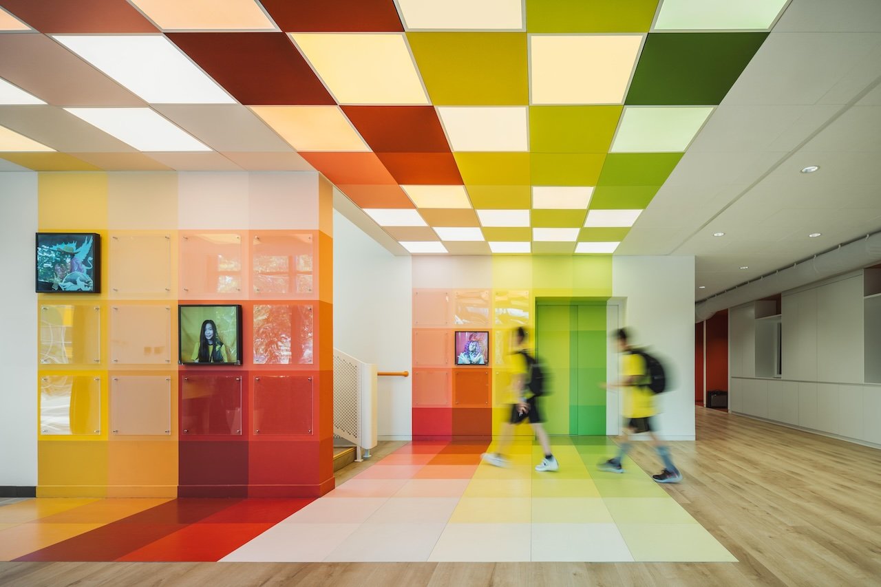
In juicy hues that punctuate its core spaces, the music classrooms of Wester Academy Beijing resonate aesthetically and acoustically. Beijing’s studio vapore, a practice that boasts a striking portfolio of super-chromatic interiors, describes its vibrant interior project as “a renovation structured by layout, sound and color.”
These three criteria guided the biggest moves in the 7,500-square-foot commission, which is part of a broader campus upgrade. This first phase is attuned to the needs of music education — and seems destined to inspire both its artistic students and dedicated faculty.
The layout organizes classrooms along a shared corridor. Each room boasts dedicated practice rooms alone with perimeter; through glass partitions, staff can supervise students in both the common area and these more intimate performing spaces — and the combination of programs allows for teaching, rehearsal and solo practice to take place in one compact zone. The ease with which students can switch modes and teachers can toggle between diverse student needs informs a cleverly conceived plan.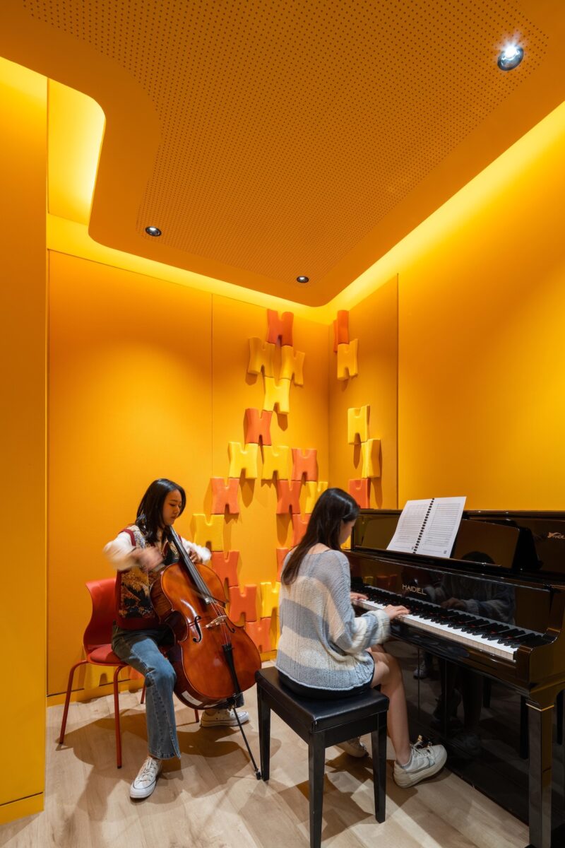
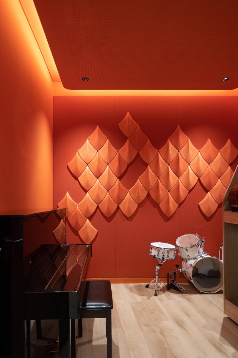
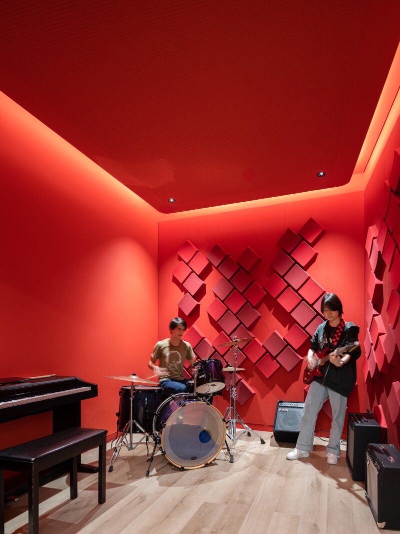
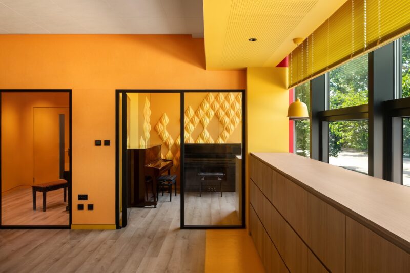
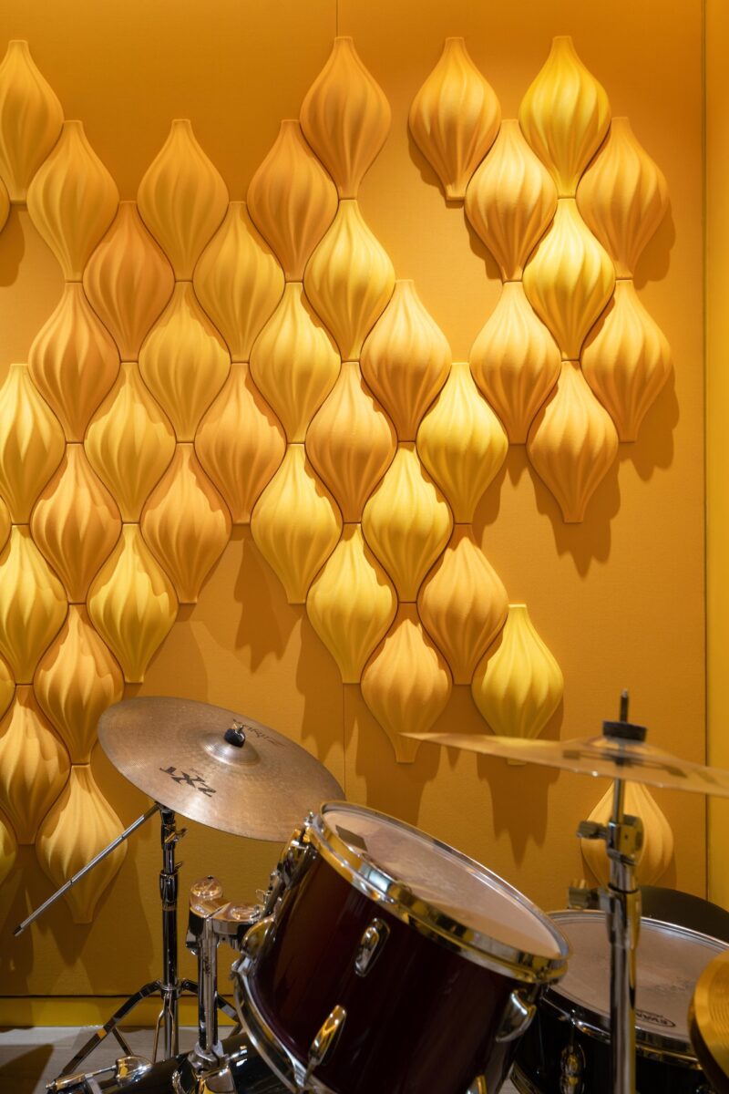
Sound quality is paramount in a project tailored to music education, so studio vapore took special care to develop acoustic treatments in collaboration with acoustic engineers for everything from walls and ceilings to floors and built-in furnishings.
Besides managing reverberations and sound transfer among rooms, the finishes they came up with — felt panels, fabrics, and three-dimensional acoustic elements — are also visually stimulating. Each room has its own personality thanks to the quirky wall modules, all in bright hues that could have popped out of a pack of Starburst candies.
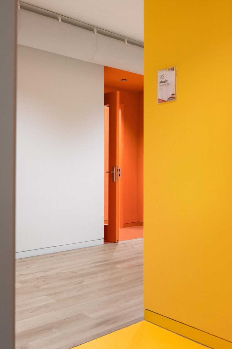
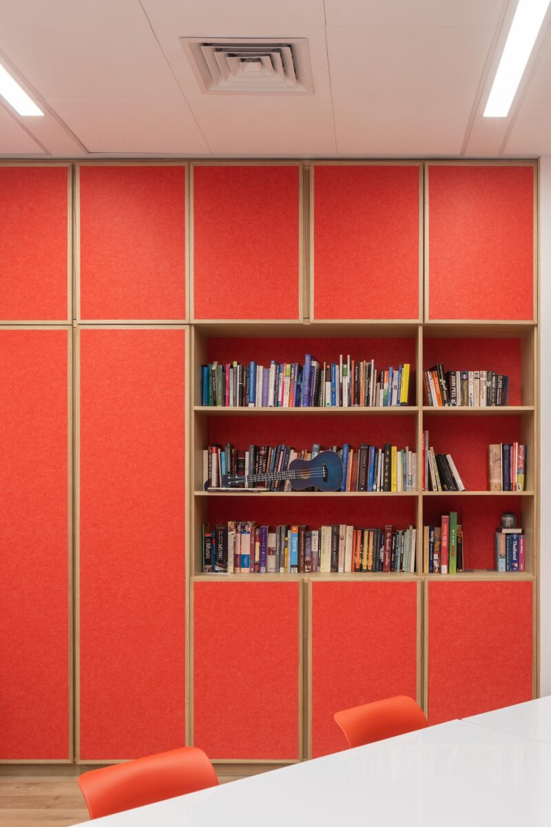
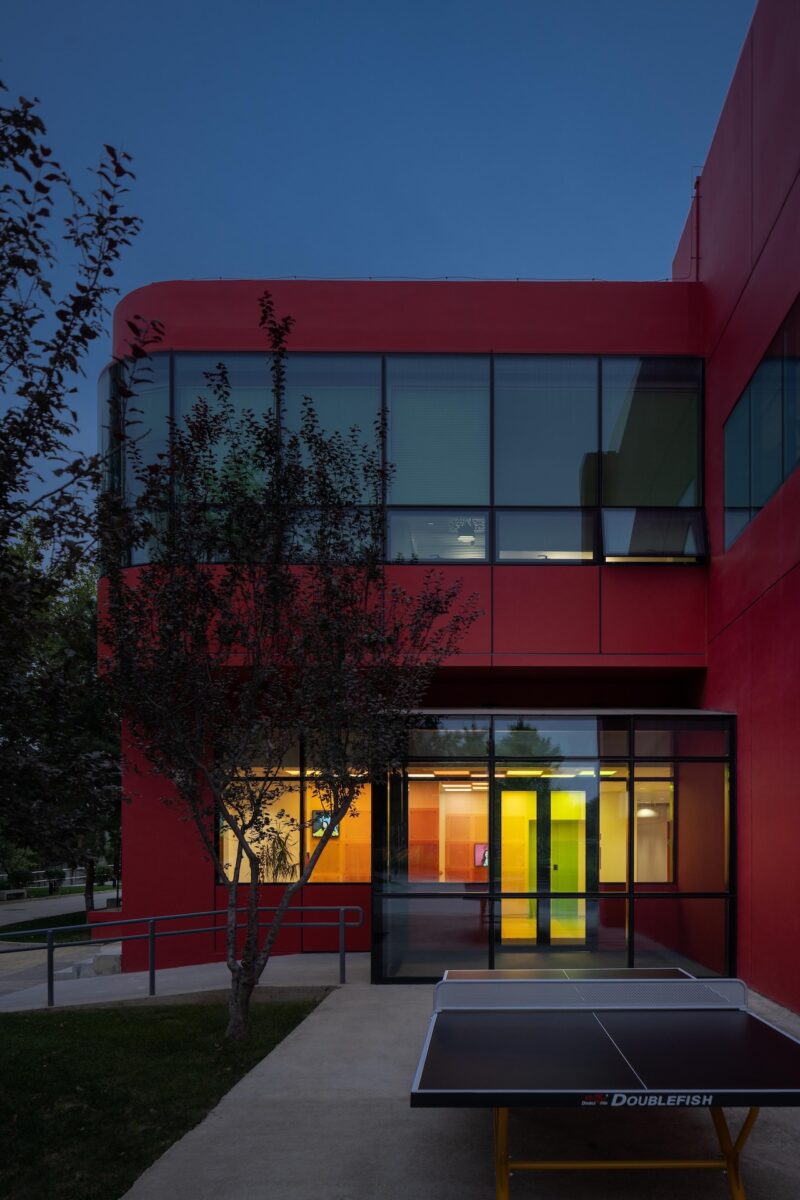
Color, of course, forms another “organizing layer,” according to studio vapore. Red, orange and yellow define the three different classrooms for the school’s three age groups. As a way-finding device, these exuberant tones are effective: From the shared corridors, the thresholds of each classroom signals exactly where students need to be.
And as a part of a larger institution, the school’s music area is easily identifiable — in fact, branded — by its bold palette from its very entrance.
Photograph at top of article by Vincent Wu. First three photos by Shawn Koh. Additional photos by Vincent Wu.