Blog
Someone designed this
Why bad UX is often a business decision, not a design failure.
There’s a screen most people have seen at least once.
You’re trying to cancel a subscription. You’ve made up your mind. You click the button that looks like it starts the process.
And then something strange happens.
The page that loads isn’t a cancellation form. It’s a full-screen gallery of everything you’re about to lose. Videos. Deals. Music. Free delivery. Presented in bright tiles, warm colours, friendly icons. A highlighted countdown showing how many days you have left.
And somewhere at the bottom, small, grey, easy to miss, the option to continue cancelling.
You almost didn’t see it.
That was the point.
Someone designed that screen. Someone decided where to put the button. Someone chose that colour. Someone wrote that copy. Someone reviewed the design, ran the numbers, and approved it.
And the number they were looking at wasn’t your satisfaction score.
The half of UX nobody puts in a portfolio
Every portfolio you’ve ever read has some version of this:
“I improved onboarding and increased conversion by 34%.” “I redesigned checkout and reduced drop-off by 22%.”
Look at what every single one of those metrics measures.
Getting users in.
The entire credibility of the UX industry was built on that half of the journey. Designers got seats at tables, budgets, job titles, because we could prove that better experience meant more revenue. It was true. It still is.
But only in one direction.
The moment a user tries to leave, really tries, with intent, the relationship between good design and good business quietly breaks down. And almost nobody in the industry talks about what happens next.
Early in my career, I worked on a financial product redesign. Depositing money was frictionless, one click, multiple payment methods, no verification needed. Withdrawing was a completely different experience. Verification only kicked in when money was going out. Minimum balance rules meant you could never take everything you earned. Conversion rates weren’t visible until the very end.
The client knew. It wasn’t illegal. But the design was built to serve one direction.
I was a junior designer. The decisions came from above. I designed what I was asked to design. I didn’t speak up, not because I didn’t feel something was off, but because I didn’t yet know how to put it into words.
I’m a product designer. I sit in those reviews. I’ve seen that moment from the inside, when a metric goes up, and something quietly feels wrong. This is about what’s on the other side of that feeling.
The name they gave it says everything
Between 2016 and 2023, Amazon’s internal name for their Prime cancellation process was “The Iliad Flow.”
Named after Homer’s epic poem about the decade-long Trojan War.
They named their own cancellation system after one of history’s longest and most gruelling journeys. Not ironically. As a design brief.
- Signing up for Prime: 2 clicks
- Cancelling Prime: 4 pages. 6 clicks. 15 options.
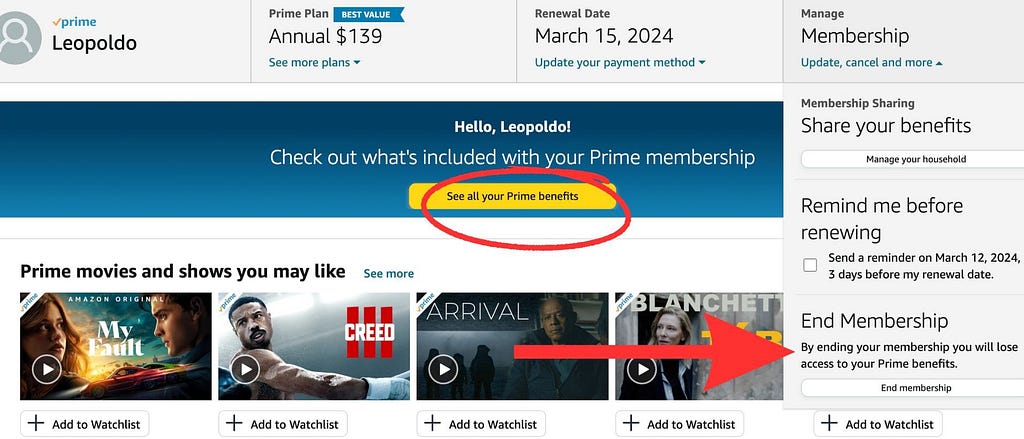
And before you even reached those 4 pages, you had to find the entrance. That meant opening the “Account & Lists” dropdown, navigating to the third column of links, and selecting the eleventh option in that column.
The FTC calls this Obstruction, also known as the Roach Motel technique, a term first documented by UX researcher Harry Brignull in 2010.
Designed so you never check out. Amazon had known since at least 2018 that users couldn’t find this link. They left it there anyway.
Once you found the entrance, here’s what waited inside. These are screenshots submitted as evidence in federal court, not mockups, not recreations:
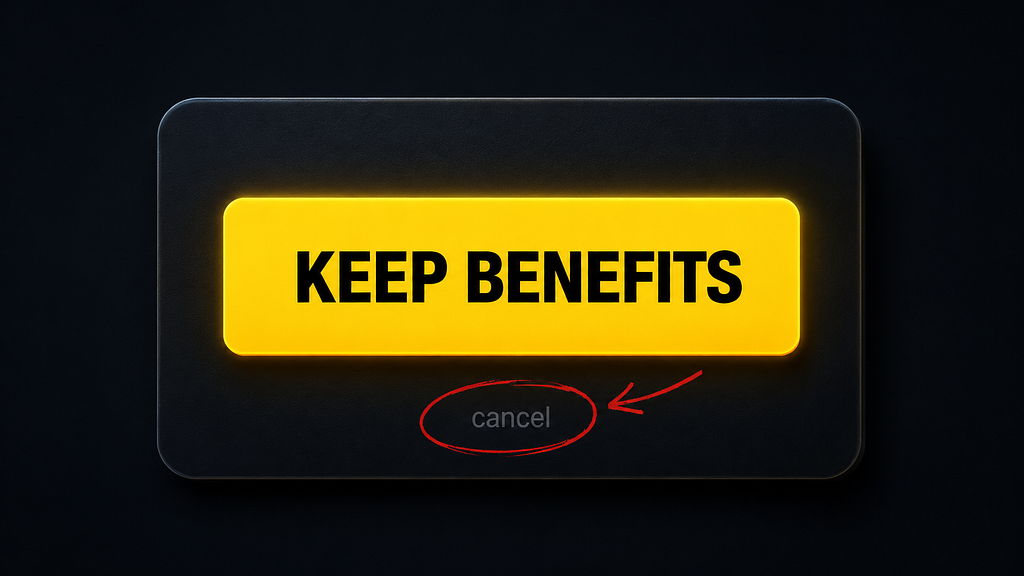
Dark pattern #1: Misdirection
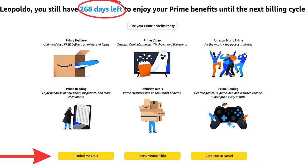
You clicked cancel. This is what loaded. Not a form, a showcase. Every Prime benefit in bright, engaging tiles. The actual path to continue cancelling is the small text at the bottom. The FTC’s term: misdirection. Design that redirects your attention away from your goal.
Dark pattern #2: Confirm-shaming
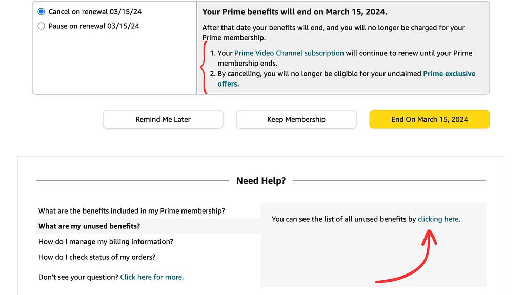
Screen two. The copy reads: “you will no longer be eligible for your unclaimed Prime exclusive offers.” Confirm-shaming. Language engineered to make cancelling feel like a mistake you’re making. The cancel option is still not the most prominent thing on screen.
Dark pattern #3: Interface interference
Screen three. A bright yellow button pushes toward Prime benefits. Warning icons appear near the cancel option to trigger anxiety. Visual hierarchy used deliberately against the user’s intent. The FTC calls this interface interference.
This wasn’t a rogue designer. This was a documented, deliberate system reviewed at executive level.
When someone at Amazon proposed simplifying cancellation, the proposal was rejected. The reason given, in writing: “Easier exits hurt subscription revenue.”
An internal memo called it “a bit of a shady world.” Another called unwanted subscriptions “an unspoken cancer.”
The people who wrote those words kept working on the product. For seven years.
And then there’s this. The detail that should make you stop completely:
Whenever Amazon made cancellation easier, Prime sign-ups dropped. So they made it hard again.
Read that once more.
Easier to leave meant fewer people joining. The friction wasn’t a side effect. It was load-bearing. Remove it and the whole business shifts.
That is the exact moment where good UX and profitable UX are not the same thing. Someone knew. Someone chose.
But this isn’t only an executive failure. Every product cycle starts with targets, improve retention by 10%, reduce churn, move the NPS. Designers working toward those goals don’t consciously decide to make cancellation harder. But the small decisions compound in one direction. The primary button goes to “Keep membership.” Cancel becomes a ghost button, or a text link. A retention offer screen appears before the exit. Each decision follows standard design hierarchy. Each one feels justified. The metric goes up. Nobody connects the dots.
That’s what makes this structural. It doesn’t require bad intent. It just requires a goal that only measures one half of the journey.
It wasn’t just Amazon
In 2024, regulators from 26 countries audited 642 subscription products globally. What they found:
- 76% had at least one dark pattern built in
- 67% had more than one
- 81% made auto-renewal impossible to turn off during sign-up
- 70% gave users no information on how to cancel
This wasn’t a study of bad companies. It was a cross-section of the industry.
And the companies caught in enforcement actions paid for it:
Amazon paid $2.5 billion for a 4-page cancellation maze that trapped 35 million people. $1.5 billion goes directly back to affected consumers. FTC v. Amazon →
Epic Games paid $245 million for button layouts that charged Fortnite players for items they were just trying to preview. Kids racked up hundreds of dollars. When parents disputed the charges, Epic locked their accounts. FTC v. Epic Games →
Google / YouTube paid $170 million for collecting children’s data without parental consent. FTC v. Google / YouTube →
HelloFresh paid $7.5 million for a cancellation flow deliberately designed to stop people from leaving. FTC v. HelloFresh →
These aren’t companies that made mistakes. They’re companies with design systems, user research, and A/B testing infrastructure who looked at the data and kept going anyway.
The assumption nobody questioned
The UX industry has one founding belief: good experience is good business.
It’s what got designers into strategy meetings. And it’s true, for the part of the journey we were allowed to see. Acquisition, onboarding, conversion, better UX, better numbers, everyone wins.
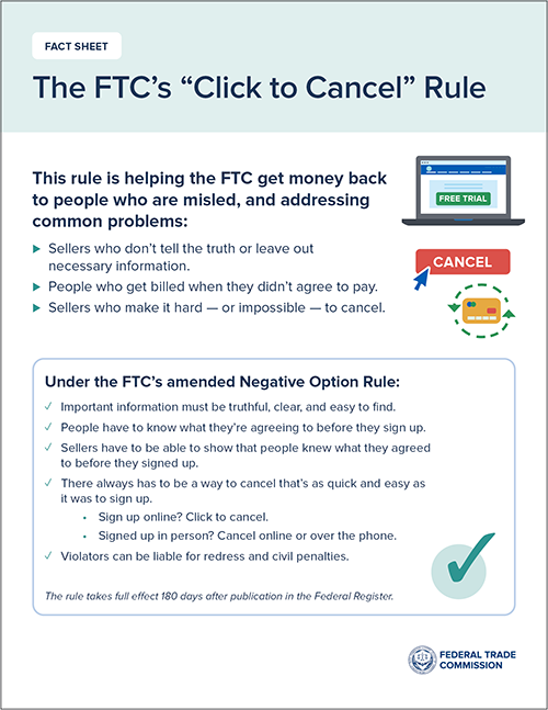
But in 2024, the FTC passed a rule that said the quiet part out loud. The Click-to-Cancel rule required companies to make cancellation as simple as sign-up. Regulators had seen enough evidence that companies were deliberately making it harder. The rule was later vacated on a procedural technicality, not because the principle was wrong, but because the FTC skipped a required economic analysis step.
The dark patterns are still legal. For now.
“Too often, businesses make people jump through endless hoops just to cancel a subscription. Nobody should be stuck paying for a service they no longer want.” — FTC Chair Lina M. Khan, October 2024
The incentive is structural. It doesn’t require bad people. It just requires a business model where confusion is more profitable than honesty.
That’s the conversation most design reviews never have.
The question worth asking before you ship
“Does this design make it as easy to leave as it is to join?”
“If not, is that a product decision or a design decision? And who owns it?”
These aren’t uncomfortable questions. They’re the ones that separate design that serves users from design that just serves revenue.
But they’re hard to ask out loud. In a room full of stakeholders focused on revenue, “this feels wrong for users” gets dismissed before you finish the sentence.
The designers who get heard reframe it:
- Not as an ethics problem alone, but as a business risk
- Not just as user empathy, but as brand trust
- Not as a feeling, but as a liability with a price tag
A user who feels trapped doesn’t just cancel quietly. They tell people. That cost doesn’t show up this quarter. It shows up later, when nobody can explain why trust dropped.
The regulatory pressure is real and it’s coming from every direction. The US FTC is actively fining companies. The EU’s Digital Services Act explicitly prohibits manipulative design. India’s Central Consumer Protection Authority introduced specific dark pattern guidelines in 2023, covering 13 identified patterns, with enforcement already happening.
Nobody cared about accessibility until ADA compliance became impossible to ignore. Then it was in every design system, every sprint, every audit checklist, not because designers became more ethical, but because ignoring it had a real cost.
Dark patterns are heading the same way. The laws are here. The fines are happening.
Designers who raise it now, framing it as risk rather than just conscience, are the ones who get heard.
Amazon had years of internal evidence that their cancellation flow was hurting real people. They had designers, researchers, product managers, and executives reviewing it regularly. Nobody asked those questions out loud. At least not loud enough.
They paid $2.5 billion to answer them in court instead.
You can ask them in your next sprint review. For free.
Screenshots: FTC v. Amazon, Case 2:23-cv-00932, public federal court document, filed June 21, 2023, U.S. District Court for the Western District of Washington.
Sources, all verified official government documents
FTC v. Amazon main case page · FTC $2.5B settlement · FTC complaint PDF with screenshots pages 44 to 52 · FTC ICPEN Sweep Report 2024 · FTC Click-to-Cancel Rule · FTC v. Epic Games · FTC v. Google YouTube · FTC v. HelloFresh
![]()
Someone designed this was originally published in UX Collective on Medium, where people are continuing the conversation by highlighting and responding to this story.