Blog
Please don’t stretch your app for foldables

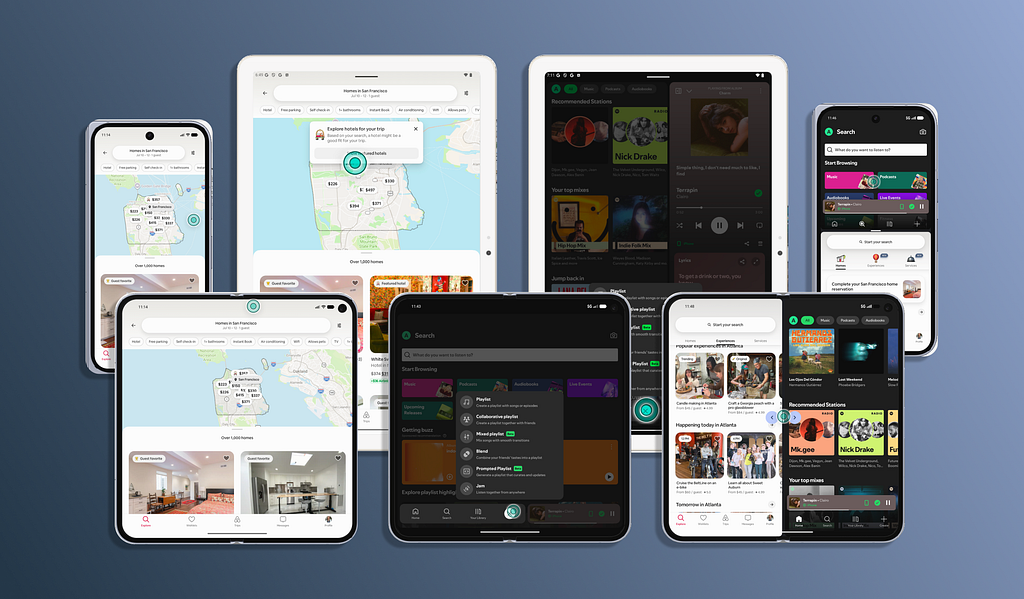
What happens when the screen isn’t a fixed constraint?
Foldables have existed in the market since 2019 with the Samsung Galaxy Fold, but it’s really only been an “Android thing.” And if your app primarily serves the U.S. market (where most smartphones are iOS), foldables haven’t been a priority to design for. Even with an Android customer base, only a small percentage of those devices are foldables.
But this foldable conversation is different now with Apple’s iPhone Duo announcement. This one foldable has caused more buzz than the entire Android foldable ecosystem ever has.
If you’ve never considered designing for foldables for your native app experience, it’s understandable (and common). It’s hard to get design/engineering buy-in when so few people will use the app on such a unique form factor.
Now there’s a greater argument. iPhone Duo has a strong sales forecast and is projected to take 25% of the foldable market by end of 2026; only to increase from there.
So if you’re starting from square-one and have no idea how to address foldables, it’s good to have a foundation to both understand the form factor and the expectations between iOS and Android. Let’s get into some best practices to integrate iOS and Android foldables into your design process.
Core principles
Foldables seem complex because they combine multiple screen sizes, aspect ratios, orientations, and postures in a single device. To maintain a good experience with foldables, you need to adapt hierarchy, layout, and controls to the available space and how the device is being used (don’t worry, we’ll get there).
Design for available space vs. the device
Instead of asking “What does this screen look like on a Galaxy Z Fold/iPhone Duo?”, ask “What does this experience need to do when the available window becomes wider, narrower, taller, or split?”
The same designs should be able to accommodate:
- Standard phones
- Flip and book-style foldables
- Tablets or multitasking windows

Preserve hierarchy
When available space changes, the UI doesn’t need to remain visually identical.
What should adapt:
- Navigation & control placement
- Content density / amount of content displayed
- Number of columns
- Supporting information / image size
What should not adapt:
- Primary task & key actions
- Content hierarchy
- Navigation model & user’s current context
For example:
When the iPhone Duo is closed, content is presented in a drill-down style with List → Tap → Detail. Versus when opened, the same content is presented simultaneously with the list on the left and details on the right of the device.
Don’t stretch the UI
You may think allowing the UI layout to expand across a large device display is an easy solution to fill in the space, but Android specifically asks for the usage of panes and adaptive layouts.
Best practices:
- Add maximum content widths & larger gutters between elements
- Use multiple columns & supporting panes
- Ensure grids are responsive
Avoid:
- Extremely long text lines (line length should be about 50 characters)
- Oversized cards, modals, bottom sheets, and imagery
- Full-width buttons spanning a tablet-sized display
- Excessive empty space

Design around the hinge
Depending on the device, the hinge (where the device folds) can impact touch interactions, content readability, and available layout space.
Avoid positioning important content across the hinge, like:
- Buttons or form fields (especially critical navigation controls)
- Dialogs or menus
- Important text or imagery
Since the hinge’s crease is quite visible in some foldables, it’s best to look at the hinge as the device’s “natural divider.” Both Android and iOS recommend making layouts “hinge-aware,” and to adapt layouts around it.

Think in “panes”
A useful mental model when designing for foldables is:
- Traditional phone → 1 primary pane
- Opened foldable/tablet → 2+ related panes
Common layout patterns using panes include:
- List → detail: Use for search results, messages/emails, or settings
- Navigation → content: Use when persistent navigation becomes valuable on a larger display
- Primary content → supporting content/controls: Useful for media, maps, or forms
Understand foldable states
A foldable can have different experiences depending on how it is positioned (called “poses” on iOS and “postures” on Android).
Closed (folded)
The device behaves more like a traditional phone, and uses the outer display of the foldable.
Prioritize what you typically would for native-mobile experiences, like:
- Essential information & primary/quick actions
- Compact navigation
- One-handed interactions
Example display layout:
- Email inbox list → Tap → Individual email details
Open (flat)
The device provides more space compared to the closed state, and uses the inner displays (they open like a book or clam-shell).
Use the additional space to:
- Reduce navigation steps & increase content visibility
- Provide persistent navigation & show additional controls
- Reveal supporting information by introducing a second pane
Example display layout (for book-style):
- Email inbox list (left pane) | Individual email details (right pane)

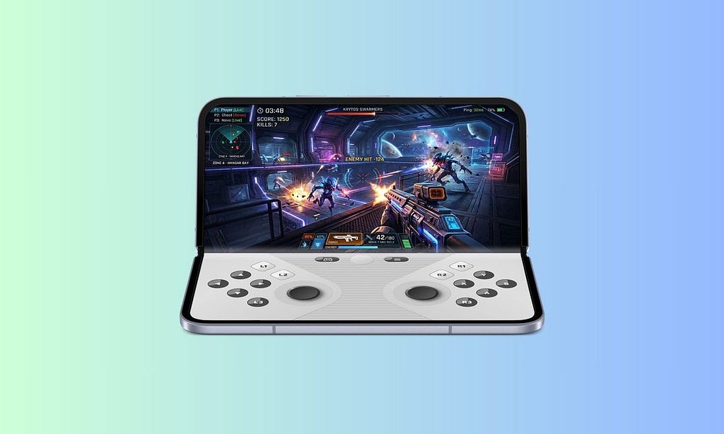
Half-open (tabletop)
The device is partially folded along the hinge in portrait orientation, which creates an upper and lower region.
- Upper region: Used for content, video, or information
- Lower region: Used for controls or additional interactions that correspond to the upper region
Example display layout:
- Upper region includes a video, and lower region includes the playback controls (how Netflix may appear)
Note: This state may not be needed for all experiences; it’s more of an enhancement if the product could benefit from supporting it (i.e., watching videos or playing games).
Half-open (book)
The device is partially folded along the hinge in landscape orientation, and creates two distinct regions in the left and right screens (like a split view).
This state works well for:
- Reading or reference content for related pieces of info
- List → detail views
- Navigation → content views
Example display layouts are similar to the “open” state, but content is divided by the device hinge. This can be used to run 2 apps simultaneously.
Adapt to changing configurations
A user can be in the middle of a task and decide to change their foldable’s orientation (landscape → portrait) or posture (folded → unfolded). When this happens, the app’s navigation, controls, sheets, and other interactive elements need to adapt while preserving the user’s context and maintaining platform conventions.
The same task should remain available across configurations, but you need to define how the presentation responds to best use the available space.
Navigation
Compact view:
- Use mobile navigation patterns (bottom nav, nav stacks, and back navigation)
- Keep frequently used navigation within reach
Expanded view:
- Use persistent navigation, navigation rails, or side navigation
- Do not stretch mobile navigation patterns across a large display
When the device changes configuration:
- Preserve the user’s current location, info hierarchy, and navigation state
- Don’t unexpectedly reset the navigation stack

Sheets, dialogs & overlays
Compact view:
- Use bottom sheets and full-screen presentations for focused tasks
- Keep actions within comfortable reach
Expanded view:
- Use centered dialogs, partial-width sheet, side panel, or secondary panes
- Don’t stretch a mobile sheet or dialog to fill the entire display
- Avoid placing important content or controls across the fold

Transitions
The transition animation from folded → unfolded should feel continuous and not increase cognitive load.
Prioritize:
- Preserve state and context
- Animate meaningful repositioning to keep the user’s focus
- Maintain content hierarchy
Avoid:
- Full-screen reloads or loss of scroll position
- Resetting navigation or form fields
- Abruptly changing the user’s task
Platform specific guidance
iOS
Apple’s new foldable guidelines introduce several concepts you should consider in your design process. Apple’s arrangement APIs help create layouts that dynamically respond to size and aspect ratio.
For these APIs to work best, you need to define layout rules, size classes, reserved regions, and how components reflow when the device state changes.
I. Use “size classes”
Size classes indicate how much horizontal and vertical space is available to an iOS app’s interface. For foldables, design around Compact and Regular size classes vs. creating custom designs for each pose.
- Compact: Horizontal=Narrow, Vertical=Short
- Regular: Horizontal=Wide, Vertical=Tall

II. Respect “reserved regions”
iPhone Duo has physical areas, called reserved regions, that can affect usable space. This is similar to safe areas (like the system UI) in Apple’s ecosystem, and includes the hinge and outer/inner display cameras.
Your design needs to account for the device’s reserved regions, hinge, and safe areas to determine what area is available to your app content.

Note: If you’re interested in learning more about designing for iPhone Duo, Apple has released some helpful, short videos (‘Get ready for iPhone Duo’).
Android
Android’s adaptive design guidelines are built around the available app window vs. physical screen size. The window size can change when a device is unfolded, rotated, or used in multi-window mode, so layouts must respond to the space available to the app.
I. Use “window size classes”
Android’s window size classes determine how your layout should adapt as the available app window changes; similar to iOS size classes.
- Compact: Narrow phone-sized window
- Medium: Larger phone or unfolded foldable-sized window
- Expanded: Tablet-sized or large foldable window

II. Design for “edge-to-edge” and window-insets
Android uses edge-to-edge layouts, with edge-to-edge enforced for apps targeting Android 15 (API 35) and later. Use window-insets to account for system UI and other areas, like camera cutouts, that can overlap your content. Window-insets are similar to the “reserved regions” in iOS.
Consider insets for:
- Status and navigation bars
- Display cutouts (cameras–placement differs per device manufacturer)
- System gestures (swiping left or right from the far edge → Android “Back” action)
- On-screen keyboard
Note: If you don’t have access to an Android device, you can download “Android Studio” and use the ‘Virtual Device Manager” to access Google Pixel devices ranging between form factors.
Foldable design checklist
Here are some questions to review as you create designs for all different types of device configurations. Once designs are implemented, it’s ideal to pressure test your app in each device configuration (folded, unfolded, half-open, split screen, & portrait/landscape orientations).
Layout
- Are maximum content widths defined vs. stretching?
- Does content reflow appropriately?
- Are different aspect ratios and orientations supported?
Fold / hinge
- Do important content and UI controls avoid the fold?
- Do dialogs and sheets avoid the fold?
- Are controls reachable in every configuration?
Navigation
- Does navigation adapt to available space?
- Does the user maintain their place when unfolding or folding?
- Is navigation still understandable when the window is resized?
Content
- Does content remain understandable when moved?
- Are text lines constrained for readability?
- Do images maintain appropriate aspect ratios?
Foldables aren’t just bigger screens. They introduce multiple ways for people to use the same device, and your app needs to adapt to those possibilities without making the experience feel unfamiliar or unexpected.
So please don’t stretch your app to fill the space. Design for the space that’s available.

Please don’t stretch your app for foldables was originally published in UX Collective on Medium, where people are continuing the conversation by highlighting and responding to this story.