Blog
Mastering Flexbox In Divi 5
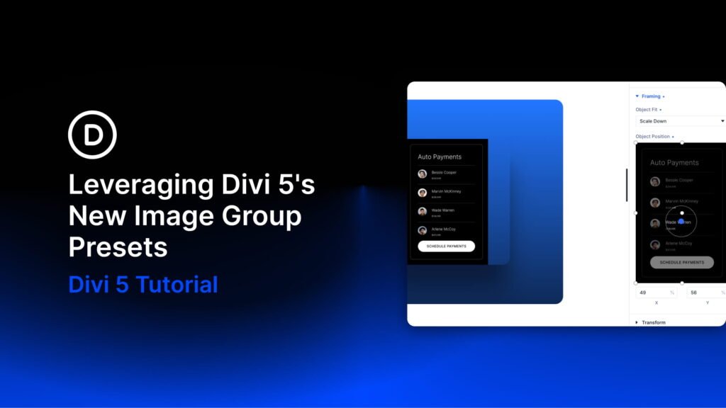
Welcome back to the Divi 5 Mastery Course. In Part 9, we built the core inner pages of the coworking website. Now, it’s time to dig deeper into the Flexbox Layout System that helped make those pages possible.
Divi 5 brings Flexbox controls directly into the Visual Builder, so you can manage spacing, alignment, wrapping, and distribution without writing custom CSS. In this post, you’ll learn how Flexbox works in Divi 5, what each major layout setting does, and how to build a simple responsive layout using those settings.
By the end, you’ll understand the main Flexbox settings and know how to use them to create cleaner, better-aligned sections across breakpoints.
Let’s dive in.
The Power Of Flexbox In Divi 5
Flexbox is best for one-dimensional layouts. That means it arranges items primarily in a row or a column while giving you control over alignment, spacing, distribution, wrapping, and order.
Throughout the coworking website, Flexbox helps power navigation bars, feature rows, testimonial cards, pricing tables, hero content, event rows, and more. It is especially useful when elements need to line up cleanly or respond gracefully as the screen size changes.
In Divi 5, Flexbox settings live in the Design > Layout option group for layout elements such as sections, rows, columns, and groups. These controls also work with your Design Variables and Presets, so spacing and layout choices can stay consistent across the site.
Flexbox Settings In The Divi 5 Interface
Select a layout element and go to the Design tab. Then, expand the Layout option group to reveal the available layout controls.
Here is what each setting does and how to use it.
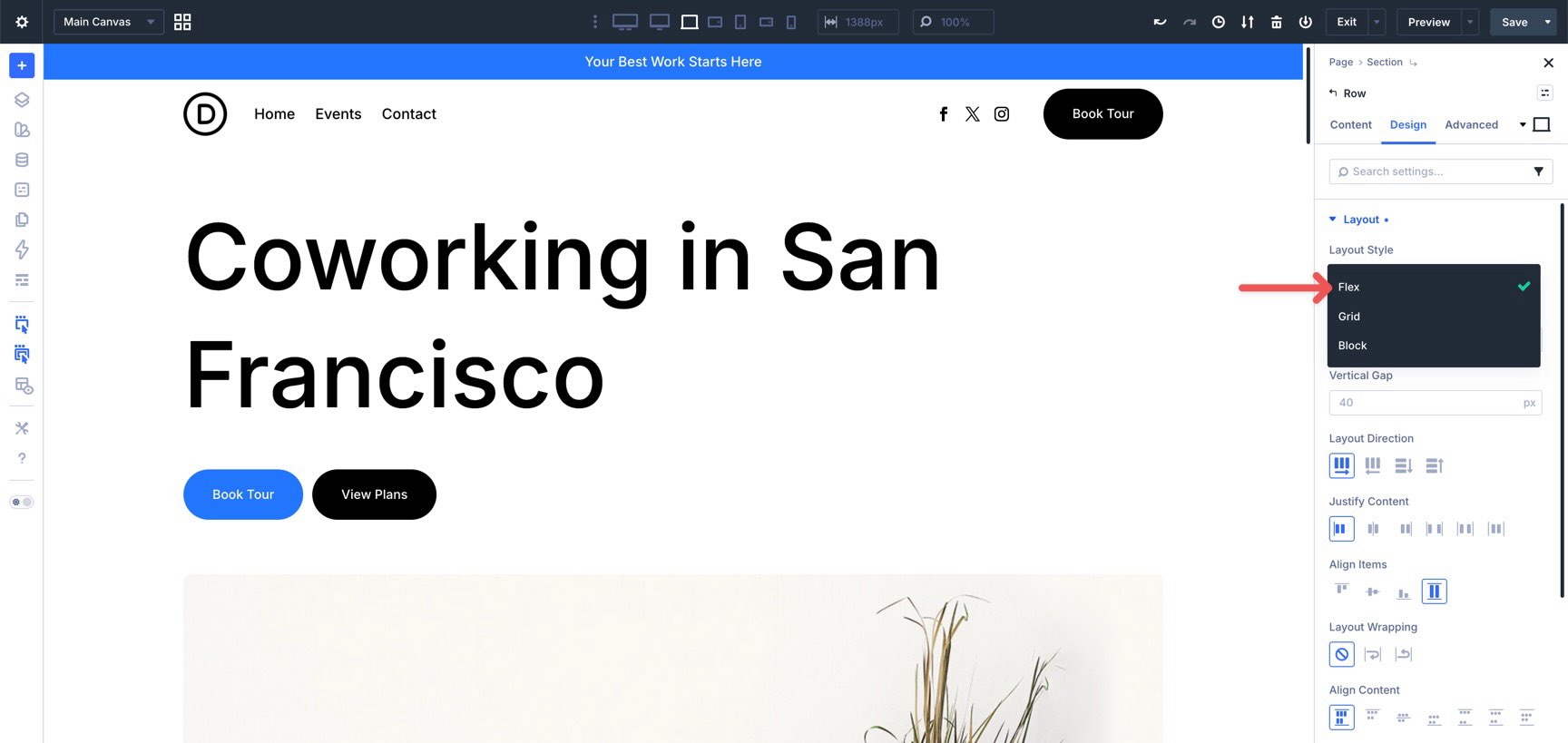
Layout Style
In Divi 5, the Layout Style setting lets you choose between Block, Flex, and CSS Grid, depending on the element and layout you are editing.
Block is the more traditional layout style. It is useful for simpler stacked layouts and legacy content. Flex is the layout style we’ll focus on in this post because it is ideal for row-based and column-based alignment. CSS Grid is better for two-dimensional layouts where you need more control over rows and columns at the same time.
We’ll explore CSS Grid in more detail in Part 11 of the Divi 5 Mastery Course.
To work with Flexbox, select Flex under Layout Style. Once Flex is selected, the Flexbox-related settings appear below.
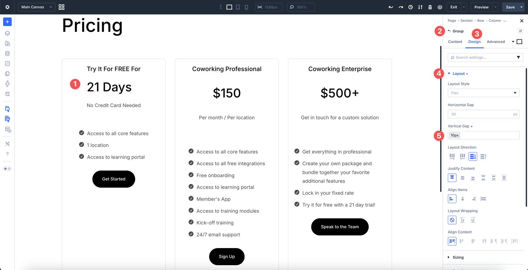
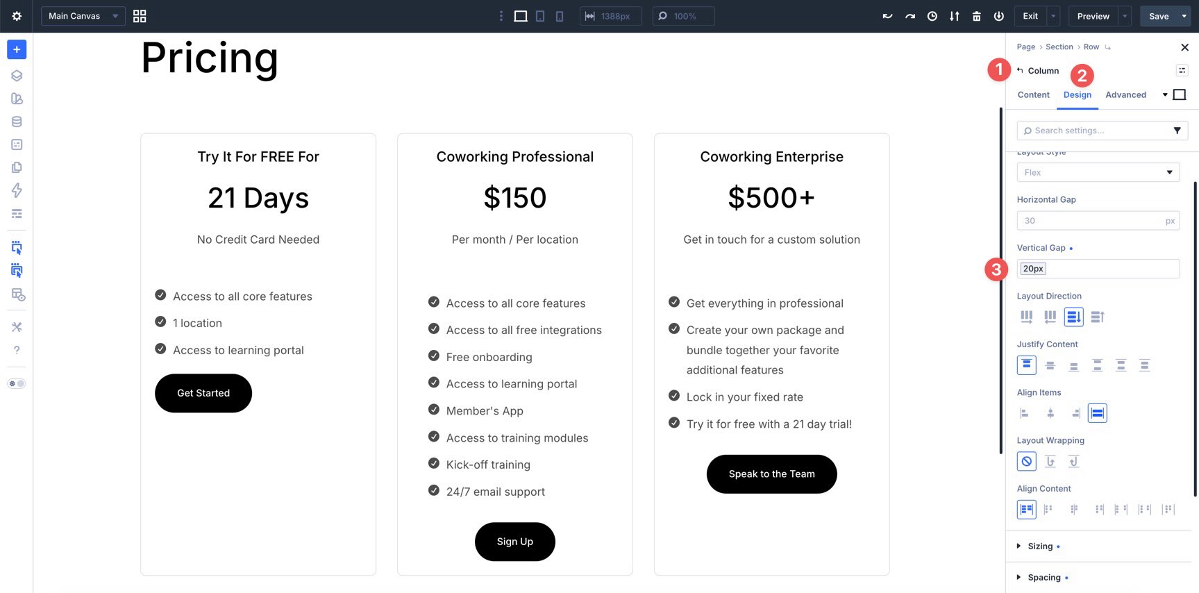
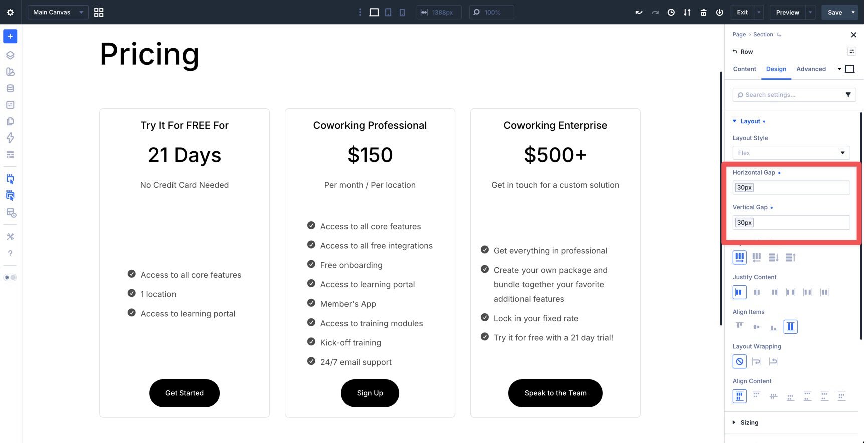
Horizontal And Vertical Gap
Divi 5 includes built-in Gap controls for spacing between child elements. Instead of adding custom margin or padding to every module, you can set spacing once at the container level.
Horizontal Gap controls the space between items placed side by side.
Vertical Gap controls the space between items stacked from top to bottom.
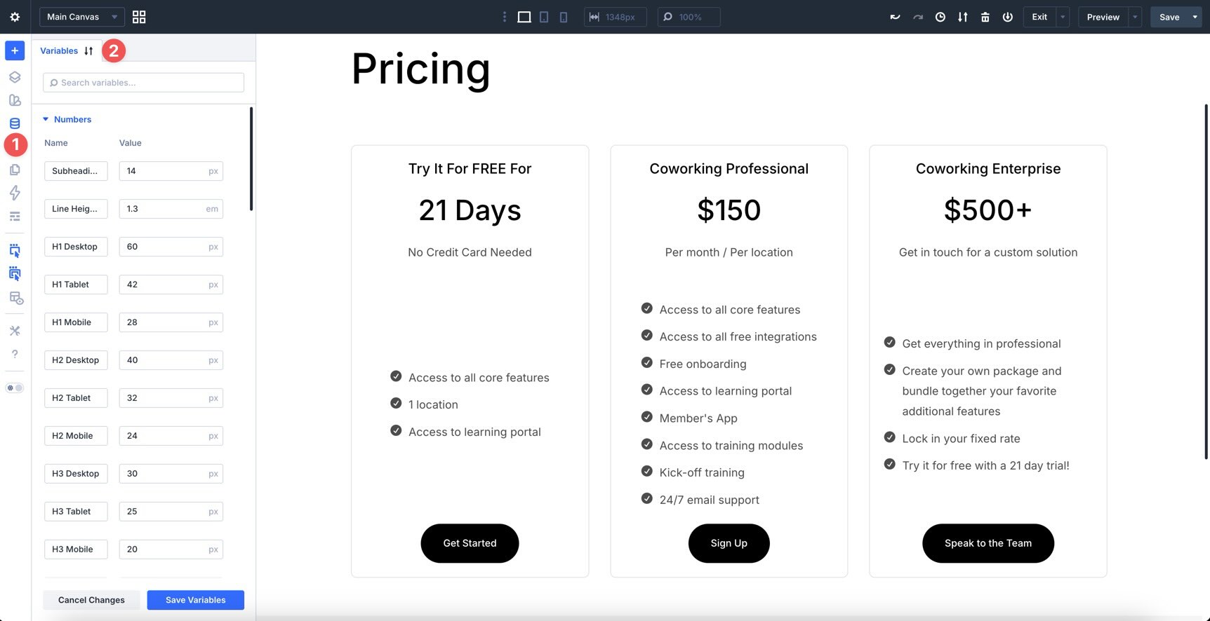
Both fields support Advanced Units, such as px, %, rem, and vw. You can also use Design Variables, like the spacing values we created in Part 3.
Using Horizontal and Vertical Gap is one of the simplest ways to keep spacing consistent across rows, columns, and groups.
Layout Direction
Layout Direction controls the main axis of a Flex container. In other words, it determines the direction child elements flow.
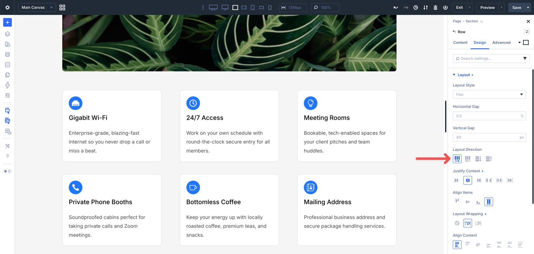
The available options are:
- Row (default): Items flow horizontally from left to right.
- Row Reverse: Items flow horizontally from right to left.
- Column: Items flow vertically from top to bottom.
- Column Reverse: Items flow vertically from bottom to top.
Switching from Row to Column is one of the most common Flexbox changes you’ll make in Divi 5. For example, a row of feature blurbs can sit side by side on desktop and stack vertically on smaller screens by changing the layout direction at the appropriate breakpoint.
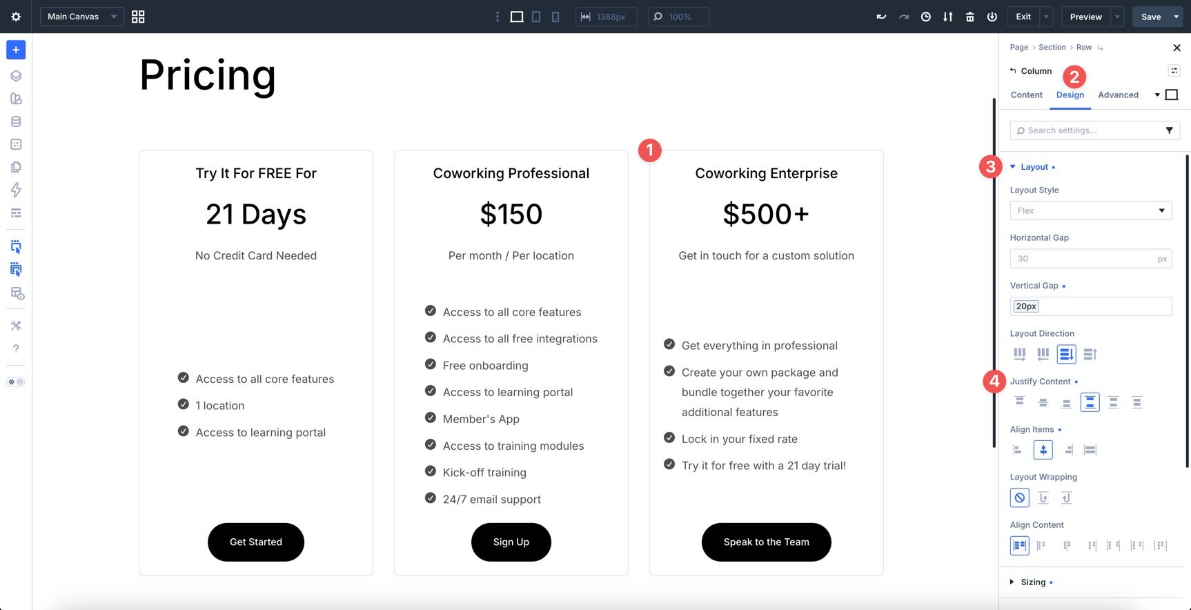
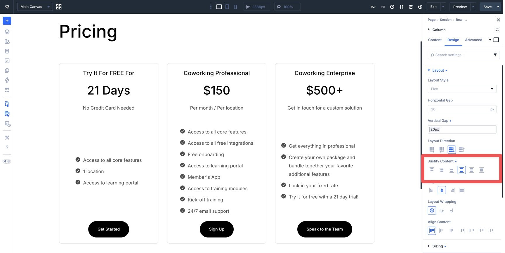
Justify Content
Justify Content controls how items are distributed along the main axis of a Flex container. When the Layout Direction is set to Row, it controls horizontal distribution. When the Layout Direction is set to Column, it controls vertical distribution.
The available options are:
- Start: Aligns items to the beginning of the main axis.
- Center: Centers items along the main axis.
- End: Aligns items to the end of the main axis.
- Space Between: Distributes items with space between them and no extra space at the outer edges.
- Space Around: Adds space around each item.
- Space Evenly: Adds equal space between items and at the outer edges.
One commonly used option is Space Between. It works well for headers and navigation layouts where you want a logo on one side and Link modules, buttons, or other navigation elements on the other.
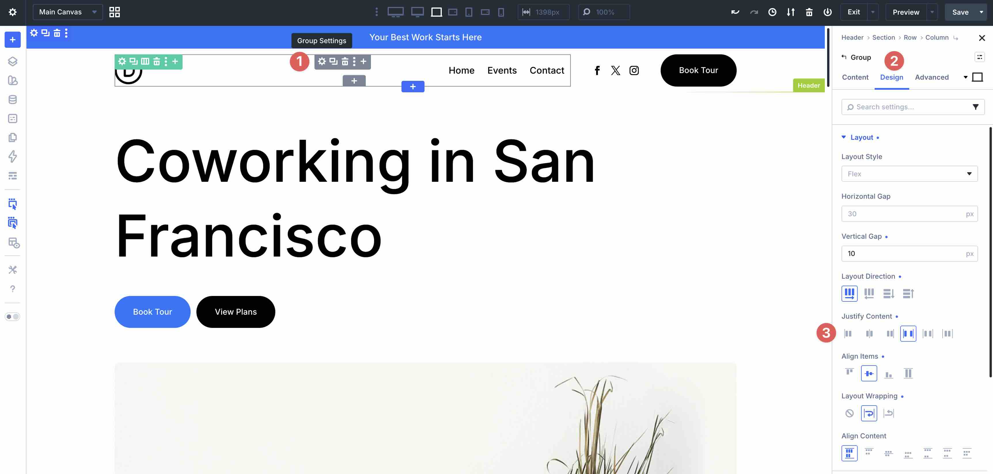
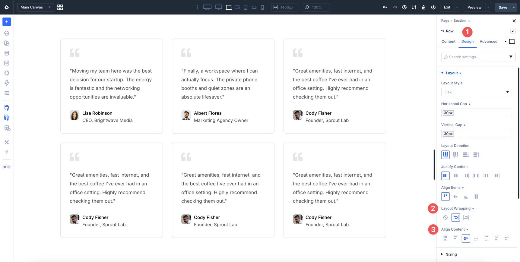
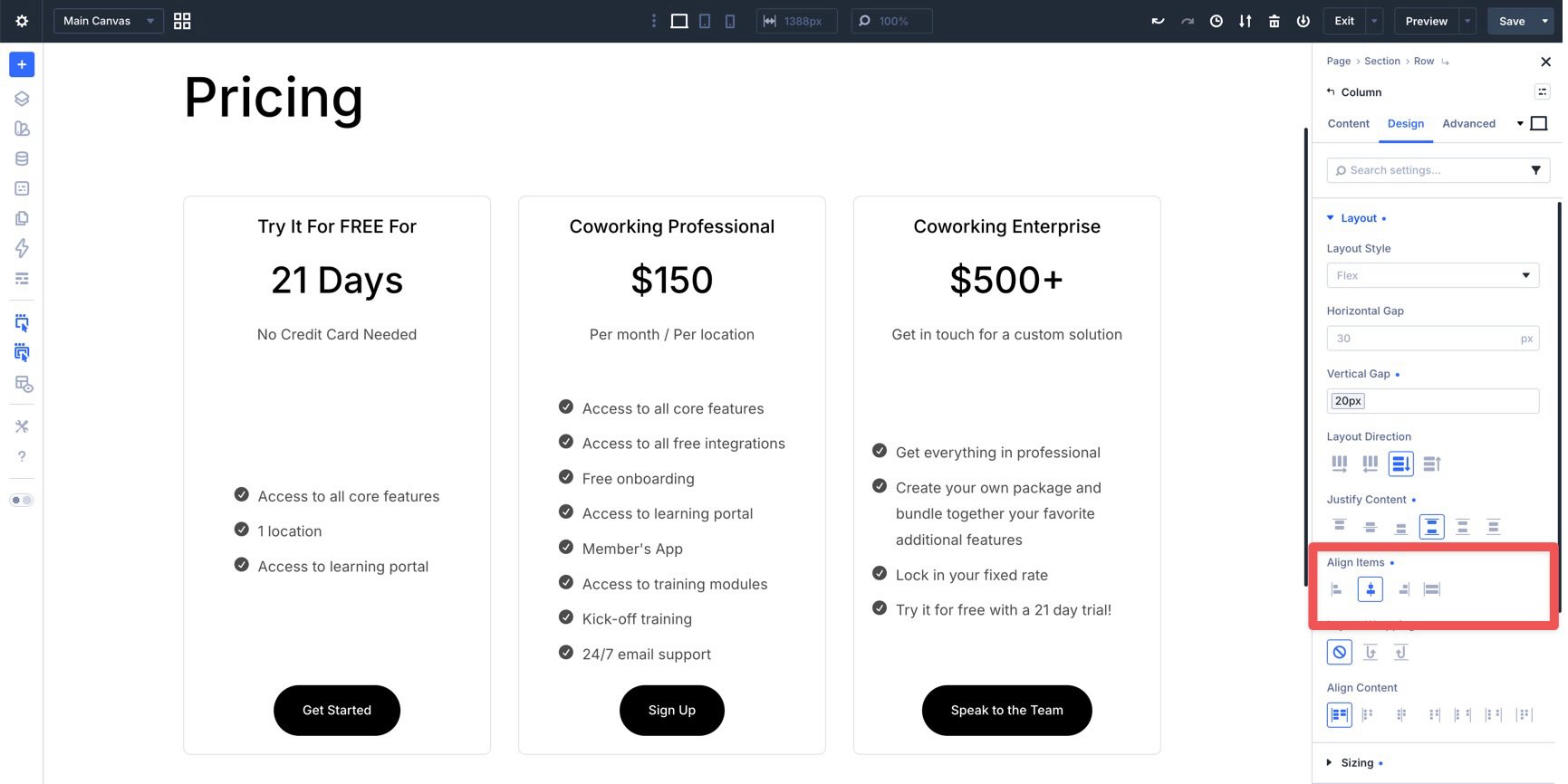
Align Items
Align Items controls how child elements align along the cross-axis. In Row direction, it controls vertical alignment. In Column direction, it controls horizontal alignment.
The main options are:
- Start: Aligns items to the start of the cross-axis.
- Center: Centers items along the cross-axis.
- End: Aligns items to the end of the cross-axis.
- Stretch: Stretches items across the available cross-axis space.
Stretch is especially useful for card layouts. When the parent container allows it, Stretch helps child elements match the available height, making cards look more balanced when their content lengths vary.
Layout Wrapping
Layout Wrapping determines whether Flex items stay on one line or wrap to additional lines when there is not enough room.
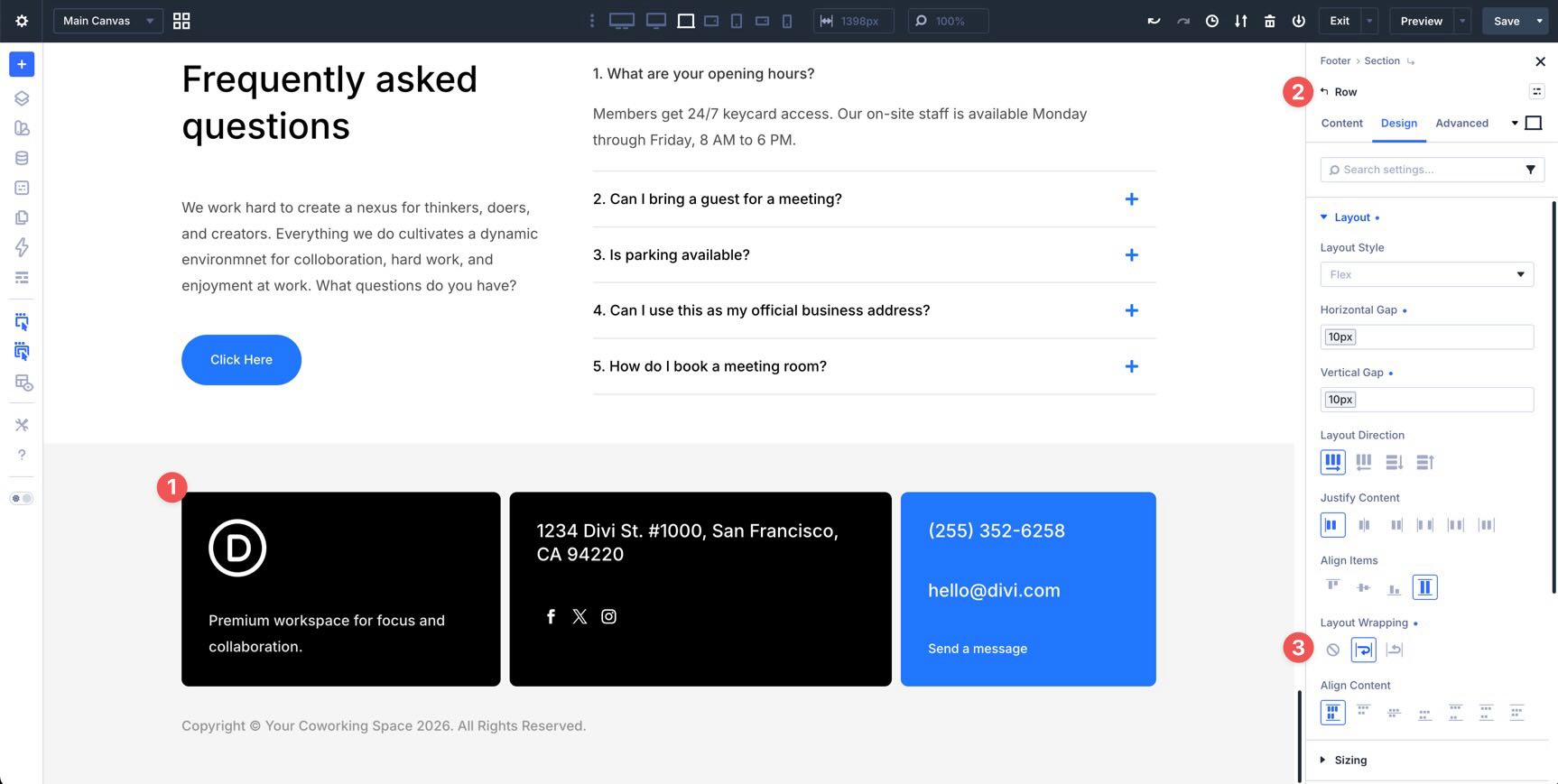
The available options are:
- No Wrap: Keeps items on a single line.
- Wrap: Allows items to move to additional lines when space runs out.
- Wrap Reverse: Allows items to wrap in the reverse direction.
Wrapping is important for responsive design because it lets layouts adapt naturally as the available width changes. For example, a row of cards can appear in multiple columns on desktop and then wrap into fewer columns on smaller screens.
Align Content
Align Content controls how wrapped lines align along the cross-axis when there is extra space in the container. It only becomes relevant when Layout Wrapping is set to Wrap or Wrap Reverse and the container has multiple lines of items.
Its options are similar to Justify Content and include Stretch, Start, Center, End, Space Between, Space Around, and Space Evenly.
Align Content is most useful in multi-line Flex layouts. For example, if a card layout wraps to two or more rows and the container has extra height, Align Content can control how those rows sit within the available space.
Building A Layout With Flexbox
Now, let’s use these Flexbox settings to create a simple three-column layout. Start by adding a new three-column Row to a page. In the Design tab, expand the Layout option group and confirm that Flex is selected in the Layout Style dropdown.
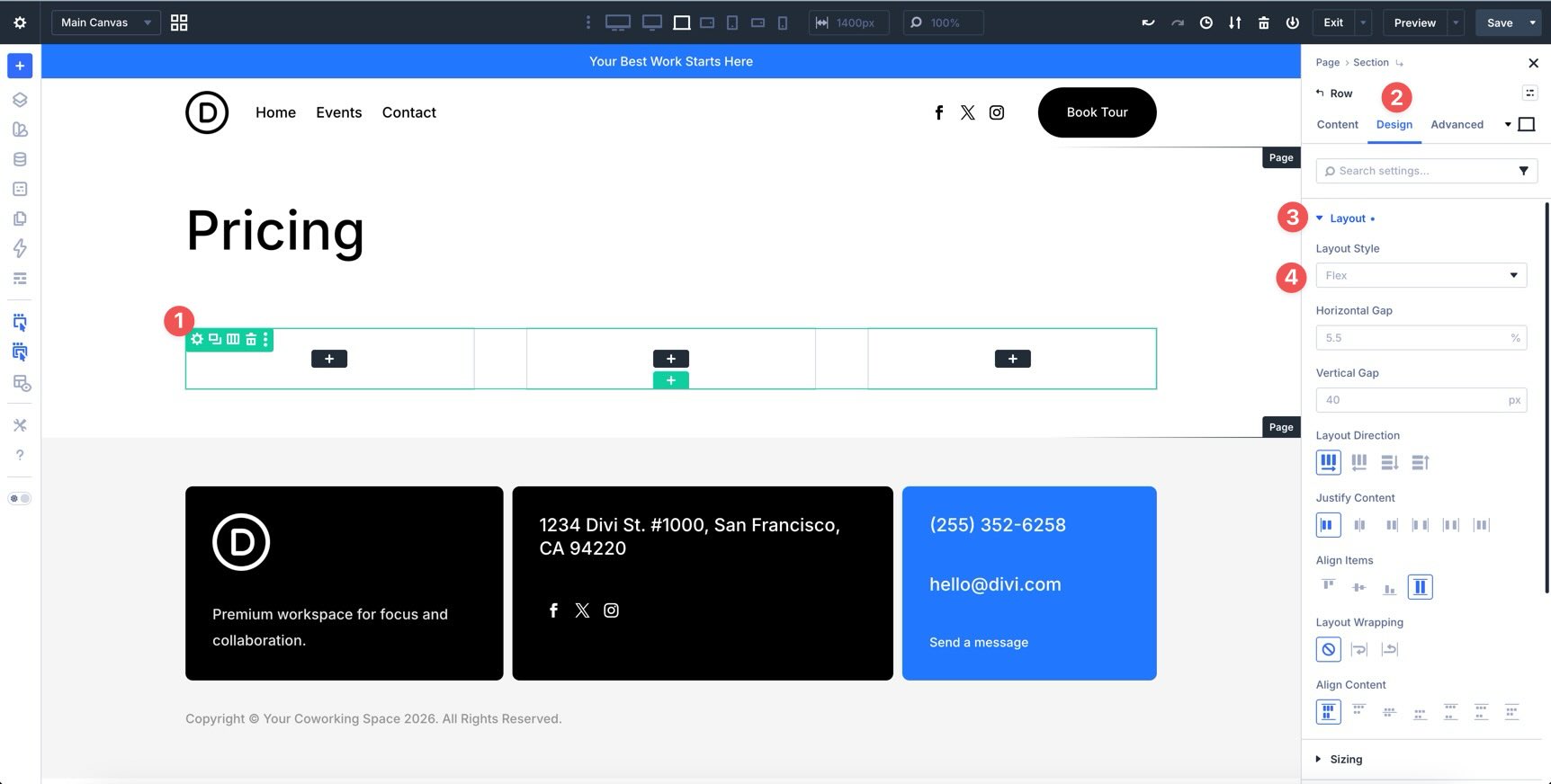
Set The Row Gap
Next, adjust the Horizontal and Vertical Gap for the Row. Hover over the Horizontal Gap field to reveal the Insert Dynamic Content icon.

Select the Spacing – Medium variable from the list and apply it.
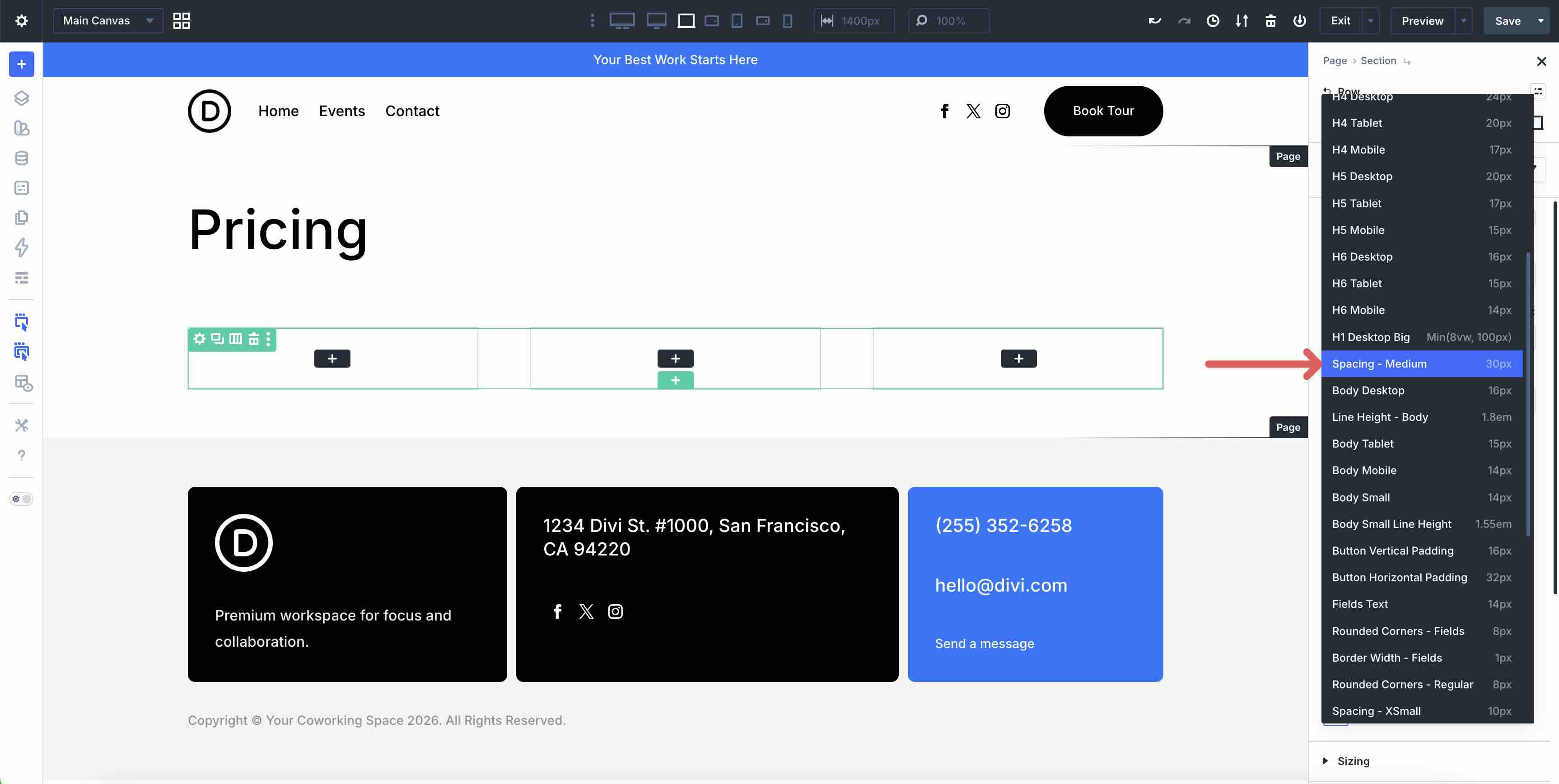
Repeat the same process for the Vertical Gap field.
Style The Columns
Next, add spacing and border styles to each Column. Start by editing the first Column.
Go to the Design tab and expand the Spacing option group. Click the Link icon in the Padding field so all four sides stay connected. Then, use the Insert Dynamic Content icon to apply the Spacing – Small variable to the padding value.
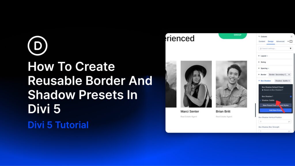
Next, hover over the Border option group to reveal the Assign Presets icon. Assign the Outlined – Dark Option Group Preset.
Copy Column Styles With Attributes
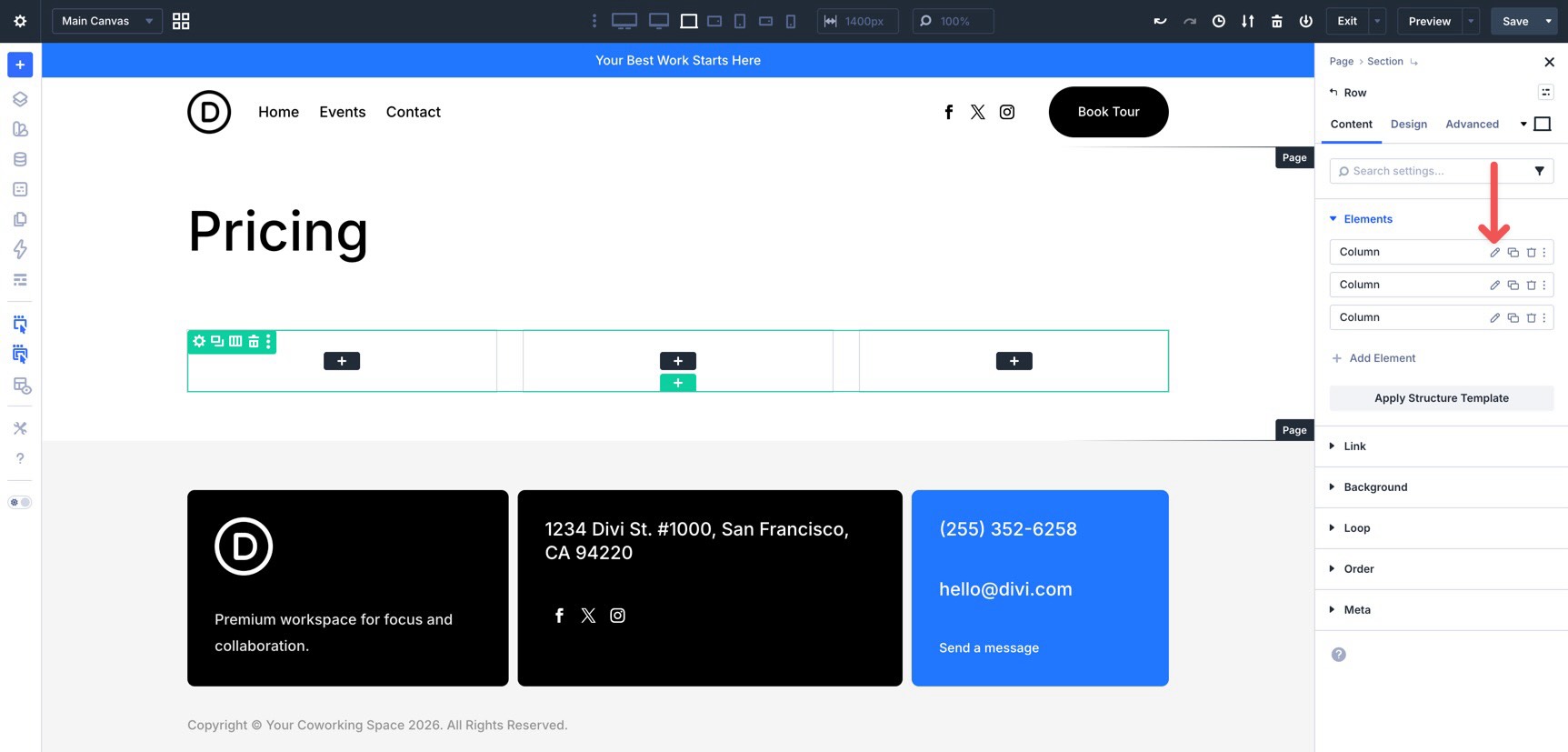
Now that the first Column has the correct spacing and border styles, use Divi’s right-click Attributes menu to apply those styles to the remaining Columns.
Right-click the first Column in the canvas and select Copy Attributes.
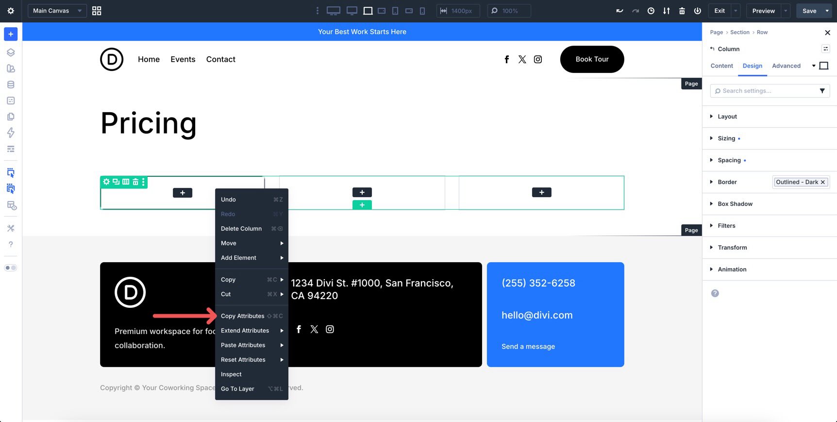
Next, right-click the second Column. When the Attributes menu appears, select Paste Attributes, then choose Paste Column Design Attributes. This copies the design-related styles from the first Column and applies them to the second.
Finally, right-click the third Column and paste the same design attributes again.
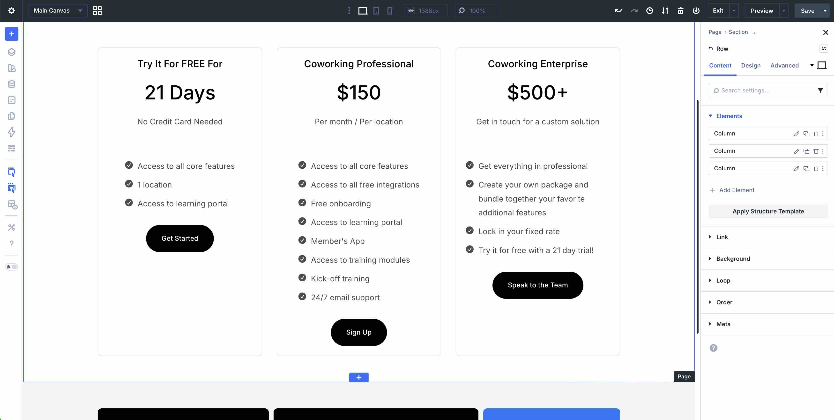
Add Content To The Columns
Now, add content to the first Column. Start with a Module Group. Inside the Group, add two Heading modules, one Text module, and one Divider module.
Outside the Group, but still inside the first Column, add an Icon List module and a Button module. Use the Presets and Variables created earlier in the course to keep the design consistent.
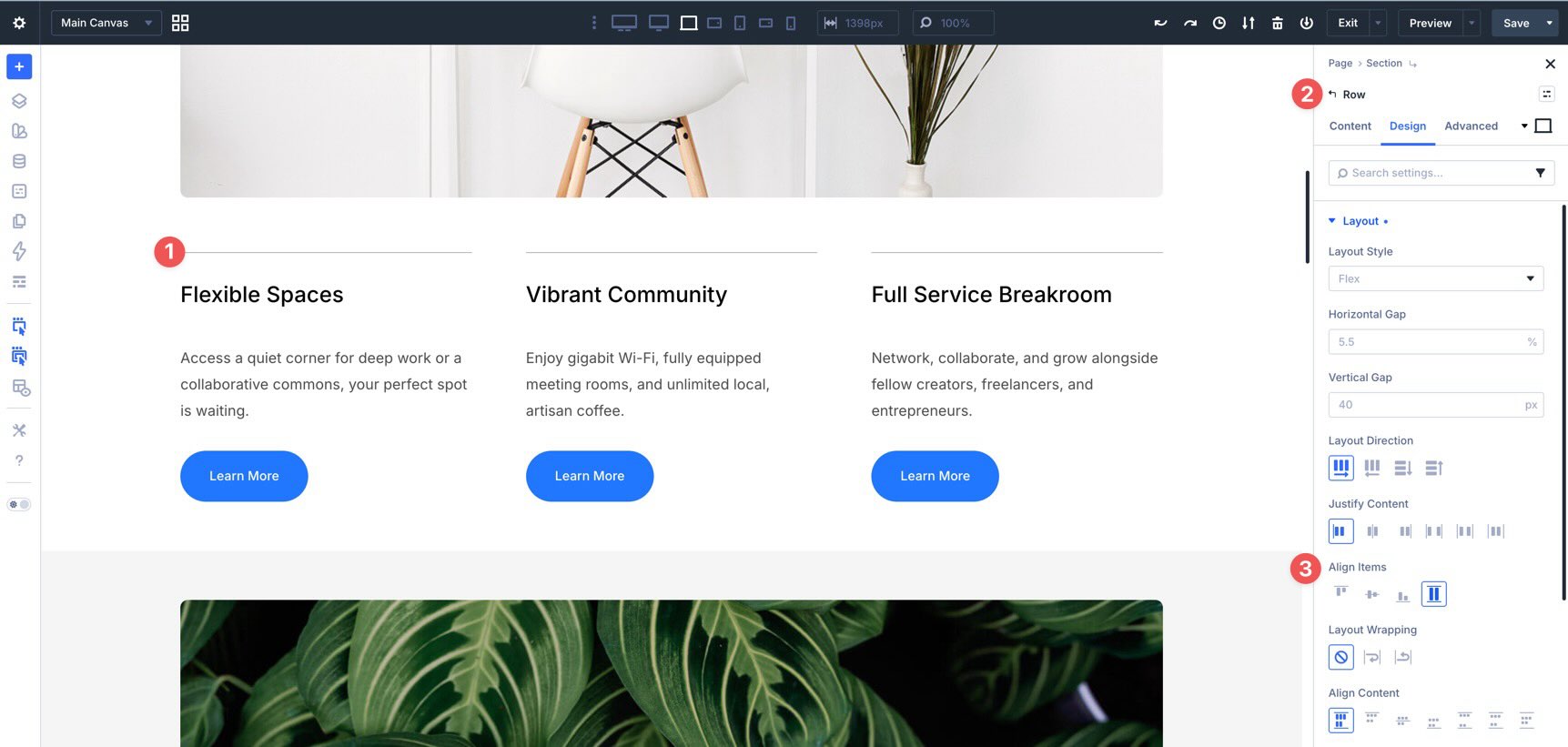
Fill the remaining Columns with similar content. Before applying more Flexbox settings, the layout should look similar to the image below.
Adjust Group And Column Gaps
Start by adjusting the vertical spacing inside each Group. Open the first Column’s Group module and go to the Design tab. Expand the Layout option group and apply the Spacing – XSmall variable to the Vertical Gap field. Repeat the same process for the remaining Groups.
Next, open the first Column’s settings and go to the Design tab. Expand the Layout option group and apply the Spacing – Small variable to the Vertical Gap field. Repeat the same process for the remaining Columns.
At this point, the top of the layout is aligned, but the Button modules at the bottom of each Column may not line up because the content lengths vary. To fix that, adjust the Justify Content setting on the Columns that need it.
In the first Column, set Justify Content to Space Between. This keeps the Group module at the top of the Column while pushing the Button module to the bottom.
Repeat the same adjustment for the third Column. Once Space Between is applied where needed, the Button modules align more consistently across the Row.
Make Responsive Adjustments
Before finishing the layout, check how it responds across different screen sizes. Divi 5 gives you several tools for this, including Structure Templates, Customizable Responsive Breakpoints, and the Responsive Editor.
If you want to test more screen widths, open the breakpoint controls in the Top Bar and enable the additional breakpoints you need. Divi 5 supports up to seven customizable breakpoints.
Next, open the Row containing the three-column layout. Cycle through the active breakpoints to see how the layout behaves. When a breakpoint needs adjustment, use Apply Structure Template in the Elements option group to change the Row structure for that screen size.
You can also use the Responsive Editor to adjust Column alignment when the Columns stack vertically. Open the first Column’s settings, go to the Design tab, and expand the Layout option group.
Hover over the Align Items field to reveal the Edit Responsive Values icon. Select it and set Align Items to Center at the relevant breakpoint. Repeat the same process for the remaining Columns.
Fine-Tune Column Widths
After the Columns are aligned, you may want more control over their widths. For example, at the Tablet Wide breakpoint, the stacked layout may leave more white space than you want.
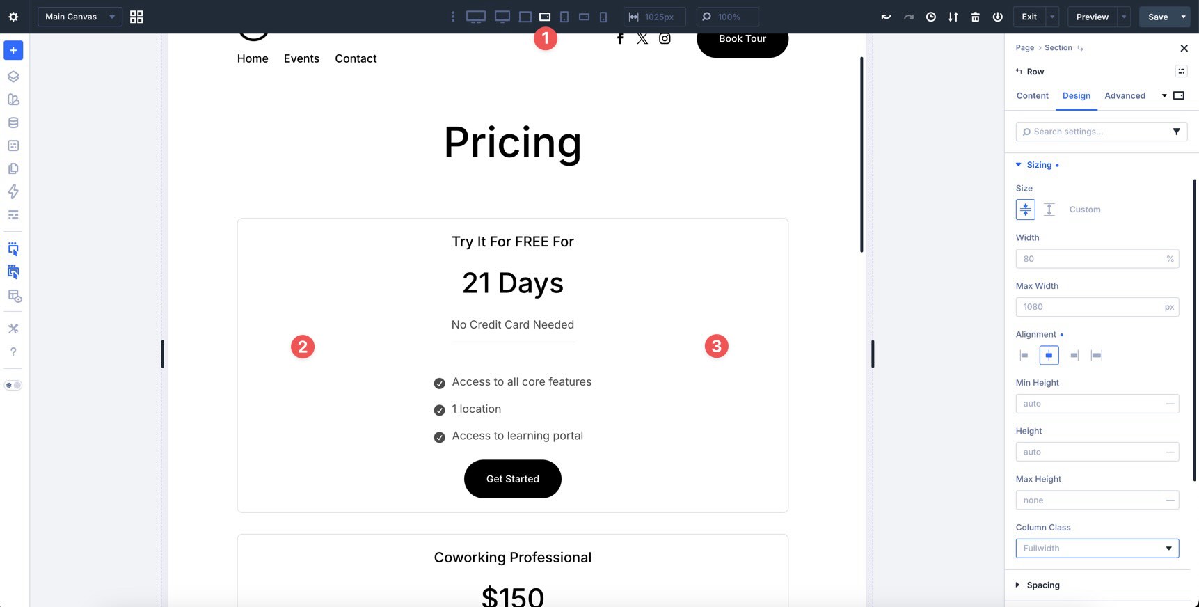
To adjust a Column’s width, open the Column settings and go to the Design tab. Expand the Sizing option group and locate the Column Class field. Click the dropdown caret inside the field to reveal the options.
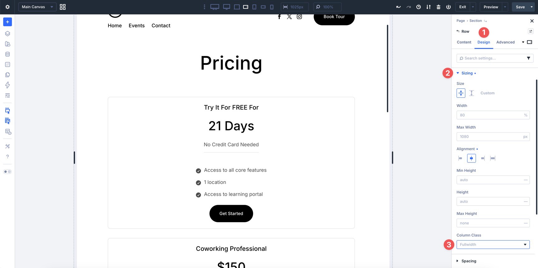
Choose 1/2 from the available options.
Reorder Elements Responsively
Sometimes, the visual order you want on desktop is not ideal on mobile. Divi 5 lets you adjust display order from the Order option group.
Click into the third Column in the layout. Expand the Order option group to reveal the Display Order field.
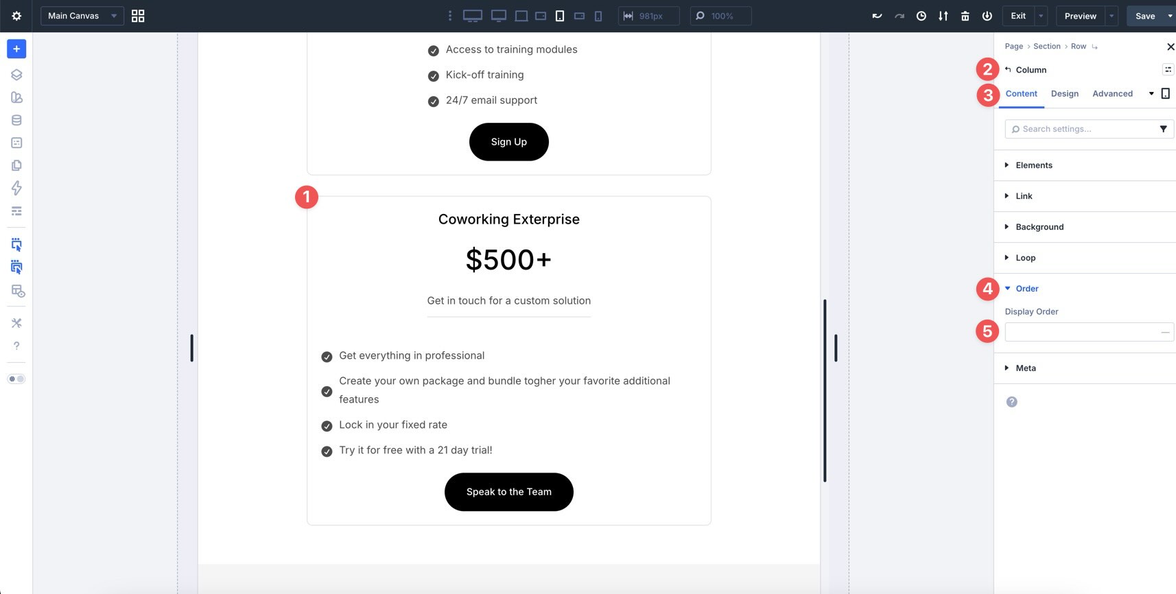
Setting the field to -1 moves the third Column earlier in the Row’s visual order at the breakpoint where that value is applied.
Tips And Best Practices
Now that you have built a Flexbox layout, here are a few ways to work faster and get more predictable results in Divi 5.
Start With Gap Controls
Use Horizontal Gap and Vertical Gap before adding custom margins to individual modules. Setting spacing at the container level creates more consistent rhythm across rows, columns, and groups.
Use Space Between For Card Layouts
Justify Content > Space Between is useful when you want content to sit at the top of a card and a button to stay aligned near the bottom. This works especially well when cards have different amounts of text.
Use Stretch For Equal-Height Cards
For equal-height elements, such as feature blurbs, pricing cards, or service cards, use Align Items > Stretch on the parent container when appropriate. This can help child elements share a consistent height.
Use Design Variables For Spacing
Combine Flexbox settings with the Design Variables you created earlier in the course. When gap, padding, and width values reference variables, layout updates are easier to manage later.
What’s Coming Next
In this part of the Divi 5 Mastery Course, you learned how Flexbox controls spacing, alignment, direction, wrapping, and distribution inside Divi 5. You also built a three-column layout that uses gap controls, Design Variables, Attribute Management, responsive structure changes, and display order.
Next, in Part 11, we’ll explore two-dimensional layouts with CSS Grid. You’ll learn when Grid is a better fit than Flexbox and how the two systems work together for modern web design.
If you have not already, download the latest version of Divi 5, explore Flexbox, and start building. Let us know what you think by leaving a comment below or reaching out on our social media channels.