Blog
Becoming an AI-native designer
On demos, tacit knowledge, and building your own scaffolding
I’ve spent seven years in the design industry. Strip away the user research and product definition, and the core task was always the same: draw things. Wireframes, visual specs — hand them to engineering, then wait.
I was essentially a translator.
Translating requirements into ideas, ideas into files, and then waiting for someone else to translate those files into code.

That changed in 2024.
My main tools now are Claude Code, Figma Make, and LLMs. They’ve rebuilt how I work from the ground up.
- I replaced static deliverables and Figma prototype flows with working demos.
- Instead of digging through component libraries, I connect my design system to Claude Code and have it generate the interface.
- I run research and synthesis inside ChatGPT projects.
In this process, I’m no longer a translator. I’m more like a conductor: issuing direction, converting my intent and experience into tasks AI can execute, then applying a senior designer’s judgment to evaluate what comes back. For the parts that matter most, I’m still hands-on.
Seven years of experience haven’t become obsolete. They’ve just moved.
The skills are the same, where they apply is different.

i. Developing a “design sense” inside code
Designers have always carried a particular frustration: you can imagine it, but you can’t build it. Or more precisely: what you produce and what actually runs are never quite the same thing.

Figma is a great tool. It slows you down and forces you to think, because it’s a middle layer. The instincts you develop there are spatial and visual — you sense change by dragging shapes around. That’s fundamentally the same as sketching on paper.
In a real product, design sense lives in systems and time: how the interface behaves when real data flows in, the easing of an animation, the logical chain between one interaction and the next. These are different muscles entirely.
So how do you develop design sense inside code?
Externalize Your Tacit Knowledge ↘
AI coding has dramatically lowered the cost of a first draft. The hard part now is generating a high-quality first shot — and then iterating effectively from there. What that actually tests is whether you can transmit your tacit knowledge to the AI.
AI understands the world’s explicit knowledge: things you can Google, documentation that’s been written down, concepts that have been named and structured. But most of what you bring to your work is tacit — accumulated through years of practice. It’s more like a personal knowledge graph: some of it is public, but a lot of it is uniquely yours. Hidden reasoning behind your calls. Intuition that tells you why something is right without being able to fully explain it. If you can’t transfer that, AI output will be generic.
The 3C framework helps: Context, Components, Criteria.

Context is everything the AI can see.
You need to transmit the full background of your project — what you’re building, who it’s for, what constraints exist, what decisions have already been made. For ongoing projects, I keep a context file in the project folder that the AI reads every session and that I update as things evolve.
Components are the tools you hand the AI to do the job.
LLMs have reasoning and retrieval built in — but for specialized work (code review, frontend design, unit testing), they need more specific scaffolding. That’s when you pull in the right Skills or configure MCP. The point: don’t assume the AI already has everything it needs to complete your task. You have to hand it the tools.
Criteria is how you define output quality.
It’s not just about telling the AI what to generate — equally important is telling it what not to generate. Negative constraints are often more effective than positive instructions. Set specific standards for format, style, and accuracy, and build in a mechanism for the AI to self-evaluate. After generating a UI, I’ll ask it to check: did it default to blue-purple? Did it reach for Arial? A quick self-audit for whether it’s produced AI slop.
With these three layers in place, the judgment calls that live in your head — the ones you’d struggle to articulate out loud — can be transmitted clearly. The output quality shifts noticeably.
Actually Run It Yourself ↘
Watching someone do something and doing it yourself are completely different experiences. There are endless AI tutorials out there right now, but the only real way to learn is to build something.

Specifically: have the AI generate a project architecture and watch how it organizes files and modules. Ask it to write tests and observe how it handles edge cases. Follow an error message down the stack until you understand what it’s actually saying. After you’ve run through this once end-to-end, you’ll find that a lot of the technical fear you had was imaginary.
More importantly — you can only develop your own general rules by doing specific things. For example: when an agent keeps circling the same bug without breaking through, you can bring in a different AI for a fresh perspective and escape the failure loop. That kind of judgment can be learned from others, but it mostly comes from accumulation.
After vibe-coding five products, you start to feel a faint “sense of the material.” It’s essentially muscle memory built on states.
ii. Redesigning the Design Process
Jenny Wen, Design Lead for Claude, argued on Lenny’s Podcast that the traditional design process — research, diverge, converge, deliver — is dead. Specifically:
- Engineering velocity has outpaced linear design workflows
- Designers no longer have time to “obsess” over static visual specs
- Long-horizon “design vision” has become impractical
https://medium.com/media/ed12ed42aeff7c8d6412736ef4759b2a/href
From this view, the death of the design process looks like it was forced by engineering’s dramatically expanded execution capacity — with a bit of tech industry hyperbole mixed in.
The traditional diverge-converge flow hasn’t actually failed.
The problem is that it assumed each step required significant upfront preparation before moving to the next, because the cost of making a mockup or demo was high. That assumption no longer holds.
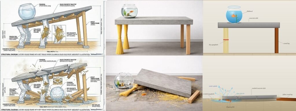
Intuition → Demo → Inevitability ↘
In the past, rigorous upfront research was necessary because building something verifiable was expensive. Now that cost is close to zero. The entire game has changed.
Experienced product thinkers can rely on intuition to generate a demo, then use that demo to pressure-test their judgment — instead of talking in circles at a whiteboard about whether a direction is right.

More critically, a demo running in a real browser carries a special kind of persuasive weight. Cleo, a former Facebook designer, calls it the “Aura of Inevitability.” When a design concept is no longer a static visual spec but something built in real code that actually runs, it takes on a kind of gravity. In that situation, it becomes very hard for a team to argue about whether to pursue something — because it nearly exists already.
The natural response is: we can probably ship this.
A static file can’t do that. Only a working prototype has that weight.
Return to First Principles ↘
Before AI, most designers had limited real exposure to how software works at a deeper level. We mostly operated at the abstraction layer: visuals, interactions, information architecture.
That was a threshold gap.
Just getting the design right and the prototype running consumed most of the available energy. There wasn’t room to go deeper.
What AI changed is precisely that ratio. It compressed the cost of “how to build it” to near zero, and in doing so, returned time and cognitive resources to designers. We can now spend more energy on the more fundamental question: what should this thing actually be?

And when you start seriously asking “what is it,” first principles thinking becomes sharp. This question has two layers.
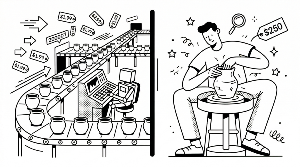
The first is the core concept of the product — the underlying form in which the software presents itself. TikTok is fundamentally an auto-looping video list. Notion’s core is the block: pages and databases. Cursor’s core is the agent, the editor, and the model. These concepts seem simple. But you can only find the leanest, most flexible connections between features by seeing through to them.
The second layer: once you understand the foundation, you can start to derive what a product should ideally be, growing logic from the inside out, rather than checking off feature lists against competitors, making choices inside someone else’s map.
This kind of understanding gives designers real space to explore what a product can become at its outer limit.
iii. Building Your Own Scaffolding
Every designer hits points where the workflow has friction, where the tools don’t quite fit. The old options were: tolerate it, or throw more manual effort at the problem. Waiting for a new tool to appear was a luxury. Most of the time, you just made do.
Now, designers can bootstrap their own tools — custom scaffolding built around the specific task at hand.

My own example: finding icons used to mean hunting across the web every single time. Classic repetitive drain.
I eventually built a dedicated icon library using Figma Make, pulling together open-source icon sets from across the web, with controls for color, weight, and style, and direct export to PNG or SVG. Something that used to happen every time now happened once. It’s the smallest possible unit of scaffolding. But it genuinely eliminated friction from that step.
Build a production-ready Icon Library documentation site.
## Tech Stack
React + TypeScript · Tailwind CSS v4 · shadcn/ui
lucide-react for UI · WCAG 2.1 AA · Mobile-first
## Core Features
1. ~100 icons in 8 categories (UI & Nav, Communication,
Media, Commerce, Social, Weather, Dev, Misc)
2. Fuzzy search + multi-select category filter
3. Size selector (12/16/24/40px) + stroke slider (1–3px)
4. Copy SVG / JSX · Download PNG / SVG per icon
5. Light + dark theme (system preference)
6. Guidelines page with specs, accessibility, code examples
## Layout
Sticky header · Sidebar w/ category counts · Control bar
Responsive icon grid (1→2→4 cols) · Footer v1.0.0
## Icon Data Shape
{ id, name, category, tags[], svg (24×24 viewBox) }
## Deliver
Static site · All features working · Clean, typed code
No backend needed · Easy to extend with more icons
Ryo Lu, Head of Design at Cursor, did something similar at a larger scale. He mentioned that designers are constantly blocked by complex backend servers and production environments — so he built Baby Cursor for himself: a highly simplified, stripped-down sandbox (miniature environments) that let him validate ideas quickly without those constraints getting in the way.
https://medium.com/media/704aaa7d237406b61e32f16293a2e99a/href
The reusable principle: when you find a step in your workflow that repeatedly drains energy and is repetitive by nature, that’s the signal to build a tool. Spend the one-time cost to set it up, and everything saved after that is time you can spend on judgment and creation.
This used to require knowing how to code. That barrier is gone.
Writing this, I realize that I’ve been saying the same thing in different ways throughout:
AI hasn’t made designers less important. It’s made the question of who the designer is more important than ever.
Anyone can use the tools. What you build with them depends on who you are.

📖 Further reading
- How AI is Changing Design Workflows — Dive Club
- First of Kind › Ryo Lu: The Way — First of Kind
- The design process is dead. Here’s what’s replacing it. — Lenny’s Podcast
- Design with Claude Code: The Designer’s Guide — UI Collective
Hey, want to become an AI-native designer?
Join my newsletter for practical tools, real design workflows, and no-code tutorials.
Becoming an AI-native designer was originally published in UX Collective on Medium, where people are continuing the conversation by highlighting and responding to this story.