Blog
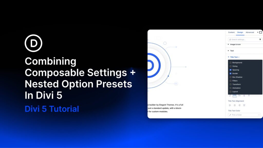
How To Build Custom Sidebar Navigation With Divi 5 Interactions
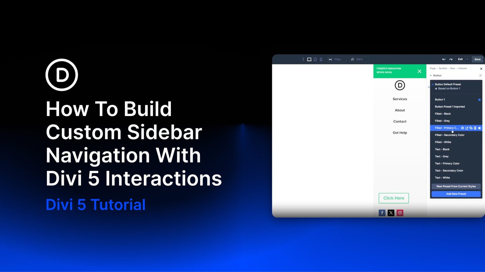
Side navigation is a familiar pattern because it keeps the main header simple while still making a full menu available when needed. It is common on mobile, but it can also work well on desktop when a design calls for a minimal header with a logo and hamburger icon.
Subscribe To Our Youtube Channel
Divi 5 brings a few native features together to make this kind of layout possible. The Theme Builder handles the global header, a global Canvas stores the off-canvas sidebar, and Interactions control the open and close behavior between them.
In this tutorial, we’ll build a minimal top header with a logo and hamburger icon. Then we’ll create a separate sidebar panel as a global Canvas, complete with a dynamic menu powered by the Loop Builder, a CTA button, and social icons. Finally, we’ll hide the sidebar by default and use Interactions to toggle it from both the hamburger icon and the close icon. Design Variables will keep shared values consistent, and Custom Attributes will help add basic accessibility metadata.
How The Pieces Fit Together
Before building, it helps to understand the structure. This tutorial uses two canvases.
The Main Canvas is the global header template in the Theme Builder. It appears across the site and contains the fixed top header with a logo and hamburger icon.
The Global Canvas is a separate reusable Canvas named Sidebar Navigation. It contains the sidebar panel, including a greeting bar with a close icon, a logo, a looped menu, a CTA button, and social icons.
Once both canvases are built, the sidebar Canvas is appended to the main canvas. The sidebar Section is hidden by default, and the hamburger icon in the main header gets a click Interaction that toggles it open. The close icon inside the sidebar gets a matching click Interaction that toggles it closed.
Design Variables
Open the Design Variable Manager from the persistent left sidebar. The following variables support this build. If you already have equivalent variables in your design system, use those instead. You can also use static values directly in the modules if you are not working with variables yet.
Color Variables
- Primary Color: #00c673. Used for the Join Today button, the sidebar greeting bar, and menu link hovers.
- Black: #000000. Used for hover states, default icon color, and menu link text.
- Background – Light Gray: #f5f5f5. Used as the light gradient stop in the header and sidebar backgrounds.
Number Variables
- Spacing – Small: 20px. Used for sidebar spacing and interior padding.
- Row Max Width: 1080px. Used as a reusable layout width value where needed.
Image Variable
- Logo Dark: Upload your site’s dark logo file. This will be used by both the main header logo and the sidebar logo.
String Variable
- Join Today: “Join Today.” This will be used as the CTA button label.
Part 1: The Main Canvas Global Header
Open the Theme Builder from the WordPress admin and create or edit your global header template. Everything in this part lives inside the Section that makes up the main header.
Add a Section. Open the Background option group and apply a linear gradient background. Set the first stop at 0% to transparent White and the second stop at 100% to #f5f5f5, or your Background – Light Gray variable. This creates a soft fade from transparent at the top to light gray at the bottom.
In the Spacing option group, set desktop padding to 10px top and 10px bottom. Leave horizontal padding at the default.
Row And Column
Inside the Section, add a Row using the Equal Columns 1 layout. Add an Image module to the row’s single column and assign your logo. Set the image width to 50px. Then add an Icon module to the same column.
In the Column’s Layout option group, set Flex Direction to row, Justify Content to space-between, and Align Items to center. This places the logo on the left and the hamburger icon on the right, with both elements centered vertically.
The Hamburger Icon
For the Icon module, choose a hamburger icon from the icon picker. In the icon settings, set the desktop color to #000000, or your Black variable, and set the size to 35px.
Because this icon will act like a button, add helpful attributes in the Advanced tab. In the Attributes option group, add role with the value button and aria-label with the value Open navigation menu.
Save the header template. The main canvas is complete: a minimal fixed header with a logo on the left, a hamburger icon on the right, and a soft gradient background.
Open the Canvas view and create a new global Canvas. Name it Sidebar Navigation. A global Canvas is reusable across the site, which makes it a good fit for an off-canvas navigation panel. Append it to the Main Canvas and set the Z Index to 999.
In the Design tab, open the Sizing option group. Set the desktop Width to 250px and the Height to 100vh. This gives the sidebar a fixed width and full viewport height.
In the Advanced tab, open the Position option group. Set the position mode to Fixed and place it at the top right on desktop. This pins the sidebar to the right edge of the viewport.
Then, in the Background option group, apply the same gradient as the main header: White at 0% and #f5f5f5, or your Background – Light Gray variable, at 100%.
In the Layout option group, set Horizontal Gap to 10px on desktop. In the Spacing option group, set desktop padding to 0px top and 10px bottom. Leave the horizontal padding unset.
Then, in the Advanced tab, open the Attributes option group and add two attributes: role with the value navigation, and aria-label with the value Sidebar navigation. These provide basic context for assistive technologies. If you adapt this pattern into a true modal menu, also test keyboard focus, escape behavior, and focus return.
Row 1: The Greeting Bar And Close Icon
Inside the Section, add a Row. This will be the top bar of the sidebar, holding a short greeting and the close icon.
In the Row’s Content tab, open the Background option group and set the desktop background color to #00c673, or your Primary Color variable. Set the hover background color to #000000, or your Black variable.
In the Sizing option group, set Width to 100% and Max Width to none on desktop so the row spans the full sidebar width. Then, in the Spacing option group, set the top and bottom padding to 10px on desktop.
Inside the column, add a Heading Module. Set the text to Helpful resources since 2009. or your own greeting. Set the heading level to h4, font size to 14px, line height to 1.3em, and color to #ffffff.
In the Heading’s Advanced tab, open the Custom CSS option group and add the following to the Main Element:
text-wrap: balance;
This CSS property helps balance text across lines, which can reduce awkward line breaks in short headings.
Below the heading, but in the same row and column, add an Icon module. In the icon picker, select the close X icon. Set the desktop color to #ffffff and the size to 35px.
In the icon’s Advanced tab, open the Attributes option group and add role with the value button, and aria-label with the value Close navigation menu. Since the icon is not a native button element, these attributes help clarify its purpose.
We’ll configure the interaction on this icon later. For now, leave it unconfigured.
Add a second single-column Row below the greeting bar. This row holds a Group module with the logo and menu. After that group, we’ll add the CTA button and social icons.
In the Row’s Sizing option group, enable Grow to Fill. Do the same on the Group module, and remove Shrink to Fit. In the Group module, set the Layout alignment to Center.
For the Image module, set the source to the Logo Dark design variable. Set Link URL to the Home URL. In the Design tab, set Max Height to 48px under Sizing, then set the image alignment to center.
Next, configure the Link module that will become the dynamic menu. In the link font settings, set the desktop color to Black, the font weight to Semibold, and the hover color to your Primary Color.
In the Link module’s Content tab, open the Loop option group. Enable looping, set Query Type to Menu, and choose Primary Menu. Then set the module text to Loop Menu Text and the link URL to Loop Menu Link, both through Dynamic Content.
Style the Button module however you like. In this example, the button uses Primary Color for the background, Black on hover, white text, border radius, and custom padding. Set the button text to the Join Today string variable. Under Design > Alignment, set it to Center.
In the Social Media Follow module’s Design tab, open the Layout option group and set Justify Content to Center. Then remove the background colors under Content > Background and set each icon color to Black.
Part 3: Wire Up The Toggle Interactions
Interactions in Divi 5 work through triggers, effects, and targets. A module fires a trigger, such as a click. The target element responds with an effect, such as show, hide, toggle visibility, or another supported action. In this case, we need two interactions: one to open the sidebar and one to close it.
Return to the main canvas and select the hamburger Icon module. In its Advanced tab, open the Interactions option group and add a new interaction with these settings:
- Trigger: Click
- Effect: Toggle Visibility
- Target: Global Canvas Section, pointing to the sidebar Section
When someone clicks the hamburger icon, Divi toggles the sidebar’s visibility.
Select the close X Icon module inside the sidebar’s first row. In its Advanced tab, open the Interactions option group and add an interaction with the same configuration:
- Trigger: Click
- Effect: Toggle Visibility
- Target: The same Global Canvas Sidebar Section
Next, select the sidebar Section. This is the Section you built inside the global Canvas, now visible inside the main canvas as a referenced section. In the Section’s Advanced tab, open the Visibility option group and disable it on desktop, tablet, and phone. This keeps the sidebar hidden until an interaction reveals it.
Start Building In Divi 5 Today!
The real value of this build is not just the sidebar itself. It is the two-canvas-plus-interaction pattern. The main canvas holds what is always visible. The global Canvas holds what appears only when triggered. An Interaction decides when to show or hide it.
That same pattern can support more than sidebar navigation. Replace the sidebar content with a shopping cart summary, and you have a cart drawer. Replace it with a login form, and you have a simple account panel. Replace it with an announcement, and you have a slide-in promo area. The structure can stay largely the same while the content changes.
If you have been waiting for a practical reason to try Divi 5, the combination of global Canvases, Interactions, and the Loop Builder is a strong one. You can build interactive navigation patterns directly in the Visual Builder, without custom JavaScript or extra plugins.