Blog
Target Soho Redesign Reimagines the Big-Box Experience

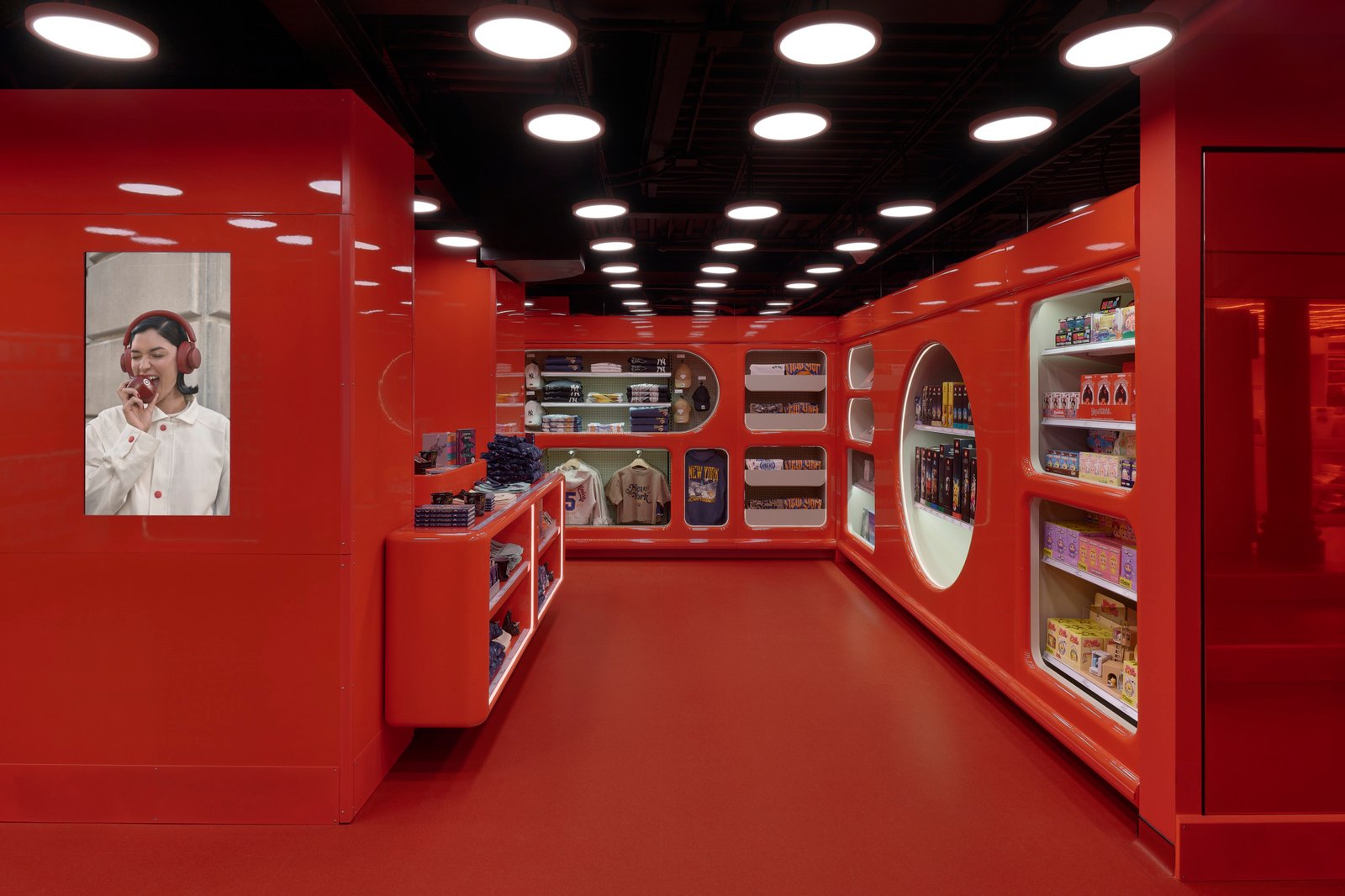
The Target red bullseye offers near-instant brand recognition. No matter which location they enter, shoppers know what to expect from the big-box retailer. That’s not quite the case at New York’s Soho location. Less than a year after reimagining its first floor, Target has unveiled a redesigned lower level by Something Special Studios that encourages exploration and discovery.
Photography by Sean Davidson
Located at the corner of Broadway and Houston Street, Target Soho was initially conceived as a “living lab” where the brand could test new ideas for the future of retail, according to Gigi Guerra, Target’s VP of Marketing, Creative Curation. Since opening 10 months ago, the location has offered a more curated, design-led shopping experience. The new lower level extends that approach to everyday categories, including home, wellness, toys, and food and beverage.
Photography by Sean Davidson
“We’re rethinking each of these categories as destinations,” Guerra says, “making everyday shopping more intuitive, engaging, and full of unexpected discoveries.”
To bring this idea to life, Target turned to New York- and LA-based Something Special Studios. “We started with the idea of making the everyday feel worth discovering,” studio founder Michael Goldberg says. “Soho is a neighborhood defined by its historic character and constant reinvention, and we wanted the Lower Level to reflect that energy while staying true to Target’s playful, optimistic point of view.”
Photography by Sean Davidson
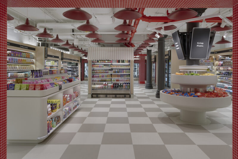
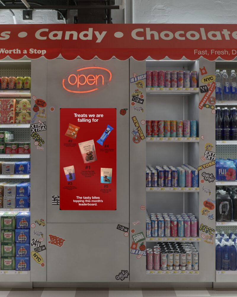
Familiar New York spaces, such as the ubiquitous local bodega or compact apartment, became starting points for the design. Rather than recreating them literally, the studio reinterpreted these environments as distinct shopping destinations. For instance, Bullseye Loft uses domestic vignettes to showcase home products, while The Snack Bar recalls a New York streetscape with corner stores and newsstands.

Photography by Sean Davidson
The design also had to respond to the constraints of the existing cast-iron commercial building. Its column grid, lightwell, escalators, and other architectural elements influenced the layout, with the existing row of columns becoming the central avenue that organizes the floor.
For all its distinct destinations, the layout still needed to be easy to navigate and shop. “We approached the floor as a journey that guests can experience at their own pace,” Goldberg says. “The central avenue provides a clear organizing spine, with wider pathways and intuitive sightlines connecting a series of curated destinations.”

Photography by Sean Davidson
Although the zones have distinct identities, there aren’t hard boundaries between them. “Lighting, material shifts, and architectural thresholds” help distinguish the areas, Goldberg explains. He adds: “Ultimately, every decision needed to balance function with delight, giving people a reason to slow down and explore while ensuring the store remains easy to navigate.”
Something Special Studios incorporated brushed and orbital-finished aluminum, tinted mirrors, glossy lacquer, fabric awnings, and integrated lighting to give the retail space a more polished, contemporary character. Wood, meanwhile, introduces warmth and contrast. “The mix is durable and functional, but still tactile and expressive,” Goldberg says.

Photography by Sean Davidson
Target Red, a brand standard, remains part of the Soho store’s identity, but it’s joined by Cherry Stain Red, a custom color developed for the store. Goldberg explains that it’s part of a broader palette of warm neutrals. “Together, these tones establish a cohesive visual identity while allowing the Lower Level to develop its own character,” he says. “The palette creates continuity with the floor above, while warmer materials, reflective surfaces, and tactile finishes give the Lower Level a more metropolitan feel.”

Photography by Sean Davidson
Beyond Soho, Cherry Stain Red will be introduced across the chain for Target’s new Beauty Studio concept, an example of how the location serves as a testing ground for the retailer. “[The Soho location] serves as a test-and-learn platform where we can experiment, learn, and evolve,” Guerra says. “We’re creating more intentional environments that give everyday categories a stronger point of view.”

Photography by Sean Davidson
This approach allows destinations like Balance Mart, for wellness products, and Explorers’ Lab, for toys and entertainment, to showcase trending brands, new collaborations, and seasonal products. Yet, despite the more immersive environment, the store still needs to function like a Target. As Goldberg explains, shoppers should be able to come in, find what they need quickly, and leave—or take their time exploring.

Photography by Sean Davidson
“The completed Target Soho store reflects our belief that great design is about more than how a space looks—it’s about how people experience it,” Guerra says. “Every element is designed to make everyday shopping feel a little more unexpected and inspiring.”