Blog
How To Get The Most Out Of Divi 5’s New Variable Fonts

Every typography decision on a website is about relationships: how one text element reads against another, how clearly the hierarchy comes through, and how body text stays readable without competing with the elements around it.
Static fonts give you a set of fixed styles. Variable fonts give you the continuous range between them, and Divi 5 brings those controls directly into the Visual Builder through its Variable Fonts feature.
In this post, we’ll use practical combinations to solve common typography challenges. We’ll configure Design Variables, tune headings, subheadings, buttons, and body text, save those decisions with Presets, and replace existing static styles without editing every module individually.
What Are Variable Fonts?
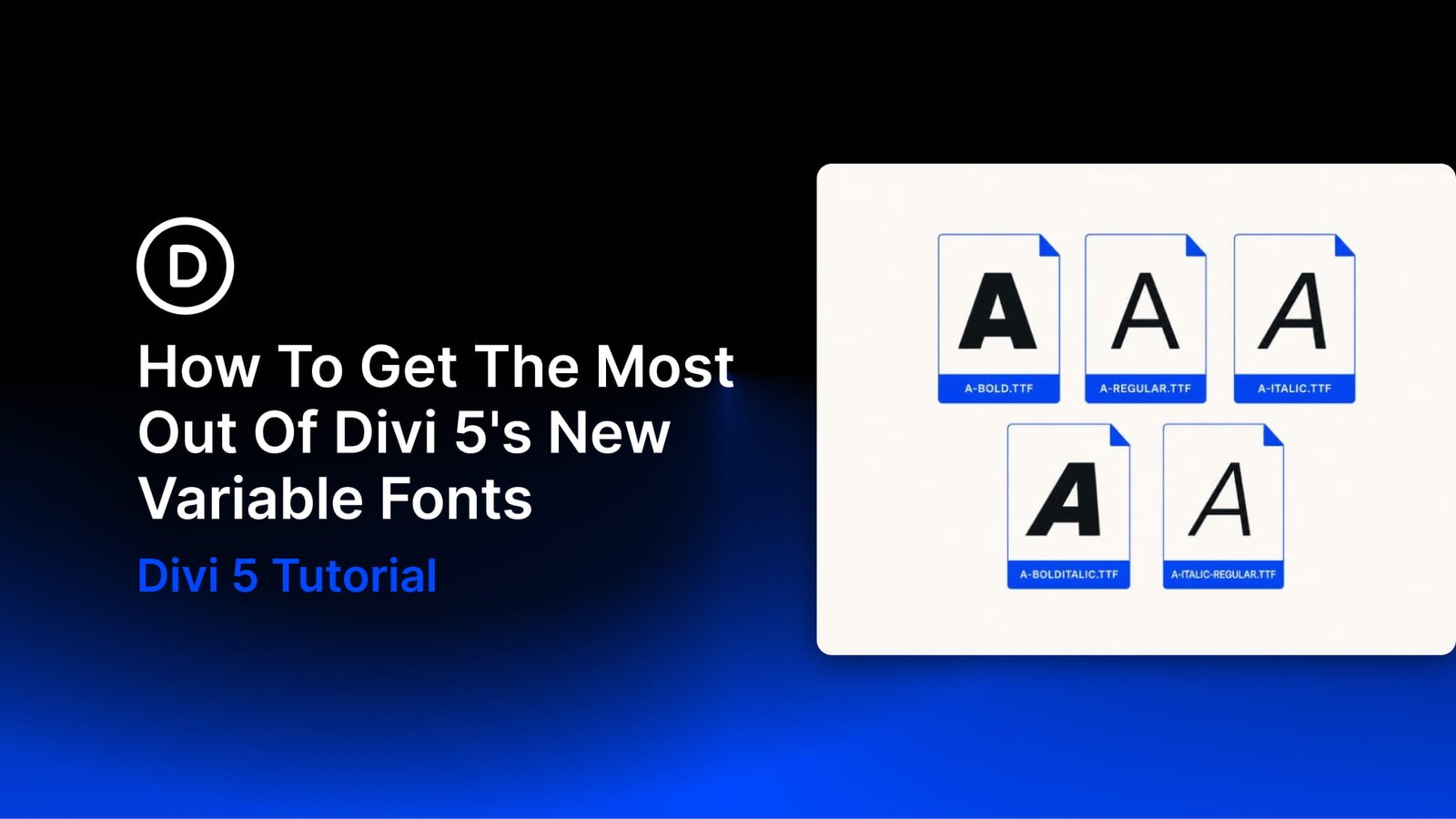
Static font families are divided into separate files or styles, such as Light, Regular, Semibold, and Bold. If the precise weight or width you need falls between those options, you have to compensate with another setting or settle for the closest available style.
Designers often work around those gaps by adjusting letter spacing, increasing the font size, or choosing a nearby weight that does not quite produce the intended relationship.
A variable font stores one or more continuous design axes inside an OpenType file. Instead of offering only isolated styles, it can let you move through a range of weights, widths, slants, optical sizes, or other characteristics defined by the font designer.
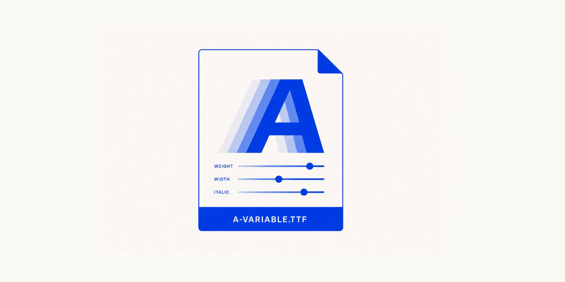
Regular and Bold can still serve as familiar reference points, but you are no longer limited to them. If a heading needs a weight of 520, the font can render that coordinate instead of rounding the design to the nearest static style.
The available axes depend on the font. Some include only Weight, while more extensive families may also include Width, Slant, Grade, Optical Sizing, and font-specific controls.
Why Should You Use Variable Fonts?
Designers often start using variable fonts for their precision, but file consolidation can be useful too. One variable font file can replace several static files when a design uses multiple weights or widths.
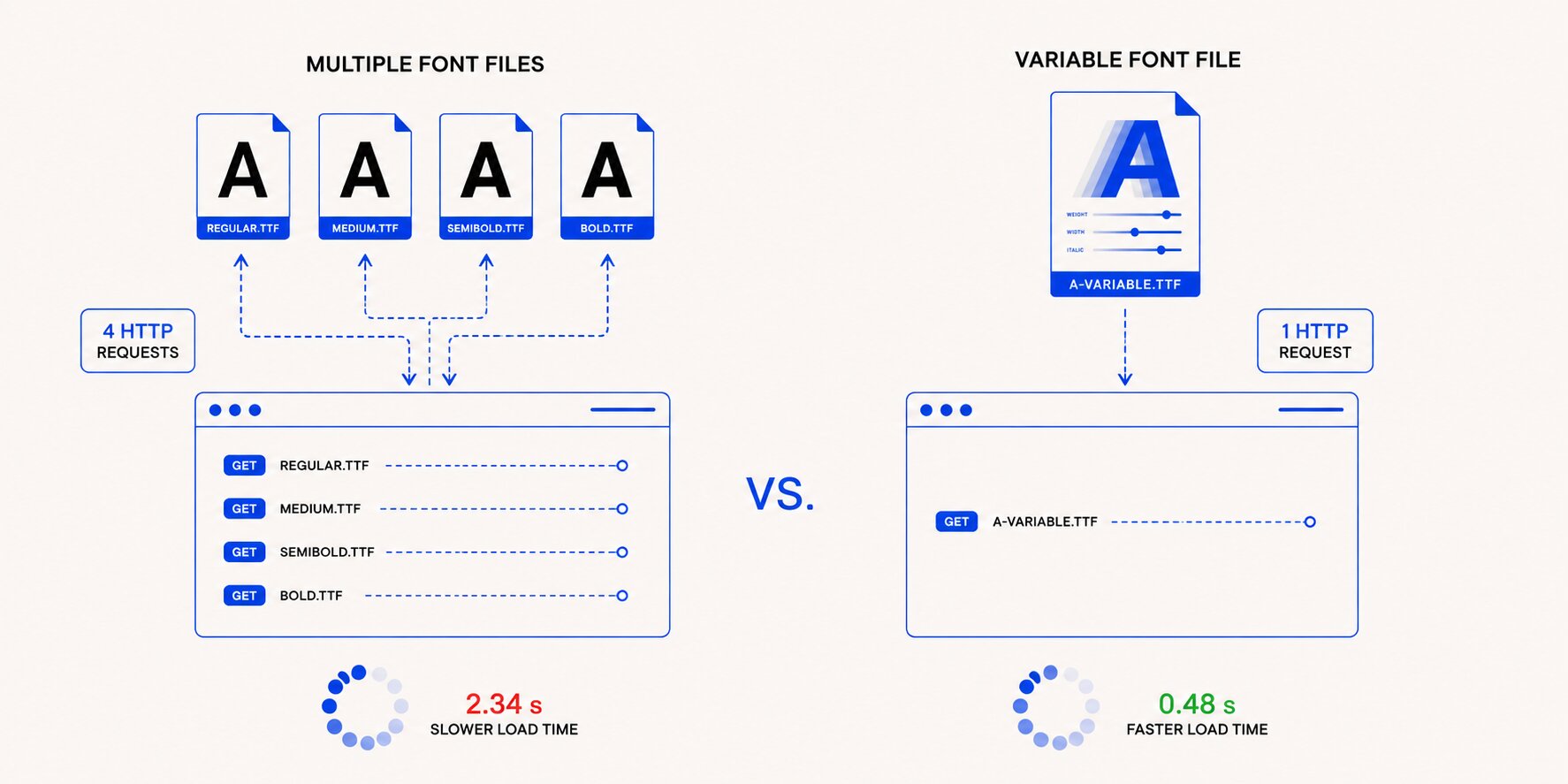
That can reduce the number of font requests a page needs to make. However, a variable font file may be larger than one individual static file, so the performance benefit depends on how many styles your website would otherwise load. The advantage is usually clearest when one variable file replaces several static weights or widths.
The same source file also creates a consistent visual foundation. A heading at Weight 600 and body text at Weight 380 still come from the same underlying typeface, so both retain the family’s shared proportions and characteristics.
You do not have to check whether a separate bold file still feels related to the regular style. That relationship is built into the family.
Variable fonts are also supported by current versions of Chrome, Firefox, Safari, and Edge. As with any web font, it is still worth defining appropriate fallbacks and testing the result across the devices your audience uses.
Introducing Divi 5’s Variable Font Settings
Divi 5 adds Variable Font controls to the Visual Builder. You’ll find them in the Design tab within text-related option groups such as Heading Text, Body Text, Title Text, and Meta Text.
The available controls appear below the standard font settings and depend on the variable font you load.
Weight moves through the font’s available weight range. Width makes the glyphs narrower or wider, while Slant adjusts their angle without necessarily switching to a separate italic design.
Grade can make text appear heavier or lighter with little or no change to the space each character occupies. This makes it useful when you need more contrast without noticeably shifting the layout.
Optical Sizing adjusts letterform details for the size at which the text is displayed. When supported by the font, smaller text may receive more open forms and sturdier details, while larger text can use finer proportions.
Some variable fonts include additional custom axes. Divi reveals the controls included in the selected font, which may include CRSV, ROND, Casual, Element Shape, Element Expansion, Thick Stroke, Thin Stroke, Counter Width, Lowercase Height, Uppercase Height, Ascender Height, Descender Depth, Figure Height, and Monospace.
Axes that are not included in the font remain hidden, so the panel only displays controls the selected font supports.
Getting The Most Out Of Variable Fonts In Divi 5
Variable fonts can expose a wide range of axes, and Divi 5 places those controls inside the Design tab. The following workflow covers how to configure your fonts before building, combine axes for common typography relationships, save the results with Presets, and apply the system across an existing website.
Setting Up Design Variables
You can select a variable font directly inside any module’s Design tab. That may be enough for a quick experiment or an isolated layout.
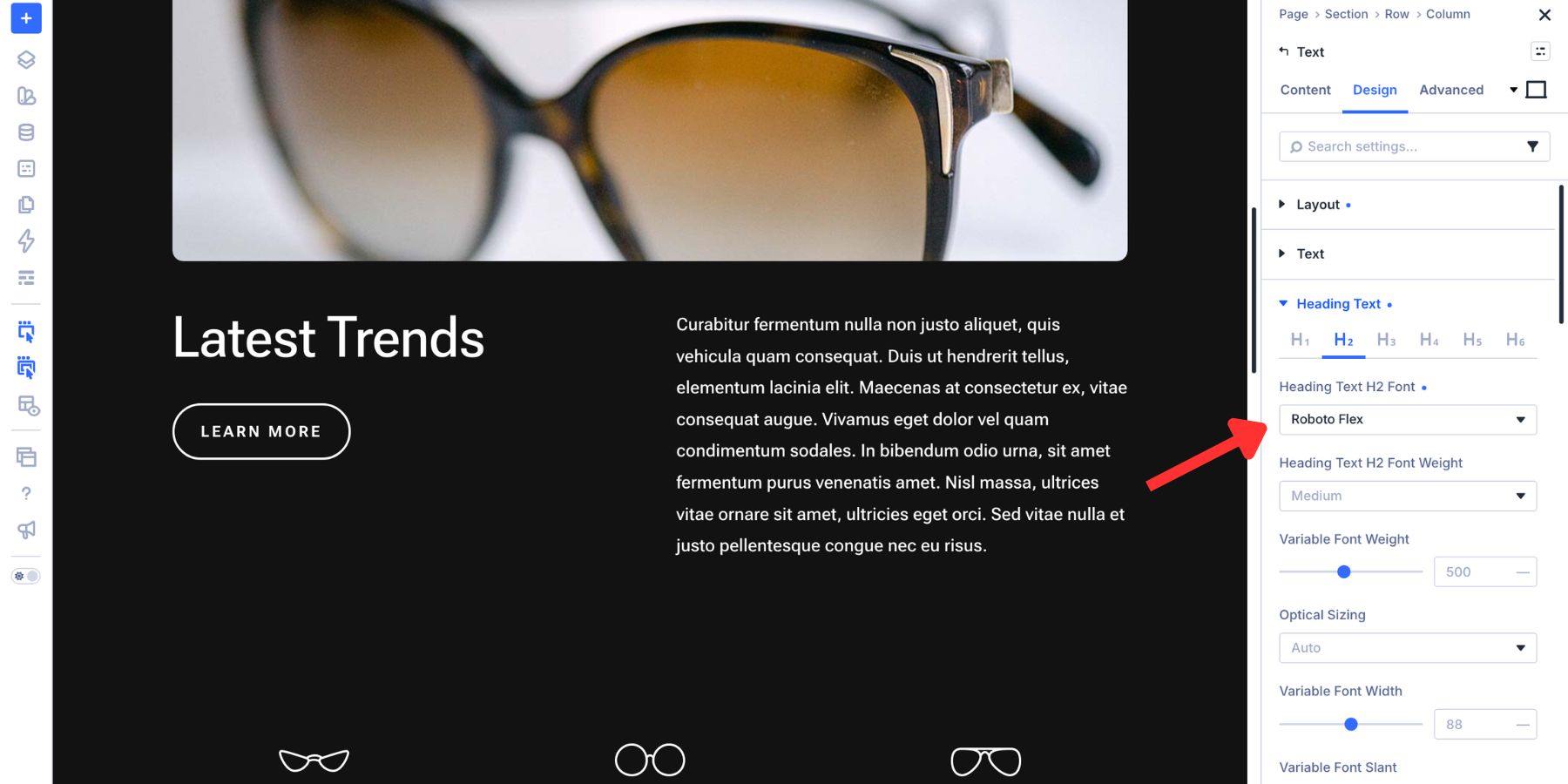
For a website intended to grow, Design Variables provide a more maintainable foundation.
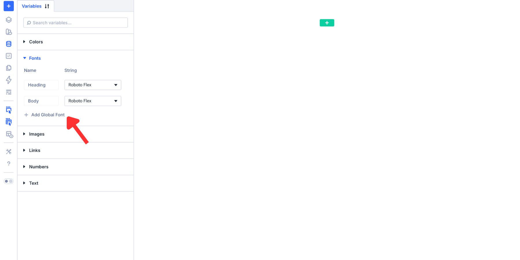
Open the Variable Manager from the left sidebar of the Visual Builder and select the Fonts tab. Divi provides default Heading and Body font variables that you can configure for the website.
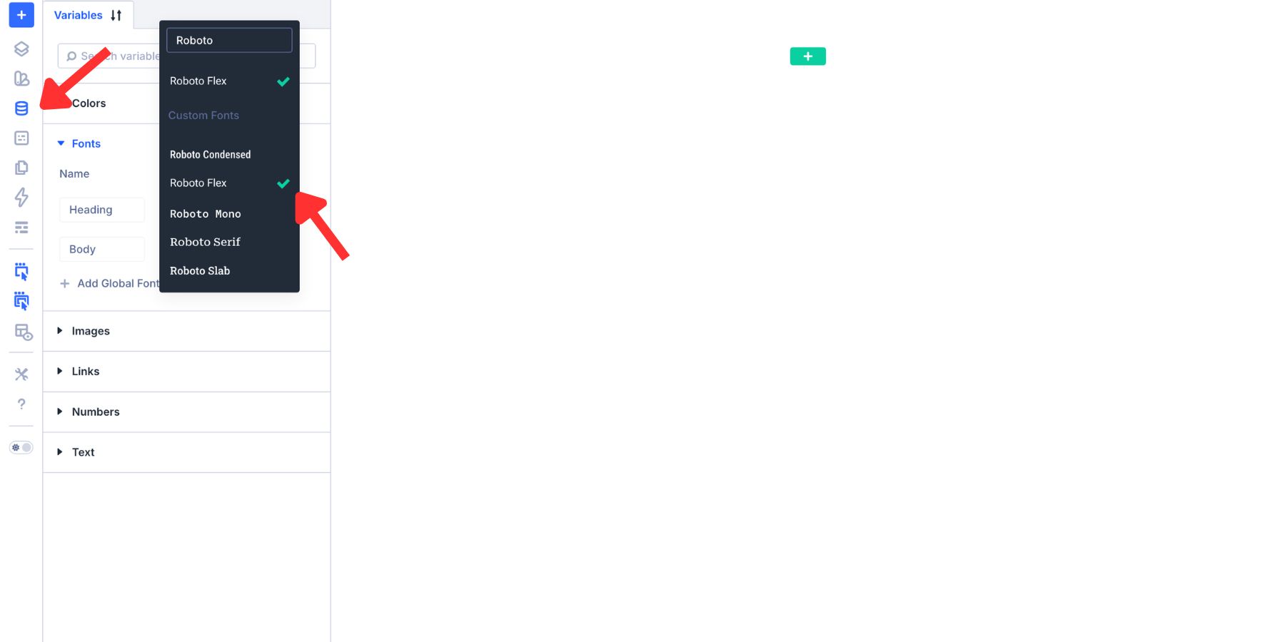
After defining a font variable, click the Insert Dynamic Content icon in a compatible font field and select it. Every element connected to that variable will inherit the selected family. Changing the font in the Variable Manager will then update those connected elements throughout the website.
The Fonts tab includes Heading and Body variables by default, but you can create additional font variables for other roles, such as display text, labels, or accent typography.
Sizing can follow the same reusable logic. Instead of assigning one fixed pixel size to a heading, you can use a clamp() value with a minimum, fluid range, and maximum.
The Numbers tab in the Variable Manager includes an option for generating fluid sizing variables. This can create a reusable clamp() scale across heading levels. You can use Divi 5’s Variable Generator to build the scale more quickly.
Defining the font families and type scale before building gives every connected element a consistent starting point while preserving the flexibility to update the system later.
Creating Variable Font Combinations
The following examples cover three typography relationships that appear frequently on real websites. Each one uses Roboto Flex, whose extensive axis range makes the differences easy to see.
Treat the values as practical starting points for Roboto Flex rather than universal settings. Another variable font may expose different axes, use different ranges, or respond differently at the same coordinate.
Example 1: Pairing A Heading With A Subheading
Headings and subheadings should feel related without becoming visually identical. If their styling is too similar, the hierarchy fades. If the contrast is too strong, they can feel as though they belong to different systems.

One common solution is to introduce a second typeface. That can create contrast, but it also adds another family to load and another set of decisions to maintain.
A variable font with several axes can create the separation within one family. Each heading level remains visibly connected while receiving a distinct weight, width, and voice.
For the H2, set Weight near 660 and keep Width at 100. Leave Optical Sizing on Auto and Slant at 0 to create an upright, structured heading.
Give the H3 a lighter treatment. A Weight near 520 reduces its visual mass, while increasing Width to around 130 opens the letterforms and distinguishes it from the more compact H2.
A slight Slant near -3 introduces another layer of contrast without switching to a separate italic style. Lowering Grade to approximately -15 softens the density further, helping the subheading read as secondary without relying on a smaller size alone.
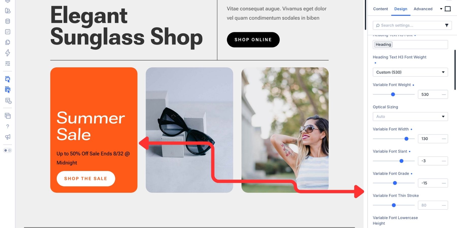
The result is a clear hierarchy created with one family. The H2 feels grounded, while the H3 remains related but lighter, wider, and more expressive.
Example 2: Scaling Buttons Without Losing Consistency
Many websites use at least two button sizes. A larger CTA may anchor a hero section, while a smaller button sits inside a card or appears inline.
If both buttons inherit exactly the same typography, the larger one may feel balanced while the smaller label becomes thin, cramped, or difficult to scan. Variable axes let you calibrate the text for each context instead of relying only on padding and font size.
Using Roboto Flex, open the Button module’s Design tab and expand the Button Text option group.
For a standard or large button, start with Weight near 700 and Width at 100. This creates a firm, stable label.
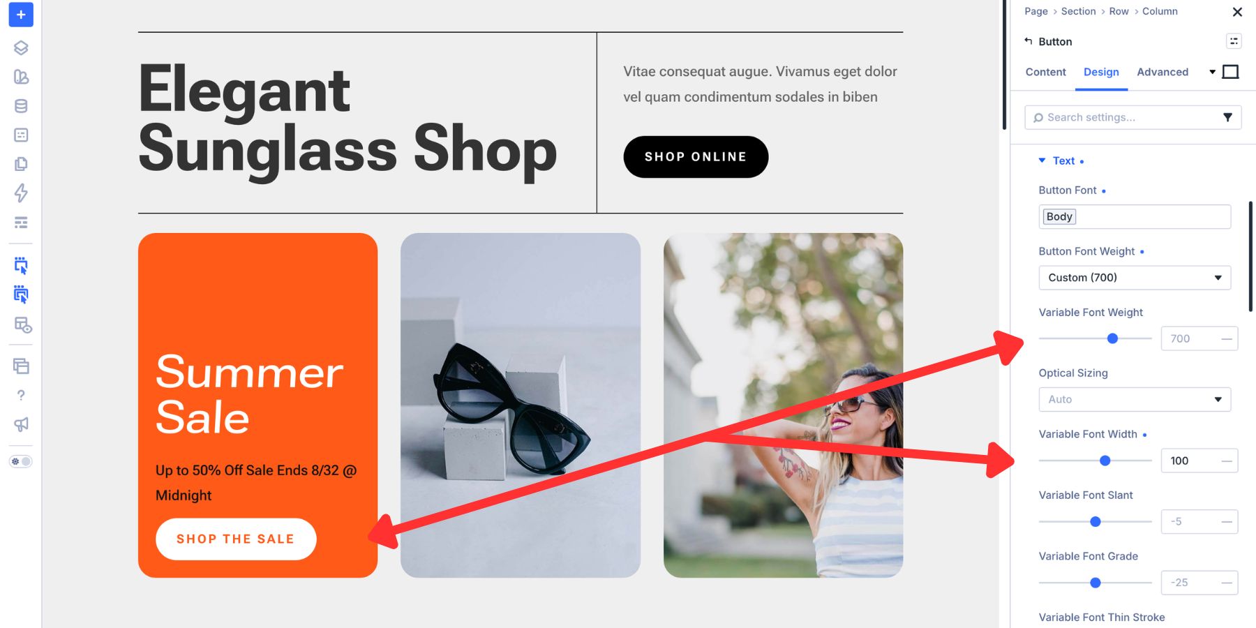
Set Letter Spacing near 0.06em to open the label slightly and give the larger button more presence without adding another level of weight.
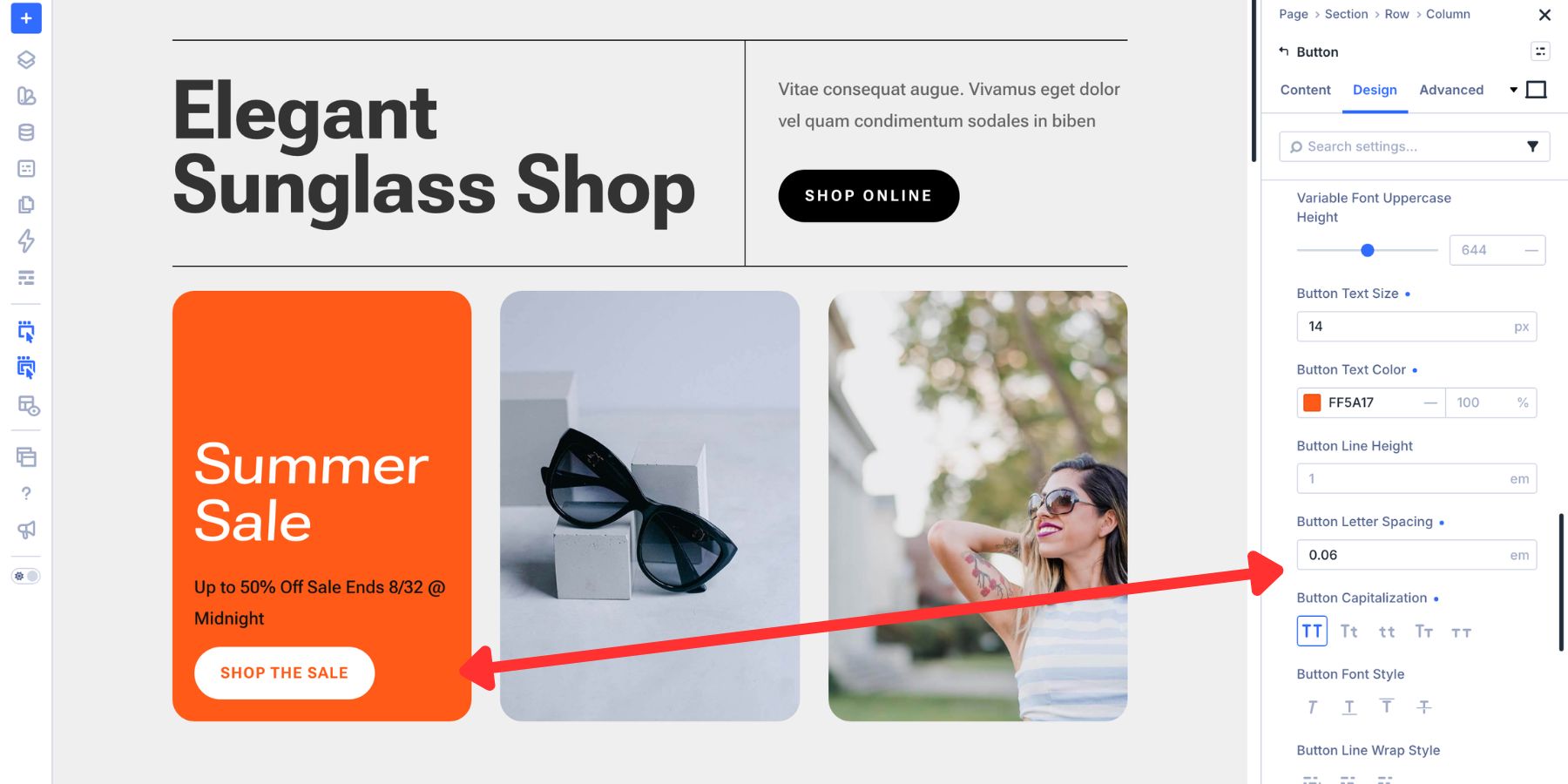
A Grade near +10 can add enough density for the label to hold its own against a light background while producing less layout movement than another weight adjustment may introduce.
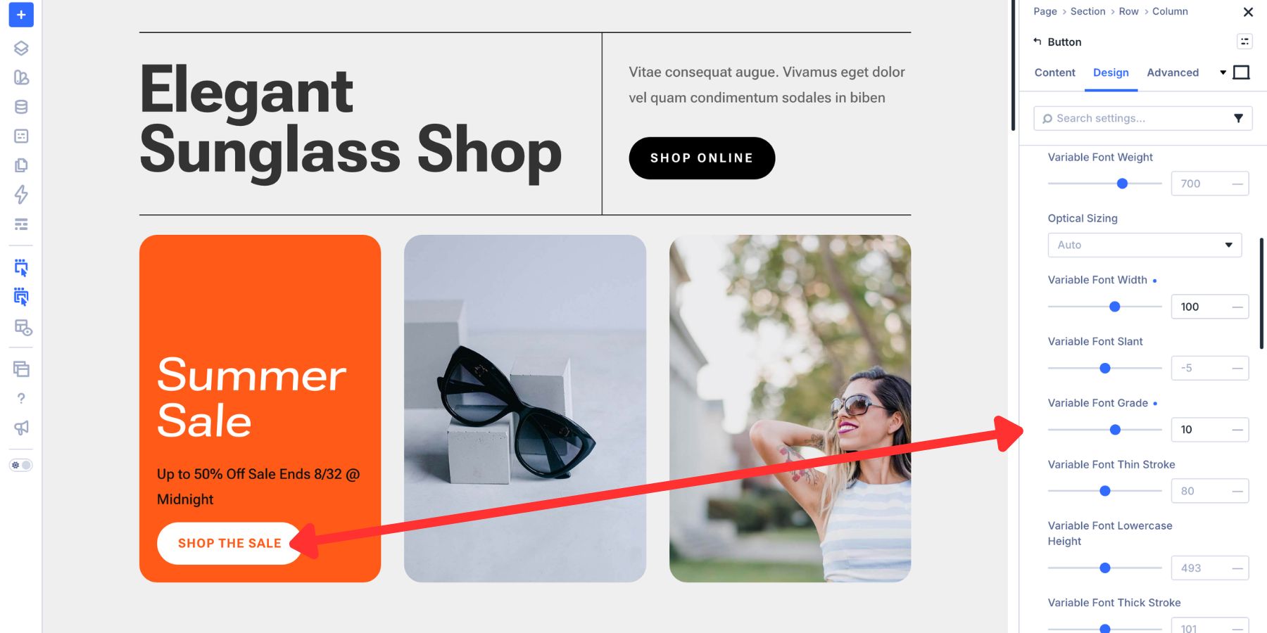
For a smaller button, try Weight near 620 and reduce Width to around 80. The narrower forms use the available horizontal space more efficiently, while the adjusted weight keeps the label from feeling too delicate.
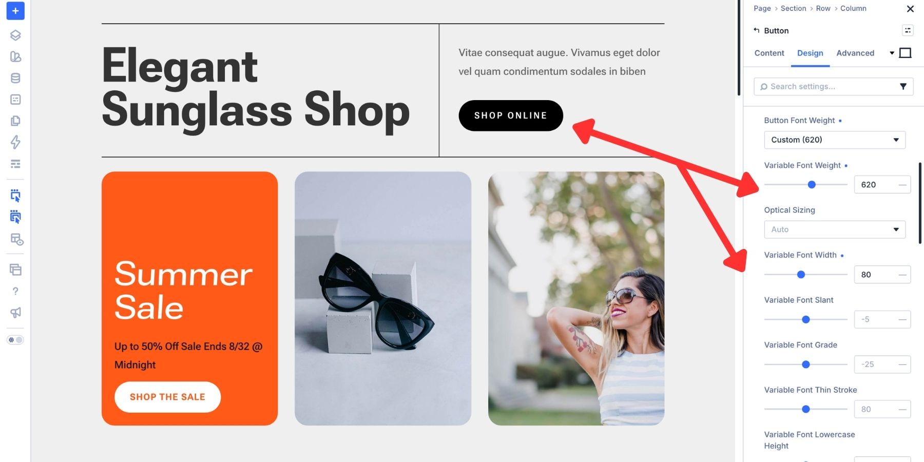
Letter Spacing near 0.08em adds separation between the narrower characters. With Optical Sizing active, Roboto Flex can also adapt its details to the smaller text size, supporting legibility through changes such as sturdier strokes and more open forms.
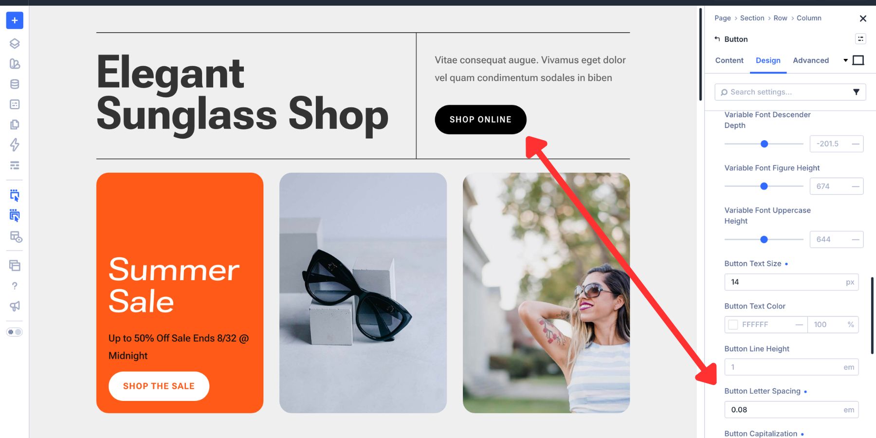
Both buttons still read as part of the same design system, but each configuration responds to a different scale and amount of available space.
Example 3: Balancing A Heading With Body Text
Headings and body text serve different purposes. A heading is usually scanned quickly, while body text must remain comfortable across complete sentences and paragraphs.
Variable fonts let you tune each style for its specific job rather than treating body text as a smaller version of the heading.
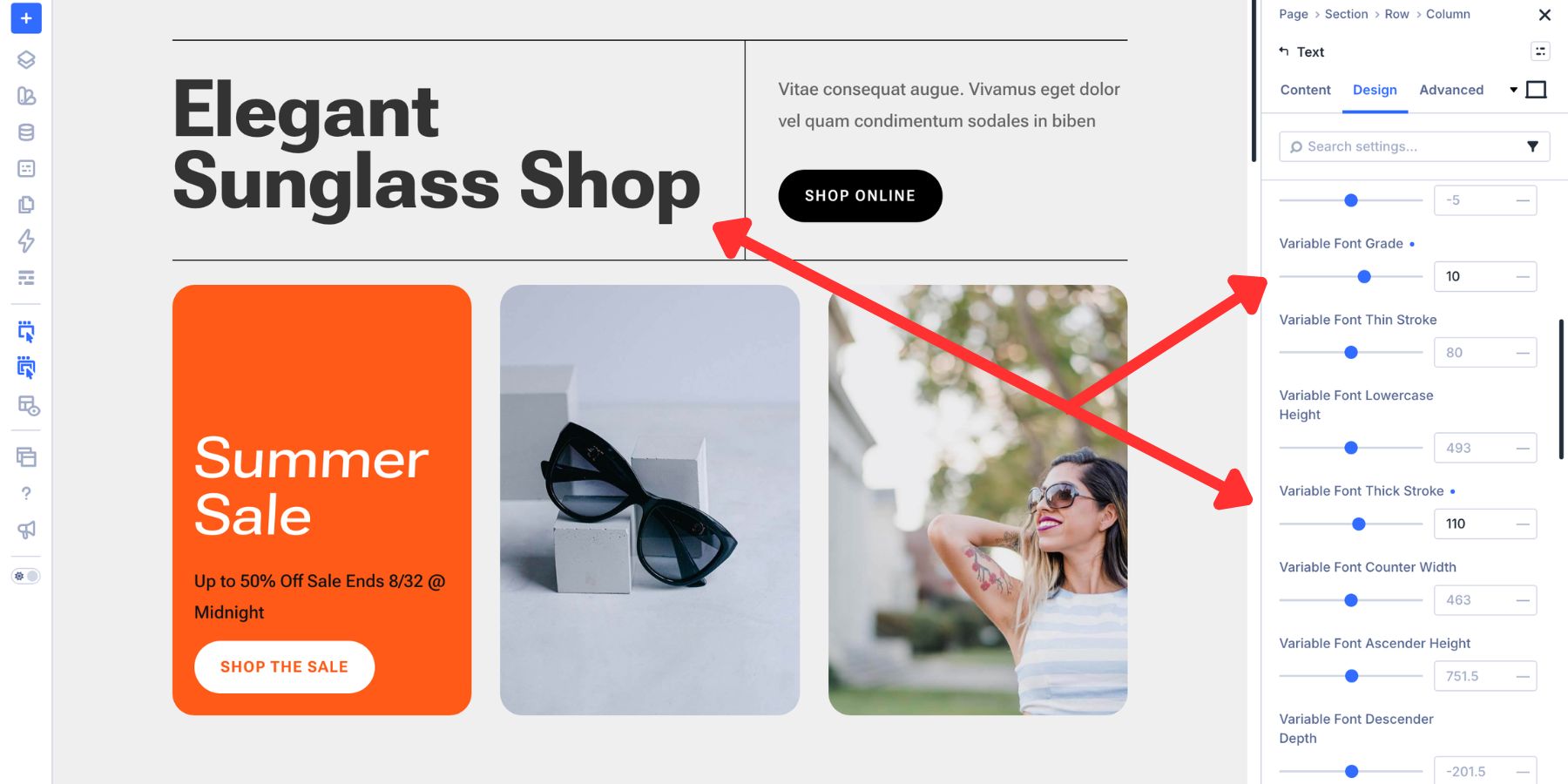
For the heading, start with Weight near 660, Width at 100, Slant at 0, and Optical Sizing on Auto. This gives it the same solid foundation used in the first example.
To add more display presence without relying entirely on Weight, raise Uppercase Height to around 720.
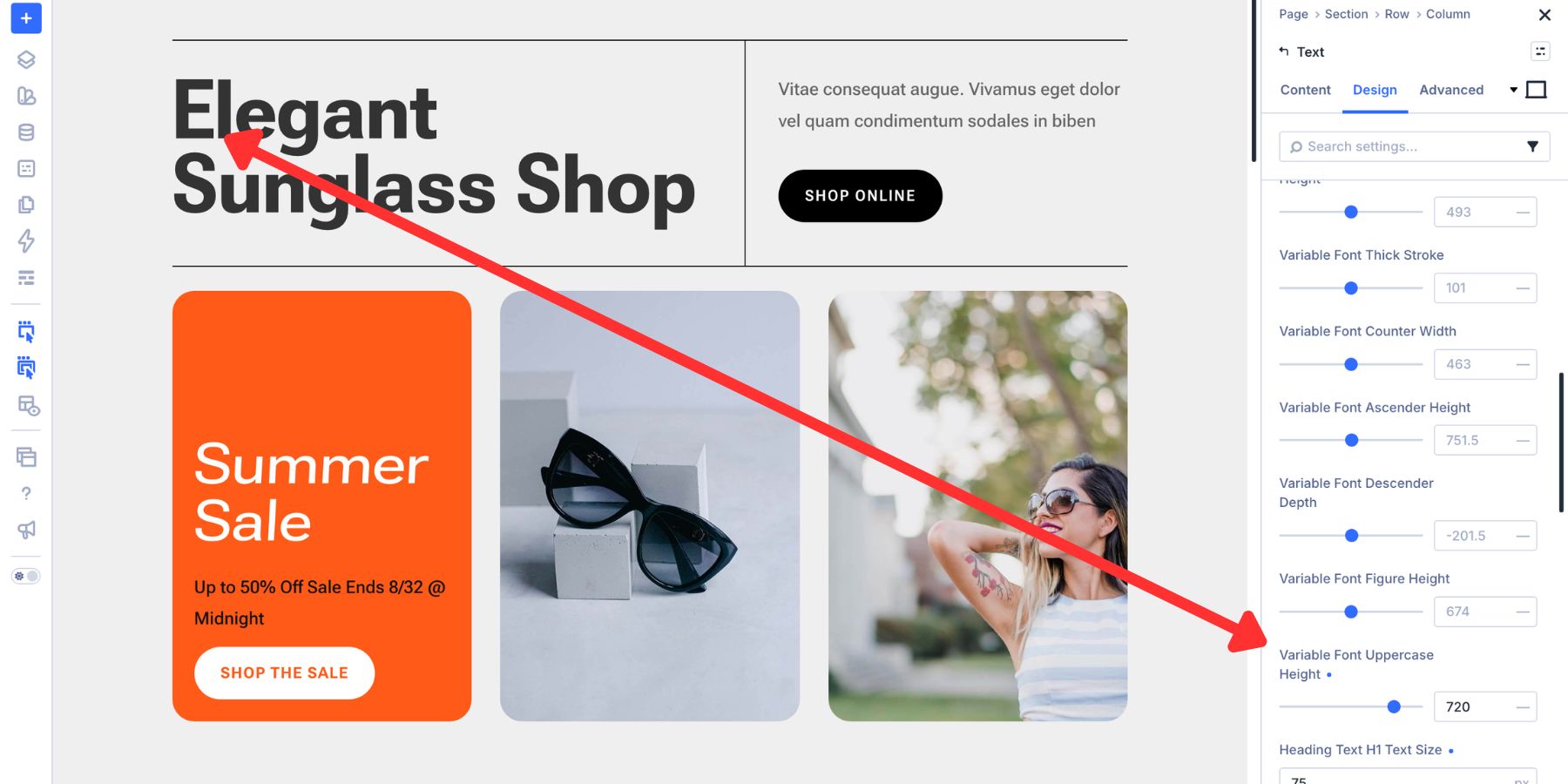
Set Thick Stroke near 110 to reinforce the primary strokes. A Grade around +10 can add a little more density while helping the heading sit cleanly against a light background.
Body text needs a different kind of support. Weight near 450, Width at 100, and Optical Sizing on Auto provide a practical starting point.
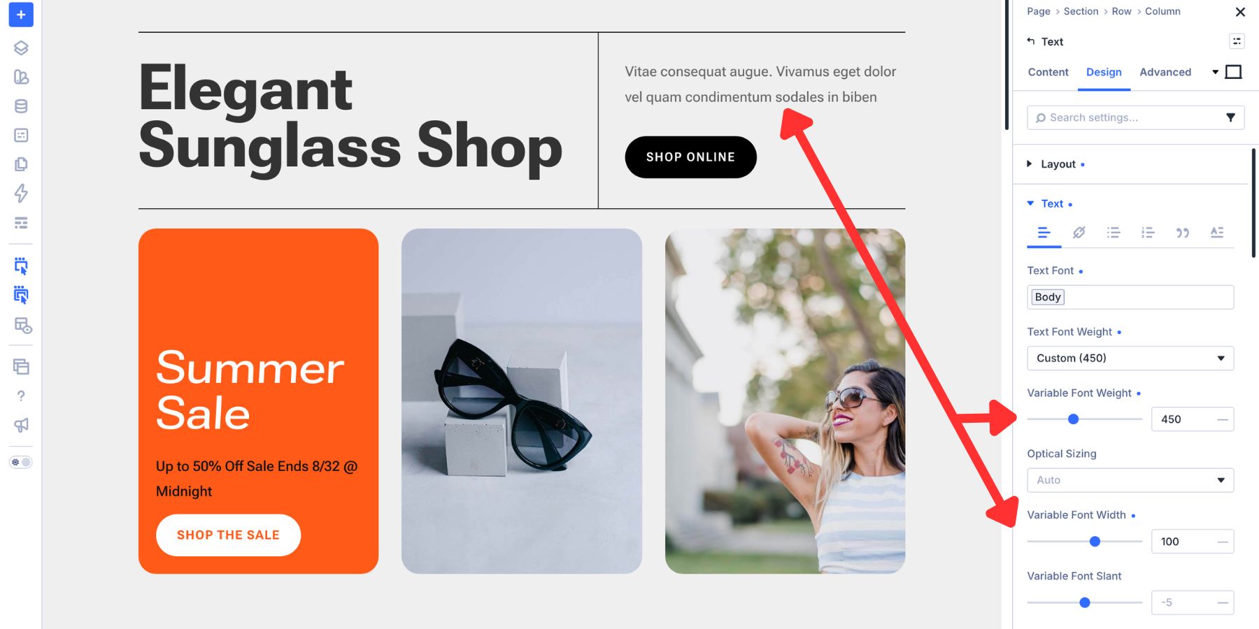
From there, set Lowercase Height near 545. Increasing the apparent height of lowercase letters can help their shapes remain distinguishable during sustained reading.
Set Thin Stroke near 85 to prevent finer lines from becoming too delicate. A Counter Width near 510 opens the internal spaces in letters such as “o,” “n,” and “d,” helping them remain clear at smaller sizes.
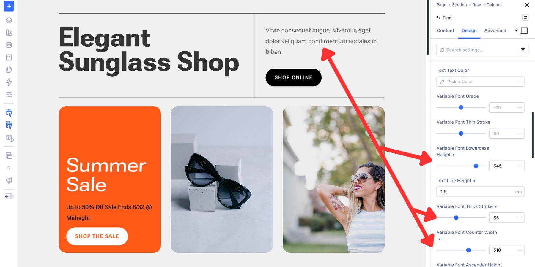
The heading is tuned for immediate impact, while the body text is tuned for longer reading. Font size still contributes to the hierarchy, but the axis settings give each text style proportions suited to its purpose.
Locking It All In With Presets
Once a heading, button, or body-text configuration feels balanced, you should not have to rebuild it manually for every module.
Divi 5’s Preset system turns those axis combinations into reusable styles, making it easier to keep the typography consistent as the website grows.
Creating And Reusing Option Group Presets
Axis values applied directly to a heading remain local to that module. That works for one element, but it becomes inefficient when the same heading appears in several sections or a teammate needs to reproduce it inside another module type.
An Option Group Preset saves the complete configuration of one settings group as a named style.
A typography preset can include the font family, variable axis values, font size, line height, letter spacing, and other settings from that option group.
Because the preset belongs to the option group rather than one module type, a compatible Body Text preset can be reused across modules such as Text, Blurb, and Accordion modules.
To create one, open the relevant option group on a styled module. Hover over the group title until the Preset icon appears.
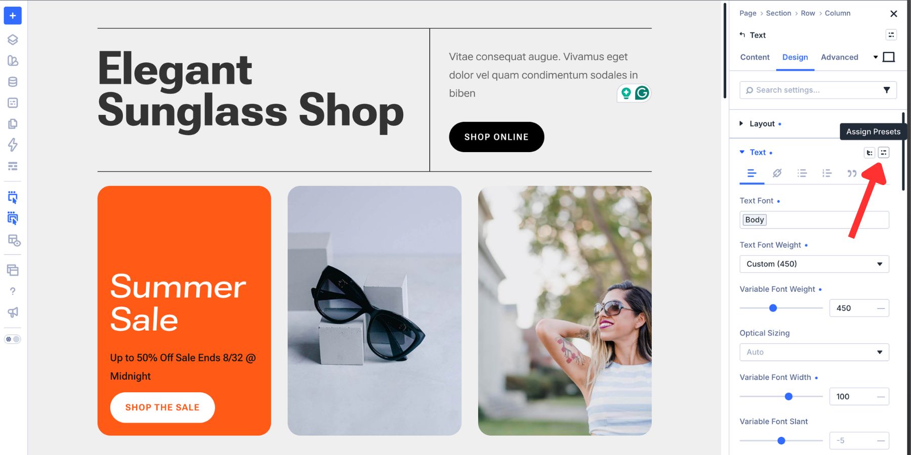
Click the icon and select New Preset From Current Styles. Give the preset a descriptive name and save it.
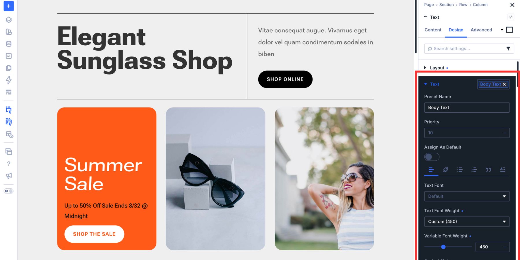
Build a focused library from there. You might create Card Title for headings used inside repeated cards, Section Intro Heading for section-level subheadings, and Primary Button Text for larger calls to action. Each preset can carry its own variable-axis configuration.
To apply one to another module, open the matching option group, click the Preset icon, and select the saved style.
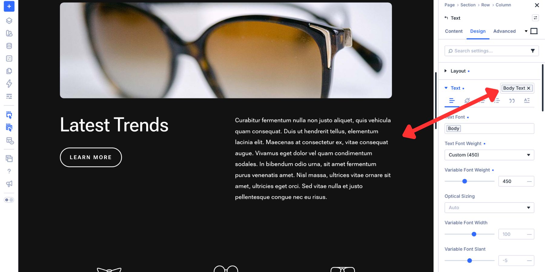
Setting Up A Preset Library Before You Build
Creating Presets from existing modules works well when a website is already underway. When starting a new build, you can define the typography system before adding the full layout.
The Preset Manager lets you create and organize those styles away from the live canvas. Open it from the left sidebar of the Visual Builder.
Open the Groups tab and select the option-group type you want to configure, such as Heading Text. Click Add New Preset to open a live preview where you can adjust the axis values before applying the preset to an element on the page.
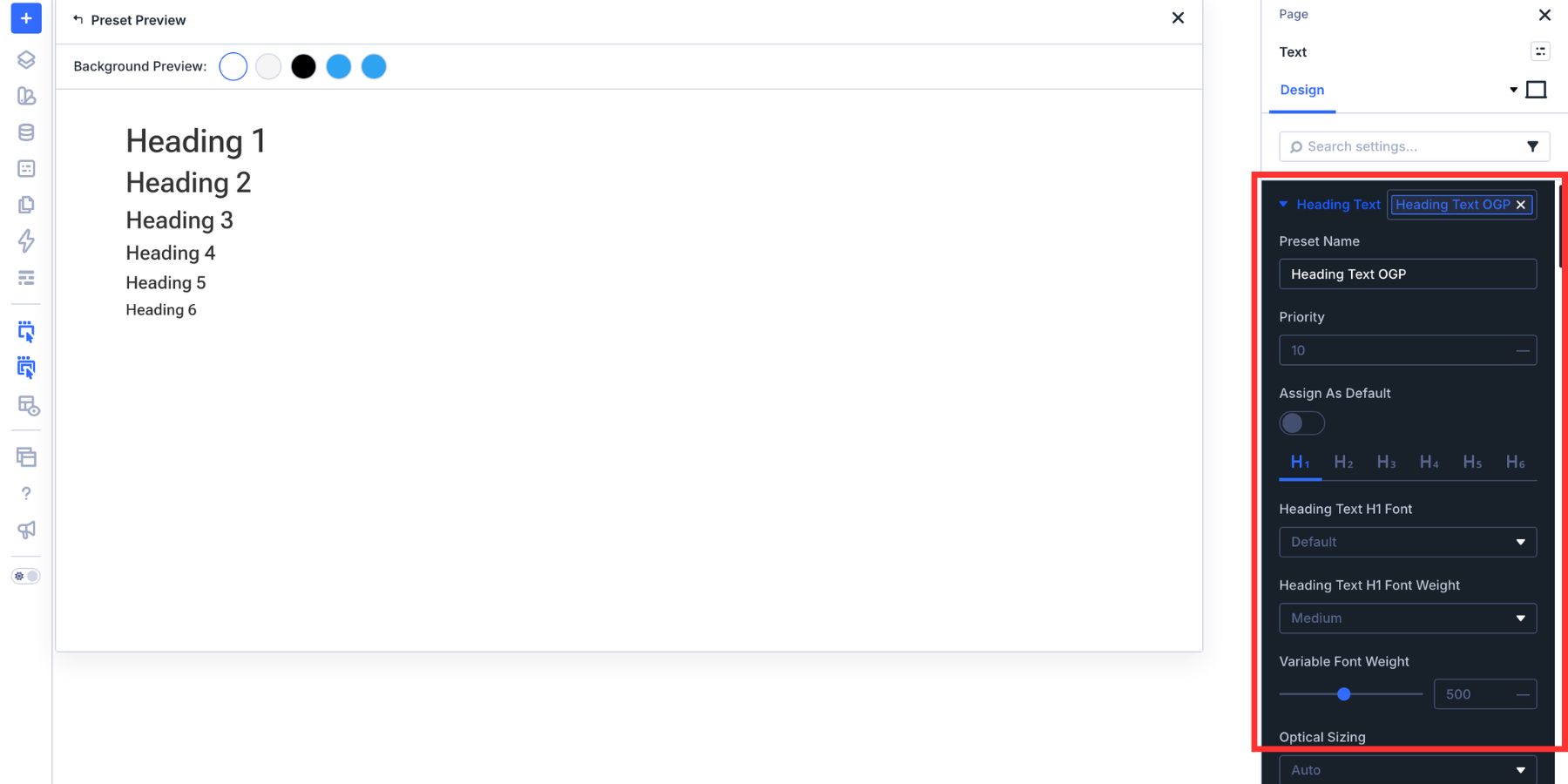
Work through the typography roles your website needs: one preset for each heading level, one or more body-text styles, and a preset for each button size.
Once a preset is ready, click the star icon to make it the default for that option group. New compatible modules will then inherit the selected typography automatically, allowing the build to remain focused on content and structure.
You can repeat this process for other shared design decisions, including backgrounds, borders, and shadows. This guide on creating reusable Border and Box Shadow Presets explains how to extend the same approach beyond typography.
How Element Presets Take It Further
An Option Group Preset controls one group of related settings. That focused scope makes it reusable across compatible module types, but it does not style the rest of the element.
Applying a Heading Text preset to a Blurb module can configure its heading. The module’s background, border, box shadow, spacing, and other option groups remain separate.
An Element Preset captures the styling of the complete module. It can include the heading, background, border, box shadow, spacing, and any Option Group Presets used inside the element.
Apply the Element Preset to another Blurb, and the complete design arrives together. If you later update an Option Group Preset referenced inside that Element Preset, the connected elements inherit the updated group-level style.
To create one, click the Element Preset icon in the upper-right corner of the module settings panel. Name the preset, save it, and make it the default when that module type should use it as its standard starting point.
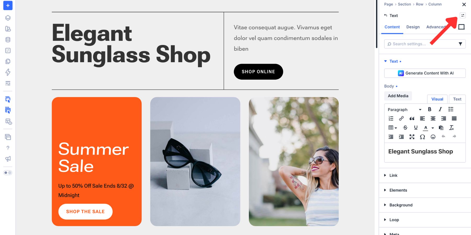
How The Full System Works In Practice
Design Variables, Option Group Presets, and Element Presets operate at different levels. Used together, they create a maintainable typography system:
- Design Variables store reusable values. A Font Variable can hold the selected font family, while Number Variables can hold font sizes or line heights. Color Variables can store text and border colors. Updating a variable changes every connected setting.
- Option Group Presets define how a settings group should be styled. A Subheading preset can combine the Font Variable with Weight, Width, Grade, Optical Sizing, font size, and line height. Because the preset belongs to the option group, it can be reused across compatible module types.
- Element Presets assemble those decisions into a complete module style. They can combine typography Presets with backgrounds, borders, shadows, spacing, and other settings. Updating a referenced Preset or Variable allows the change to propagate through the system.
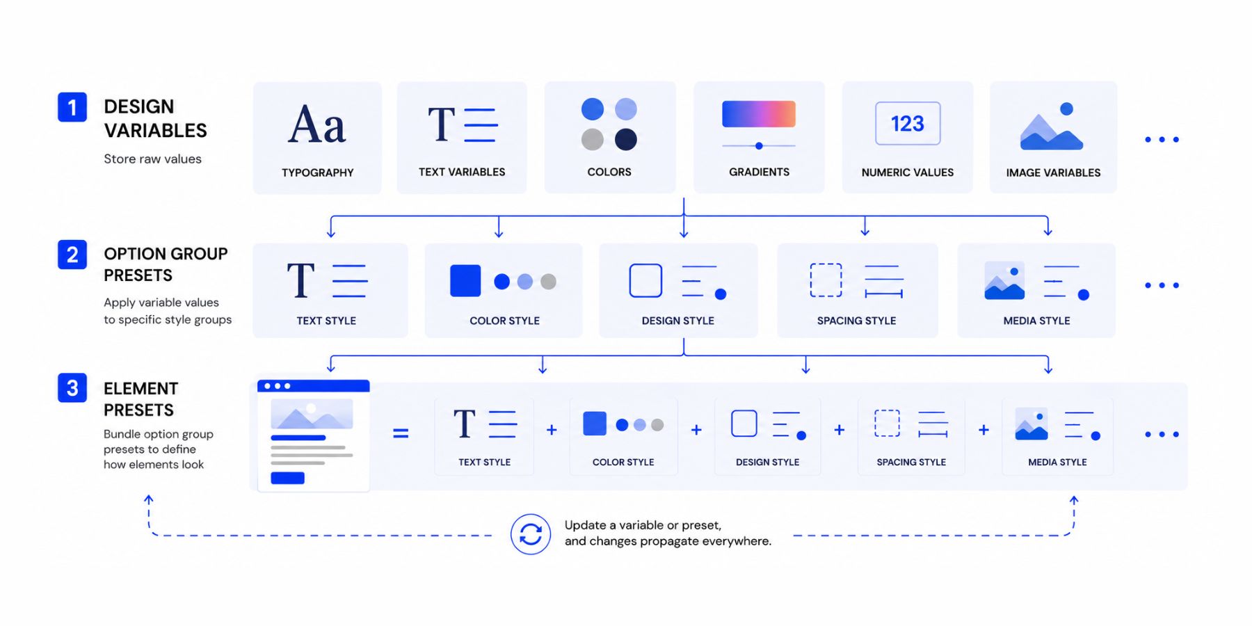
Local overrides remain possible. You can change one module’s border or typography setting without automatically rewriting the shared Preset. The connected system establishes consistency while still allowing intentional exceptions.
Pro Tip: Replacing Existing Styles With The New Font System
Adding a variable font does not automatically replace static font settings already applied throughout a website. Divi 5 includes several tools that can help you migrate those styles without opening every module individually.
Find And Replace
Find And Replace is useful for broad, repetitive changes, such as replacing the same static font value across several modules.
Right-click a font field in the Design tab and choose Replace Value. You can replace the existing font with a Font Design Variable and select the appropriate scope.
Each distinct font value or style may require its own pass. Enable Only Replace Identical Fields to avoid changing unrelated settings that happen to contain the same value.
Extend Attributes
Extend Attributes starts with an element that is already styled correctly and copies its attributes to compatible elements.
Right-click the updated module, choose the option to extend its attributes, select which styles or Presets should be copied, and define how far the change should reach.
This approach is useful when one correctly configured module should become the source for similar elements elsewhere in the section, page, or website.
Inspector
The Inspector is suited to more targeted work, such as finding a module with a unique local font value or reviewing which Presets affect repeated elements.
Right-click an element and select Inspect. The Styles tab surfaces settings that carry custom values, making it easier to find and replace a static font. The Presets tab helps you review the Presets connected to the inspected elements and identify where a shared style should be updated.
For a closer comparison of these three tools, read Inspector Vs. Find And Replace Vs. Extend Attributes.
Get More From Every Variable Font Axis In Divi 5
Static fonts offer a limited set of predefined styles. Variable fonts fill the space between those options, turning each supported axis into a practical design decision rather than a workaround.
Divi 5 places those controls directly in the Design tab, so you can tune variable fonts without writing custom CSS. Design Variables establish the shared font families and sizing values, Option Group Presets preserve the axis combinations, and Element Presets apply them as part of complete module designs.
Start with the purpose of each text style. Give headings the presence they need, optimize body text for sustained reading, and adjust button labels for the space available. Then save the successful combinations so the system remains consistent as the website grows.
Download Divi 5 below and start exploring the full axis range available in your favorite variable fonts.