Blog
The death of the empty state in AI products
AI products replaced 20 years of empty-state research with a prompt box, and the first-session drop-off shows it.
Editor’s note: I wrote this article from firsthand experience as a founder and engineer. I used Claude Code as a writing assistant for structural feedback and copy editing. All insights, data, decisions, and stories are my own.
Disclosure: I co-founded browser extensions that add features to major AI chat products. I have a commercial interest in those products having UX gaps that third-party tools can fill. I disclose this upfront so readers can factor it into the argument below.
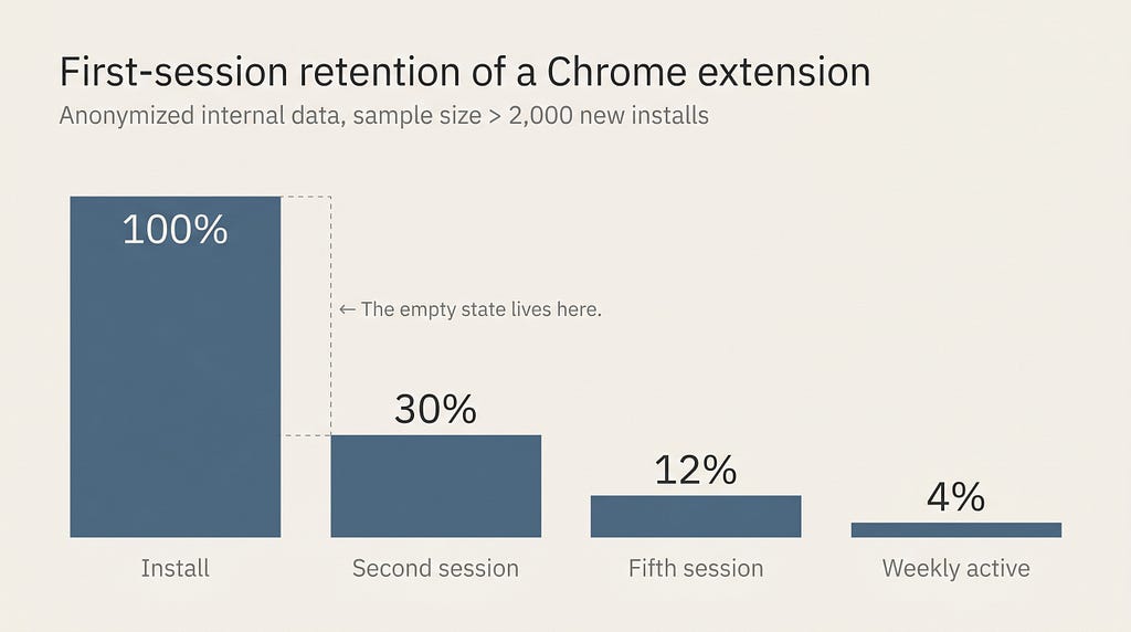
About 70% of new installs of a Chrome extension I co-built never come back for a second session. The empty state is the single biggest reason. We rebuilt it three times. The version that performed worst was the one that looked most like every modern AI product.
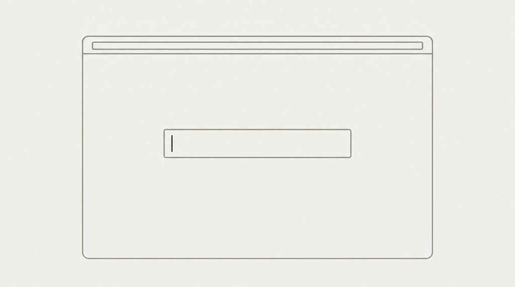
For most of UI history, the empty state was where designers spent their best work. Templates, sample data, a guided tour, a 60-second video, a CTA labeled “Start here.” Then AI products shipped. The empty state became a centered text field with placeholder copy that says “Ask me anything.” Every AI tool launched since 2023 ships a variation of the same blank prompt. We called this minimalism. It isn’t minimalism. It is the absence of design.
The empty state used to be the most designed surface in a product
The empty state, the screen a new user sees on first open, was historically the most over-designed surface in any software product. Linear, Notion, Figma, Airtable, Slack, Trello, Intercom, Asana all invested years in their first-run experiences. There was a reason. Don Norman established in The Design of Everyday Things that a well-designed object communicates its function through signifiers: visible cues that tell a user what the object is and how it can be used. An empty surface with no signifiers is, by his definition, broken.
The Nielsen Norman Group has been explicit about this in their empty state guidelines: an effective empty state must explain what should appear there, show users how to make something appear, and give them a starting action. None of these are decoration. They are the difference between a user who returns on day two and a user who never opens the product again.
A senior designer at any product company in 2019 could have told you exactly why their empty state had a template gallery, a video, and a sample dataset on it. Those choices were load-bearing.

AI products collapsed the empty state into a prompt box
Every major AI product released in the past three years ships an empty state that consists of a centered text field, a placeholder string, and four to six suggested prompts the user is invited to click. ChatGPT, Claude, Gemini, Copilot, Cursor, Perplexity, Grok, Mistral’s Le Chat. The screen looks the same in each of them because it is the same screen. The model is the product, the prompt is the surface, and the suggestion chips are the only signifier.
This was not a category constraint. It was a category convention that solidified in 2023, when the first generation of LLM products shipped without a real design phase, and has not been revisited since. Bret Victor warned about exactly this kind of design failure twenty years ago in “Magic Ink”: when interactivity is treated as the primary surface of an information product, the user is forced to learn how to operate each new piece of software from scratch. A prompt box is interactivity all the way down. Every session starts with a blinking cursor and a question the user has to invent.
I wrote about a related failure mode in “The Chat Box Isn’t a UI Paradigm”: the chat box is what shipped when LLMs arrived without design time, not a paradigm we deliberately chose. The empty state is the same story scoped down to the first frame the user sees.

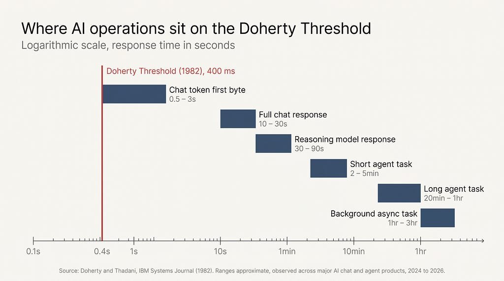
What about 70% first-session drop-off actually looks like
About 70% of new installs of a Chrome extension I co-built never come back for a second session. The cohort that installed it was qualified: they searched for the product, read the listing, clicked install, and granted permissions. They wanted what we built. They did not stay because the first session asked them to think instead of do.
When we A/B-tested empty states, the pattern was consistent. Versions that showed users a real artifact, a populated example, a sample result drawn from their own data, a completed instance of the thing they wanted to make, outperformed versions that showed a blank field and a “type to begin” instruction by margins large enough that any 2010-era growth team would have shipped them as the only variant.
Kathy Sierra called this gap the Suck Threshold: the distance between install and competence, where a user has to feel incompetent before they can feel skilled. The faster you move a user across that threshold, the more likely you are to keep them. Every empty-prompt-box first session widens it by design.
The numbers I have are from a Chrome extension, but the pattern generalizes. Anyone who has read first-week retention curves for AI products knows the shape: a steep drop after session one, a long flat tail, and a tiny power-user cohort that drove the engagement numbers cited in the launch post. The drop happens at the empty state, not at the model.
The vocabulary we abandoned when we accepted the prompt box
The prompt box didn’t replace empty-state design with something simpler. It replaced it with nothing. Forty years of HCI work on how a beginner becomes a competent user, signifiers, affordances, recognition over recall, progressive disclosure, scaffolded onboarding, was effectively retired in the product category that needed it most.
Jakob Nielsen’s 10 usability heuristics include “recognition rather than recall”: users should not have to remember information from one part of the interface to use another. A prompt box violates recognition by definition. The user is asked to recall what the product can do, in their own words, before they have seen what the product can do.
Steve Krug’s Don’t Make Me Think is the premise under most mainstream web UX. A prompt box is a screen that says “think.” First the user thinks about whether to type something specific or something exploratory, then about what words the model will respond best to, then about how to phrase those words. By the time the user has typed two sentences, they have done more cognitive work than the entire onboarding flow of a comparable 2019 SaaS product asked of them.
Erika Hall’s Conversational Design (A Book Apart, 2018) made the case that conversational interfaces only succeed when there is real shared context between the two parties. A blank prompt box on a brand-new user’s first session has no shared context. The user does not know what the product does well, what it does poorly, what it will charge for, what data it remembers. The conversation cannot meaningfully begin.
What a real empty state for AI would look like
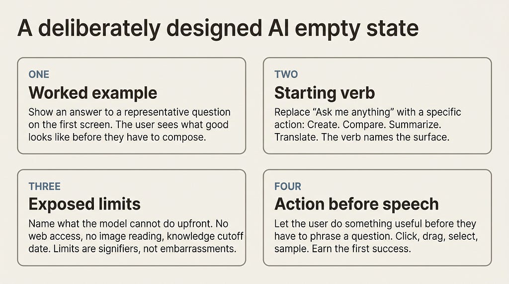
A deliberately designed AI empty state would have four properties. It would show a worked example. It would offer a starting verb. It would expose the model’s known limits. It would let the user act before they speak. The technology supports all four. The reason none of these shipped at scale is that the prompt box was the cheapest screen to build, and the industry has not built a more expensive one since.
A worked example replaces the blinking cursor. Instead of asking the user to invent a question, the product shows them an answer to a representative question on the first screen. Bret Victor’s framing in “Magic Ink” applies directly: information software should show, not interact. A first-screen worked example is a graphic, not an interaction.
A starting verb replaces “ask me anything.” Linear’s empty state said “Create your first issue.” Notion’s said “Type slash for commands.” Specific verbs let users act. “Ask me anything” is the inverse of a verb. It is the absence of one.
Exposed limits replace silent failure. Norman’s principle of feedback says the system should communicate what state it is in and what it cannot do. AI products universally bury their limits inside hedging language at the answer level. A designed empty state would name the boundaries upfront: this model has no live web access, this model cannot read images, this model’s knowledge ends on date X. I made a related argument about retrieval in “The forgotten conversation problem in AI chat”: AI products consistently hide the architecture of their own limitations, and the user pays the cost.
Action before speech replaces dialog-first design. The single best moment in any AI product’s first session is the moment the user accidentally does something useful. A designed empty state engineers that moment. It does not wait for the user to phrase a question well enough to earn it.
Key takeaways
- The empty state was historically the most designed surface in a product. AI products replaced it with a prompt box and stopped designing it.
- The prompt box is not minimalism. It is the absence of signifiers, affordances, and starting verbs.
- First-session drop-off in AI-adjacent products is dominated by the empty state, not by the model behind it.
- HCI principles that applied in 2019 still apply in 2026. Recognition over recall, signifiers, the Suck Threshold, and Don’t Make Me Think are not optional for AI products.
- A deliberately designed AI empty state would show a worked example, offer a starting verb, expose the model’s limits, and let the user act before they speak.
Which AI product still has the empty state you remember most clearly? In my own use, the ones I came back to are the ones that gave me a worked example before they gave me a cursor.
Follow me on Medium for more essays on AI UX and the design reality of building for global audiences.
About the author: Adi Leviim is a full-stack engineer and product builder with 7+ years of experience shipping commercial software to global audiences. He writes about AI UX, the design reality of building for millions of users, and the gap between AI demos and production AI. Follow him on Medium for essays at the intersection of engineering and design.
![]()
The death of the empty state in AI products was originally published in UX Collective on Medium, where people are continuing the conversation by highlighting and responding to this story.