Blog
Creating A Divi 5 Global Design System With Design Variables

In Part 2, we walked through the major parts of the Divi 5 interface. You now know where the main tools live and how the builder is organized. In Part 3, we’ll focus on a small but important part of that interface: Design Variables.
Design Variables are named, reusable values that can be referenced by modules, presets, templates, and other parts of your Divi 5 design system. Instead of storing one-off values inside individual modules, you define important values once and reuse them across the site. In Divi 5, that includes colors, fonts, numbers, images, text strings, and links.
This matters because every Preset we create in Part 4, every page section we build in Part 5, and every template we construct in Part 8 will reference these variables. Without them, the presets would rely on hardcoded values. As a result, the design system would be harder to update, reuse, and scale.
By the end of this post, our Coworking Space website will have a complete set of Design Variables for typography, colors, spacing, borders, layout dimensions, button styling, form fields, and reusable content. These are the raw ingredients that power everything that comes next.
Why Design Variables Come First
A Design Variable is a named value that can be referenced throughout your Divi 5 site. For example, instead of typing #2176ff into every module that uses your brand blue, you create a color variable called Primary Color with the value #2176ff. Then, you reference Primary Color wherever that blue appears. The hex code lives in one place, and every reference points back to it.
Divi 5 supports six practical variable types: colors, fonts, numbers, images, text, and links. Therefore, your variable system can cover more than styling values. It can also store logos, business details, CTA text, and external URLs.
We create variables first because the rest of the design system depends on them. In Part 4, we’ll build Option Group Presets and Element Presets that reference these variables. If the variables do not exist yet, those presets cannot bind to them. Think of variables as the atoms, presets as the molecules, and pages as the organisms. The order matters.
Opening the Design Variable Manager
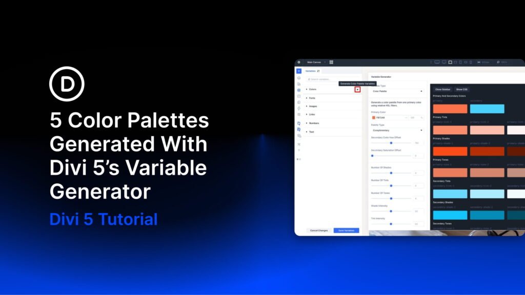
To access the Design Variable Manager, open any page or template in the Visual Builder. Then, click the Design Variable icon in the Builder Bar on the left side of the screen. This opens the Design Variable Manager, where you can create, organize, and manage sitewide variables.
At the top of the manager, use the dropdown to filter variables by type: Colors, Fonts, Numbers, Images, Text, and Links. To create a new variable, click the + button in the appropriate type section. Next, give the variable a descriptive name, set its value, and save it.
The mechanics are simple. However, the strategic decisions matter: what you name each variable, which value it stores, and how many variables you create. The rest of this article gives you a practical set to build from.
A Simple Naming Rule Before You Start
Before creating variables, use names that describe each variable’s role. For broad brand values, names like Primary Color, Secondary Color, and Body Text Color work well because they can be used in many contexts.
For values with a specific job, use functional names such as Border – Fields Dark, Background Overlay – Dark, or Rounded Corners – Buttons. This keeps the system easier to scan later, especially when you start building presets from these variables in Part 4.
Color Variables
Colors define brand identity, establish visual hierarchy, and create contrast between sections. Our Coworking Space site uses a narrow palette built from a small number of base colors. Then, we extend that palette with Divi 5’s Relative Color system to create transparent variants, overlay tones, and contextual shades.
Base Colors
Start by creating the foundational color variables. Primary, Secondary, Heading Text, Body Text, and Link colors are already generated for you. In this step, update them to match the Coworking Space design.
- Primary Color: #2176ff
- Secondary Color: #ff5700
- Heading Text Color: #000000
- Body Text Color: rgba(0,0,0,0.7)
- Link Color: Reference Primary Color
From there, add a few utility colors. Black and White will not be used directly on modules very often. Instead, they act as base values for the relative colors below, where we adjust opacity to create overlays, borders, shadows, and transparent tints.
- Black: #000000
- White: #ffffff
- Background – Light Gray: #f5f5f5
Relative Text Colors
With the base colors in place, build derived text colors using Divi 5’s variable referencing and relative color functionality. These values create dark-on-light and light-on-dark counterparts. As a result, a section can switch color schemes by choosing a different preset, which we’ll cover in Part 4.
- Heading Text – Light: Reference the White variable directly.
- Body Text – Light: Create a relative color from White at 90% opacity.
- Text – Dark Transparent: Create a relative color from Body Text Color at 40% opacity.
- Text – Light Transparent: Create a relative color from Body Text – Light at 60% opacity.
Relative Background, Overlay, and Utility Colors
These remaining color variables round out the palette. Some are role-based, such as Border – Dark and Drop Shadow, because they are intended for specific design jobs. Others, such as Black – Transparent and White – Transparent, are more flexible utility values.
In practice, both naming styles are useful. Use descriptive color names when a value can appear in many contexts. Use functional names when a value has a specific purpose.
- Background Overlay – Dark: Create a relative color from Black at 86% opacity.
- Background Overlay – Light: Create a relative color from White at 86% opacity.
- Black – Transparent: Create a relative color from Black at 10% opacity.
- White – Transparent: Create a relative color from White at 20% opacity.
- Border – Dark: Create a relative color from Black at 12% opacity.
- Border – Light: Create a relative color from White at 30% opacity.
- Border – Fields Dark: Create a relative color from Black at 30% opacity.
- Border – Fields Light: Create a relative color from White at 50% opacity.
- Drop Shadow: Create a relative color from Black at 15% opacity.
Font Variables
For this site, create two font variables: Heading and Body. Divi makes it easy to select Google Fonts, and Divi also supports uploaded custom fonts for projects that need them. For our Coworking Space site, both variables use Inter.
- Heading: Inter
- Body: Inter
Using a single typeface for both headings and body text is not always required. However, it can make your first design system easier to manage. In this build, the visual difference between headings and body text comes from size, weight, and line height instead of from separate font families.
A single font family can also reduce font-loading complexity. Still, using two well-chosen font families will not ruin your site’s performance on its own. Use the type system your design needs, and keep the font selection intentional.
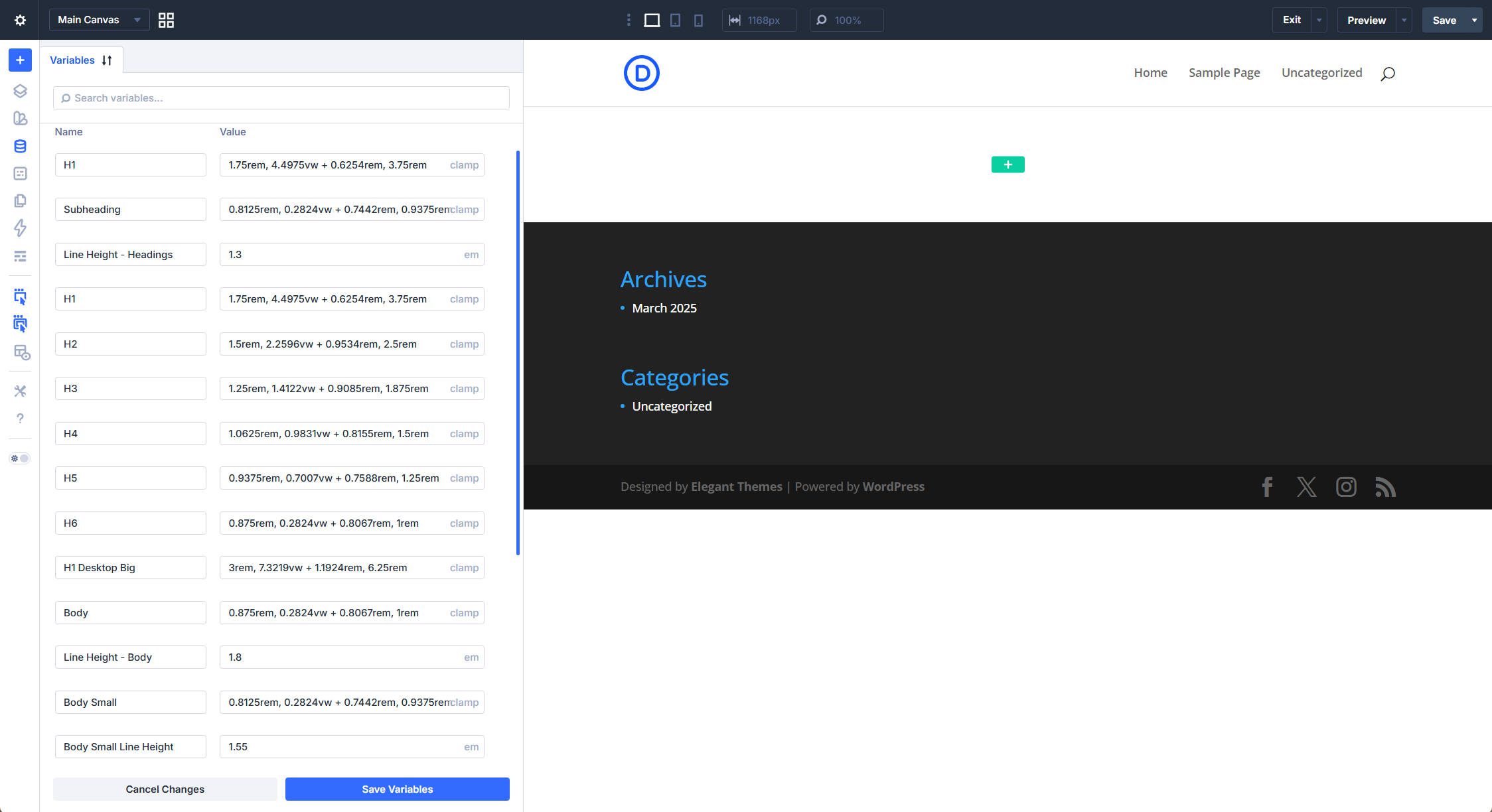
Number Variables: Typography
Number variables handle values measured in pixels, rems, ems, or CSS functions. We’ll create them in logical groups, starting with typography.
Heading Sizes
Each heading level gets a fluid size using a CSS clamp() function. These values define a minimum size, a preferred scaling rate, and a maximum size. Therefore, headings can scale smoothly between mobile and desktop without requiring separate values for every breakpoint.
Together, these variables create a proportional type scale that remains visually balanced across screen sizes. To add them to the Design Variable Manager, create a new Number Variable, copy the full clamp() value, and paste it in.
- H1: clamp(1.75rem, 4.4975vw + 0.6254rem, 3.75rem)
- H2: clamp(1.5rem, 2.2596vw + 0.9534rem, 2.5rem)
- H3: clamp(1.25rem, 1.4122vw + 0.9085rem, 1.875rem)
- H4: clamp(1.0625rem, 0.9831vw + 0.8155rem, 1.5rem)
- H5: clamp(0.9375rem, 0.7007vw + 0.7588rem, 1.25rem)
- H6: clamp(0.875rem, 0.2824vw + 0.8067rem, 1rem)
- H1 Big: clamp(3rem, 7.3219vw + 1.1924rem, 6.25rem)
- Eyebrow Subheading: clamp(0.8125rem, 0.2824vw + 0.7442rem, 0.9375rem)
Body Text Sizes
Body is the standard paragraph size. Body Small covers secondary text, such as footers and captions. Body XS is a fixed size for tags and fine print. Meanwhile, Fields Text matches Body Small today but stays separate so form field text can be adjusted independently later.
- Body: clamp(0.875rem, 0.2824vw + 0.8067rem, 1rem)
- Body Small: clamp(0.8125rem, 0.2824vw + 0.7442rem, 0.9375rem)
- Body XS: 12px
- Fields Text: clamp(0.8125rem, 0.2824vw + 0.7442rem, 0.9375rem)
Line Heights
Headings use tight leading because large text already provides visual structure. Body text uses more generous leading for comfortable reading. Small text sits in between.
- Line Height – Headings: 1.3em
- Line Height – Body: 1.8em
- Body Small Line Height: 1.55em
Spacing
Spacing variables create a consistent rhythm between elements. Rather than eyeballing padding and margins on every module, reference a spacing variable that enforces the same distance wherever it is used.
The fixed values cover tight element gaps, such as Spacing – XSmall, through generous section padding, such as Spacing – Large. In addition, Spacing – Fluid scales with the viewport to avoid spacing that feels too tight on desktop or too loose on mobile. Grid Gap – Fluid is similar, but it is capped at 60px for CSS Grid layouts.
- Spacing – XSmall: 10px
- Spacing – Small: 20px
- Spacing – Medium: 30px
- Spacing – Regular: 60px
- Spacing – Large: 100px
- Spacing – Fluid: clamp(24px, 6vw, 90px)
- Grid Gap – Fluid: min(4vw, 60px)
Borders and Corners
Structural borders and field borders share the same value, but they are separated so they can evolve independently. Button borders are set to 0px because this design uses filled backgrounds rather than outlines.
The same logic applies to corner radii. The three 8px values match now, but they are separated because images, containers, and form fields are different design concerns. For example, you might later want rounder images but sharper cards. In that case, you can change one variable without affecting the others. Finally, Rounded Corners – Buttons uses 500px to create a pill shape.
- Border Width: 1px
- Border Width – Fields: 1px
- Border Width – Buttons: 0px
- Rounded Corners – Regular: 8px
- Rounded Corners – Images: 8px
- Rounded Corners – Fields: 8px
- Rounded Corner – Small: 4px
- Rounded Corner – Large: 16px
- Rounded Corners – Buttons: 500px
The 2:1 horizontal-to-vertical padding ratio creates a wide, click-friendly button shape. These three variables, combined with Rounded Corners – Buttons and Border Width – Buttons, define the physical dimensions of every button on the site.
- Button Font Size: 14px
- Button Vertical Padding: 16px
- Button Horizontal Padding: 32px
Layout Dimensions
Layout variables constrain content to readable line lengths. Row Max Width is the default for standard content rows. The narrower options are for blog posts, forms, and compact centered blocks, where shorter lines can improve readability.
- Row Max Width: 1080px
- Max Width – 900: 900px
- Max Width – 700: 700px
- Max Width – 510: 510px
Image Variables
Image variables store visual assets that are reused across the site.
- Logo Dark: The dark version of the logo for light backgrounds.
- Logo Light: The light or white version of the logo for dark backgrounds.
Every header, footer, and template that displays the logo can reference one of these variables. Then, if you improve or replace a logo later, you only need to update the Image Variable. The change will apply wherever that variable is used. If you do not have a logo yet, use Logoipsum to create a temporary placeholder.

Text Variables
Text variables store words and phrases that repeat across pages and templates. If you expect to type the same text more than once, it is often worth saving it as a Text Design Variable. Business details are a strong use case because they tend to appear in headers, footers, contact sections, and templates.
- Company Name: Elegant Themes
- Address: 1234 Divi St. #1000, San Francisco, CA 94220
- Phone Number: (255) 352-6258
- Email: [email protected]
- Opening Hours: Mon-Fri: 10am–5pm / Sat-Sun: Closed
CTA anchor text is also worth planning in advance. Because buttons appear throughout the site, reusable CTA variables help keep wording consistent and reduce small decisions during the build.
- Book Tour: Book Tour
- View Plans: View Plans
- Learn More: Learn More
- Read More: Read More

Link Variables
Link variables store URLs that get referenced across multiple modules. For links built inside your WordPress installation, dynamic data may already be the better choice. However, for external destinations like social profiles, scheduling tools, or third-party resources, Link Variables are convenient.
- Elegant Themes: https://www.elegantthemes.com/
- YouTube: https://www.youtube.com/
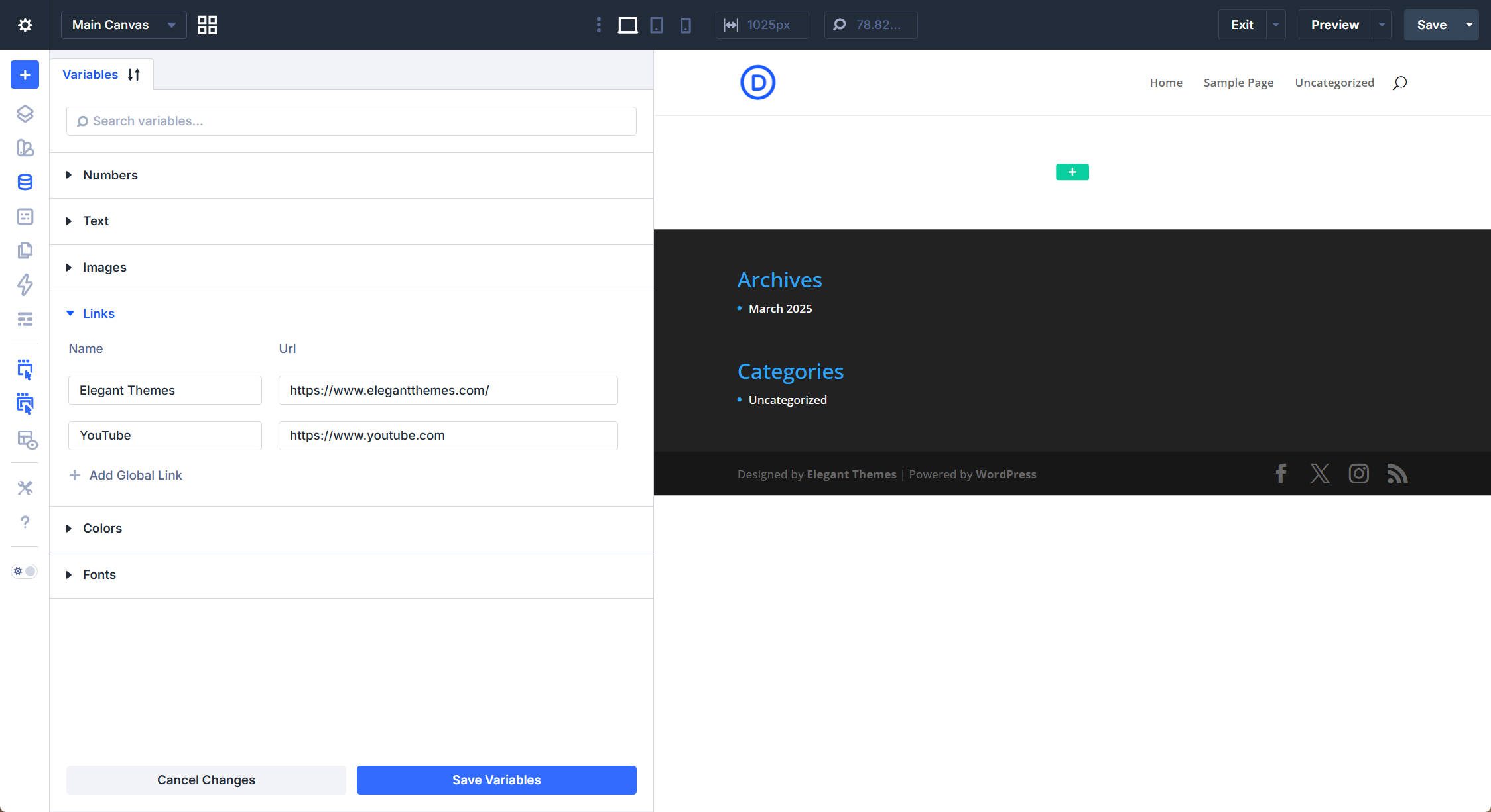
These variables are especially useful when an external URL changes. For example, after your YouTube channel qualifies for a custom handle or vanity URL, you can update the YouTube Link Variable once. Then, every module that references it will point to the new destination.
Reviewing the Complete System
With all variables created, the design system contains 21 color variables: 8 base colors and 13 colors built with the relative color system. It also includes 2 font variables, 38 number variables, 2 image variables for logo variants, 9 text variables for business information and CTAs, and 2 link variables for reusable URLs.
That gives us 74 active design variables before any page modules have been added. More importantly, the constraints are already in place. Every color has a name, every spacing value has a purpose, and every heading level has a fluid size that adapts across screen sizes.
The payoff is consistency and changeability. When you apply Spacing – Small to a card’s padding and a list’s gap, those distances match because the variable enforces them. Likewise, if a client decides the brand blue needs to shift, you can change Primary Color once and let that update flow through every preset that references it.
What’s Coming Next
The variables are in place, but they do not do much on their own yet. In Part 4: Mastering Divi 5 Presets For Faster, More Consistent Web Design, we’ll use these variables to build a complete library of Option Group Presets and Element Presets.
You’ll see how a Primary Color variable becomes a Filled – Primary Color button preset, how heading size variables get bundled into Heading 1 through Heading 6 presets, and how a few spacing variables generate an entire family of container padding presets. Once those presets are built, they can be reused across every module on the site.