Blog
Exploring Every Aspect Of The Divi 5 Interface
Welcome back to the Divi 5 Mastery Course. In Part 1, we covered everything you need to prepare before opening the Builder, from installing WordPress and Divi to gathering your brand assets, sitemap, and content for the coworking space website we’ll build together.
Now that you’re prepared, it’s time to step inside the Divi 5 Visual Builder. Divi 5 is now fully released and out of Beta, bringing a completely revamped, modern, high-performance interface.
In this post, we’ll explore every major element of the new interface, focusing on where things live, what they do, and how they work together. By the end, you’ll know exactly where to find what you need so you can design with confidence.
Let’s dive in.
Overall Interface Layout And Workspace Overview
The Divi 5 Visual Builder has been completely redesigned to feel like a modern, professional design tool. It’s clean, spacious, and highly customizable, giving you plenty of room to focus on creativity without clutter or distractions.
At its core, the interface follows a clear hierarchy that makes navigation intuitive once you understand where everything lives.
The Page Bar (Top)
The Page Bar is the main toolbar. It houses your page settings, responsive views, and publishing actions. It’s fixed to the top of the screen, so you never have to scroll back up to save your work.
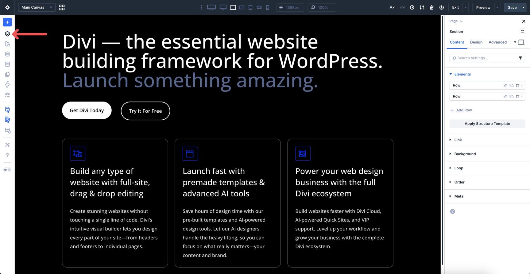
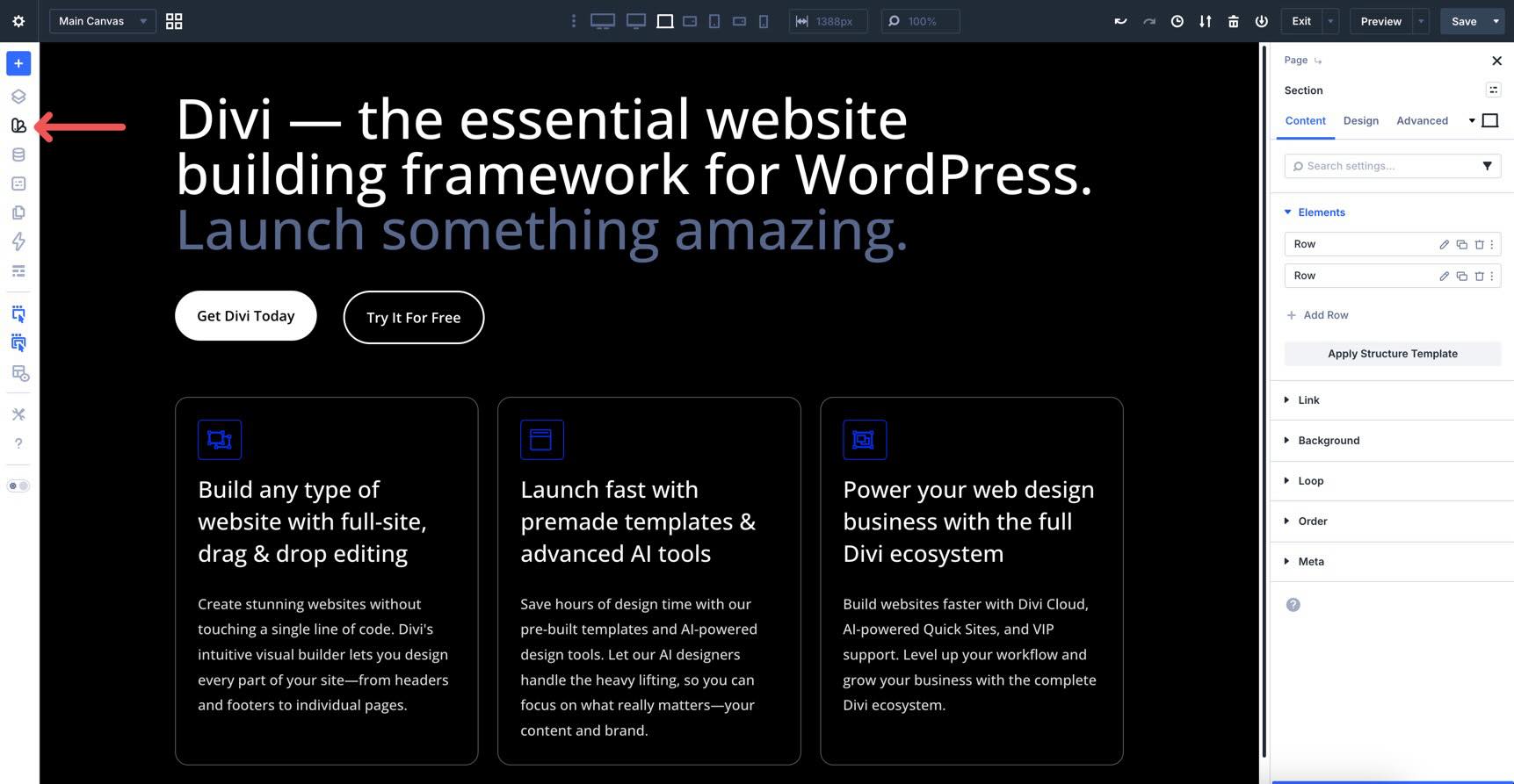
The Builder Bar (Left)
The Builder Bar houses your creative toolkit. It’s where you’ll toggle panels like Layers and the Inspector, manage global Design Variables and Presets, and switch between viewing modes like Wireframe or X-Ray. You can open and close these tools whenever you need them, keeping your workspace clutter-free.
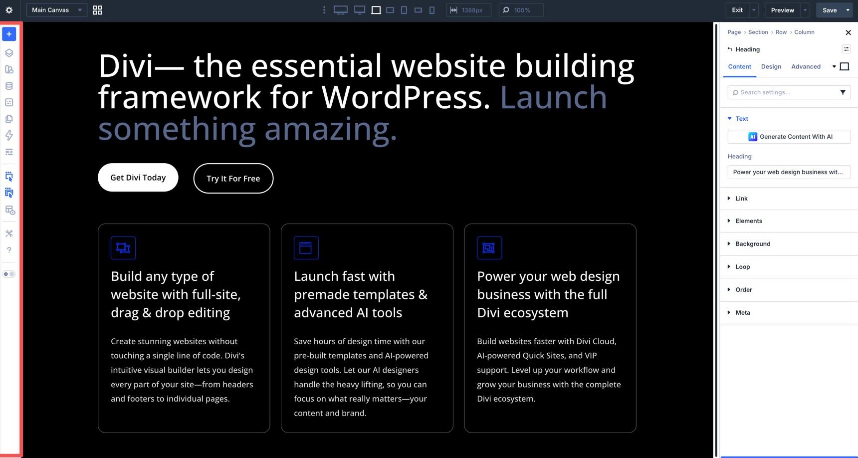
The Canvas (Center)
This is your main workspace. It’s the central space where you’ll build and design your pages in real time. Because it’s a true visual builder, what you see here is exactly what your visitors will see on the live site.
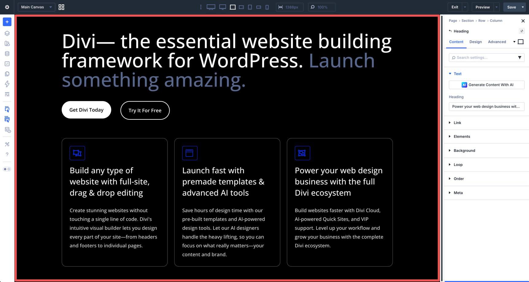
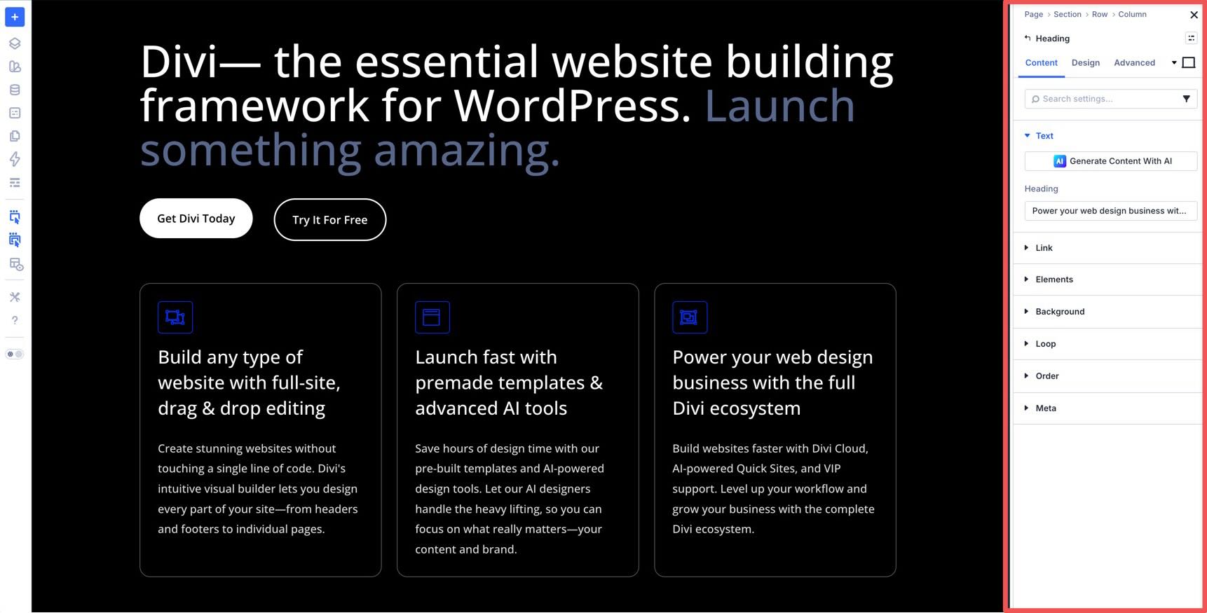
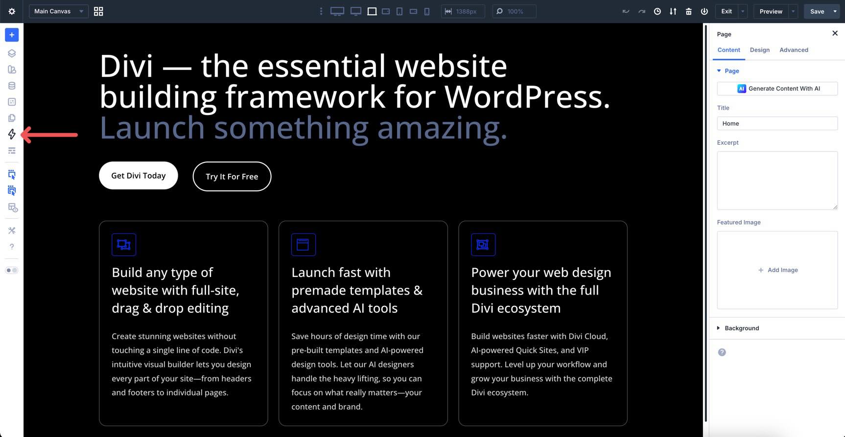
The right Sidebar contains all content and design settings for the selected module. Whenever you click an element on the Canvas, this panel displays all the settings you need to customize it. If nothing is selected, it defaults to your page-level settings so you can manage the big picture. It’s the go-to spot for fine-tuning your content and perfecting your design.
Customizable Panels
All of the panels in the Divi 5 interface are highly customizable. You can drag them to dock them to the left or right, group multiple panels into tabs for quick switching, or use them as floating panels. This allows you to maximize canvas space and support a customizable workflow.
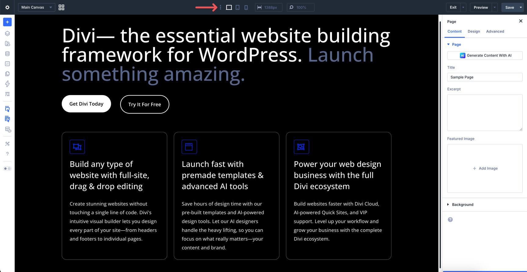
The Page Bar
In Divi 5, the Page Bar serves as the control center for page-level actions. It stays pinned to the top of the Builder, where you can find your page settings, customizable responsive breakpoints, and publishing actions.
Clicking the Gear icon opens a central menu where you can manage your page’s overall settings. You can access page settings, save the layout to your library, or use the Import/Export tools. It’s also a quick shortcut for clearing your layout, accessing your edit history, or jumping into a recently edited page.
The Canvas Select dropdown menu and Canvas Grid View icon allow you to switch between Canvases. Every page starts with a Main Canvas for your primary content, but Divi 5 lets you create additional detached canvases. Think of these as flexible workspaces rather than separate pages. You can use them as staging areas to experiment with new designs safely or as the foundation for off-canvas elements like popups, slide-ins, and mega menus.
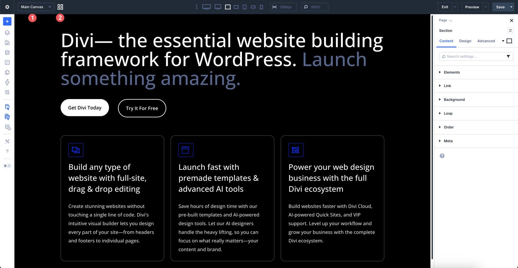
You can use the Canvas Selector menu to jump between different workspaces or toggle the Grid View to see a bird’s-eye view of every canvas associated with your page.
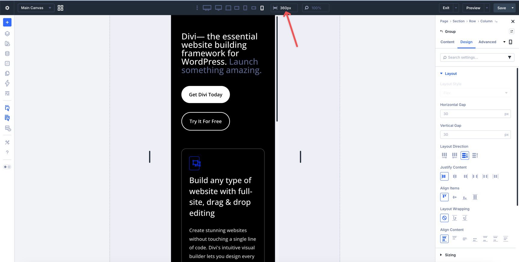
Responsive & Viewport Tools
The next section of the Page Bar is where you ensure your site looks great on every screen. These Customizable Responsive Breakpoints are state switchers that tell the Builder exactly which device you are styling for.
By default, Divi 5 starts with three enabled breakpoints for Desktop, Tablet, and Phone. Click the ellipsis menu to reveal the remaining breakpoints.
If you need to target a specific device size, such as an ultra-wide desktop monitor or a small phone, you can enable additional breakpoints by toggling them on. There are seven in total, allowing you to target a variety of screen sizes.
You can also resize the Canvas by grabbing the edge while in a responsive view. This lets you resize the window manually and see exactly how your design reflows across different widths.
Use the Responsive Select field to enter a specific width value when you want to pinpoint a specific size, like 360px for older, smaller devices.
Actions & Publishing
The right side of the Page Bar is where you manage your progress and finalize your work. These tools let you save your layout and serve as a safety net if you need to backtrack. To enable these settings, you first need to turn them on in the Builder Settings in the Builder Bar, which we will expand on in the next section.
Undo/Redo & History
Once enabled, these icons give you total control over your editing timeline. You can step backward through recent changes with undo and redo or open the History panel to see a chronological list of every edit made during your session.
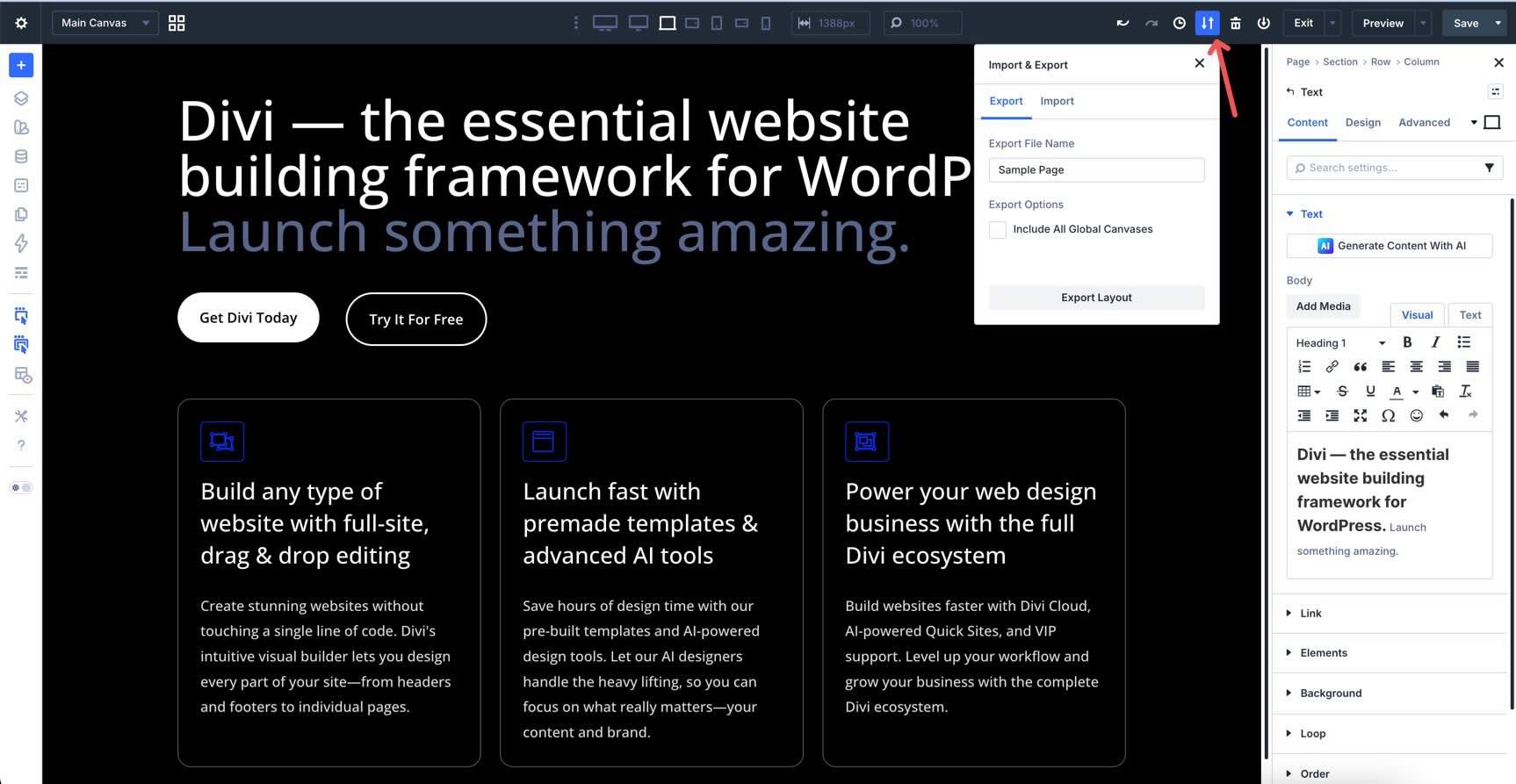
Portability & Library
When you need to save or load a layout, delete it, or add it to the Divi Library, you can do these things from here. The Export & Import button allows you to export your layout as a JSON file, including all Global Canvases, or import a saved JSON file from your computer.
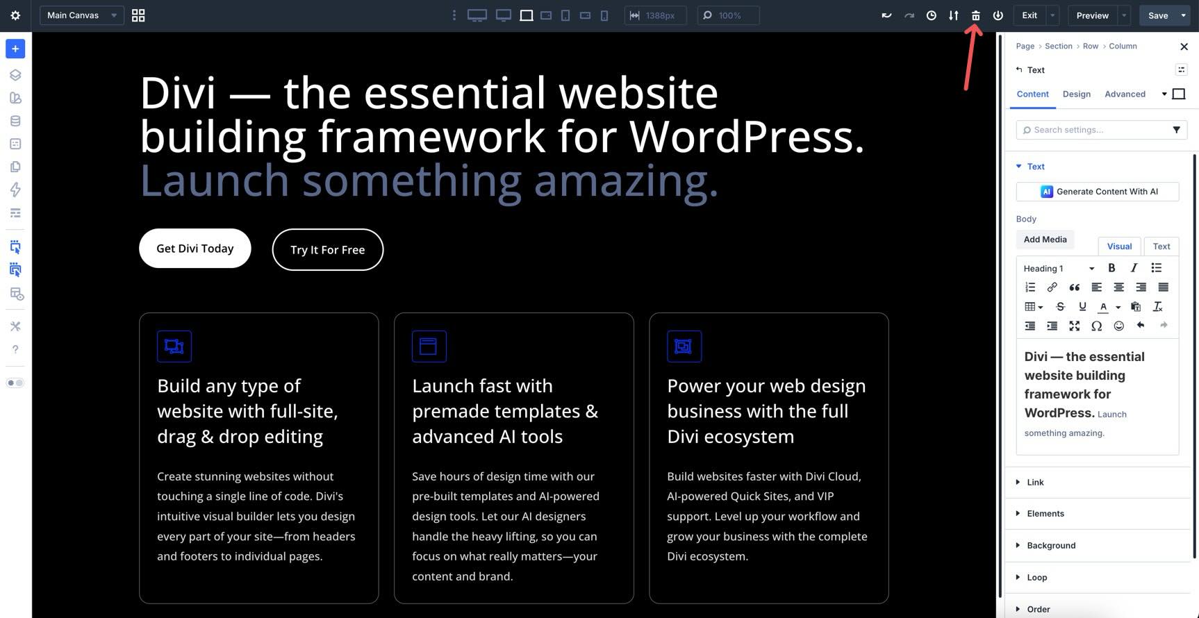
The Clear Layout icon (trash can) instantly clears every module on the Canvas, so you can start fresh.
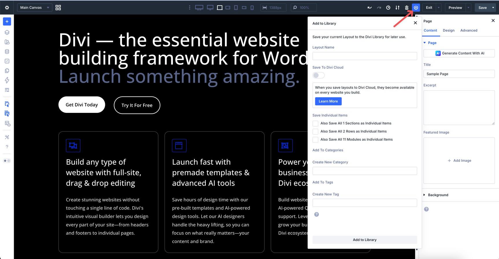
If you’d like to save the entire layout for reuse, the Add To Library icon lets you name it, save it, and import it anywhere else on your site. You can save it to Divi Cloud and save individual sections, rows, or modules as separate items. Layouts can also be categorized and tagged for easy identification as your site grows.
Preview & Exit
Use Preview Mode to strip away the Visual Builder interface and see your site exactly as a visitor would. It opens in the same window, keeping your design clutter-free so you can make additional changes as needed.
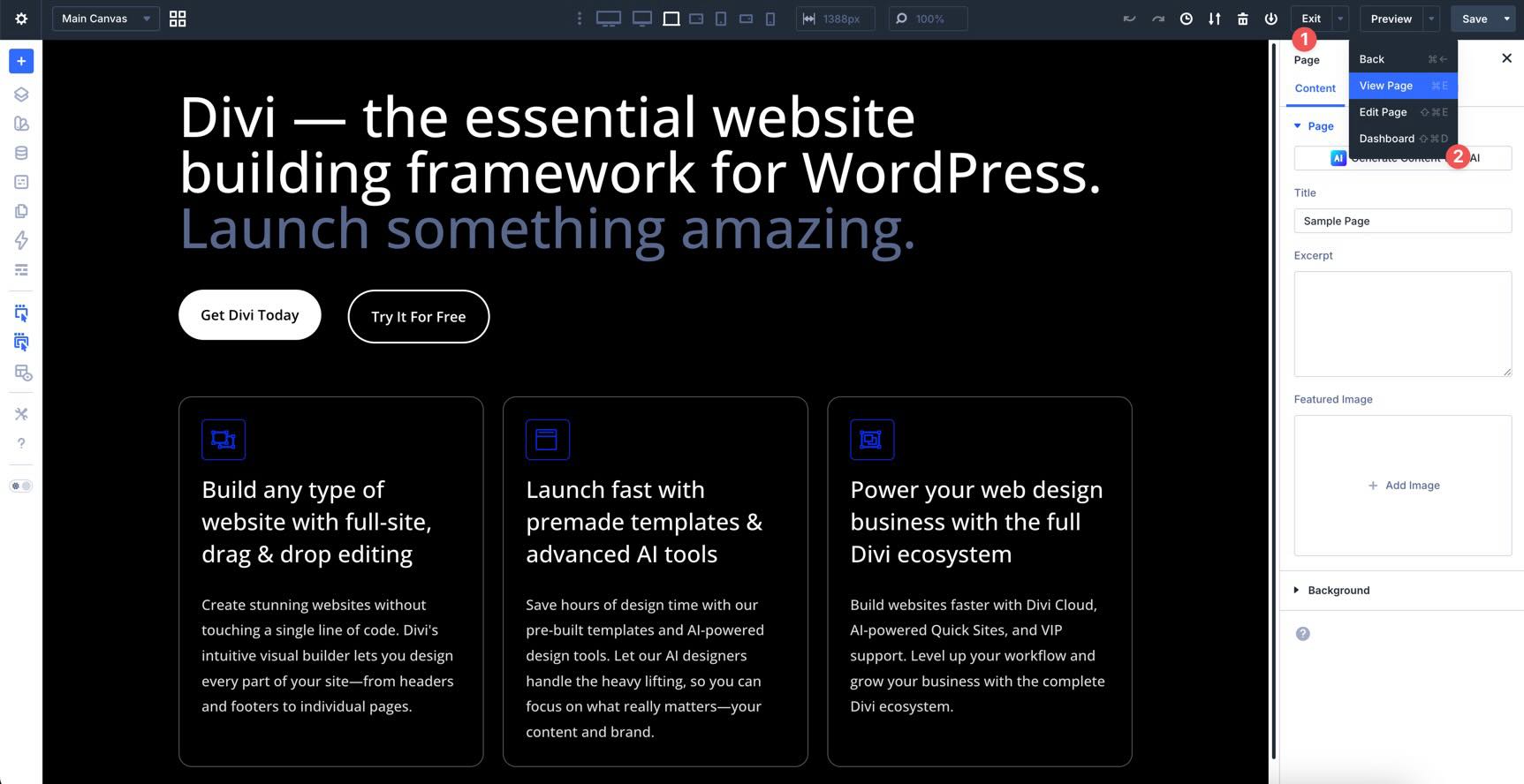
The Exit menu gives you a few options, including exiting to the Pages area of your site, viewing your site in a new tab (View Page), editing the page, or exiting to the Dashboard.
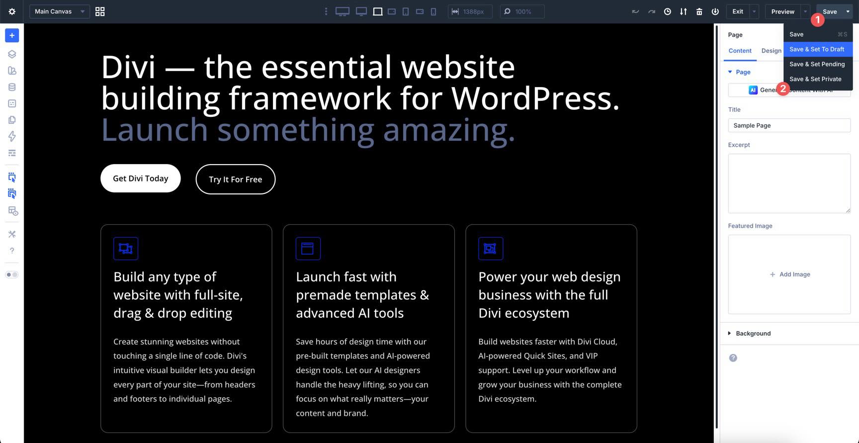
Finally, the Save button allows you to save the page or save it and set it to draft, pending, or private.
The Builder Bar
The Builder Bar, located on the left Sidebar of the Visual Builder, is your creative toolkit. It provides quick access to tools that help you navigate your page structure, manage your global design system, and customize your workflow.
Add Layout / Divi Library Access
At the top of the Builder Bar, there’s quick access to insert premade layouts, Divi Library items (saved layouts), or build a layout with Divi AI.
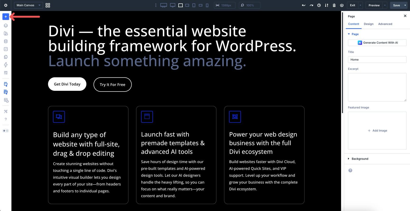
This provides quick access to load a favorite Divi Library item, get started with a Layout Pack, or let AI craft a layout for you.
Layers View
The Layers View provides an overview of your page structure. It’s a searchable, hierarchical tree of every element. Use it to expand, collapse, or rename sections and modules to keep your project organized.
It is especially useful for long-form pages with many sections. Instead of scrolling endlessly, you can use Layers View to jump to any element with a single click or rename layers to keep your structure clear and easy to identify.
The Inspector
Inspired by professional design tools like Figma, the Inspector gives you a high-level overview of an element’s attributes.
Instead of hunting through different tabs for colors or fonts, the Inspector aggregates and groups them in one place. You can use it to bulk-edit styles or content, such as changing a brand color, across multiple elements or Presets simultaneously.
The Variable Manager
The Variable Manager is your design system hub. Instead of hard-coding static values like colors or pixel sizes into every module, you create reusable Design Variables. Divi 5 supports variables for colors, fonts, numbers, text, images, and links.
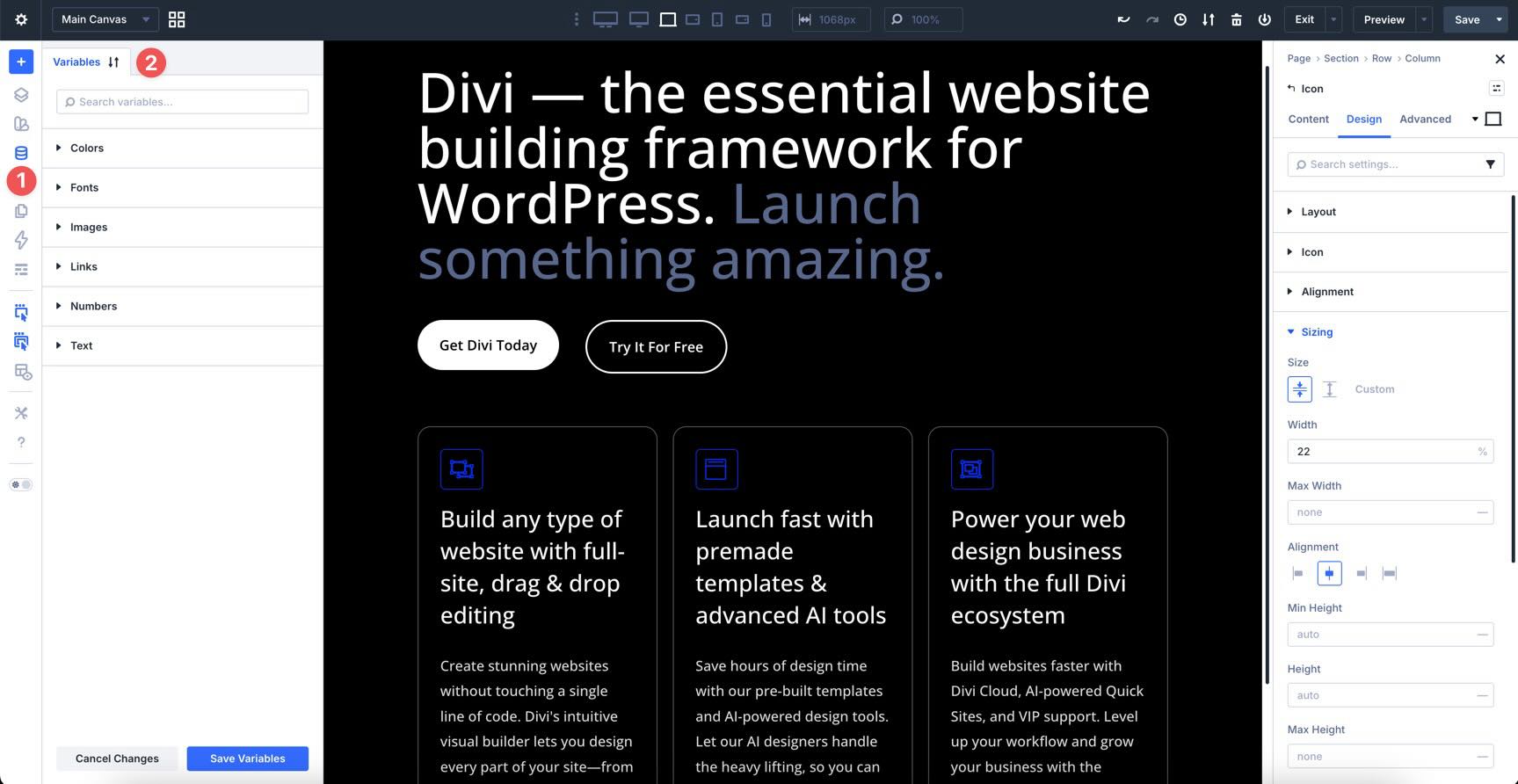
You can create Relative Colors using HSL (hue, saturation, and lightness). For example, you can define a primary brand color and then create a lighter version that stays linked to it. If you change the main brand color, the lighter version updates automatically to match.
You can store complex values like clamp() in Number variables to handle fluid typography and spacing across all devices from one central spot.
If your client changes their branding, you update the variable once here, and every module, preset, and page using that variable updates instantly across the entire site.
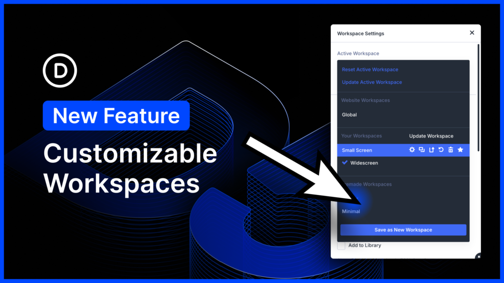
The Preset Manager
Presets in Divi 5 have been completely reimagined to be more powerful and granular. You’re no longer limited to saving the entire module. You can now save specific groups of settings independently to build a truly flexible design system. Presets now have a centralized location for global style management: the Preset Manager.
It houses both Element and Option Group Presets. Element Presets control the entire module. If you’ve designed a primary button preset with specific colors, fonts, and shadows, you save it as an Element Preset to use it anywhere on your site.
Option Group Presets offer a new, granular way to save styles. Instead of the whole module, you can save just the Box Shadow, Typography, or Border settings as a standalone preset.
You can stack or nest multiple presets on a single element, making Divi 5’s preset-based design system a great way to create new projects with minimal upfront work. Just like Variables, if you edit a preset in the Preset Manager, every module on your site that uses that preset will update instantly to match the new look.
If you’re coming from Divi 4, think of Variables and Presets as an evolution of global design. Instead of relying solely on global modules, Divi 5 offers a more flexible system for managing styles and values across your entire site. We will cover these features in depth in Parts 3 and 4 of our Divi 5 Mastery Course.
The Page Manager
The Page Manager turns the Visual Builder into a site-wide control center. It lets you manage your entire website’s structure without having to jump back to the WordPress dashboard.
Once clicked, you’ll get a searchable list of all your pages, posts, and projects. Clicking on a page opens it in the Builder immediately.
As you select a page, Divi 5 uses Speculative Prerendering to predict which page you’ll click next based on your mouse movements and start loading it in the background, making page switching feel nearly instant.
You can use the Page Manager to add new pages, duplicate existing ones, or delete pages you no longer need.
The Command Center
The Divi 5 Command Center serves as a productivity tool in the Visual Builder. Instead of clicking through nested menus to find a specific setting, you can simply type what you need. It’s designed to keep your hands on the keyboard and significantly speed up the building process.
There’s a dedicated search + filter field that lets you filter through commands for elements, modals, settings, navigation, and page-level commands.
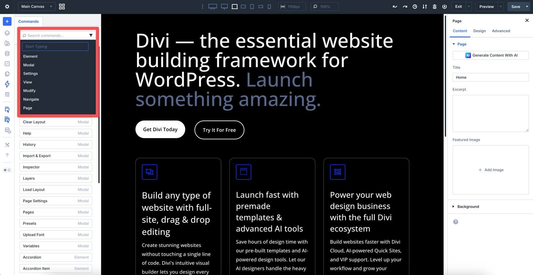
Click into an area of the Canvas you want to edit, type the name of a module, and hit Enter to add it instantly.
If you need to change a box shadow, border, or spacing, just type those words to jump straight to those controls without any manual scrolling.
The Command Center isn’t just for the Canvas. Use it to find specific pages on your site, jump to the Theme Builder, or quickly save your current layout to the Divi Library.
You can even build entire layouts using simple text commands. For example, typing row > column > blurb > button and using Cmd + Return between each command will instantly generate a Row containing a Column, a Blurb, and a Button module.
Wireframe View
Toggle this to see your page as a clean, structured blueprint. This mode hides all styling, images, and colors so you can focus entirely on the hierarchy and organization of your content. Once clicked, you’ll have the familiar back-end look of Divi 4 right inside the front end of the Visual Builder.
Action and Parent Icons On Hover
The Action Icons On Hover setting controls whether the editing buttons (settings, duplicate, delete, etc.) appear when you mouse over an element. Turning this off gives you a clean view of your design without UI elements popping up.
The Parent Action Icons On Hover setting specifically toggles the icons for parent containers like sections or rows. It helps reduce visual noise when you only want to focus on individual modules.
X-Ray Mode
Unlike Wireframe mode, X-Ray Mode keeps your images and content visible as you browse, revealing the underlying structure. It draws an outline around every element on the page, making it a useful tool for troubleshooting layout issues. By viewing the boundaries of every container, you can instantly identify which element is causing a spacing conflict, even if it has a transparent background or overlaps another module.
Use this whenever your design gets complex to see exactly where your invisible containers are sitting on the Canvas.
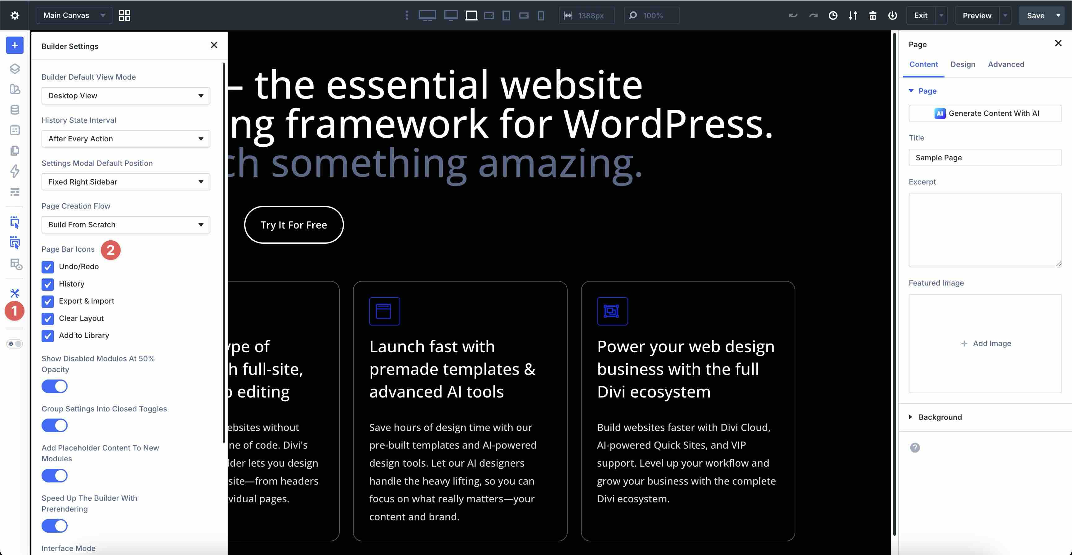
Builder Settings
The Builder Settings icon contains a series of tools for personalizing the interface. From here, you can toggle which tools stay visible in the Builder and adjust their overall behavior to match your workflow.
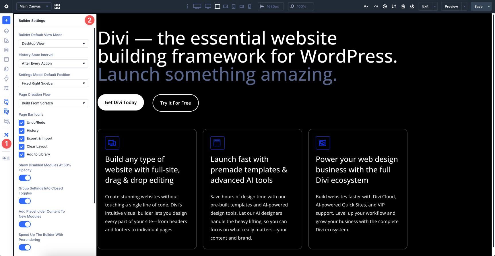
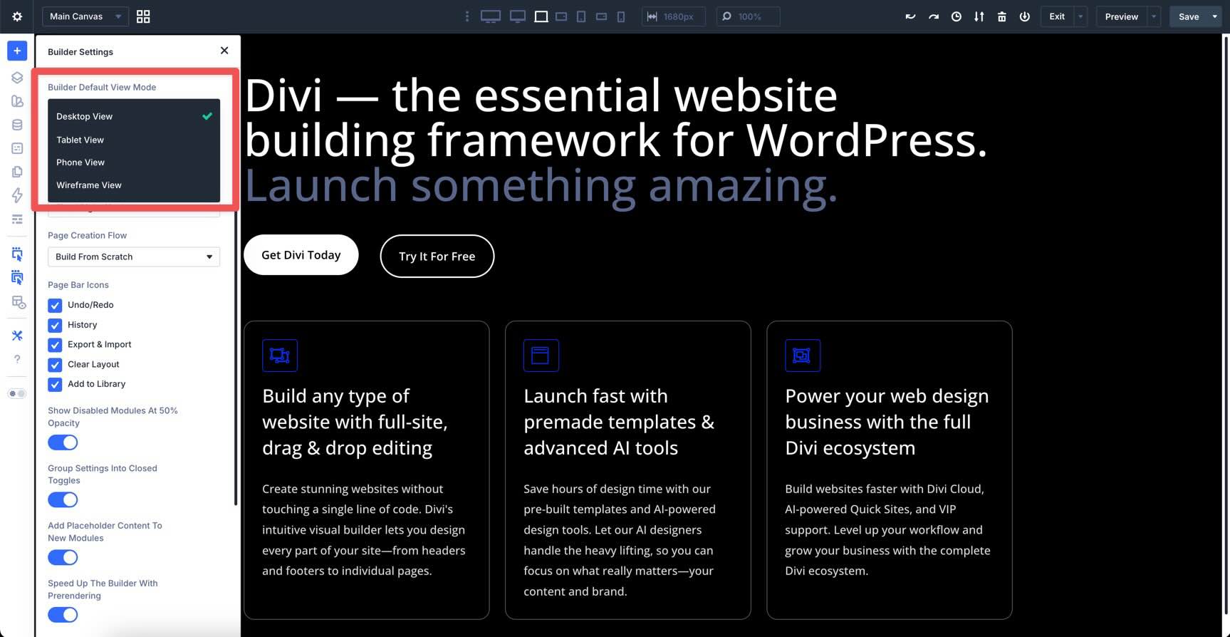
Builder Default View Mode
Choose which view opens by default when you launch the Builder: Desktop, Tablet, Phone, or Wireframe. This is helpful if you prefer starting with a structural overview or if you are focusing specifically on mobile optimization.
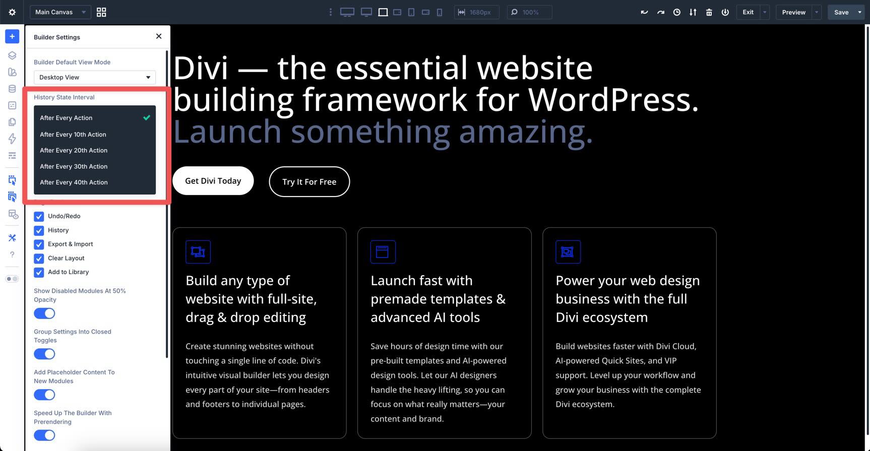
History State Interval
Customize how frequently the Visual Builder saves a History State. Adjusting this lets you control how granular your undo/redo timeline is during an active session.
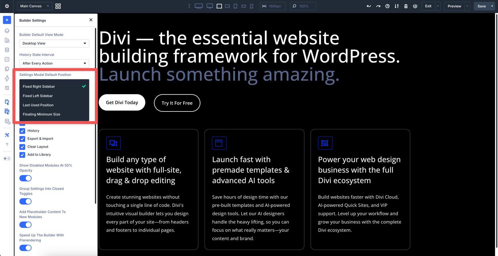
Settings Modal Default Position
You can decide where your settings panels live. You can pin them as sidebars on the left or right, return them to the last-used position, or set a floating minimum size so you can move them freely as you design.
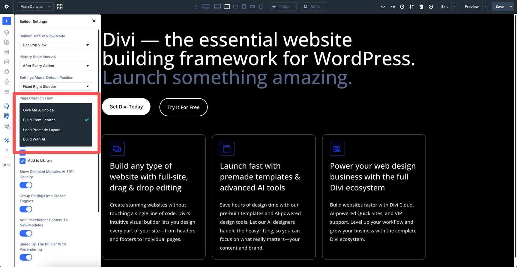
Page Creation Flow
This determines what you see when creating a new page. You can choose to always show the Build From Scratch choice, automatically open the premade layout library, or jump straight into building a page with Divi AI.
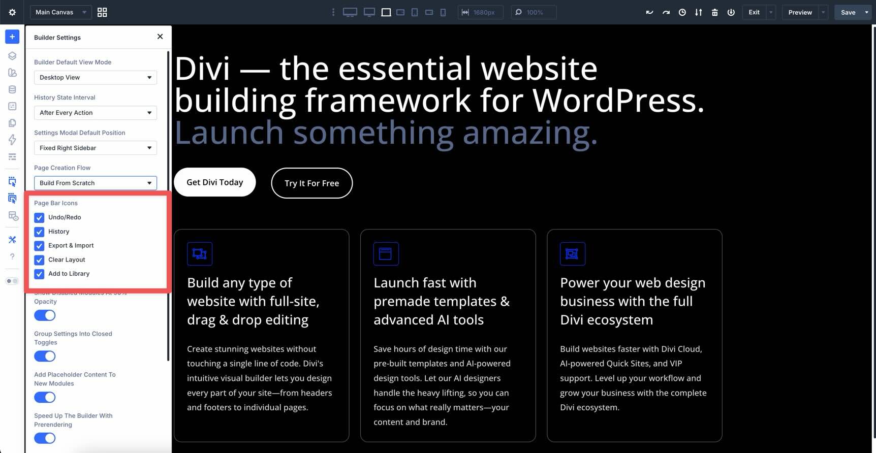
Page Bar Icons
Here, you can toggle the Page Bar icons for undo/redo, history, export and import, clear layout, and add to library.
Show Disabled Modules At 50% Opacity
For a clearer visual experience, the Show Disabled Modules At 50% Opacity setting dims inactive elements, such as those hidden on mobile, so you can tell at a glance which are live without cluttering your view.
When toggled off, the hidden element disappears from the layout entirely.
Group Settings Into Closed Toggles
To keep your design workspace uncluttered, you can enable Group Settings Into Closed Toggles, which ensures that the Content, Design, and Advanced tabs remain collapsed until you specifically need them.

Add Placeholder Content To New Modules
You can also toggle Add Placeholder Content To New Modules, which automatically fills new elements with placeholder text and images so you can see your layout’s structure immediately.

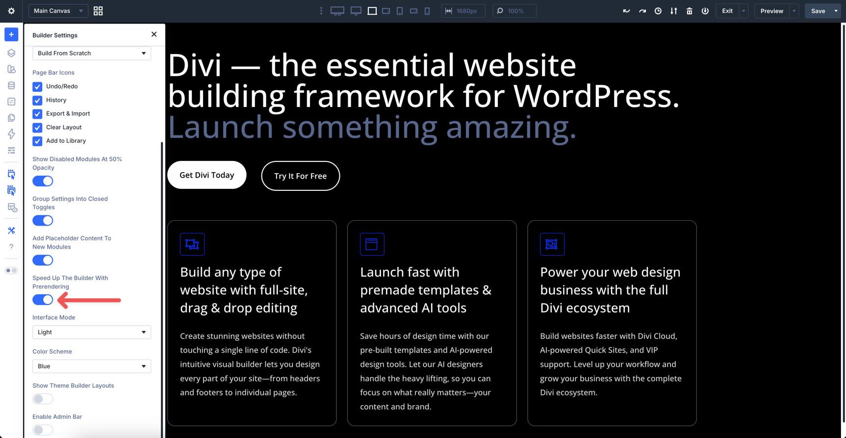
Speed Up The Builder With Prerendering
When enabled, Divi 5 uses Speculative Prerendering to predict your next move, such as hovering over the exit button or a new page. It begins loading the destination in the background for nearly instant transitions, whether you’re loading a different page, heading back to the dashboard, or opening the Theme Builder.
Interface Mode
The Interface Mode setting lets you choose between light and dark mode, giving you control over how the Visual Builder is displayed.
Color Scheme
You can change the primary UI color scheme, such as blue, purple, red, green, or orange, to personalize the look of the Builder’s buttons and accents without affecting your actual website design.
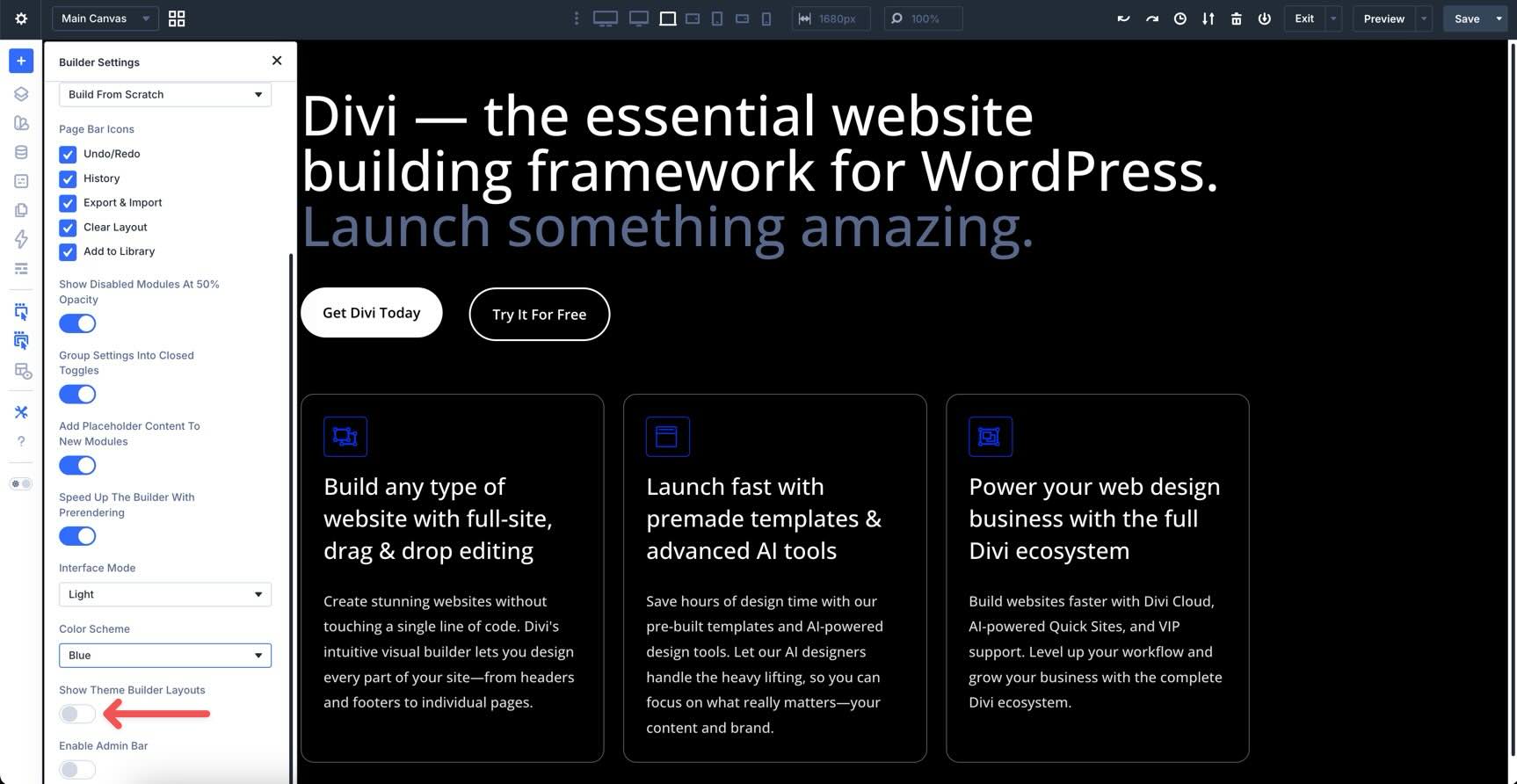
Show Theme Builder Layouts
A toggle in Divi 5 lets you hide or show global areas like headers and footers while editing a page. This is useful for removing visual distractions when you want to focus exclusively on the page’s body content.
Enable Admin Bar
When enabled, the Enable Admin Bar toggle keeps the standard WordPress top bar visible in the Builder.

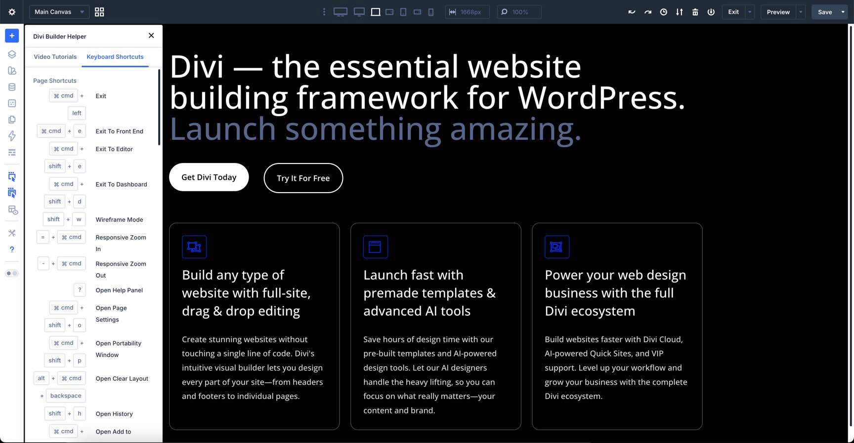
Help
The Help setting in the Builder Bar gives you access to a series of video tutorials to help you get started with Divi 5. It covers everything from an introduction to the Visual Builder to using Divi 5’s design settings and becoming a power user.
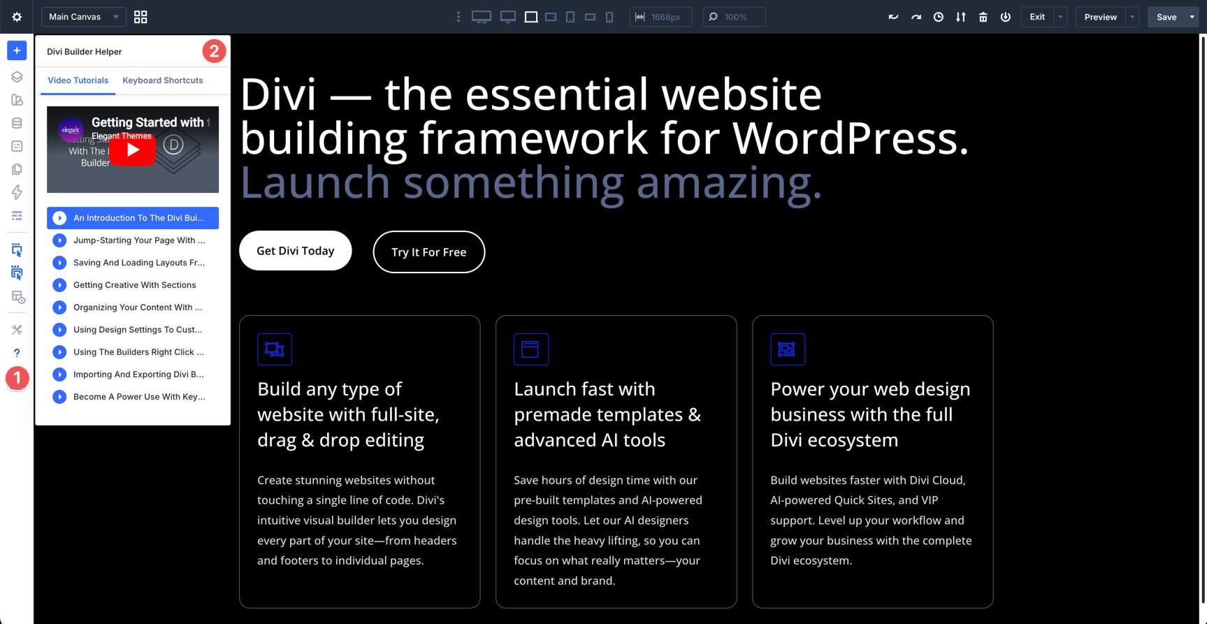
There’s also a full list of keyboard shortcuts that can help you work more efficiently inside the Builder.
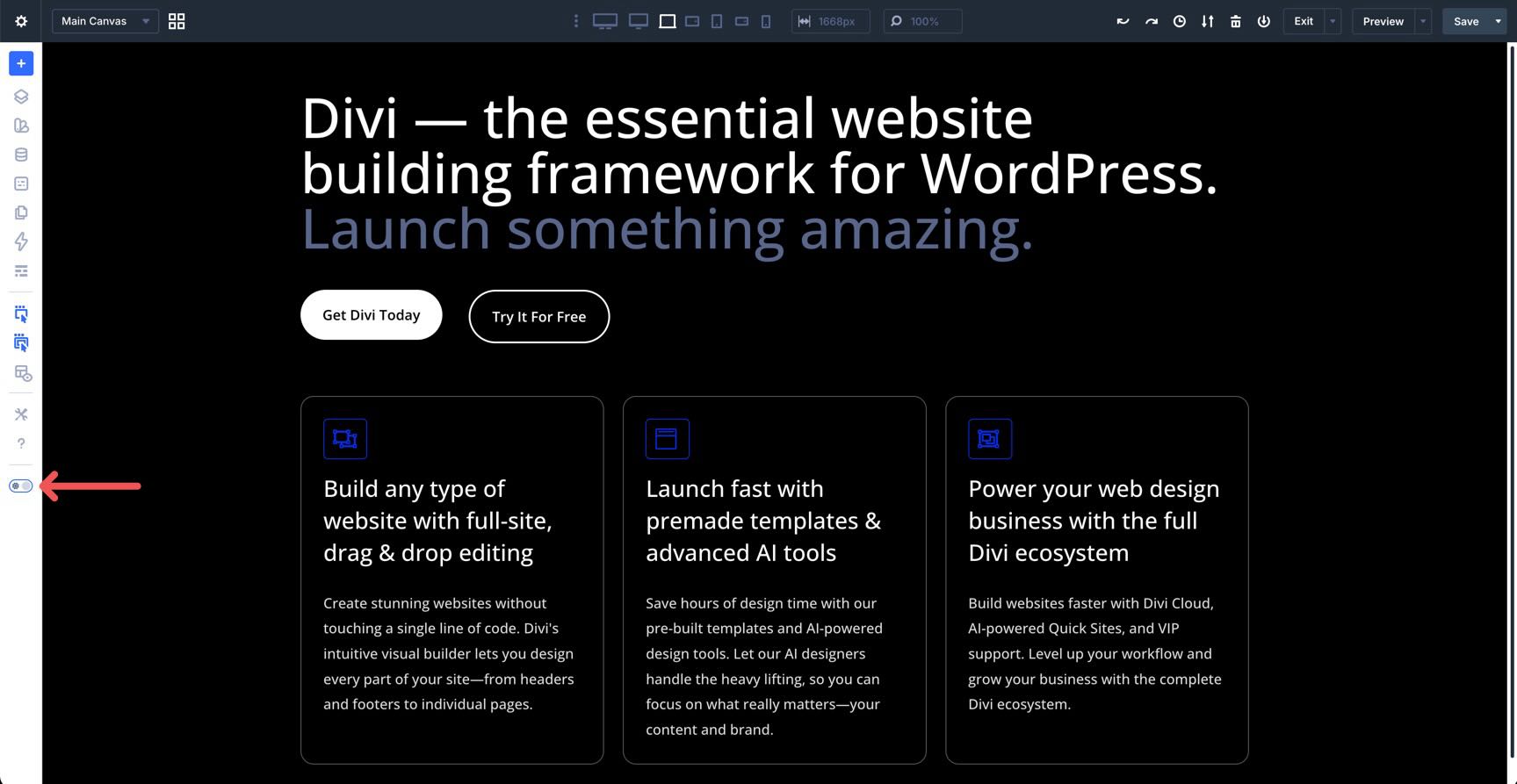
Light/Dark Mode
The last item in the Builder Bar is the Light/Dark Mode toggle. It lets you quickly switch between the two modes without digging through the Builder or Page Settings.
The Canvas
In Divi 5, the Canvas is no longer just a preview window. It works as a detached, high-performance workspace. The most significant changes are found in the right-click contextual menus and the multi-select workflow.
Divi 5 makes the Canvas even more powerful with intuitive right-click menus that put the most common actions right at your fingertips. Instead of hunting through icons or opening settings panels repeatedly, you can right-click any section, row, column, or module to reveal a context-sensitive menu packed with quick tools.
These menus include essential actions like duplicate, undo/redo, move, delete, copy, paste, inspect, and add an element above, inside, or below. You’ll also find options to copy, paste, and extend attributes (more on this in the next section), reset specific settings, and save to the library.
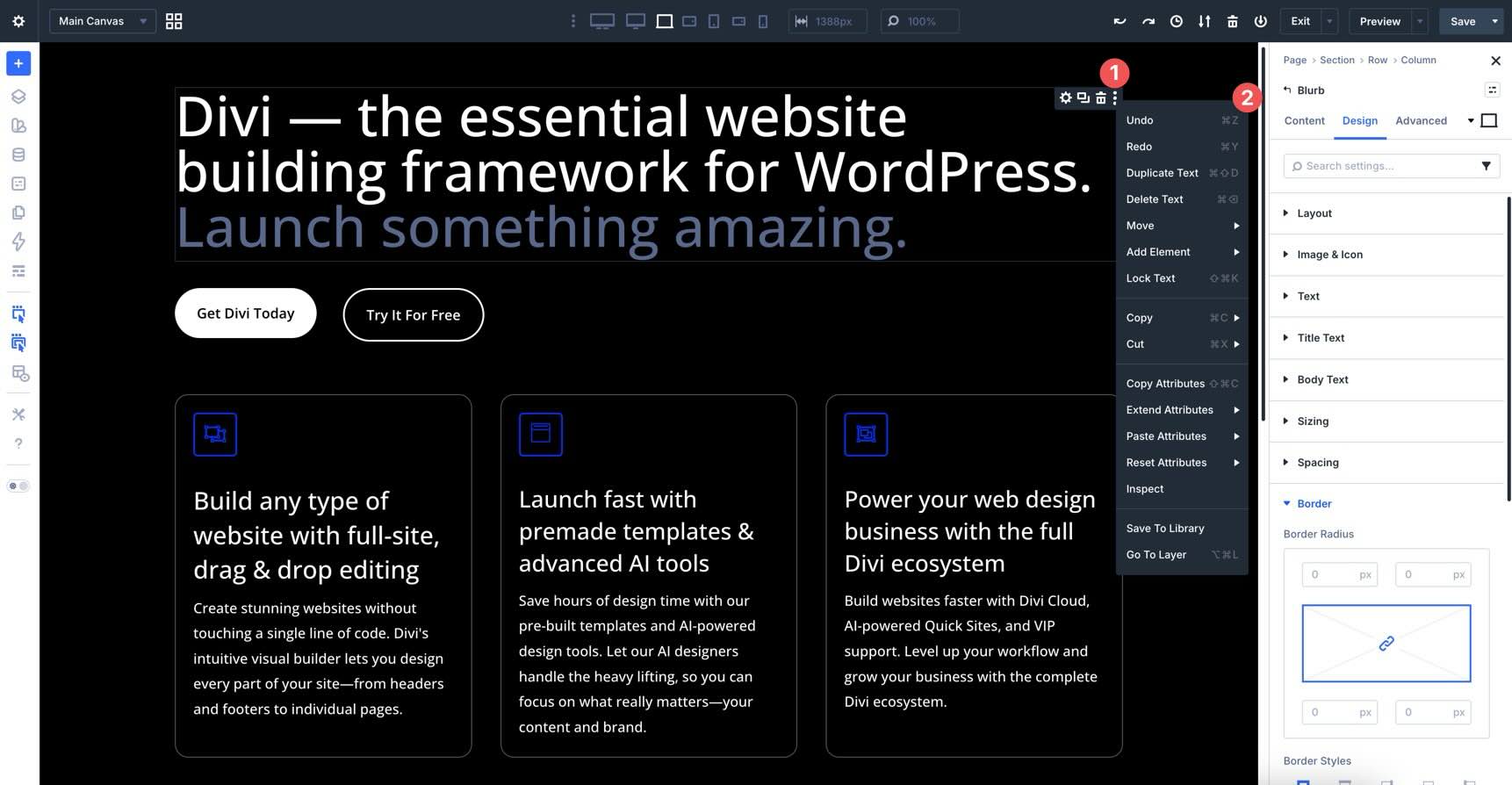
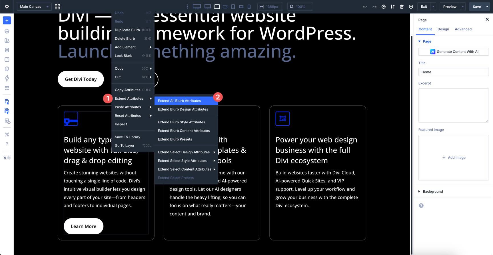
Extend Attributes
While the old version only handled styles, this new system allows you to propagate styles, content, and presets across your layout simultaneously. When you right-click an element and select Extend Attributes, you can choose exactly what to push. You can extend an entire Option Group, such as all Button settings, or drill down to Modified Fields only.
For instance, you can change only the styles of every button on the page while leaving their unique text intact.
You can define the scope of the extension. Apply your changes to similar elements within the current Module Group, column, row, section, or the entire page.
You can now extend attributes across different module types. For example, you can take the button styling from a Contact Form and extend those attributes to all standalone Button modules on the page.
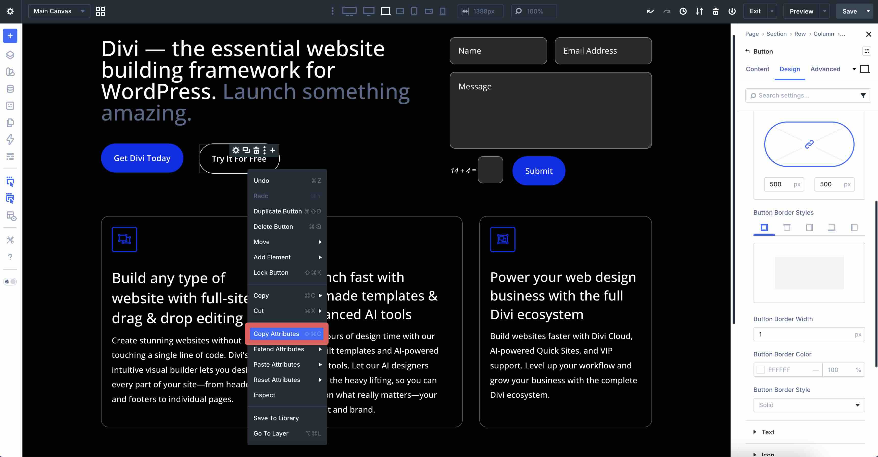
Attribute Management
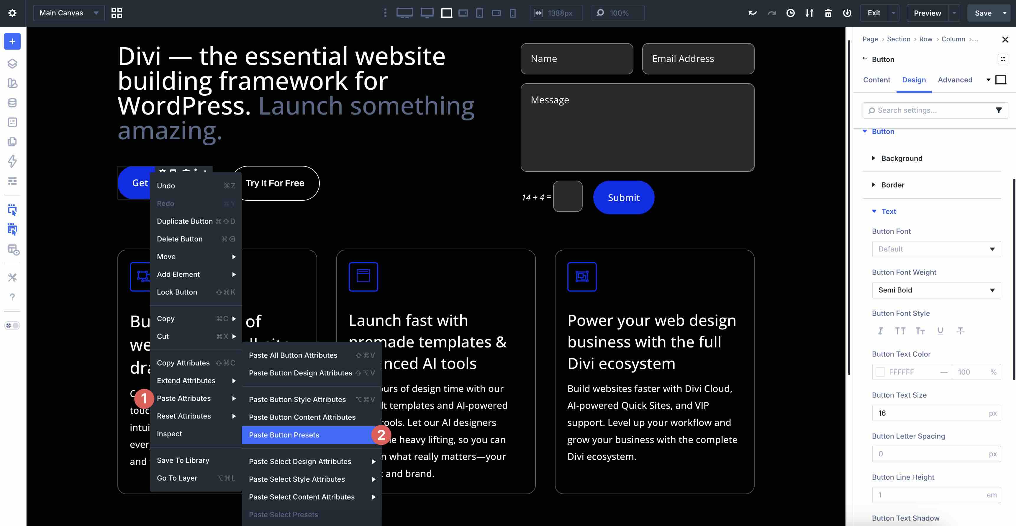
In addition to extending attributes, you can now copy and paste specific parts of an element without cloning the entire thing. When you right-click a module, you now have a sophisticated Copy and Paste Attributes menu.
Right-click a module and select Copy Attributes.
Then, right-click on a module that shares the same properties and select Paste Attributes. A menu appears, allowing you to choose which attributes you’d like to paste, including all module attributes, styles, and content, or just selected styles and content.
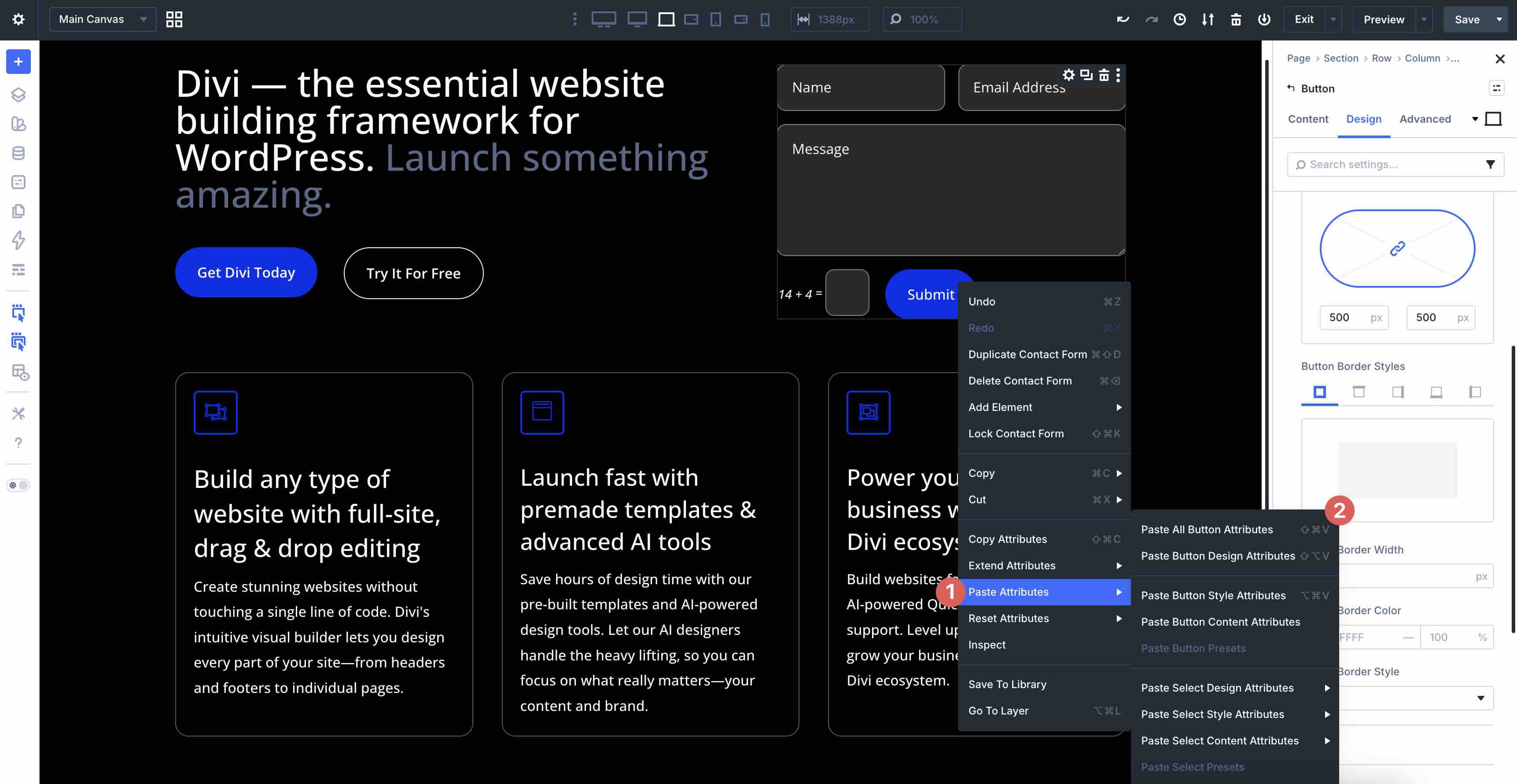
If a preset is applied to the copied module, you can paste its preset as well.
Bulk Editing With the Inspector
As previously mentioned, the Inspector allows you to see every style setting, all of your content, layout style, and applied presets in one place. It lets you audit your designs in a dedicated tool in the Builder Bar, showing every color, font, spacing value, content item, and preset used in the selected area. It works in tandem with the Canvas, making it easy to make quick changes.
To use it, click into a module, column, row, or section, and click the Inspector icon. You’ll have instant access to all styles, content, and presets used in that area of the Canvas.
If you need to change a specific color across an entire section, you can do so once in the Inspector. It will instantly find every element using that color and update them all simultaneously.
Multi-Selecting Modules
While the Inspector handles styles and content, multi-selection handles structure. In Divi 5, selecting multiple modules is a great way to manage your page layout in blocks.
Hold Shift and click on multiple modules to select them as a group.
Once selected, you can drag the selected modules to a new location on the page. This makes reorganizing complex layouts incredibly fast.
One-Click Editing
In addition to right-clicking, Divi 5 supports one-click editing. Unlike earlier versions, where you had to click settings icons directly, simply clicking anywhere on a module, row, column, or section instantly opens its full settings in the Sidebar. This direct integration makes the Builder responsive and natural.
The right-hand Sidebar provides deep, contextual control over your design. In Divi 5, this panel is intelligent. It automatically switches its controls based on what you’ve selected on the Canvas. If no module is selected, it defaults to Page Settings, acting as the command center for your layout’s global attributes.
When you click a module, look at the top of the Sidebar to find a breadcrumb trail. Instead of hunting for your place in the Builder, you can click the breadcrumbs to jump instantly from a module up to its parent Column, Row, or Section.
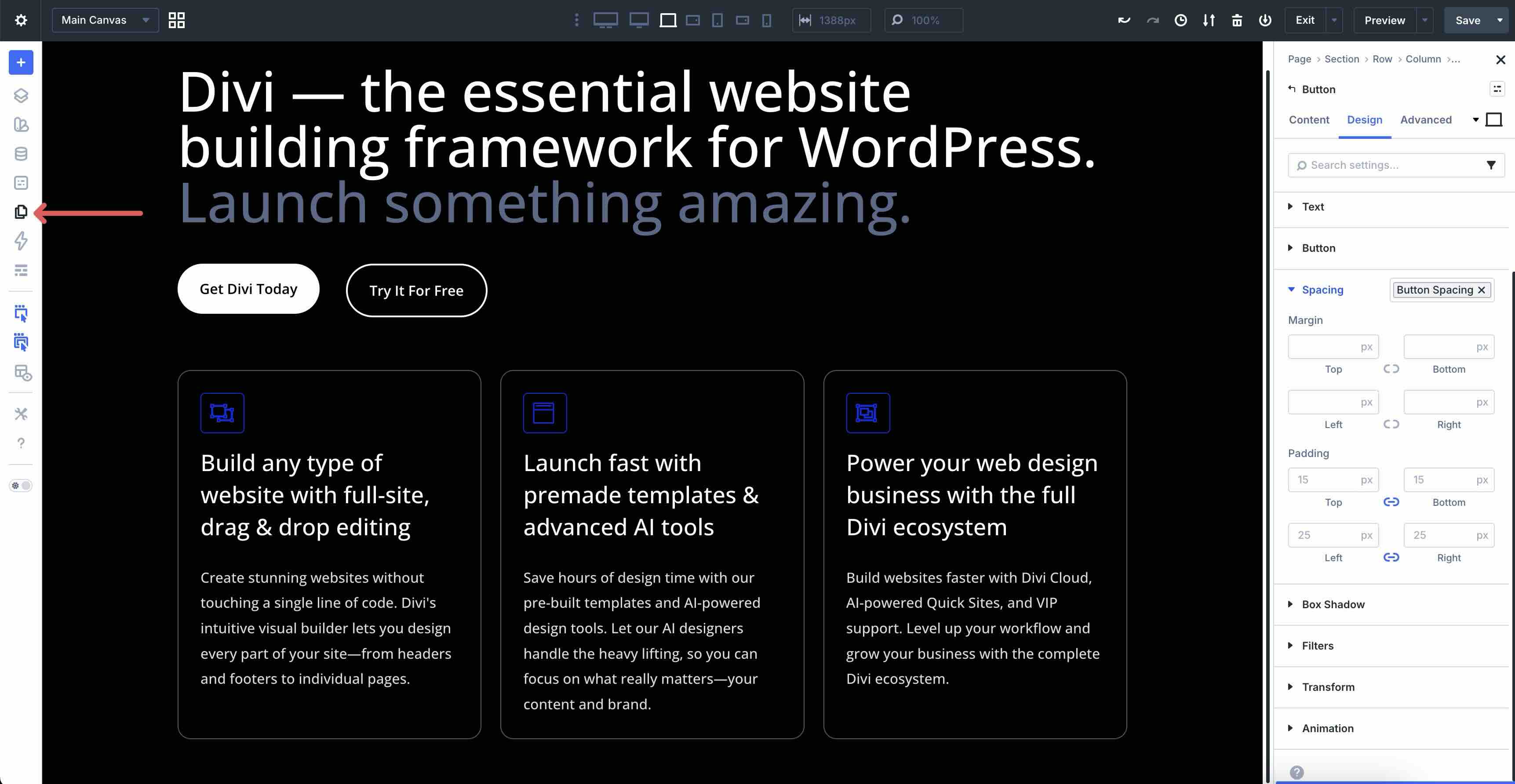
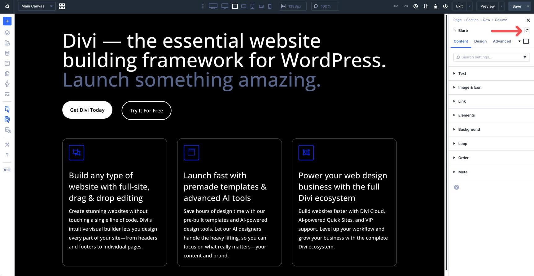
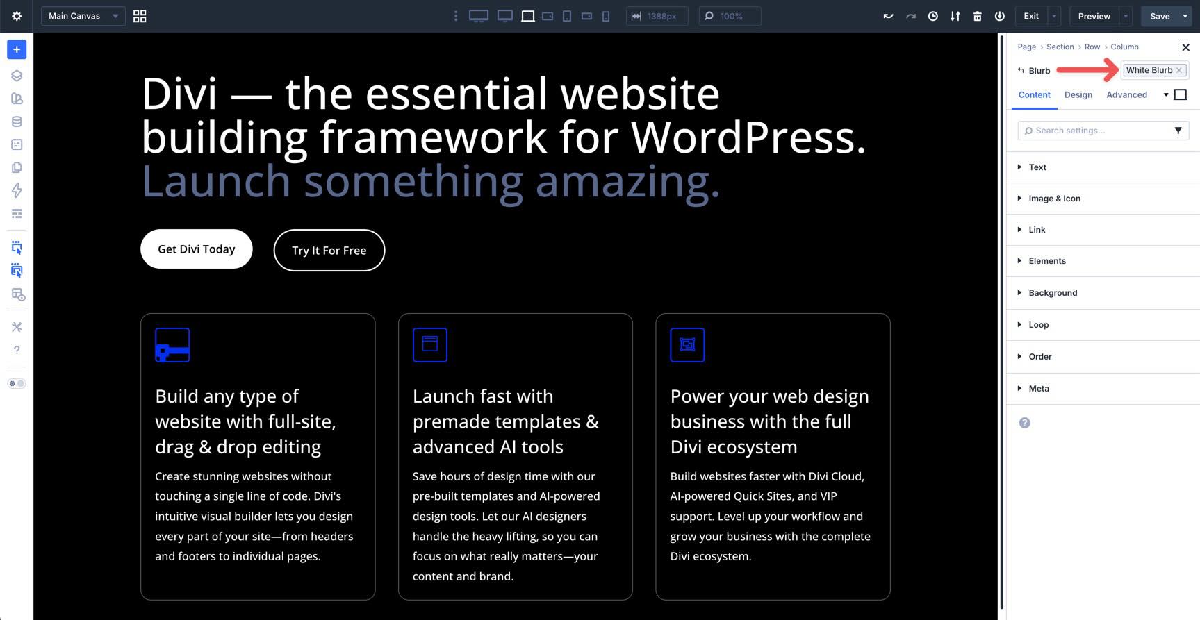
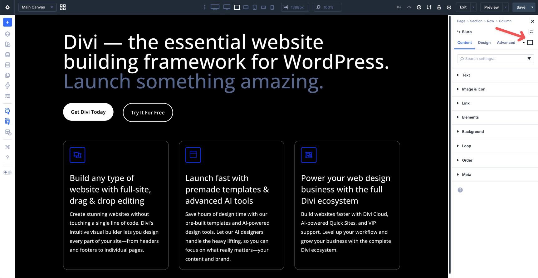
Element Presets
Located at the top right of the module name in the Sidebar, this small icon acts as a quick-access toggle for your Element Presets.
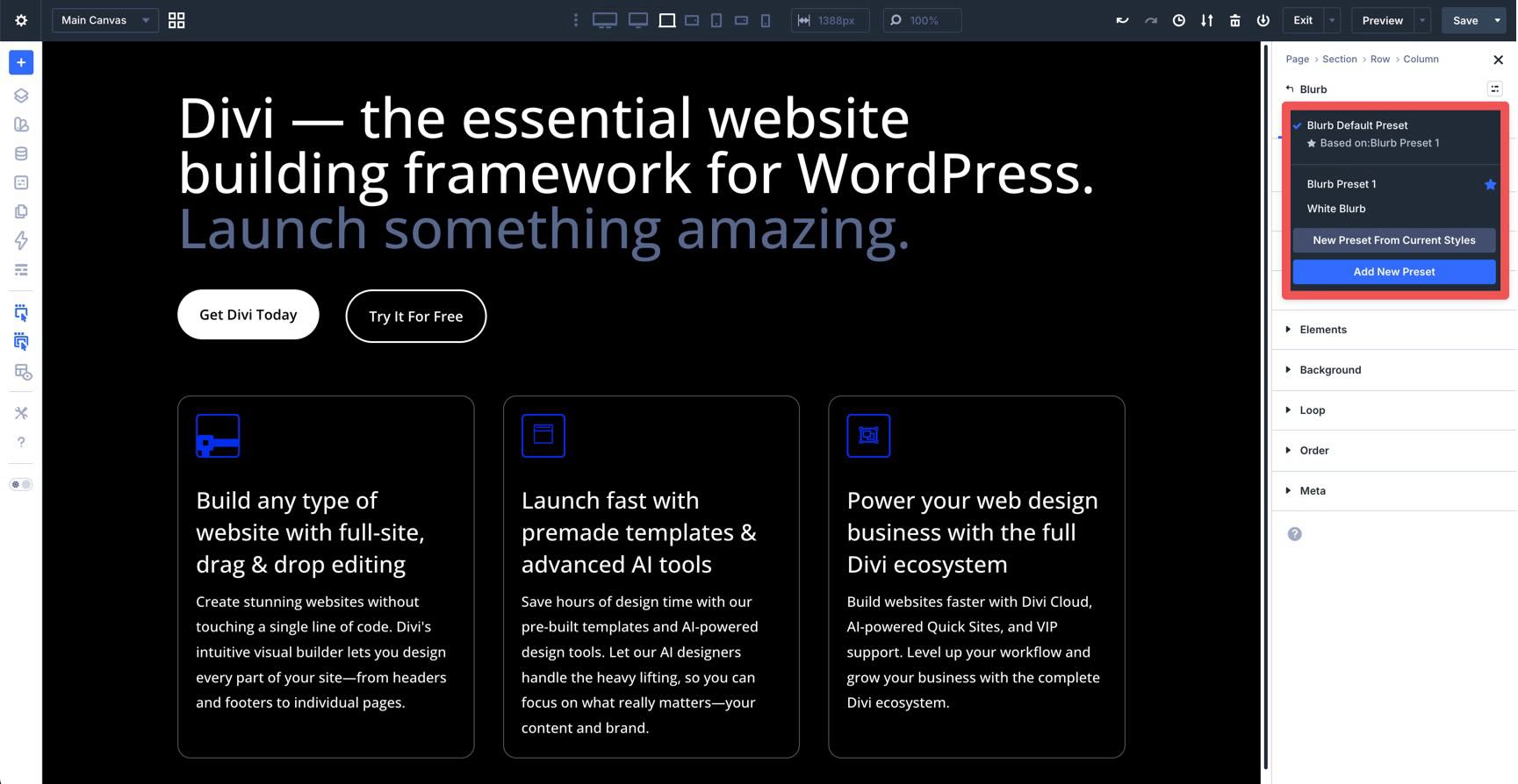
Clicking this icon opens a dropdown of all saved presets for that specific module type. Instead of navigating back to the Preset Manager in the Builder Bar, you can apply your preset styles directly as you work. If a preset is applied, its name will be displayed instead of the preset icon.
To add a preset, click the Element Preset icon to reveal the options. You can apply a preset, create a new preset from current styles, or select Add New Preset.
Responsive State Picker
Below that, you’ll find the familiar Content, Design, and Advanced tabs, along with the new Responsive State Picker. Here, you can set the responsive state for each breakpoint, hover state, and sticky state. This ensures you always know exactly which version of the module you are styling.
The Content, Design, and Advanced tabs remain largely the same, but with more granular organization and better performance.
Each settings panel (Content, Design, and Advanced) includes a search bar at the top and filters to show modified fields, variables in use, and more. This makes hunting through options much faster.
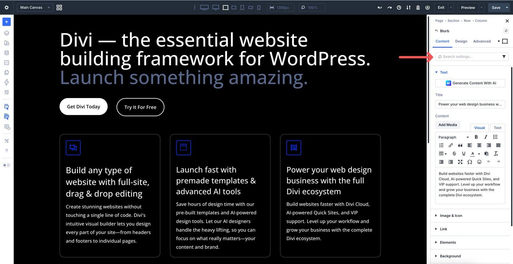
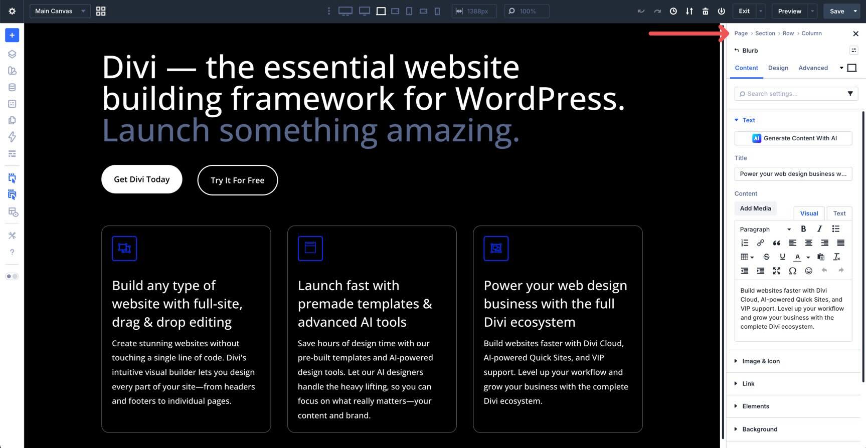
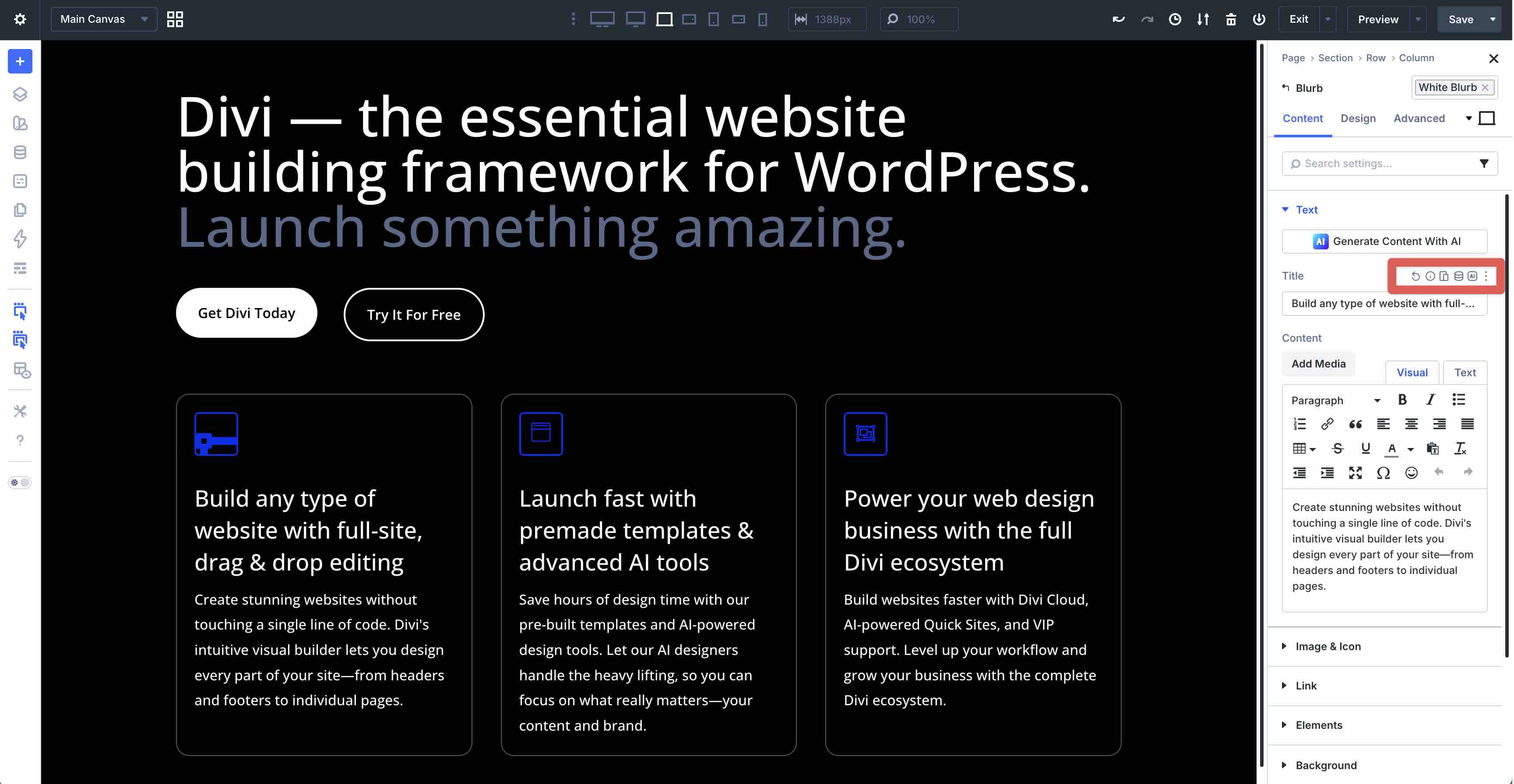
Content Tab
This is where you manage the content of your element, including text, images, and links. In Divi 5, the Responsive Editor, Dynamic Content icon, and Divi AI icon are more accessible, making it easier to pull in titles or custom fields, adjust typography for smaller screens, or write content with Divi AI. In the Blurb module specifically, these icons are available over any Text field, while the Responsive Editor icon is available for Link fields.
These icons also appear contextually throughout applicable fields in the Content and Design tabs.
Elements Menu
One of the biggest changes in the Divi 5 Content tab is the Elements menu.
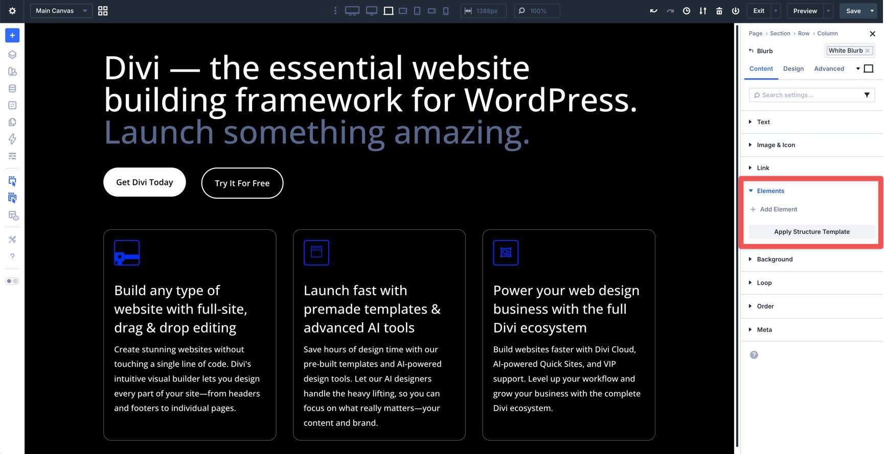
This unlocks Nested Modules, giving you the freedom to place modules inside other modules. Using the Blurb module as an example, you can easily add a Button module directly inside the module’s container.
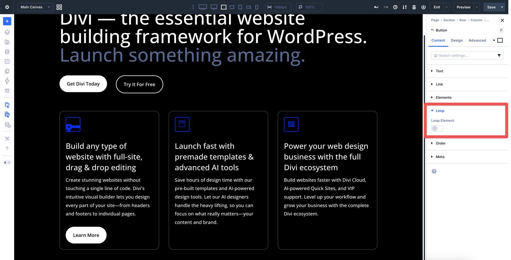
Loop Menu
The Loop section in the Content tab introduces the Loop Builder, a feature that fundamentally changes how you handle dynamic content. In Divi 4, you were often restricted to specific modules, such as the Blog or Portfolio module, to display a feed of posts. In Divi 5, you can turn any element — whether it’s a Column, Row, Group module, or Link Module — into a repeating loop.
Managing Layouts At The Row & Column Level
While individual modules handle your content, the Row and Column settings in the Content tab provide the structural foundation. This is where you’ll find two of Divi 5’s new layout tools: Structure Templates and Display Order.
Structure Templates (Row Level)
When adding a Row, the Apply Structure Template button allows you to redefine your column arrangement for specific devices.
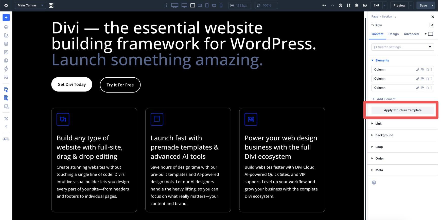
If you have a three-column layout on Desktop but want a single-column layout on Tablet, you can switch to the Tablet breakpoint and click Apply Structure Template. This opens a modal that lets you select a new arrangement that applies only to that responsive state.
Order Menu (Column Level)
When you move into the Column settings, the Order menu allows you to change the display order of that column on smaller screens.
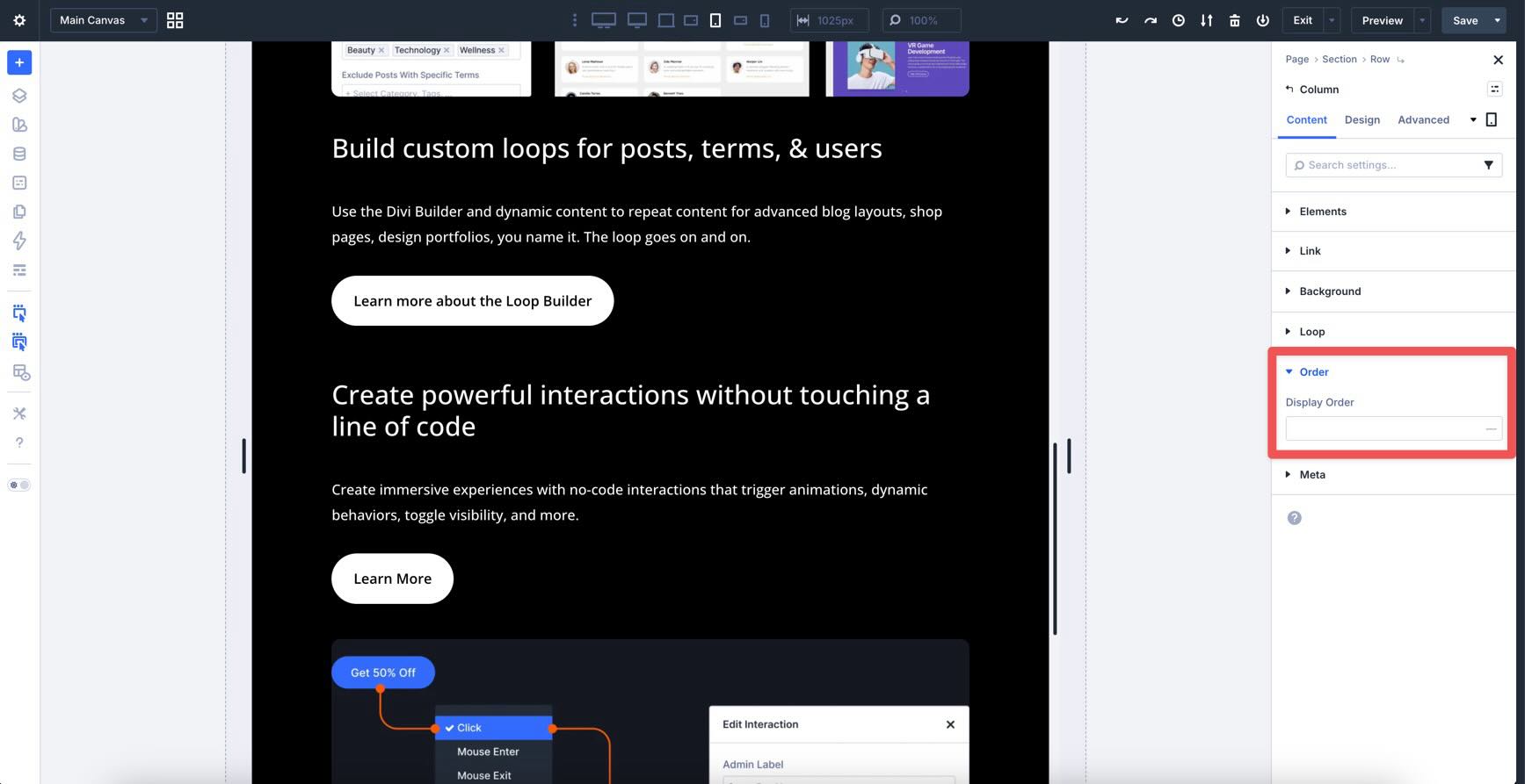
For example, if you have an alternating layout on Desktop — such as an image on the left and text on the right, followed by text on the left and an image on the right — the standard stacking order on smaller screens can look messy. You might end up with an image-text-text-image flow instead of a cleaner image-text-image-text flow.
In Divi 5, this is an easy fix. Switch to a smaller breakpoint, such as Tablet, and use the Order field to change the display order for that column. The Builder will automatically rearrange the columns at that breakpoint according to the sequence you define, ensuring your content is always presented logically, regardless of device width.
Design Tab
While the Content tab handles the structure and content of your modules, the Design tab is where you refine the styling. For Divi 4 users, the most significant change is the shift toward a composable design system and the introduction of professional-grade layout engines such as Flexbox and CSS Grid.
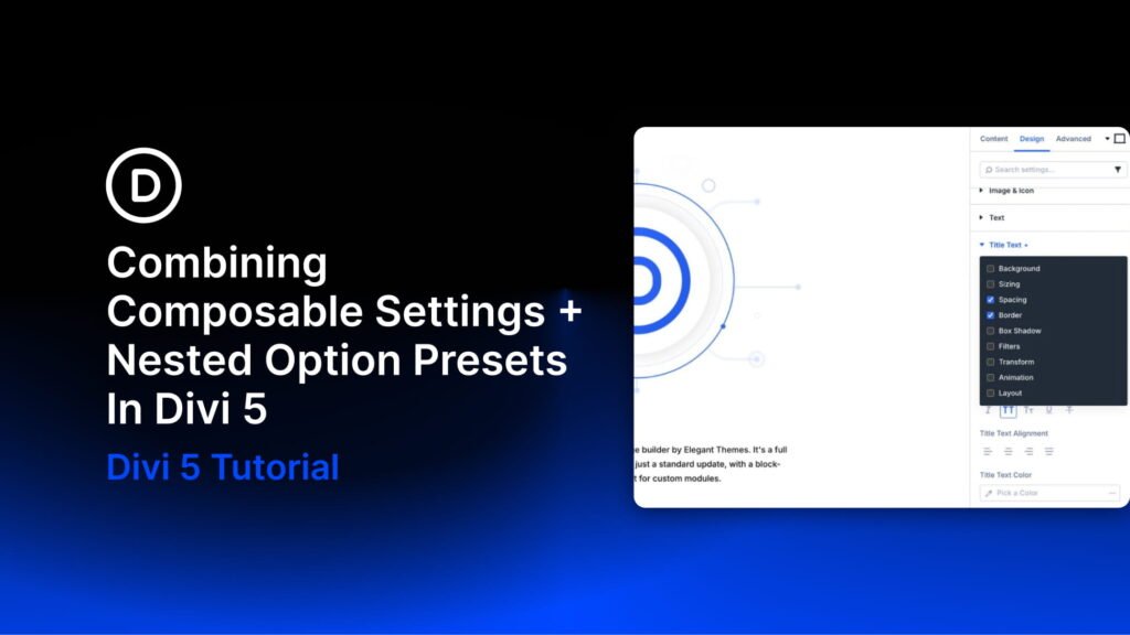
Composable Settings
In Divi 4, settings were module-based and included a specific set of design options. Divi 5 introduces Composable Settings, which means design features are now interchangeable and can be added to almost any element. Using the Blurb module as an example, click on the Design tab and expand the Title Text menu. As you can see, the Title Text menu has the familiar settings you’re used to, including Title Font, Font Weight, Font Style, and others.
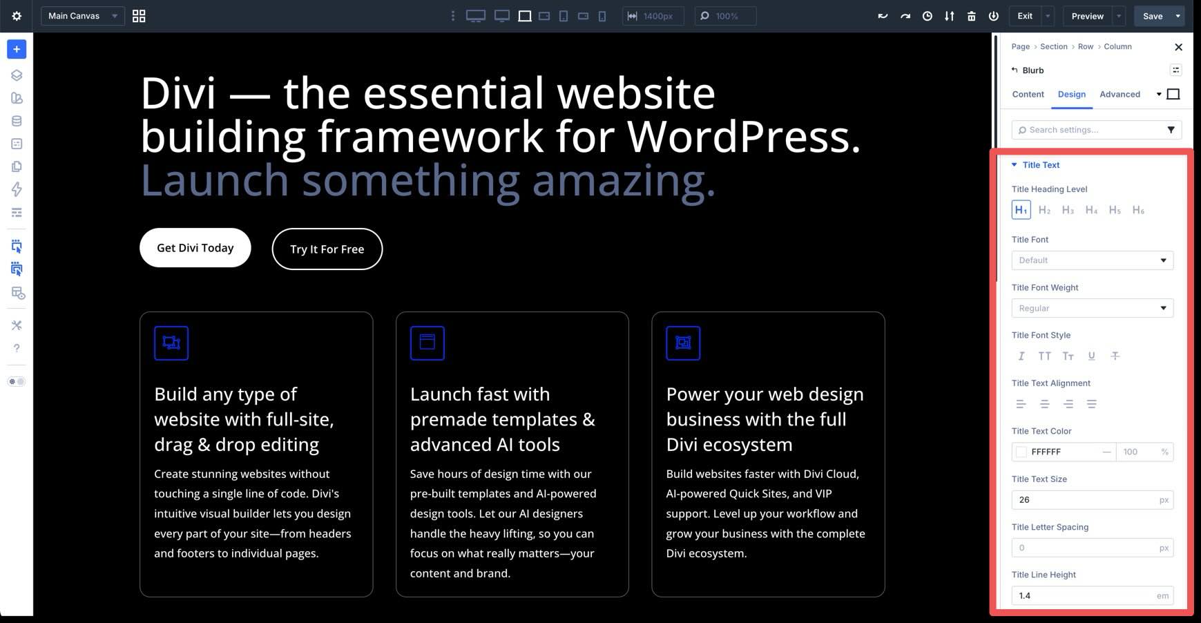
When you hover next to the menu’s title, you’ll see two new icons: one for presets and another for composable settings.
When you click the new composable settings icon, you can enable new sub-element options that were previously unavailable.
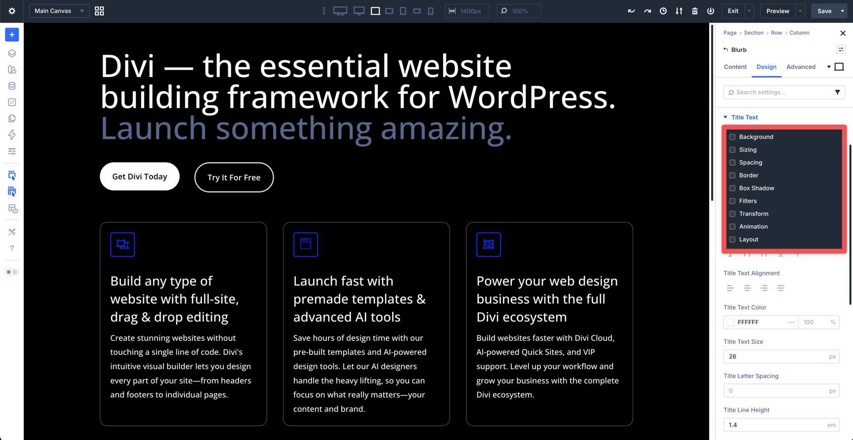
This means you can add styling for Background, Sizing, Spacing, Border, and more directly to the Blurb’s Title Text. Once enabled, you can immediately style the Title Text with these new options.
Advanced Units
In any module, Divi 5 replaces simple number fields with a new Advanced Units system. Every input for spacing, sizing, and typography now acts as a mini code editor.
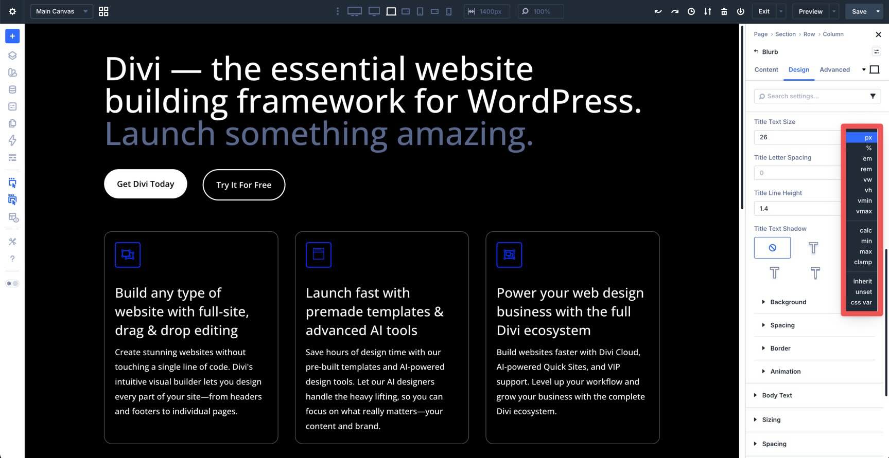
With Advanced Units, you aren’t limited to static numbers. You can type complex CSS functions like clamp(), calc(), min(), and max() directly into the field. You can access these units by clicking to the right of any sizing, spacing, or typography field. Using the Blurb as an example, click to the right of the Title Text Size field. This displays a list of every available unit. This allows you to build fluid typography and responsive spacing that adapts to different screen sizes without manual tweaking.
You can also select a Design Variable by clicking the Insert Dynamic Content icon in any of these fields to globally link it. For example, we can add spacing to the Blurb’s Padding fields with a few clicks. If you update that variable in the Variable Manager, every module that uses it will update instantly across your entire site.
Advanced Layouts: Flexbox & CSS Grid
The most powerful updates in the Design tab happen at the Row and Column levels. Divi 5 has replaced the older layout method with modern CSS standards, giving you total control over how elements are aligned and distributed.
Flexbox
In the Layout menu in the Design tab of any module, you can use Flexbox settings to handle alignment.
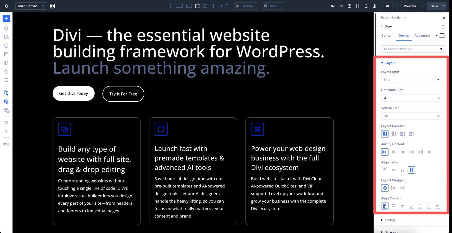
Control Layout Direction by choosing row or column, and decide whether items should Wrap to the next line on smaller screens.
Use Justify Content and Align Items to center elements, push them to the edges, or create space between items within a container.
You can also control the horizontal and vertical spacing between items using the Gap settings.
CSS Grid
For complex, non-linear layouts, you can enable CSS Grid. While Flexbox handles alignment in one direction, CSS Grid is a two-dimensional system.
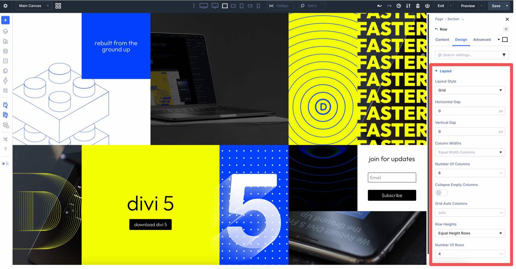
You can easily define the number of rows and columns in your container.

Grid makes it easy to create unique layouts that would be difficult to achieve without custom CSS. You can even redefine the grid structure specifically for mobile, moving elements into different cells or deleting them to fit smaller screens.
Advanced Tab
The Advanced Tab in Divi 5 is designed for precision and extensibility. For users coming from Divi 4, these four areas represent a major leap in what you can achieve without leaving the Builder.
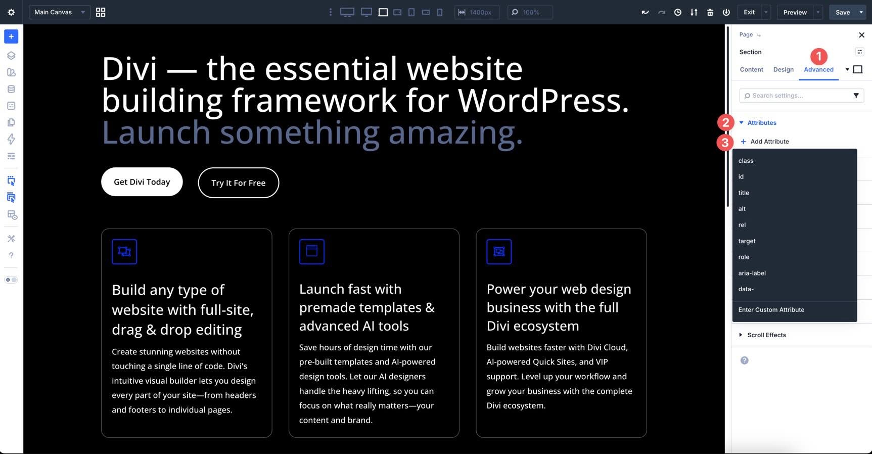
Attributes
Divi 5 introduces a professional Custom Attribute system. Beyond just IDs and classes, you can now add custom HTML attributes, like data attributes or aria-labels, directly to any element. This is a useful feature for developers who need to improve accessibility or add custom functionality.
Semantic Elements & Custom HTML Wrappers
With Semantic Elements, you can redefine the meaning of a module. Use this menu to swap standard div wrappers for semantic tags like article, aside, or nav. This helps search engines and assistive technologies better understand your content.
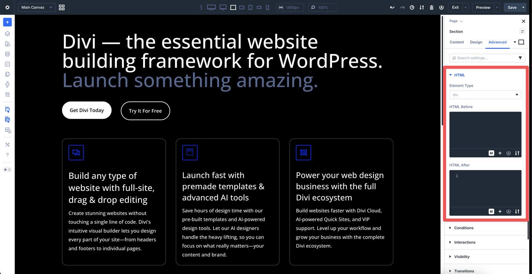
In the same HTML option group, Divi 5 also introduces Custom HTML Wrappers. These allow you to inject HTML directly before and after any element, effectively wrapping modules in custom markup.
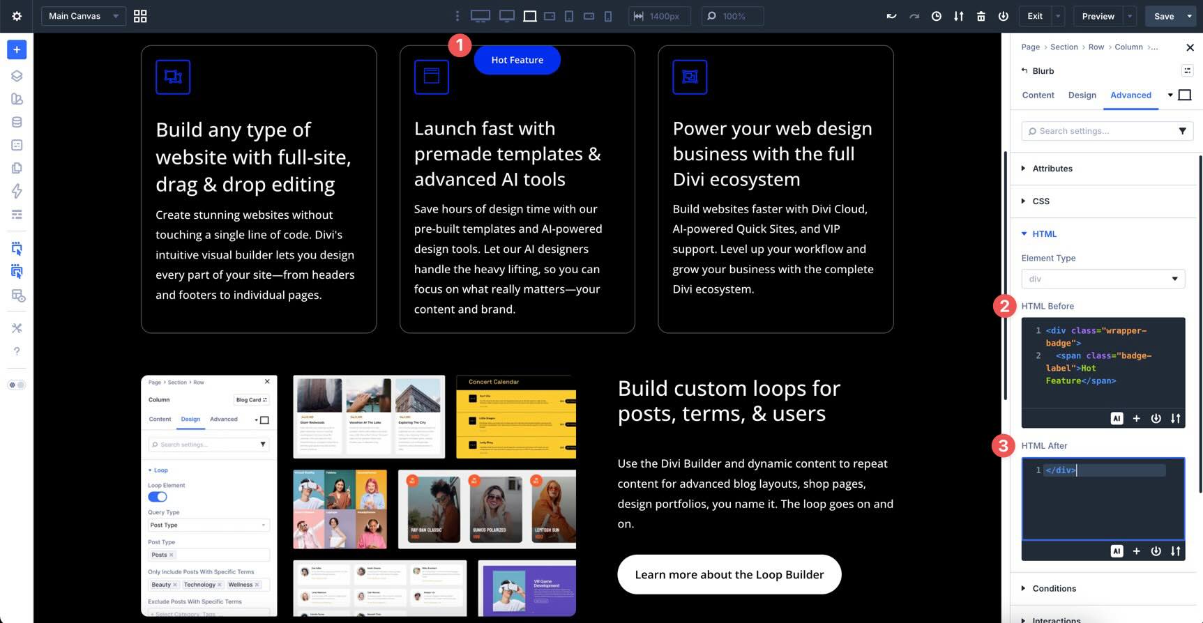
Any associated CSS styles for these containers should be placed at the page level in the Advanced tab under the Custom CSS field.
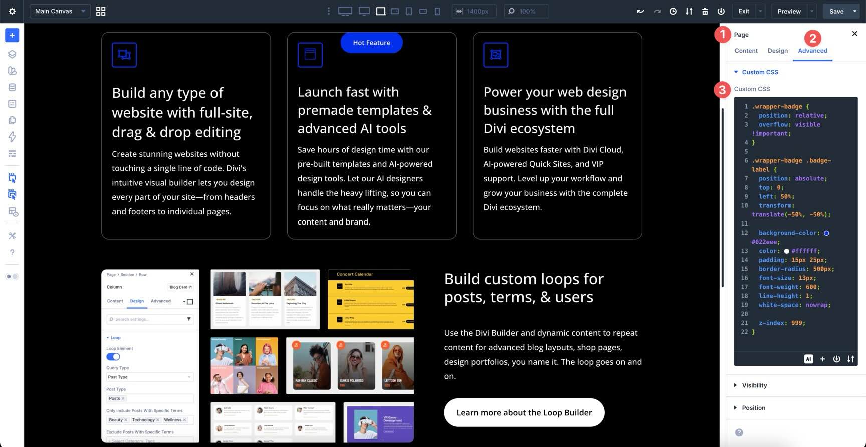
This is especially useful for advanced use cases where a standard Code module can’t reach, such as adding custom parent containers, inserting helper elements, or integrating third-party scripts directly around a module’s output.
Together, Semantic Elements and Custom HTML Wrappers give you full control over both the meaning and structure of your layout without leaving the Visual Builder.
Interactions
Interactions allow you to create complex, high-performance animations, like translate, scale, rotate, or tilt, that trigger based on the user’s mouse movements.
Because they are built on a modern engine, these animations are smooth and lightweight. When combined with Canvases, Interactions can be used for triggering popups, slide-ins, and mega menus, making it easier than ever to create dynamic effects for your site.
What’s Coming Next
With a solid understanding of where everything lives in the Divi 5 Visual Builder, from the predictive power of the Page Manager to the precision of CSS Grid and Advanced Units, you’re ready to start building with purpose.
In Part 3, we’ll put this interface to work by creating a Global Design System. We’ll turn your brand colors, typography, and spacing into a library of Design Variables, ensuring that the coworking space website we build together is fast, consistent, and easy to manage.
Ready to dive deeper? Experiment with the new interface on your own site, try switching between Light and Dark modes, and get comfortable with the Command Center. Drop any comments or questions below, or reach out on our social media channels.